
Lorsque vous devez afficher des images statiques dans votre application, vous pouvez utiliser la classe Drawable et ses sous-classes pour dessiner des formes et des images. Un Drawable est une abstraction générale pour quelque chose qui peut être dessiné. Les différentes sous-classes aident à gérer des scénarios d'image spécifiques. Vous pouvez les étendre pour définir vos propres objets Drawable qui se comportent de manière unique.
Il existe deux façons de définir et d'instancier un Drawable en plus d'utiliser les constructeurs de classe :
- Décompressez une ressource d'image (fichier bitmap) enregistrée dans votre projet.
- Développez une ressource XML qui définit les propriétés du drawable.
Remarque : Vous pouvez également utiliser un drawable vectoriel, qui définit une image avec un ensemble de points, de lignes et de courbes, ainsi que les informations de couleur associées. Cela permet de mettre à l'échelle les drawables vectoriels pour différentes tailles sans perte de qualité. Pour en savoir plus, consultez Présentation des drawables vectoriels.
Créer des drawables à partir d'images de ressources
Vous pouvez ajouter des éléments graphiques à votre application en référençant un fichier image à partir des ressources de votre projet. Les types de fichiers acceptés sont PNG (recommandé), JPG (acceptable) et GIF (déconseillé). Les icônes d'application, les logos et autres éléments graphiques, tels que ceux utilisés dans les jeux, conviennent parfaitement à cette technique.
Pour utiliser une ressource d'image, ajoutez votre fichier au répertoire res/drawable/ de votre projet. Une fois la ressource d'image dans votre projet, vous pouvez y faire référence dans votre code ou votre mise en page XML. Dans les deux cas, il est référencé à l'aide d'un ID de ressource, qui correspond au nom du fichier sans l'extension du type de fichier. Par exemple, faites référence à my_image.png en tant que my_image.
Remarque : Les ressources d'image placées dans le répertoire res/drawable/ peuvent être automatiquement optimisées avec une compression d'image sans perte grâce à l'outil aapt pendant le processus de compilation. Par exemple, un fichier PNG en couleurs réelles qui ne nécessite pas plus de 256 couleurs peut être converti en fichier PNG 8 bits avec une palette de couleurs. Cela produit une image de qualité égale, mais nécessite moins de mémoire. Par conséquent, les versions binaires d'images placées dans ce répertoire peuvent changer lors de la compilation. Si vous prévoyez de lire une image sous la forme d'un flux de bits pour la convertir en bitmap, placez plutôt vos images dans le dossier res/raw/, où l'outil aapt ne les modifiera pas.
L'extrait de code suivant montre comment créer un ImageView qui utilise une image créée à partir d'une ressource Drawable et l'ajoute à la mise en page :
Kotlin
private lateinit var constraintLayout: ConstraintLayout

override fun onCreate(savedInstanceState: Bundle?) {
    super.onCreate(savedInstanceState)

    // Instantiate an ImageView and define its properties
    val i = ImageView(this).apply {
        setImageResource(R.drawable.my_image)
        contentDescription = resources.getString(R.string.my_image_desc)

        // set the ImageView bounds to match the Drawable's dimensions
        adjustViewBounds = true
        layoutParams = ViewGroup.LayoutParams(
                ViewGroup.LayoutParams.WRAP_CONTENT,
                ViewGroup.LayoutParams.WRAP_CONTENT)
    }

    // Create a ConstraintLayout in which to add the ImageView
    constraintLayout = ConstraintLayout(this).apply {

        // Add the ImageView to the layout.
        addView(i)
    }

    // Set the layout as the content view.
    setContentView(constraintLayout)
}
Java
ConstraintLayout constraintLayout;

protected void onCreate(Bundle savedInstanceState) {
  super.onCreate(savedInstanceState);

  // Create a ConstraintLayout in which to add the ImageView
  constraintLayout = new ConstraintLayout(this);

  // Instantiate an ImageView and define its properties
  ImageView i = new ImageView(this);
  i.setImageResource(R.drawable.my_image);
  i.setContentDescription(getResources().getString(R.string.my_image_desc));

  // set the ImageView bounds to match the Drawable's dimensions
  i.setAdjustViewBounds(true);
  i.setLayoutParams(new ViewGroup.LayoutParams(
          ViewGroup.LayoutParams.WRAP_CONTENT,
          ViewGroup.LayoutParams.WRAP_CONTENT));

  // Add the ImageView to the layout and set the layout as the content view.
  constraintLayout.addView(i);
  setContentView(constraintLayout);
}
Dans d'autres cas, vous pouvez gérer votre ressource d'image en tant qu'objet Drawable, comme illustré dans l'exemple suivant :
Kotlin
val myImage: Drawable = ResourcesCompat.getDrawable(context.resources, R.drawable.my_image, null)
Java
Resources res = context.getResources();
Drawable myImage = ResourcesCompat.getDrawable(res, R.drawable.my_image, null);
Avertissement : Chaque ressource unique de votre projet ne peut conserver qu'un seul état, quel que soit le nombre d'objets différents que vous instanciez pour elle. Par exemple, si vous instanciez deux objets Drawable à partir de la même ressource d'image et que vous modifiez une propriété (comme l'alpha) pour l'un des objets, cela affecte également l'autre. Lorsque vous manipulez plusieurs instances d'une ressource d'image, au lieu de transformer directement l'objet Drawable, vous devez effectuer une animation Tween.
L'extrait de code XML ci-dessous montre comment ajouter une ressource drawable à un ImageView dans la mise en page XML :
<ImageView
        android:layout_width="wrap_content"
        android:layout_height="wrap_content"
        android:src="@drawable/my_image"
        android:contentDescription="@string/my_image_desc" />
Pour en savoir plus sur l'utilisation des ressources de projet, consultez Ressources et éléments.
Remarque : Lorsque vous utilisez des ressources d'image comme source de vos éléments drawables, assurez-vous que les images sont de la taille appropriée pour différentes densités de pixels. Si les images ne sont pas correctes, elles seront mises à l'échelle pour s'adapter, ce qui peut entraîner des artefacts dans vos drawables. Pour en savoir plus, consultez Assurer la compatibilité avec différentes densités de pixels.
Créer des drawables à partir de ressources XML
Si vous souhaitez créer un objet Drawable qui ne dépend pas initialement des variables définies par votre code ou l'interaction de l'utilisateur, définir Drawable dans XML est une bonne option. Même si vous vous attendez à ce que votre Drawable modifie ses propriétés pendant l'interaction de l'utilisateur avec votre application, vous devez envisager de définir l'objet en XML, car vous pouvez modifier les propriétés une fois l'objet instancié.
Une fois que vous avez défini votre Drawable en XML, enregistrez le fichier dans le répertoire res/drawable/ de votre projet. L'exemple suivant montre le code XML qui définit une ressource TransitionDrawable, qui hérite de Drawable :
<!-- res/drawable/expand_collapse.xml -->
<transition xmlns:android="http://schemas.android.com/apk/res/android">
    <item android:drawable="@drawable/image_expand"/>
    <item android:drawable="@drawable/image_collapse"/>
</transition>
Ensuite, récupérez et instanciez l'objet en appelant Resources#getDrawable() et en transmettant l'ID de ressource de votre fichier XML. Toute sous-classe Drawable qui accepte la méthode inflate() peut être définie en XML et instanciée par votre application.
Chaque classe de drawable compatible avec l'inflation XML utilise des attributs XML spécifiques qui permettent de définir les propriétés de l'objet. Le code suivant instancie TransitionDrawable et le définit comme contenu d'un objet ImageView :
Kotlin
val transition= ResourcesCompat.getDrawable(
        context.resources,
        R.drawable.expand_collapse,
        null
) as TransitionDrawable

val image: ImageView = findViewById(R.id.toggle_image)
image.setImageDrawable(transition)

// Description of the initial state that the drawable represents.
image.contentDescription = resources.getString(R.string.collapsed)

// Then you can call the TransitionDrawable object's methods.
transition.startTransition(1000)

// After the transition is complete, change the image's content description
// to reflect the new state.
Java
Resources res = context.getResources();
TransitionDrawable transition =
    (TransitionDrawable) ResourcesCompat.getDrawable(res, R.drawable.expand_collapse, null);

ImageView image = (ImageView) findViewById(R.id.toggle_image);
image.setImageDrawable(transition);

// Description of the initial state that the drawable represents.
image.setContentDescription(getResources().getString(R.string.collapsed));

// Then you can call the TransitionDrawable object's methods.
transition.startTransition(1000);

// After the transition is complete, change the image's content description
// to reflect the new state.
Pour en savoir plus sur les attributs XML acceptés, consultez les classes listées ci-dessus.
Drawables de forme
Un objet ShapeDrawable peut être une bonne option lorsque vous souhaitez dessiner dynamiquement un graphique en deux dimensions. Vous pouvez dessiner des formes primitives de manière programmatique sur un objet ShapeDrawable et appliquer les styles dont votre application a besoin.
ShapeDrawable est une sous-classe de Drawable. Pour cette raison, vous pouvez utiliser un ShapeDrawable partout où un Drawable est attendu. Par exemple, vous pouvez utiliser un objet ShapeDrawable pour définir l'arrière-plan d'une vue en le transmettant à la méthode setBackgroundDrawable() de la vue. Vous pouvez également dessiner votre forme en tant que vue personnalisée et l'ajouter à une mise en page dans votre application.
Étant donné que ShapeDrawable possède sa propre méthode draw(), vous pouvez créer une sous-classe de View qui dessine l'objet ShapeDrawable lors de l'événement onDraw(), comme indiqué dans l'exemple de code suivant :
Kotlin
class CustomDrawableView(context: Context) : View(context) {
    private val drawable: ShapeDrawable = run {
        val x = 10
        val y = 10
        val width = 300
        val height = 50
        contentDescription = context.resources.getString(R.string.my_view_desc)

        ShapeDrawable(OvalShape()).apply {
            // If the color isn't set, the shape uses black as the default.
            paint.color = 0xff74AC23.toInt()
            // If the bounds aren't set, the shape can't be drawn.
            setBounds(x, y, x + width, y + height)
        }
    }

    override fun onDraw(canvas: Canvas) {
        drawable.draw(canvas)
    }
}
Java
public class CustomDrawableView extends View {
  private ShapeDrawable drawable;

  public CustomDrawableView(Context context) {
    super(context);

    int x = 10;
    int y = 10;
    int width = 300;
    int height = 50;
    setContentDescription(context.getResources().getString(
            R.string.my_view_desc));

    drawable = new ShapeDrawable(new OvalShape());
    // If the color isn't set, the shape uses black as the default.
    drawable.getPaint().setColor(0xff74AC23);
    // If the bounds aren't set, the shape can't be drawn.
    drawable.setBounds(x, y, x + width, y + height);
  }

  protected void onDraw(Canvas canvas) {
    drawable.draw(canvas);
  }
}
Vous pouvez utiliser la classe CustomDrawableView dans l'exemple de code ci-dessus comme vous le feriez pour n'importe quelle autre vue personnalisée. Par exemple, vous pouvez l'ajouter de manière programmatique à une activité de votre application, comme illustré dans l'exemple suivant :
Kotlin
private lateinit var customDrawableView: CustomDrawableView

override fun onCreate(savedInstanceState: Bundle?) {
    super.onCreate(savedInstanceState)
    customDrawableView = CustomDrawableView(this)

    setContentView(customDrawableView)
}
Java
CustomDrawableView customDrawableView;

protected void onCreate(Bundle savedInstanceState) {
  super.onCreate(savedInstanceState);
  customDrawableView = new CustomDrawableView(this);

  setContentView(customDrawableView);
}
Si vous souhaitez utiliser la vue personnalisée dans la mise en page XML, la classe CustomDrawableView doit remplacer le constructeur View(Context, AttributeSet), qui est appelé lorsque la classe est gonflée à partir du fichier XML. L'exemple suivant montre comment déclarer CustomDrawableView dans la mise en page XML :
<com.example.shapedrawable.CustomDrawableView
        android:layout_width="fill_parent"
        android:layout_height="wrap_content"
        />
La classe ShapeDrawable, comme de nombreux autres types de drawable dans le package android.graphics.drawable, vous permet de définir différentes propriétés de l'objet à l'aide de méthodes publiques. Voici quelques exemples de propriétés que vous pouvez ajuster : transparence alpha, filtre de couleur, tramage, opacité et couleur.
Vous pouvez également définir des formes drawable primitives à l'aide de ressources XML. Pour en savoir plus, consultez Drawable de forme dans Types de ressources drawable.
Drawables NinePatch
Un graphique NinePatchDrawable est une image bitmap extensible que vous pouvez utiliser comme arrière-plan d'une vue. Android redimensionne automatiquement le graphique pour l'adapter au contenu de la vue. L'arrière-plan utilisé par les boutons Android standards, qui doivent s'étirer pour s'adapter aux chaînes de différentes longueurs, est un bon exemple d'utilisation d'une image NinePatch. Un graphique NinePatch est une image PNG standard qui inclut une bordure supplémentaire d'un pixel.
Il doit être enregistré avec l'extension 9.png dans le répertoire res/drawable/ de votre projet.
Utilisez la bordure pour définir les zones étirables et statiques de l'image. Pour indiquer une section extensible, dessinez une ou plusieurs lignes noires d'un pixel de large dans la partie gauche et supérieure de la bordure (les autres pixels de la bordure doivent être entièrement transparents ou blancs). Vous pouvez avoir autant de sections extensibles que vous le souhaitez. La taille relative des sections extensibles reste la même. La section la plus grande reste donc toujours la plus grande.
Vous pouvez également définir une section dessinable facultative de l'image (en fait, les lignes de marge intérieure) en traçant une ligne à droite et une ligne en bas. Si un objet View définit le graphique NinePatch comme arrière-plan, puis spécifie le texte de la vue, il s'étire de sorte que tout le texte n'occupe que la zone désignée par les lignes de droite et du bas (si elles sont incluses).
Si les lignes de marge intérieure ne sont pas incluses, Android utilise les lignes de gauche et du haut pour définir cette zone de dessin.
Pour clarifier la différence entre les lignes, les lignes de gauche et du haut définissent les pixels de l'image qui peuvent être répliqués pour étirer l'image. Les lignes du bas et de droite définissent la zone relative de l'image que le contenu de la vue est autorisé à occuper.
La figure 1 montre un exemple de graphique NinePatch utilisé pour définir un bouton :
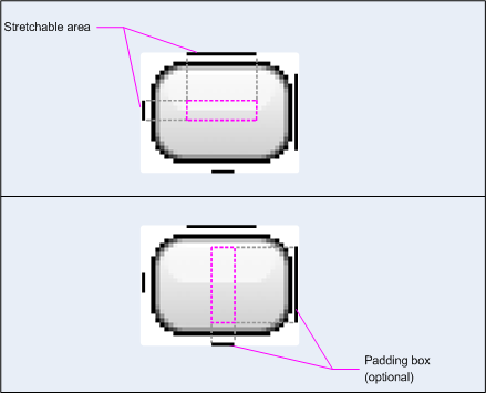
Figure 1 : Exemple de graphique NinePatch définissant un bouton
Ce graphique NinePatch définit une zone extensible avec les lignes de gauche et du haut, et la zone dessinable avec les lignes du bas et de droite. Dans l'image du haut, les lignes grises en pointillés identifient les régions de l'image qui sont répliquées pour l'étirer. Le rectangle rose de l'image du bas identifie la région dans laquelle le contenu de la vue est autorisé. Si le contenu ne tient pas dans cette région, l'image est étirée pour l'adapter.
L'outil Draw 9-patch offre un moyen extrêmement pratique de créer vos images NinePatch à l'aide d'un éditeur graphique WYSIWYG. Il émet même des avertissements si la région que vous avez définie pour la zone extensible risque de produire des artefacts de dessin en raison de la réplication des pixels.
L'exemple de code XML de mise en page suivant montre comment ajouter un graphique NinePatch à deux boutons. L'image NinePatch est enregistrée dans res/drawable/my_button_background.9.png.
<Button android:id="@+id/tiny"
        android:layout_width="wrap_content"
        android:layout_height="wrap_content"
        android:layout_alignParentTop="true"
        android:layout_centerInParent="true"
        android:text="Tiny"
        android:textSize="8sp"
        android:background="@drawable/my_button_background"/>

<Button android:id="@+id/big"
        android:layout_width="wrap_content"
        android:layout_height="wrap_content"
        android:layout_alignParentBottom="true"
        android:layout_centerInParent="true"
        android:text="Biiiiiiig text!"
        android:textSize="30sp"
        android:background="@drawable/my_button_background"/>
Notez que les attributs layout_width et layout_height sont définis sur wrap_content pour que le bouton s'adapte parfaitement au texte.
La figure 2 montre les deux boutons affichés à partir du fichier XML et de l'image NinePatch présentés ci-dessus. Notez que la largeur et la hauteur du bouton varient en fonction du texte, et que l'image d'arrière-plan s'étire pour s'adapter.
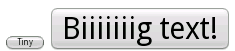
Figure 2 : Boutons affichés à l'aide d'une ressource XML et d'un graphique NinePatch
Drawables personnalisés
Si vous souhaitez créer des dessins personnalisés, vous pouvez le faire en étendant la classe Drawable (ou l'une de ses sous-classes).
La méthode la plus importante à implémenter est draw(Canvas), car elle fournit l'objet Canvas que vous devez utiliser pour fournir vos instructions de dessin.
Le code suivant illustre une sous-classe simple de Drawable
qui dessine un cercle :
Kotlin
class MyDrawable : Drawable() {
    private val redPaint: Paint = Paint().apply { setARGB(255, 255, 0, 0) }

    override fun draw(canvas: Canvas) {
        // Get the drawable's bounds
        val width: Int = bounds.width()
        val height: Int = bounds.height()
        val radius: Float = Math.min(width, height).toFloat() / 2f

        // Draw a red circle in the center
        canvas.drawCircle((width / 2).toFloat(), (height / 2).toFloat(), radius, redPaint)
    }

    override fun setAlpha(alpha: Int) {
        // This method is required
    }

    override fun setColorFilter(colorFilter: ColorFilter?) {
        // This method is required
    }

    override fun getOpacity(): Int =
        // Must be PixelFormat.UNKNOWN, TRANSLUCENT, TRANSPARENT, or OPAQUE
        PixelFormat.OPAQUE
}
Java
public class MyDrawable extends Drawable {
    private final Paint redPaint;

    public MyDrawable() {
        // Set up color and text size
        redPaint = new Paint();
        redPaint.setARGB(255, 255, 0, 0);
    }

    @Override
    public void draw(Canvas canvas) {
        // Get the drawable's bounds
        int width = getBounds().width();
        int height = getBounds().height();
        float radius = Math.min(width, height) / 2;

        // Draw a red circle in the center
        canvas.drawCircle(width/2, height/2, radius, redPaint);
    }

    @Override
    public void setAlpha(int alpha) {
        // This method is required
    }

    @Override
    public void setColorFilter(ColorFilter colorFilter) {
        // This method is required
    }

    @Override
    public int getOpacity() {
        // Must be PixelFormat.UNKNOWN, TRANSLUCENT, TRANSPARENT, or OPAQUE
        return PixelFormat.OPAQUE;
    }
}
Vous pouvez ensuite ajouter votre élément graphique où vous le souhaitez, par exemple à un ImageView, comme indiqué ci-dessous :
Kotlin
val myDrawing = MyDrawable()
val image: ImageView = findViewById(R.id.imageView)
image.setImageDrawable(myDrawing)
image.contentDescription = resources.getString(R.string.my_image_desc)
Java
MyDrawable mydrawing = new MyDrawable();
ImageView image = findViewById(R.id.imageView);
image.setImageDrawable(mydrawing);
image.setContentDescription(getResources().getString(R.string.my_image_desc));
Sur Android 7.0 (niveau d'API 24) ou version ultérieure, vous pouvez également définir des instances de votre drawable personnalisé avec XML de l'une des manières suivantes :
- Utilisez le nom de classe complet comme nom d'élément XML. Pour cette approche, la classe de drawable personnalisée doit être une classe publique de premier niveau :
<com.myapp.MyDrawable xmlns:android="http://schemas.android.com/apk/res/android"
    android:color="#ffff0000" />
- Utiliser
drawablecomme nom de balise XML et spécifier le nom de classe complet à partir de l'attribut de classe. Cette approche peut être utilisée à la fois pour les classes de niveau supérieur publiques et pour les classes internes statiques publiques :<drawable xmlns:android="http://schemas.android.com/apk/res/android" class="com.myapp.MyTopLevelClass$MyDrawable" android:color="#ffff0000" />
Ajouter une teinte aux drawables
Avec Android 5.0 (niveau d'API 21) ou version ultérieure, vous pouvez teinter les bitmaps et les nine-patches définis comme masques alpha. Vous pouvez les teinter avec des ressources de couleur ou des attributs de thème qui se résolvent en ressources de couleur (par exemple, ?android:attr/colorPrimary). En général, vous ne créez ces éléments qu'une seule fois et vous les colorez automatiquement pour qu'ils correspondent à votre thème.
Vous pouvez appliquer une teinte aux objets BitmapDrawable, NinePatchDrawable ou VectorDrawable avec la méthode setTint(). Vous pouvez également définir la couleur et le mode de teinte dans vos mises en page avec les attributs android:tint et android:tintMode.
Extraire les couleurs dominantes d'une image
La bibliothèque Android Support inclut la classe Palette, qui vous permet d'extraire les couleurs dominantes d'une image.
Vous pouvez charger vos éléments drawables en tant que Bitmap et les transmettre à Palette pour accéder à leurs couleurs.
Pour en savoir plus, consultez Sélectionner des couleurs avec l'API Palette.