Jetpack Compose는 Android를 위한 권장 UI 도구 키트입니다. Compose에서 테마 설정을 사용하는 방법을 알아보세요.
<ph type="x-smartling-placeholder"></ph>
머티리얼 디자인 3 →
를 통해 개인정보처리방침을 정의할 수 있습니다.
Material Design은 플랫폼 및 기기 전반의 시각적 요소, 모션, 상호작용 디자인을 위한 포괄적인 가이드입니다. Android 앱에서 Material Design을 사용하려면 다음에 정의된 가이드라인을 따르세요.
Material Design 사양을 참고하세요. 앱에서 Jetpack을 사용하는 경우
Compose를 사용하려면
Compose Material 3 라이브러리 앱에서 뷰를 사용하는 경우 Android Material 구성요소 라이브러리를 사용할 수 있습니다.
Android에서는 Material Design 앱을 빌드하는 데 도움이 되는 다음과 같은 기능을 제공합니다.
모든 UI 위젯의 스타일을 지정하는 Material Design 앱 테마
목록 및 카드와 같은 복잡한 뷰를 위한 위젯
맞춤 그림자 및 애니메이션을 위한 API
머티리얼 테마 및 위젯
표준 UI 위젯 스타일 지정과 같은 머티리얼 기능을 활용하고
앱에 머티리얼 기반 테마를 적용하면 앱의 스타일 정의를 간소화할 수 있습니다.
그림 1. 어두운 머티리얼 테마
그림 2. 밝은 머티리얼 테마
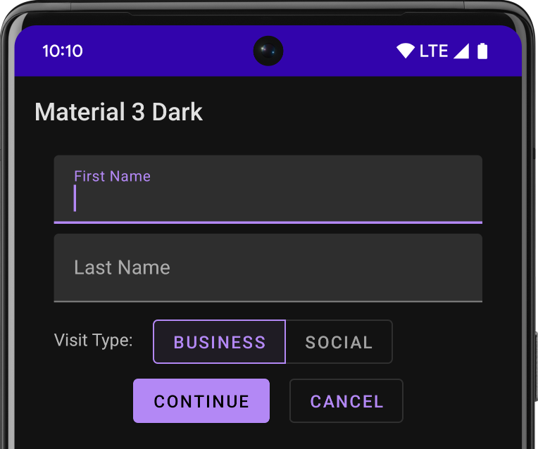
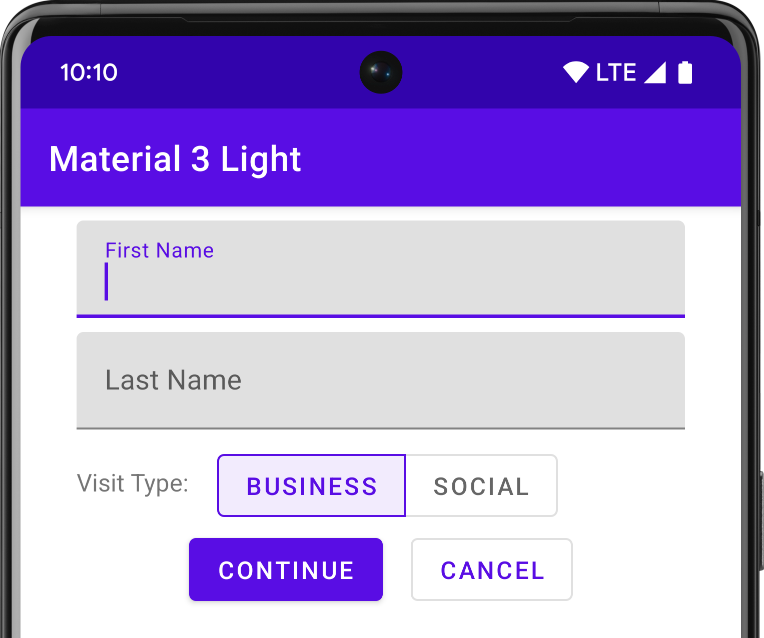
Android 스튜디오를 사용하여 Android 프로젝트를 만들면 기본적으로 Material 테마가 적용됩니다.
프로젝트 테마를 업데이트하는 방법은 다음을 참고하세요.
스타일 및 테마:
사용자에게 친숙한 환경을 제공하려면 Material의 가장 일반적인 UX 패턴을 사용하세요.
앱 레이아웃 및 탐색을 위한 여러 다른 Material 구성요소 중에서 선택하세요. 예를 들면 다음과 같습니다.
툴바, 탭, 하단 탐색 메뉴 등을 접을 수 있습니다. 모두 보려면
Android용 Material 구성요소 카탈로그
가능하면 사전 정의된 머티리얼 아이콘을 사용하세요. 예를 들어 탐색 '메뉴'의 경우 버튼
탐색 창에는 표준 '햄버거'를 사용합니다. 아이콘을 클릭합니다. 사용 가능한 아이콘 목록은 Material Design Icons을 참고하세요. Android 스튜디오의
Vector Asset Studio
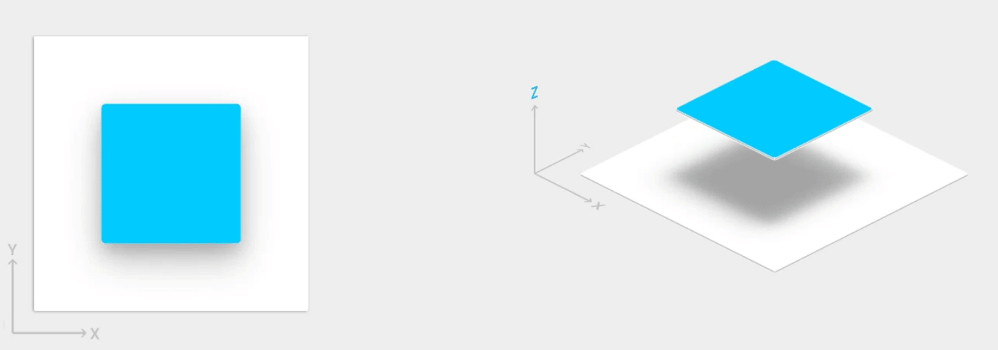
엘리베이션 그림자 및 카드
Android의 뷰에는 X 및 Y 속성 외에도 Z 속성이 있습니다.
이 속성은 다음을 결정하는 뷰의 엘리베이션을 나타냅니다.
그림자 크기: Z 값이 큰 뷰는 그림자가 더 커집니다.
그리기 순서: Z 값이 더 높은 뷰가 다른 뷰 위에 표시됩니다.
그림 3. 고도를 나타내는 Z 값입니다.
카드 기반 레이아웃에 엘리베이션을 적용하면 머티리얼 스타일의 카드 안에 중요한 정보를 표시하는 데 도움이 됩니다. CardView 위젯을 사용하여 기본 엘리베이션으로 카드를 생성할 수 있습니다. 자세한 내용은
카드 기반 레이아웃을 만듭니다.
다른 뷰에 엘리베이션을 추가하는 방법에 대한 자세한 내용은 다음을 참조하세요.
그림자 및 클립 뷰 만들기
애니메이션
<ph type="x-smartling-placeholder">그림 4. 터치 피드백 애니메이션
Animation API를 사용하면 UI 컨트롤에서 터치 피드백을 위한 맞춤 애니메이션을 만들 수 있습니다.
뷰 상태 변경사항, 활동 전환 등이 있습니다.
이러한 API를 통해 다음을 할 수 있습니다.
터치 피드백 애니메이션으로 뷰의 터치 이벤트에 응답할 수 있습니다.
회전 표시 애니메이션으로 뷰를 숨기고 표시할 수 있습니다.
맞춤 활동 전환 애니메이션으로 활동 간에 전환할 수 있습니다.
곡선 모션으로 더 자연스러운 애니메이션을 만들 수 있습니다.
뷰 상태 변경 애니메이션으로 하나 이상의 뷰 속성 변경사항을 애니메이션 처리할 수 있습니다.
뷰 상태 변경 사이의 상태 목록 드로어블에 애니메이션을 표시할 수 있습니다.
터치 피드백 애니메이션은 버튼과 같은 여러 표준 뷰에 빌드됩니다. Animation API
애니메이션을 맞춤설정하고 사용자 지정 뷰에 추가할 수 있습니다.
다음과 같은 드로어블의 기능은 Material Design 앱을 구현하는 데 도움이 됩니다.
벡터 드로어블은 선명도 손실 없이 확장 가능하며
단일 색상 인앱 아이콘을 지원합니다. 다음에 대해 자세히 알아보기
벡터 드로어블로 변환할 수 있습니다.
드로어블 색조 조정을 사용하면 비트맵을 알파 마스크로 정의하고 런타임 시 색상으로 비트맵에 색조를 지정할 수 있습니다. 자세히 알아보기
드로어블에 색조 추가.
색상 추출을 사용하면 비트맵에서 주요 색상을 자동으로 추출할 수 있습니다.
이미지 자세히 알아보기
Palette API로 색상 선택
이 페이지에 나와 있는 콘텐츠와 코드 샘플에는 콘텐츠 라이선스에서 설명하는 라이선스가 적용됩니다. 자바 및 OpenJDK는 Oracle 및 Oracle 계열사의 상표 또는 등록 상표입니다.
최종 업데이트: 2025-07-26(UTC)
[null,null,["최종 업데이트: 2025-07-26(UTC)"],[],[],null,["# Material Design for Android\n\nTry the Compose way \nJetpack Compose is the recommended UI toolkit for Android. Learn how to work with theming in Compose. \n[Material Design 3 →](/jetpack/compose/designsystems/material3) \n\nMaterial Design is a comprehensive guide for visual, motion, and interaction design across\nplatforms and devices. To use Material Design in your Android apps, follow the guidelines defined in\nthe [Material Design specification](https://m3.material.io/). If your app uses Jetpack\nCompose, you can use the\n[Compose Material 3](/jetpack/androidx/releases/compose-material3) library. If your app\nuses views, you can use the\n[Android Material Components](https://github.com/material-components/material-components-android)\nlibrary. \n\nAndroid provides the following features to help you build Material Design apps:\n\n- A Material Design app theme to style all your UI widgets\n- Widgets for complex views, such as lists and cards\n- APIs for custom shadows and animations\n\nMaterial theme and widgets\n--------------------------\n\nTo take advantage of the Material features, such as styling for standard UI widgets, and to\nstreamline your app's style definition, apply a Material-based theme to your app. \n**Figure 1.** Dark Material theme. \n**Figure 2.** Light Material theme.\n\nIf you use Android Studio to create your Android project, it applies a Material theme by default.\nTo learn how to update your project's theme, see\n[Styles and themes](/develop/ui/views/theming/themes).\n\nTo provide your users a familiar experience, use Material's most common UX patterns:\n\n- Promote your UI's main action with a [floating action button](/guide/topics/ui/floating-action-button) (FAB).\n- Show your brand, navigation, search, and other actions using the [app bar](/training/appbar).\n- Show and hide your app's navigation with the [navigation drawer](/training/implementing-navigation/nav-drawer).\n- Choose from the many other Material Components for your app layout and navigation, such as collapsing toolbars, tabs, a bottom nav bar, and more. To see them all, see the [Material Components for Android catalog](https://m3.material.io/components).\n\nWhenever possible, use predefined Material Icons. For example, for the navigation \"menu\" button\nfor your navigation drawer, use the standard \"hamburger\" icon. See\n[Material Design Icons](https://m3.material.io/styles/icons/overview) for a list of\navailable icons. You can also import SVG icons from the Material Icon library with Android Studio's\n[Vector Asset Studio](/studio/write/vector-asset-studio#importing).\n\nElevation shadows and cards\n---------------------------\n\nIn addition to the *X* and *Y* properties, views in Android have a *Z* property.\nThis property represents the elevation of a view, which determines the following:\n\n- The size of its shadow: views with higher *Z* values cast bigger shadows.\n- The drawing order: views with higher *Z* values appear on top of other views.\n\n**Figure 3.** The *Z* value representing elevation.\n\nYou can apply elevation to a card-based layout, which helps you display important pieces of\ninformation inside cards that provide a Material look. You can use the\n[CardView](/reference/androidx/cardview/widget/CardView) widget to\ncreate cards with a default elevation. For more information, see\n[Create a card-based layout](/guide/topics/ui/layout/cardview).\n\nFor information about adding elevation to other views, see\n[Create shadows and clip views](/training/material/shadows-clipping).\n\nAnimations\n----------\n\n**Figure 4.** A touch feedback animation.\n\nAnimation APIs let you create custom animations for touch feedback in UI controls,\nchanges in view state, and activity transitions.\n\nThese APIs let you:\n\n- Respond to touch events in your views with **touch feedback** animations.\n- Hide and show views with **circular reveal** animations.\n- Switch between activities with custom **activity transition** animations.\n- Create more natural animations with **curved motion**.\n- Animate changes in one or more view properties with **view state change** animations.\n- Show animations in **state list drawables** between view state changes.\n\nTouch feedback animations are built into several standard views, such as buttons. The animation APIs\nlet you customize these animations and add them to your custom views.\n\nFor more information, see\n[Introduction to animations](/training/animation/overview).\n\nDrawables\n---------\n\n[Try the Compose way\nWork with Drawables in Compose\narrow_forward](/jetpack/compose/graphics/images/compare)\n\nThese capabilities for drawables help you implement Material Design apps:\n\n- **Vector drawables** are scalable without losing definition and are perfect for single-color in-app icons. Learn more about [vector drawables](/guide/topics/graphics/vector-drawable-resources).\n- **Drawable tinting** lets you define bitmaps as an alpha mask and tint them with a color at runtime. See how to [add tint to drawables](/guide/topics/graphics/2d-graphics#DrawableTint).\n- **Color extraction** lets you automatically extract prominent colors from a bitmap image. See how to [select colors with the Palette API](/training/material/palette-colors)."]]