
Если вам нужно отображать статические изображения в вашем приложении, вы можете использовать класс Drawable и его подклассы для рисования фигур и изображений. Drawable — это общая абстракция того, что можно нарисовать . Различные подклассы помогают работать с конкретными сценариями изображений, и вы можете расширить их, чтобы определить свои собственные рисуемые объекты, которые ведут себя уникальным образом.
Помимо использования конструкторов классов, существует два способа определения и создания Drawable :
- Раздуйте ресурс изображения (растровый файл), сохраненный в вашем проекте.
- Разверните ресурс XML, определяющий свойства рисования.
Примечание. Вместо этого вы можете предпочесть использовать векторный рисунок, который определяет изображение с набором точек, линий и кривых, а также связанной с ним информацией о цвете. Это позволяет масштабировать векторные изображения для разных размеров без потери качества. Дополнительные сведения см. в разделе Обзор векторных рисунков .
Создание рисунков из изображений ресурсов
Вы можете добавить графику в свое приложение, ссылаясь на файл изображения из ресурсов вашего проекта. Поддерживаемые типы файлов: PNG (предпочтительно), JPG (допустимо) и GIF (не рекомендуется). Значки приложений, логотипы и другая графика, например, используемая в играх, хорошо подходят для этого метода.
Чтобы использовать ресурс изображения, добавьте файл в каталог res/drawable/ вашего проекта. В своем проекте вы можете ссылаться на ресурс изображения из своего кода или макета XML. В любом случае речь идет об использовании идентификатора ресурса, который представляет собой имя файла без расширения типа файла. Например, ссылайтесь на my_image.png как my_image .
Примечание. Ресурсы изображений, размещенные в каталоге res/drawable/ могут быть автоматически оптимизированы с помощью сжатия изображений без потерь с помощью инструмента aapt во время процесса сборки. Например, полноцветный PNG, для которого не требуется более 256 цветов, можно преобразовать в 8-битный PNG с цветовой палитрой. В результате получается изображение одинакового качества, но требующее меньше памяти. В результате двоичные файлы изображений, помещенные в этот каталог, могут измениться во время сборки. Если вы планируете читать изображение как битовый поток, чтобы преобразовать его в растровое изображение, вместо этого поместите изображения в папку res/raw/ , где инструмент aapt не будет их изменять.
В следующем фрагменте кода показано, как создать ImageView , который использует изображение, созданное из рисуемого ресурса, и добавляет его в макет:
Котлин
private lateinit var constraintLayout: ConstraintLayout

override fun onCreate(savedInstanceState: Bundle?) {
    super.onCreate(savedInstanceState)

    // Instantiate an ImageView and define its properties
    val i = ImageView(this).apply {
        setImageResource(R.drawable.my_image)
        contentDescription = resources.getString(R.string.my_image_desc)

        // set the ImageView bounds to match the Drawable's dimensions
        adjustViewBounds = true
        layoutParams = ViewGroup.LayoutParams(
                ViewGroup.LayoutParams.WRAP_CONTENT,
                ViewGroup.LayoutParams.WRAP_CONTENT)
    }

    // Create a ConstraintLayout in which to add the ImageView
    constraintLayout = ConstraintLayout(this).apply {

        // Add the ImageView to the layout.
        addView(i)
    }

    // Set the layout as the content view.
    setContentView(constraintLayout)
}
Ява
ConstraintLayout constraintLayout;

protected void onCreate(Bundle savedInstanceState) {
  super.onCreate(savedInstanceState);

  // Create a ConstraintLayout in which to add the ImageView
  constraintLayout = new ConstraintLayout(this);

  // Instantiate an ImageView and define its properties
  ImageView i = new ImageView(this);
  i.setImageResource(R.drawable.my_image);
  i.setContentDescription(getResources().getString(R.string.my_image_desc));

  // set the ImageView bounds to match the Drawable's dimensions
  i.setAdjustViewBounds(true);
  i.setLayoutParams(new ViewGroup.LayoutParams(
          ViewGroup.LayoutParams.WRAP_CONTENT,
          ViewGroup.LayoutParams.WRAP_CONTENT));

  // Add the ImageView to the layout and set the layout as the content view.
  constraintLayout.addView(i);
  setContentView(constraintLayout);
}
В других случаях вы можете обрабатывать свой ресурс изображения как объект Drawable , как показано в следующем примере:
Котлин
val myImage: Drawable = ResourcesCompat.getDrawable(context.resources, R.drawable.my_image, null)
Ява
Resources res = context.getResources();
Drawable myImage = ResourcesCompat.getDrawable(res, R.drawable.my_image, null);
Предупреждение. Каждый уникальный ресурс в вашем проекте может поддерживать только одно состояние, независимо от того, сколько разных объектов вы для него создаете. Например, если вы создаете экземпляры двух объектов Drawable из одного и того же ресурса изображения и меняете свойство (например, альфа) для одного объекта, это также повлияет на другой. При работе с несколькими экземплярами ресурса изображения вместо прямого преобразования объекта Drawable следует выполнить анимацию анимации .
В приведенном ниже фрагменте XML показано, как добавить рисуемый ресурс в ImageView в макете XML:
<ImageView
        android:layout_width="wrap_content"
        android:layout_height="wrap_content"
        android:src="@drawable/my_image"
        android:contentDescription="@string/my_image_desc" />
Дополнительные сведения об использовании ресурсов проекта см. в разделе Ресурсы и активы .
Примечание. При использовании ресурсов изображений в качестве источника рисунков убедитесь, что изображения имеют соответствующий размер для различной плотности пикселей. Если изображения неверны, они будут увеличены до нужного размера, что может привести к появлению артефактов в ваших рисунках. Дополнительные сведения см. в разделе Поддержка различной плотности пикселей .
Создание чертежей из ресурсов XML
Если вы хотите создать объект Drawable , который изначально не зависит от переменных, определенных вашим кодом или взаимодействием с пользователем, то определение Drawable в XML является хорошим вариантом. Даже если вы ожидаете, что ваш Drawable изменит свои свойства во время взаимодействия пользователя с вашим приложением, вам следует рассмотреть возможность определения объекта в XML, поскольку вы можете изменять свойства после создания экземпляра объекта.
После того, как вы определили свой Drawable в XML, сохраните файл в каталоге res/drawable/ вашего проекта. В следующем примере показан XML-код, определяющий ресурс TransitionDrawable , который наследуется от Drawable :
<!-- res/drawable/expand_collapse.xml -->
<transition xmlns:android="http://schemas.android.com/apk/res/android">
    <item android:drawable="@drawable/image_expand"/>
    <item android:drawable="@drawable/image_collapse"/>
</transition>
Затем извлеките и создайте экземпляр объекта, вызвав Resources#getDrawable() и передав идентификатор ресурса вашего XML-файла. Любой подкласс Drawable , поддерживающий метод inflate() может быть определен в XML и создан вашим приложением.
Каждый рисуемый класс, поддерживающий инфляцию XML, использует определенные атрибуты XML, которые помогают определить свойства объекта. Следующий код создает экземпляр TransitionDrawable и устанавливает его как содержимое объекта ImageView :
Котлин
val transition= ResourcesCompat.getDrawable(
        context.resources,
        R.drawable.expand_collapse,
        null
) as TransitionDrawable

val image: ImageView = findViewById(R.id.toggle_image)
image.setImageDrawable(transition)

// Description of the initial state that the drawable represents.
image.contentDescription = resources.getString(R.string.collapsed)

// Then you can call the TransitionDrawable object's methods.
transition.startTransition(1000)

// After the transition is complete, change the image's content description
// to reflect the new state.
Ява
Resources res = context.getResources();
TransitionDrawable transition =
    (TransitionDrawable) ResourcesCompat.getDrawable(res, R.drawable.expand_collapse, null);

ImageView image = (ImageView) findViewById(R.id.toggle_image);
image.setImageDrawable(transition);

// Description of the initial state that the drawable represents.
image.setContentDescription(getResources().getString(R.string.collapsed));

// Then you can call the TransitionDrawable object's methods.
transition.startTransition(1000);

// After the transition is complete, change the image's content description
// to reflect the new state.
Для получения дополнительной информации о поддерживаемых атрибутах XML обратитесь к классам, перечисленным выше.
Фигуры
Объект ShapeDrawable может быть хорошим вариантом, если вы хотите динамически рисовать двухмерную графику. Вы можете программно рисовать примитивные фигуры на объекте ShapeDrawable и применять стили, необходимые вашему приложению.
ShapeDrawable — это подкласс Drawable . По этой причине вы можете использовать ShapeDrawable везде, где ожидается Drawable . Например, вы можете использовать объект ShapeDrawable для установки фона представления, передав его методу setBackgroundDrawable() представления. Вы также можете нарисовать свою фигуру как отдельный вид и добавить ее в макет своего приложения.
Поскольку у ShapeDrawable есть собственный метод draw() , вы можете создать подкласс View , который рисует объект ShapeDrawable во время события onDraw() , как показано в следующем примере кода:
Котлин
class CustomDrawableView(context: Context) : View(context) {
    private val drawable: ShapeDrawable = run {
        val x = 10
        val y = 10
        val width = 300
        val height = 50
        contentDescription = context.resources.getString(R.string.my_view_desc)

        ShapeDrawable(OvalShape()).apply {
            // If the color isn't set, the shape uses black as the default.
            paint.color = 0xff74AC23.toInt()
            // If the bounds aren't set, the shape can't be drawn.
            setBounds(x, y, x + width, y + height)
        }
    }

    override fun onDraw(canvas: Canvas) {
        drawable.draw(canvas)
    }
}
Ява
public class CustomDrawableView extends View {
  private ShapeDrawable drawable;

  public CustomDrawableView(Context context) {
    super(context);

    int x = 10;
    int y = 10;
    int width = 300;
    int height = 50;
    setContentDescription(context.getResources().getString(
            R.string.my_view_desc));

    drawable = new ShapeDrawable(new OvalShape());
    // If the color isn't set, the shape uses black as the default.
    drawable.getPaint().setColor(0xff74AC23);
    // If the bounds aren't set, the shape can't be drawn.
    drawable.setBounds(x, y, x + width, y + height);
  }

  protected void onDraw(Canvas canvas) {
    drawable.draw(canvas);
  }
}
Вы можете использовать класс CustomDrawableView в приведенном выше примере кода, как и любое другое пользовательское представление. Например, вы можете программно добавить его к действию в своем приложении, как показано в следующем примере:
Котлин
private lateinit var customDrawableView: CustomDrawableView

override fun onCreate(savedInstanceState: Bundle?) {
    super.onCreate(savedInstanceState)
    customDrawableView = CustomDrawableView(this)

    setContentView(customDrawableView)
}
Ява
CustomDrawableView customDrawableView;

protected void onCreate(Bundle savedInstanceState) {
  super.onCreate(savedInstanceState);
  customDrawableView = new CustomDrawableView(this);

  setContentView(customDrawableView);
}
Если вместо этого вы хотите использовать пользовательское представление в макете XML, класс CustomDrawableView должен переопределить конструктор View(Context, AttributeSet) , который вызывается, когда класс раздувается из XML. В следующем примере показано, как объявить CustomDrawableView в макете XML:
<com.example.shapedrawable.CustomDrawableView
        android:layout_width="fill_parent"
        android:layout_height="wrap_content"
        />
Класс ShapeDrawable , как и многие другие типы рисования в пакете android.graphics.drawable , позволяет определять различные свойства объекта с помощью общедоступных методов. Некоторые примеры свойств, которые вы, возможно, захотите настроить, включают альфа-прозрачность, цветовой фильтр, сглаживание, непрозрачность и цвет.
Вы также можете определить примитивные рисуемые фигуры, используя ресурсы XML. Дополнительные сведения см. в разделе «Рисуемая фигура» в разделе «Типы рисуемых ресурсов» .
NinePatch чертежи
Графика NinePatchDrawable — это растягиваемое растровое изображение, которое можно использовать в качестве фона представления. Android автоматически изменяет размер изображения в соответствии с содержимым представления. Примером использования изображения NinePatch является фон, используемый стандартными кнопками Android: кнопки должны растягиваться, чтобы вместить строки различной длины. Графика NinePatch представляет собой стандартное изображение PNG с дополнительной рамкой в 1 пиксель. Его необходимо сохранить с расширением 9.png в каталоге res/drawable/ вашего проекта.
Используйте границу, чтобы определить растягиваемые и статические области изображения. Вы указываете растягиваемый раздел, рисуя одну (или несколько) черных линий шириной 1 пиксель в левой и верхней части границы (остальные пиксели границы должны быть полностью прозрачными или белыми). Вы можете иметь столько растягиваемых секций, сколько захотите. Относительный размер растягиваемых секций остается прежним, поэтому самая большая секция всегда остается самой большой.
Вы также можете определить необязательную рисуемую часть изображения (по сути, линии заполнения), нарисовав линию справа и линию внизу. Если объект View устанавливает изображение NinePatch в качестве фона, а затем указывает текст представления, он растягивается так, что весь текст занимает только область, обозначенную правой и нижней строками (если они есть). Если линии заполнения не включены, Android использует левую и верхнюю линии для определения этой области рисования.
Чтобы прояснить разницу между строками, левая и верхняя строки определяют, какие пиксели изображения разрешено копировать, чтобы растянуть изображение. Нижняя и правая строки определяют относительную область изображения, которую может занимать содержимое представления.
На рис. 1 показан пример изображения NinePatch, используемого для определения кнопки:
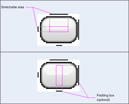
Рисунок 1. Пример изображения NinePatch, определяющего кнопку.
Это изображение NinePatch определяет одну растягиваемую область с левой и верхней линиями, а также область рисования с нижней и правой линиями. На верхнем изображении пунктирные серые линии обозначают области изображения, которые реплицируются для растягивания изображения. Розовый прямоугольник на нижнем изображении обозначает область, в которой разрешено содержимое представления. Если содержимое не помещается в эту область, изображение растягивается, чтобы оно поместилось.
Инструмент Draw 9-patch предлагает чрезвычайно удобный способ создания изображений NinePatch с использованием графического редактора WYSIWYG. Он даже выдает предупреждения, если область, которую вы определили для растягиваемой области, может создавать артефакты рисования в результате репликации пикселей.
В следующем примере XML-макета показано, как добавить изображение NinePatch к нескольким кнопкам. Изображение NinePatch сохраняется в res/drawable/my_button_background.9.png .
<Button android:id="@+id/tiny"
        android:layout_width="wrap_content"
        android:layout_height="wrap_content"
        android:layout_alignParentTop="true"
        android:layout_centerInParent="true"
        android:text="Tiny"
        android:textSize="8sp"
        android:background="@drawable/my_button_background"/>

<Button android:id="@+id/big"
        android:layout_width="wrap_content"
        android:layout_height="wrap_content"
        android:layout_alignParentBottom="true"
        android:layout_centerInParent="true"
        android:text="Biiiiiiig text!"
        android:textSize="30sp"
        android:background="@drawable/my_button_background"/>
Обратите внимание, что атрибутам layout_width и layout_height присвоено значение wrap_content , чтобы кнопка аккуратно располагалась вокруг текста.
На рис. 2 показаны две кнопки, созданные на основе изображений XML и NinePatch, показанных выше. Обратите внимание, как ширина и высота кнопки варьируются в зависимости от текста, а фоновое изображение растягивается, чтобы вместить его.
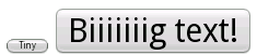
Рис. 2. Кнопки, отображаемые с использованием ресурса XML и графики NinePatch.
Пользовательские чертежи
Если вы хотите создать собственные рисунки, вы можете сделать это, расширив класс Drawable (или любой из его подклассов).
Наиболее важным методом реализации является draw(Canvas) поскольку он предоставляет объект Canvas , который вы должны использовать для предоставления инструкций по рисованию.
Следующий код показывает простой подкласс Drawable , рисующий круг:
Котлин
class MyDrawable : Drawable() {
    private val redPaint: Paint = Paint().apply { setARGB(255, 255, 0, 0) }

    override fun draw(canvas: Canvas) {
        // Get the drawable's bounds
        val width: Int = bounds.width()
        val height: Int = bounds.height()
        val radius: Float = Math.min(width, height).toFloat() / 2f

        // Draw a red circle in the center
        canvas.drawCircle((width / 2).toFloat(), (height / 2).toFloat(), radius, redPaint)
    }

    override fun setAlpha(alpha: Int) {
        // This method is required
    }

    override fun setColorFilter(colorFilter: ColorFilter?) {
        // This method is required
    }

    override fun getOpacity(): Int =
        // Must be PixelFormat.UNKNOWN, TRANSLUCENT, TRANSPARENT, or OPAQUE
        PixelFormat.OPAQUE
}
Ява
public class MyDrawable extends Drawable {
    private final Paint redPaint;

    public MyDrawable() {
        // Set up color and text size
        redPaint = new Paint();
        redPaint.setARGB(255, 255, 0, 0);
    }

    @Override
    public void draw(Canvas canvas) {
        // Get the drawable's bounds
        int width = getBounds().width();
        int height = getBounds().height();
        float radius = Math.min(width, height) / 2;

        // Draw a red circle in the center
        canvas.drawCircle(width/2, height/2, radius, redPaint);
    }

    @Override
    public void setAlpha(int alpha) {
        // This method is required
    }

    @Override
    public void setColorFilter(ColorFilter colorFilter) {
        // This method is required
    }

    @Override
    public int getOpacity() {
        // Must be PixelFormat.UNKNOWN, TRANSLUCENT, TRANSPARENT, or OPAQUE
        return PixelFormat.OPAQUE;
    }
}
Затем вы можете добавить свой рисунок куда угодно, например, в ImageView , как показано здесь:
Котлин
val myDrawing = MyDrawable()
val image: ImageView = findViewById(R.id.imageView)
image.setImageDrawable(myDrawing)
image.contentDescription = resources.getString(R.string.my_image_desc)
Ява
MyDrawable mydrawing = new MyDrawable();
ImageView image = findViewById(R.id.imageView);
image.setImageDrawable(mydrawing);
image.setContentDescription(getResources().getString(R.string.my_image_desc));
В Android 7.0 (уровень API 24) и более поздних версиях вы также можете определить экземпляры вашего пользовательского объекта рисования с помощью XML следующими способами:
- Использование полного имени класса в качестве имени элемента XML. Для этого подхода пользовательский класс, который можно рисовать, должен быть общедоступным классом верхнего уровня:
<com.myapp.MyDrawable xmlns:android="http://schemas.android.com/apk/res/android"
    android:color="#ffff0000" />
- Использование
drawableв качестве имени тега XML и указание полного имени класса из атрибута класса. Этот подход может использоваться как для общедоступных классов верхнего уровня, так и для общедоступных статических внутренних классов:<drawable xmlns:android="http://schemas.android.com/apk/res/android" class="com.myapp.MyTopLevelClass$MyDrawable" android:color="#ffff0000" />
Добавить оттенок к рисункам
В Android 5.0 (уровень API 21) и более поздних версиях вы можете тонировать растровые изображения и девять патчей, определенных как альфа-маски. Вы можете оттенить их с помощью цветовых ресурсов или атрибутов темы, которые преобразуются в цветовые ресурсы (например, ?android:attr/colorPrimary ). Обычно вы создаете эти ресурсы только один раз и автоматически раскрашиваете их в соответствии с вашей темой.
Вы можете применить оттенок к объектам BitmapDrawable , NinePatchDrawable или VectorDrawable с помощью метода setTint() . Вы также можете установить цвет и режим оттенка в своих макетах с помощью атрибутов android:tint и android:tintMode .
Извлечение ярких цветов из изображения
Библиотека поддержки Android включает класс Palette , который позволяет извлекать яркие цвета из изображения. Вы можете загрузить свои рисунки в виде Bitmap и передать их в Palette , чтобы получить доступ к цветам. Дополнительные сведения см. в разделе Выбор цветов с помощью API палитры .