
Material Design 是用于指导用户在各种平台和设备上进行视觉、动作和互动设计的全面指南。如需在您的 Android 应用中使用 Material Design,请遵循 Material Design 规范中定义的准则。如果您的应用使用 Jetpack Compose,则可以使用 Compose Material 3 库。如果您的应用使用视图,则可以使用 Android Material Components 库。
Android 提供了以下功能来帮助您构建 Material Design 应用:
- 一个 Material Design 应用主题背景,用于设置所有界面微件的样式
- 用于复杂视图(例如列表和卡片)的 widget
- 用于自定义阴影和动画的 API
Material 主题背景和微件
如需充分利用各项 Material 功能(例如,为标准界面微件设置样式),以及简化应用的样式定义,请将基于 Material 的主题背景应用到您的应用中。
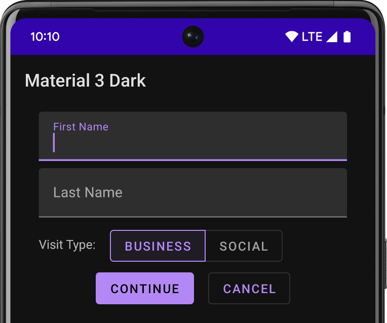
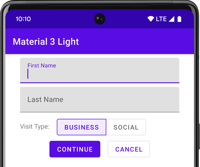
如果您使用 Android Studio 创建 Android 项目,系统会默认应用 Material 主题。 如需了解如何更新项目的主题,请参阅样式和主题。
如需为用户提供熟悉的体验,请使用 Material 的最常见用户体验模式:
- 通过悬浮操作按钮 (FAB) 提升界面的主要操作。
- 使用应用栏显示您的品牌、导航、搜索和其他操作。
- 使用抽屉式导航栏显示和隐藏应用的导航。
- 在应用布局和导航中使用众多其他 Material 组件之一,例如收起工具栏、标签页、底部导航栏等。如需了解所有这些信息,请参阅 Material Components for Android 目录。
尽可能使用预定义的 Material 图标。例如,对于抽屉式导航栏的导航“菜单”按钮,请使用标准的“汉堡”图标。如需查看可用图标的列表,请参阅 Material Design 图标。您还可以使用 Android Studio 的 Vector Asset Studio 从 Material 图标库中导入 SVG 图标。
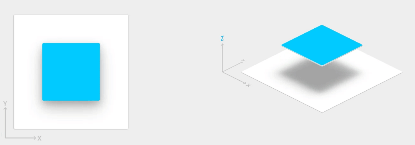
高度阴影和卡片
除 X 和 Y 属性外,Android 中的视图还具有 Z 属性。此属性表示视图的高度,此高度决定了以下内容:
- 阴影的大小:视图的 Z 值越高,投射的阴影越大。
- 绘制顺序:Z 值较高的视图会显示在其他视图的顶部。
您可以为卡片式布局应用高度,这有助于您在提供 Material 样式的卡片中显示重要的信息。您可以使用 CardView 微件创建具有默认高度的卡片。如需了解详情,请参阅创建卡片式布局。
如需了解如何向其他视图添加高度,请参阅创建阴影和剪裁视图。
动画
借助动画 API,您可以为界面控件中的触控反馈、视图状态更改和 activity 转换创建自定义动画。
这些 API 的功能包括:
- 使用轻触反馈动画响应您的视图中的触摸事件。
- 使用圆形揭露动画隐藏和显示视图。
- 使用自定义 Activity 转换动画在 Activity 之间切换。
- 使用曲线运动创建更自然的动画。
- 使用视图状态更改动画为一个或多个视图属性的更改添加动画。
- 视图状态更改期间在状态列表可绘制对象中显示动画。
轻触反馈动画内置于多个标准视图中,例如按钮。借助动画 API,您可以自定义这些动画并将其添加到自定义视图中。
如需了解详情,请参阅动画简介。
可绘制对象
以下用于可绘制对象的功能可帮助您实现 Material Design 应用:
- 矢量可绘制对象可伸缩,不会失去定义,是单色应用内图标的理想之选。详细了解矢量可绘制对象。
- 通过对可绘制对象进行着色,您可以将位图定义为透明遮罩,并在运行时用一种颜色对其进行着色。了解如何向可绘制对象添加色调。
- 颜色提取用于自动从位图图片中提取突出颜色。了解如何使用 Palette API 选择颜色。