
应用界面的设计与特定的设备外形规格无关。Android 应用需要适应多种不同类型的设备,从 4 英寸手机到 50 英寸电视再到配备大小可调窗口的 ChromeOS 设备。
应用界面是在窗口内绘制的,窗口的大小可以随意更改。您可以使用资源限定符为不同的窗口大小提供不同的布局。这些差异可能是由于设备屏幕大小的限制造成的,也可能是用户使用多窗口模式来调整窗口大小造成的。
设计自适应内容
建议您为所有用户提供丰富的体验,让应用中的每个屏幕都能充分利用可用的窗口空间。
例如,如果应用在占据手机屏幕整个宽度的窗口中运行,则在进入多窗口模式时可能会隐藏某些内容的细节;并且在占据 ChromeOS 设备屏幕整个宽度的窗口中运行时,该应用可以扩展其界面来提供更多内容。
除了满足这些用户期望之外,通常还需要在大型设备上提供更多内容,以免留下过多空白或无意中引入尴尬的互动。在下图中,您可以看到在针对较大窗口调整界面设计时可能出现的一些问题:
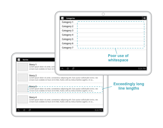
图 1. 宽度较大的窗口上的内容不足,导致空白过多,内容行过长。
如需详细了解如何设计自适应导航体验,请参阅自适应界面的导航。
提供量身定制的用户体验
除了扩展内容视图以填充可用空间之外,您还必须提供独特的体验。您可以定制界面,以针对指定的窗口尺寸提供理想的用户体验,甚至是使用完全不同的布局和微件。
在图 2 中,当有足够的垂直空间时,BottomNavigationView 用作顶级导航。当窗口尺寸缩小(如图右侧所示)时,则改为使用 DrawerLayout 实现顶级导航。

图 2. 当垂直空间有限时,底部导航栏会替换为抽屉式导航栏。
下面是其他一些示例:
Toolbar可根据可用空间量显示或隐藏操作菜单项。RecyclerView.LayoutManager可更改其跨度计数,以充分利用窗口大小- 由于空间足够,您可以增加为自定义视图显示的详细信息量。
这些全都是好方法,可确保您的用户在运行应用时获得良好体验。
您可以在 material.io 上找到有关自适应布局的自适应设计模式和创意的更多示例。