
アプリでは、リスト内のアイテムに関する情報を保持するコンテナなど、同じようなスタイルのコンテナ内にデータを表示することがよくあります。プラットフォーム全体で一貫したデザインのカード内に情報を表示するための CardView API が提供されています。たとえば、カードはデフォルトで、含まれているビューグループより高い位置にあるため、システムによってカードの下に影が描画されます。カードを使用すると、コンテナのスタイルを維持しながら、簡単にビューグループを追加できます。
依存関係を追加する
CardView ウィジェットは AndroidX の一部です。プロジェクトで使用するには、アプリ モジュールの build.gradle ファイルに次の依存関係を追加します。
Groovy
dependencies {
    implementation "androidx.cardview:cardview:1.0.0"
}
Kotlin
dependencies {
    implementation("androidx.cardview:cardview:1.0.0")
}
カードを作成する
CardView を使用するには、レイアウト ファイルに追加します。他のビューを含めるには、ビューグループとして使用します。次の例では、CardView に ImageView といくつかの TextViews を含めて、なんらかの情報をユーザーに表示します。
<?xml version="1.0" encoding="utf-8"?>
<androidx.constraintlayout.widget.ConstraintLayout
    xmlns:android="http://schemas.android.com/apk/res/android"
    xmlns:app="http://schemas.android.com/apk/res-auto"
    android:padding="16dp"
    android:background="#E0F7FA"
    android:layout_width="match_parent"
    android:layout_height="match_parent">

    <androidx.cardview.widget.CardView
        android:layout_width="match_parent"
        android:layout_height="wrap_content"
        app:layout_constraintBottom_toBottomOf="parent"
        app:layout_constraintEnd_toEndOf="parent"
        app:layout_constraintStart_toStartOf="parent"
        app:layout_constraintTop_toTopOf="parent">

        <androidx.constraintlayout.widget.ConstraintLayout
            android:padding="4dp"
            android:layout_width="match_parent"
            android:layout_height="match_parent">

            <ImageView
                android:id="@+id/header_image"
                android:layout_width="match_parent"
                android:layout_height="200dp"
                android:src="@drawable/logo"
                app:layout_constraintEnd_toEndOf="parent"
                app:layout_constraintStart_toStartOf="parent"
                app:layout_constraintTop_toTopOf="parent" />

            <TextView
                android:id="@+id/title"
                style="@style/TextAppearance.MaterialComponents.Headline3"
                android:layout_width="match_parent"
                android:layout_height="wrap_content"
                android:layout_marginTop="4dp"
                android:text="I'm a title"
                app:layout_constraintEnd_toEndOf="parent"
                app:layout_constraintStart_toStartOf="parent"
                app:layout_constraintTop_toBottomOf="@id/header_image" />

            <TextView
                android:id="@+id/subhead"
                style="@style/TextAppearance.MaterialComponents.Subtitle2"
                android:layout_width="match_parent"
                android:layout_height="wrap_content"
                android:layout_marginTop="4dp"
                android:text="I'm a subhead"
                app:layout_constraintEnd_toEndOf="parent"
                app:layout_constraintStart_toStartOf="parent"
                app:layout_constraintTop_toBottomOf="@id/title" />

            <TextView
                android:id="@+id/body"
                style="@style/TextAppearance.MaterialComponents.Body1"
                android:layout_width="match_parent"
                android:layout_height="wrap_content"
                android:layout_marginTop="4dp"
                android:text="I'm a supporting text. Very Lorem ipsum dolor sit amet, consectetur adipiscing elit, sed do eiusmod tempor incididunt ut labore et dolore magna aliqua. Ut enim ad minim veniam, quis nostrud exercitation ullamco laboris nisi ut aliquip ex ea commodo consequat. Duis aute irure dolor in reprehenderit in voluptate velit esse cillum dolore eu fugiat nulla pariatur. Excepteur sint occaecat cupidatat non proident, sunt in culpa qui officia deserunt mollit anim id est laborum."
                app:layout_constraintEnd_toEndOf="parent"
                app:layout_constraintStart_toStartOf="parent"
                app:layout_constraintTop_toBottomOf="@id/subhead" />
        </androidx.constraintlayout.widget.ConstraintLayout>
    </androidx.cardview.widget.CardView>
</androidx.constraintlayout.widget.ConstraintLayout>
前のコード スニペットでは、同じ Android ロゴ画像を使用している場合、次のような結果が生成されます。
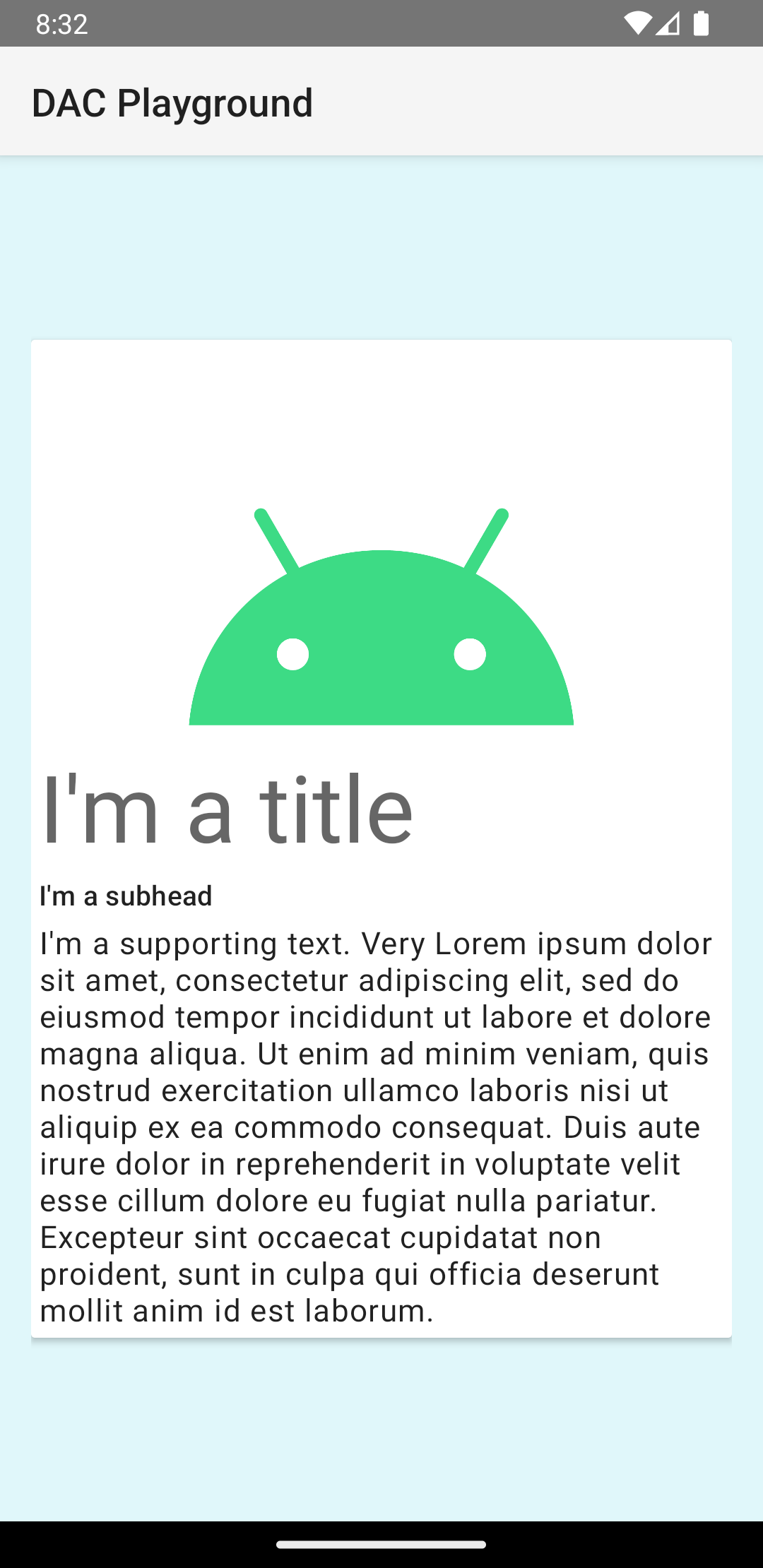
この例のカードは、デフォルトで高い位置にある画面に描画されます。このため、システムによってカードの下に影が描画されます。card_view:cardElevation 属性を使用すると、カードのカスタムの高度を指定できます。高度が高いカードは影が濃く、高度が低いカードは影が薄くなります。CardView は、Android 5.0(API レベル 21)以降では実際の高度と動的な影を使用します。
CardView ウィジェットの外観をカスタマイズするには、以下のプロパティを使用します。
- レイアウトで角の丸みを設定するには、
card_view:cardCornerRadius属性を使用します。 - コードで角の丸みを設定するには、
CardView.setRadiusメソッドを使用します。 - カードの背景色を設定するには、
card_view:cardBackgroundColor属性を使用します。