
Radyo düğmesi, kullanıcının bir dizi seçenek arasından birini belirlemesine olanak tanır. Bir listeden yalnızca bir öğe seçilebildiğinde radyo düğmesi kullanılır. Kullanıcıların birden fazla öğe seçmesi gerekiyorsa bunun yerine geçiş kullanın.

API yüzeyi
Kullanılabilir seçenekleri listelemek için RadioButton composable'ı kullanın. Her RadioButton seçeneğini ve etiketini bir Row bileşeninin içine yerleştirerek bunları birlikte gruplandırın.
RadioButton aşağıdaki temel parametreleri içerir:
selected: Radyo düğmesinin seçili olup olmadığını gösterir.onClick: Kullanıcı radyo düğmesini tıkladığında uygulamanızın yürüttüğü bir lambda işlevi. Bunullise kullanıcı, radyo düğmesiyle doğrudan etkileşimde bulunamaz.enabled: Radyo düğmesinin etkinleştirilip devre dışı bırakılacağını kontrol eder. Kullanıcılar devre dışı radyo düğmeleriyle etkileşim kuramaz.interactionSource: Düğmenin etkileşim durumunu (ör. basılı, üzerine gelindi veya odaklanılmış) gözlemlemenizi sağlar.
Temel radyo düğmesi oluşturma
Aşağıdaki kod snippet'i, Column içinde radyo düğmelerinin listesini oluşturur:
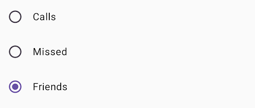
@Composable fun RadioButtonSingleSelection(modifier: Modifier = Modifier) { val radioOptions = listOf("Calls", "Missed", "Friends") val (selectedOption, onOptionSelected) = remember { mutableStateOf(radioOptions[0]) } // Note that Modifier.selectableGroup() is essential to ensure correct accessibility behavior Column(modifier.selectableGroup()) { radioOptions.forEach { text -> Row( Modifier .fillMaxWidth() .height(56.dp) .selectable( selected = (text == selectedOption), onClick = { onOptionSelected(text) }, role = Role.RadioButton ) .padding(horizontal = 16.dp), verticalAlignment = Alignment.CenterVertically ) { RadioButton( selected = (text == selectedOption), onClick = null // null recommended for accessibility with screen readers ) Text( text = text, style = MaterialTheme.typography.bodyLarge, modifier = Modifier.padding(start = 16.dp) ) } } } }
Kodla ilgili önemli noktalar
radioOptions, radyo düğmelerinin etiketlerini gösterir.remembercomposable işlevi,selectedOptionadlı bir durum değişkeni ve bu durumu güncellemek içinonOptionSelectedadlı bir işlev oluşturur. Bu durum, seçilen radyo düğmesi seçeneğini tutar.mutableStateOf(radioOptions[0]), durumu listedeki ilk öğe olarak başlatır. "Aramalar" ilk öğe olduğundan varsayılan olarak seçilen radyo düğmesidir.
Modifier.selectableGroup(), ekran okuyucular için uygun erişilebilirlik davranışını sağlar. Bu özellik, sisteminColumniçindeki öğelerin seçilebilir bir grubun parçası olduğunu anlamasını sağlar. Böylece ekran okuyucu desteği düzgün şekilde sağlanır.Modifier.selectable(),Rowöğesinin tamamını tek bir seçilebilir öğe haline getirir.selected, geçerliRowöğesininselectedOptiondurumuna göre seçilip seçilmediğini gösterir.onClicklambda işlevi,RowtıklandığındaselectedOptiondurumunu tıklanan seçenekle günceller.role = Role.RadioButton, erişilebilirlik hizmetlerineRowöğesinin radyo düğmesi olarak işlev gördüğünü bildirir.
RadioButton(...)composable'ı oluşturur.RadioButtononClick = nullsimgesiRadioButtonerişilebilirliği artırır. Bu, radyo düğmesinin tıklama etkinliğini doğrudan işlemesini önler veRow'nınselectabledeğiştiricisinin seçim durumunu ve erişilebilirlik davranışını yönetmesine olanak tanır.
Sonuç
Ek kaynaklar
- Materyal Tasarım: Düğmeler