Оптимизируйте свои подборки
Сохраняйте и классифицируйте контент в соответствии со своими настройками.
Scaffold
В Material Design каркас — это фундаментальная структура, обеспечивающая стандартизированную платформу для сложных пользовательских интерфейсов. Он объединяет различные элементы пользовательского интерфейса, такие как панели приложений и плавающие кнопки действий, обеспечивая приложениям целостный внешний вид и ощущение.
Пример
Компонуемый объект Scaffold предоставляет простой API, который можно использовать для быстрой сборки структуры приложения в соответствии с принципами Material Design. Scaffold принимает в качестве параметров несколько компонуемых объектов. Среди них следующие:
topBar : Панель приложений в верхней части экрана.
bottomBar : Панель приложений в нижней части экрана.
floatingActionButton : кнопка, которая располагается в правом нижнем углу экрана и позволяет отображать ключевые действия.
Вы также можете передавать содержимое Scaffold так же, как и в другие контейнеры. Значение PaddingValues передается в лямбда-функцию content , которую следует применить к корневому компонуемому элементу контента, чтобы ограничить его размер.
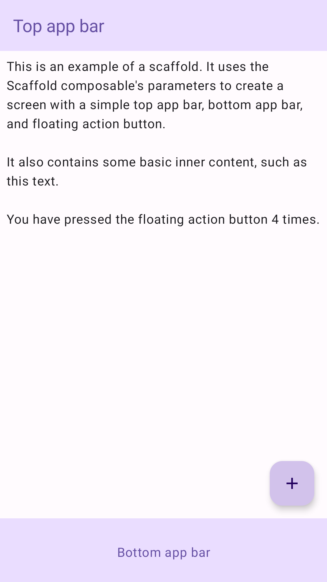
В следующем примере показана полная реализация Scaffold . Она содержит верхнюю и нижнюю панели приложений, а также плавающую кнопку действия.
@ComposablefunScaffoldExample(){varpressesbyremember{mutableIntStateOf(0)}Scaffold(topBar={TopAppBar(colors=topAppBarColors(containerColor=MaterialTheme.colorScheme.primaryContainer,titleContentColor=MaterialTheme.colorScheme.primary,),title={Text("Top app bar")})},bottomBar={BottomAppBar(containerColor=MaterialTheme.colorScheme.primaryContainer,contentColor=MaterialTheme.colorScheme.primary,){Text(modifier=Modifier.fillMaxWidth(),textAlign=TextAlign.Center,text="Bottom app bar",)}},floatingActionButton={FloatingActionButton(onClick={presses++}){Icon(Icons.Default.Add,contentDescription="Add")}}){innerPadding->
Column(modifier=Modifier.padding(innerPadding),verticalArrangement=Arrangement.spacedBy(16.dp),){Text(modifier=Modifier.padding(8.dp),text=""" This is an example of a scaffold. It uses the Scaffold composable's parameters to create a screen with a simple top app bar, bottom app bar, and floating action button. It also contains some basic inner content, such as this text. You have pressed the floating action button $presses times. """.trimIndent(),)}}}
Контент и образцы кода на этой странице предоставлены по лицензиям. Java и OpenJDK – это зарегистрированные товарные знаки корпорации Oracle и ее аффилированных лиц.
Последнее обновление: 2025-08-27 UTC.
[null,null,["Последнее обновление: 2025-08-27 UTC."],[],[],null,["Scaffold\n\nIn Material Design, a scaffold is a fundamental structure that provides a\nstandardized platform for complex user interfaces. It holds together different\nparts of the UI, such as app bars and floating action buttons, giving apps a\ncoherent look and feel.\n\nExample\n\nThe [`Scaffold`](/reference/kotlin/androidx/compose/material3/package-summary#Scaffold(androidx.compose.ui.Modifier,kotlin.Function0,kotlin.Function0,kotlin.Function0,kotlin.Function0,androidx.compose.material3.FabPosition,androidx.compose.ui.graphics.Color,androidx.compose.ui.graphics.Color,androidx.compose.foundation.layout.WindowInsets,kotlin.Function1)) composable provides a straightforward API you can use to\nquickly assemble your app's structure according to Material Design guidelines.\n`Scaffold` accepts several composables as parameters. Among these are the\nfollowing:\n\n- `topBar`: The app bar across the top of the screen.\n- `bottomBar`: The app bar across the bottom of the screen.\n- `floatingActionButton`: A button that hovers over the bottom-right corner of the screen that you can use to expose key actions.\n\n| **Note:** For more detailed examples on how you can implement both top and bottom app bars, see the app bars page.\n\nYou can also pass `Scaffold` content as you would to other containers. It passes\n`PaddingValues` to the `content` lambda that you should apply to your\ncontent's root composable to constrain its size.\n\nThe following example shows a complete `Scaffold` implementation. It contains a\ntop app bar, a bottom app bar, and a floating action button.\n\n\n```kotlin\n@Composable\nfun ScaffoldExample() {\n var presses by remember { mutableIntStateOf(0) }\n\n Scaffold(\n topBar = {\n TopAppBar(\n colors = topAppBarColors(\n containerColor = MaterialTheme.colorScheme.primaryContainer,\n titleContentColor = MaterialTheme.colorScheme.primary,\n ),\n title = {\n Text(\"Top app bar\")\n }\n )\n },\n bottomBar = {\n BottomAppBar(\n containerColor = MaterialTheme.colorScheme.primaryContainer,\n contentColor = MaterialTheme.colorScheme.primary,\n ) {\n Text(\n modifier = Modifier\n .fillMaxWidth(),\n textAlign = TextAlign.Center,\n text = \"Bottom app bar\",\n )\n }\n },\n floatingActionButton = {\n FloatingActionButton(onClick = { presses++ }) {\n Icon(Icons.Default.Add, contentDescription = \"Add\")\n }\n }\n ) { innerPadding -\u003e\n Column(\n modifier = Modifier\n .padding(innerPadding),\n verticalArrangement = Arrangement.spacedBy(16.dp),\n ) {\n Text(\n modifier = Modifier.padding(8.dp),\n text =\n \"\"\"\n This is an example of a scaffold. It uses the Scaffold composable's parameters to create a screen with a simple top app bar, bottom app bar, and floating action button.\n\n It also contains some basic inner content, such as this text.\n\n You have pressed the floating action button $presses times.\n \"\"\".trimIndent(),\n )\n }\n }\n}https://github.com/android/snippets/blob/5673ffc60b614daf028ee936227128eb8c4f9781/compose/snippets/src/main/java/com/example/compose/snippets/components/Scaffold.kt#L47-L100\n```\n\n\u003cbr /\u003e\n\nThis implementation appears as follows:\n**Figure 1.** An implementation of scaffold.\n\nAdditional resources\n\n- [App bars](/develop/ui/compose/components/app-bars)"]]
