הרכיב Dialog מציג הודעות בתיבת דו-שיח או מבקש קלט מהמשתמש בשכבה מעל התוכן הראשי של האפליקציה. היא יוצרת חוויית משתמש שמשבשת את הפעילות כדי למשוך את תשומת הלב של המשתמש.
אלה כמה תרחישי שימוש לדו-שיח:
- אישור פעולת משתמש, למשל כשמוחקים קובץ.
- בקשת קלט מהמשתמש, כמו באפליקציה של רשימת מטלות.
- הצגת רשימת אפשרויות לבחירת המשתמש, כמו בחירת מדינה בהגדרת פרופיל.

תיבת דו-שיח של התראה
רכיב ה-Composable AlertDialog מספק API נוח ליצירת תיבת דו-שיח עם ערכת נושא של Material Design. ל-AlertDialog יש פרמטרים ספציפיים לטיפול באלמנטים מסוימים של הדו-שיח. למשל:
-
title: הטקסט שמופיע בחלק העליון של תיבת הדו-שיח. -
text: הטקסט שמופיע במרכז תיבת הדו-שיח. icon: הגרפיקה שמופיעה בחלק העליון של תיבת הדו-שיח.-
onDismissRequest: הפונקציה שמופעלת כשהמשתמש סוגר את תיבת הדו-שיח, למשל על ידי הקשה מחוץ לה. -
dismissButton: רכיב שאפשר להוסיף ממנו רכיבים אחרים, שמשמש כלחצן לסגירה. -
confirmButton: רכיב שאפשר להוסיף ממנו רכיבים אחרים, שמשמש ככפתור אישור.
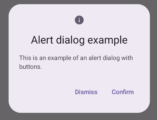
בדוגמה הבאה מוטמעים שני לחצנים בתיבת דו-שיח של התראה: לחצן אחד לסגירת תיבת הדו-שיח ולחצן אחר לאישור הבקשה.
@Composable fun AlertDialogExample( onDismissRequest: () -> Unit, onConfirmation: () -> Unit, dialogTitle: String, dialogText: String, icon: ImageVector, ) { AlertDialog( icon = { Icon(icon, contentDescription = "Example Icon") }, title = { Text(text = dialogTitle) }, text = { Text(text = dialogText) }, onDismissRequest = { onDismissRequest() }, confirmButton = { TextButton( onClick = { onConfirmation() } ) { Text("Confirm") } }, dismissButton = { TextButton( onClick = { onDismissRequest() } ) { Text("Dismiss") } } ) }
ההטמעה הזו מרמזת על תוכן קומפוזבילי הורה שמעביר ארגומנטים לתוכן הקומפוזבילי הצאצא באופן הבא:
@Composable fun DialogExamples() { // ... val openAlertDialog = remember { mutableStateOf(false) } // ... when { // ... openAlertDialog.value -> { AlertDialogExample( onDismissRequest = { openAlertDialog.value = false }, onConfirmation = { openAlertDialog.value = false println("Confirmation registered") // Add logic here to handle confirmation. }, dialogTitle = "Alert dialog example", dialogText = "This is an example of an alert dialog with buttons.", icon = Icons.Default.Info ) } } } }
ההטמעה הזו נראית כך:
רכיב Dialog composable
Dialog הוא רכיב בסיסי שאפשר להוסיף לו רכיבים אחרים, והוא לא מספק סגנון או משבצות מוגדרות מראש לתוכן. זהו מאגר תגים פשוט יחסית שצריך לאכלס אותו במאגר תגים כמו Card. אלה כמה מהפרמטרים העיקריים של דיאלוג:
-
onDismissRequest: פונקציית ה-lambda שמופעלת כשהמשתמש סוגר את תיבת הדו-שיח. -
properties: מופע שלDialogPropertiesשמספק היקף נוסף להתאמה אישית.
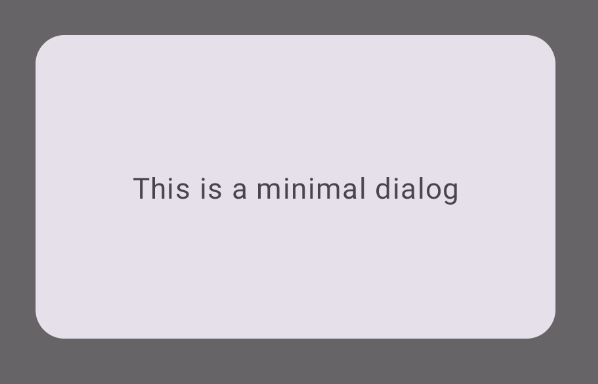
דוגמה בסיסית
הדוגמה הבאה היא הטמעה בסיסית של הקומפוזיציה Dialog. הערה:
הוא משתמש ב-Card כקונטיינר המשני. בלי התג Card, הרכיב Text יופיע לבד מעל התוכן הראשי של האפליקציה.
@Composable fun MinimalDialog(onDismissRequest: () -> Unit) { Dialog(onDismissRequest = { onDismissRequest() }) { Card( modifier = Modifier .fillMaxWidth() .height(200.dp) .padding(16.dp), shape = RoundedCornerShape(16.dp), ) { Text( text = "This is a minimal dialog", modifier = Modifier .fillMaxSize() .wrapContentSize(Alignment.Center), textAlign = TextAlign.Center, ) } } }
ההטמעה הזו נראית כך. שימו לב: כשתיבת הדו-שיח פתוחה, תוכן האפליקציה הראשי שמתחתיה מוצג בצבע כהה ואפור:
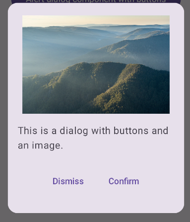
דוגמה מתקדמת
הקוד הבא הוא הטמעה מתקדמת יותר של רכיב ה-Dialog. במקרה הזה, הרכיב מטמיע באופן ידני ממשק דומה לדוגמה AlertDialog שלמעלה.
@Composable fun DialogWithImage( onDismissRequest: () -> Unit, onConfirmation: () -> Unit, painter: Painter, imageDescription: String, ) { Dialog(onDismissRequest = { onDismissRequest() }) { // Draw a rectangle shape with rounded corners inside the dialog Card( modifier = Modifier .fillMaxWidth() .height(375.dp) .padding(16.dp), shape = RoundedCornerShape(16.dp), ) { Column( modifier = Modifier .fillMaxSize(), verticalArrangement = Arrangement.Center, horizontalAlignment = Alignment.CenterHorizontally, ) { Image( painter = painter, contentDescription = imageDescription, contentScale = ContentScale.Fit, modifier = Modifier .height(160.dp) ) Text( text = "This is a dialog with buttons and an image.", modifier = Modifier.padding(16.dp), ) Row( modifier = Modifier .fillMaxWidth(), horizontalArrangement = Arrangement.Center, ) { TextButton( onClick = { onDismissRequest() }, modifier = Modifier.padding(8.dp), ) { Text("Dismiss") } TextButton( onClick = { onConfirmation() }, modifier = Modifier.padding(8.dp), ) { Text("Confirm") } } } } } }
ההטמעה הזו נראית כך: