
使用微章可在其他可组合项上显示一个小视觉元素,以表示状态或数值。以下是一些您可能会使用徽章的常见场景:
- 通知:在应用图标或通知铃铛上显示未读通知的数量。
- 消息:指示聊天应用中的新消息或未读消息。
- 状态更新:显示任务的状态,例如“已完成”“正在进行中”或“失败”。
- 购物车数量:显示用户购物车中的商品数量。
- 新内容:突出显示可供用户使用的新内容或功能。

API Surface
使用 BadgedBox 可组合项在应用中实现徽章。它最终是一个容器。您可以使用以下两个主要参数控制其外观:
content:BadgedBox包含的可组合内容。通常为Icon。badge:显示为内容上方徽章的可组合项。 通常是专用的Badge可组合项。
基本示例
此代码段展示了 BadgedBox 的基本实现:
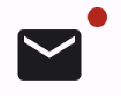
@Composable fun BadgeExample() { BadgedBox( badge = { Badge() } ) { Icon( imageVector = Icons.Filled.Mail, contentDescription = "Email" ) } }
此示例显示了一个与所提供的 Icon 可组合项重叠的徽章。请注意代码中的以下事项:
BadgedBox用作整体容器。BadgedBox的badge参数的实参为Badge。 由于Badge本身没有实参,因此应用会显示默认的标记(一个小红圈)。Icon用作BadgedBox的content形参的实参。徽章会显示在该图标上方。在本例中,它是邮件图标。
显示效果如下:
详细示例
以下代码段演示了如何在徽章中显示响应用户操作的值。
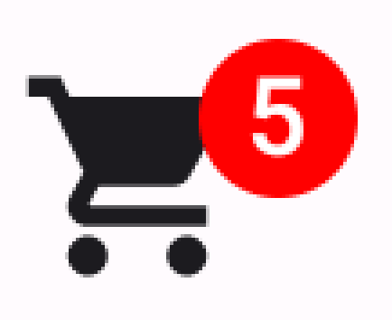
@Composable fun BadgeInteractiveExample() { var itemCount by remember { mutableIntStateOf(0) } Column( verticalArrangement = Arrangement.spacedBy(16.dp) ) { BadgedBox( badge = { if (itemCount > 0) { Badge( containerColor = Color.Red, contentColor = Color.White ) { Text("$itemCount") } } } ) { Icon( imageVector = Icons.Filled.ShoppingCart, contentDescription = "Shopping cart", ) } Button(onClick = { itemCount++ }) { Text("Add item") } } }
此示例实现了一个带有徽章的购物车图标,该徽章用于显示用户购物车中的商品数量。
- 只有当商品数量大于 0 时,才会显示
BadgedBox。 containerColor和contentColor的实参用于控制徽章的外观。Badge的内容槽的Text可组合项显示在徽章内。在这种情况下,它会显示购物车中的商品数量。
此实现如下所示: