
Card 可组合函数充当界面的 Material Design 容器。卡片通常会呈现单个连贯的内容。以下是一些您可能会使用卡片的示例:
- 购物应用中的商品。
- 新闻应用中的新闻报道。
- 通讯应用中的消息。
Card 与其他容器的区别在于,它侧重于呈现单个内容。例如,Scaffold 为整个屏幕提供一般结构。卡片通常是较大布局中的较小界面元素,而 Column 或 Row 等布局组件则提供更简单、更通用的 API。

基本实现方法
Card 的行为与 Compose 中的其他容器非常相似。您可以通过在其中调用其他可组合函数来声明其内容。例如,在以下最简示例中,Card 包含对 Text 的调用:
@Composable
fun CardMinimalExample() {
    Card() {
        Text(text = "Hello, world!")
    }
}
高级实现方法
如需查看 Card 的 API 定义,请参阅参考文档。它定义了多个参数,可让您自定义组件的外观和行为。
以下是一些需要注意的关键参数:
elevation:为组件添加阴影,使其看起来高于背景。colors:使用CardColors类型设置容器和所有子项的默认颜色。enabled:如果您为此参数传递false,则卡片会显示为已停用,并且不会响应用户输入。onClick:通常情况下,Card不接受点击事件。因此,您需要注意的主要重载是定义onClick参数的重载。如果您希望Card的实现响应用户的按压操作,则应使用此重载。
以下示例展示了如何使用这些参数,以及其他常见参数(例如 shape 和 modifier)。
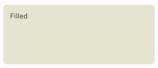
填充卡片
以下示例展示了如何实现填充卡片。
这里的关键是使用 colors 属性来更改填充颜色。
@Composable fun FilledCardExample() { Card( colors = CardDefaults.cardColors( containerColor = MaterialTheme.colorScheme.surfaceVariant, ), modifier = Modifier .size(width = 240.dp, height = 100.dp) ) { Text( text = "Filled", modifier = Modifier .padding(16.dp), textAlign = TextAlign.Center, ) } }
此实现如下所示:
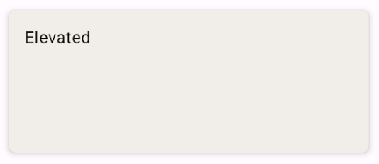
上层卡片
以下代码段演示了如何实现高程卡片。使用专用 ElevatedCard 可组合项。
您可以使用 elevation 属性来控制海拔高度的外观和由此产生的阴影。
@Composable fun ElevatedCardExample() { ElevatedCard( elevation = CardDefaults.cardElevation( defaultElevation = 6.dp ), modifier = Modifier .size(width = 240.dp, height = 100.dp) ) { Text( text = "Elevated", modifier = Modifier .padding(16.dp), textAlign = TextAlign.Center, ) } }
此实现如下所示:
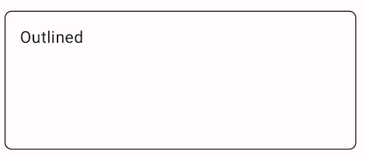
轮廓卡片
以下是轮廓卡片的示例。使用专用 OutlinedCard 可组合项。
@Composable fun OutlinedCardExample() { OutlinedCard( colors = CardDefaults.cardColors( containerColor = MaterialTheme.colorScheme.surface, ), border = BorderStroke(1.dp, Color.Black), modifier = Modifier .size(width = 240.dp, height = 100.dp) ) { Text( text = "Outlined", modifier = Modifier .padding(16.dp), textAlign = TextAlign.Center, ) } }
此实现如下所示:
限制
卡片本身不具备滚动或关闭操作,但可以集成到提供这些功能的 composable 中。例如,如需在卡片上实现滑动关闭功能,请将其与 SwipeToDismiss 可组合项集成。如需与滚动集成,请使用滚动修饰符,例如 verticalScroll。如需了解详情,请参阅滚动文档。