
借助单选按钮,用户可以从一组选项中选择一个选项。当只能从列表中选择一项时,您可以使用单选按钮。如果用户需要选择多个项目,请改用开关。

API Surface
使用 RadioButton 可组合项列出可用选项。将每个 RadioButton 选项及其标签封装在 Row 组件中,以便将它们分组在一起。
RadioButton 包含以下关键参数:
selected:指示单选按钮是否处于选中状态。onClick:用户点击单选按钮时应用执行的 lambda 函数。如果此值为null,则用户无法直接与单选按钮互动。enabled:控制单选按钮是启用还是停用。用户无法与已停用的单选按钮互动。interactionSource:用于观察按钮的互动状态,例如是否处于按下、悬停或聚焦状态。
创建基本单选按钮
以下代码段会在 Column 中呈现单选按钮列表:
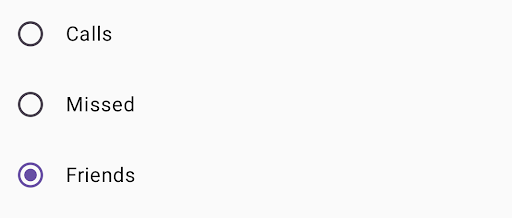
@Composable fun RadioButtonSingleSelection(modifier: Modifier = Modifier) { val radioOptions = listOf("Calls", "Missed", "Friends") val (selectedOption, onOptionSelected) = remember { mutableStateOf(radioOptions[0]) } // Note that Modifier.selectableGroup() is essential to ensure correct accessibility behavior Column(modifier.selectableGroup()) { radioOptions.forEach { text -> Row( Modifier .fillMaxWidth() .height(56.dp) .selectable( selected = (text == selectedOption), onClick = { onOptionSelected(text) }, role = Role.RadioButton ) .padding(horizontal = 16.dp), verticalAlignment = Alignment.CenterVertically ) { RadioButton( selected = (text == selectedOption), onClick = null // null recommended for accessibility with screen readers ) Text( text = text, style = MaterialTheme.typography.bodyLarge, modifier = Modifier.padding(start = 16.dp) ) } } } }
代码要点
radioOptions表示单选按钮的标签。remember可组合函数会创建一个状态变量selectedOption和一个用于更新该状态的函数onOptionSelected。此状态用于保存所选的单选按钮选项。mutableStateOf(radioOptions[0])将状态初始化为列表中的第一项。“通话”是第一个项目,因此是默认选中的单选按钮。
Modifier.selectableGroup()可确保屏幕阅读器具有适当的无障碍功能行为。它会告知系统,此Column中的元素属于可选择的群组,从而实现适当的屏幕阅读器支持。Modifier.selectable()使整个Row充当单个可选择项。selected用于指示当前Row是否根据selectedOption状态处于选中状态。- 当用户点击
Row时,onClicklambda 函数会将selectedOption状态更新为所点击的选项。 role = Role.RadioButton会告知无障碍服务,Row的功能与单选按钮相同。
RadioButton(...)会创建RadioButton可组合项。onClick = null上的RadioButton改进了无障碍功能。这样可以防止单选按钮直接处理点击事件,并允许Row的selectable修饰符管理选择状态和无障碍功能行为。
结果
其他资源
- Material Design:按钮