
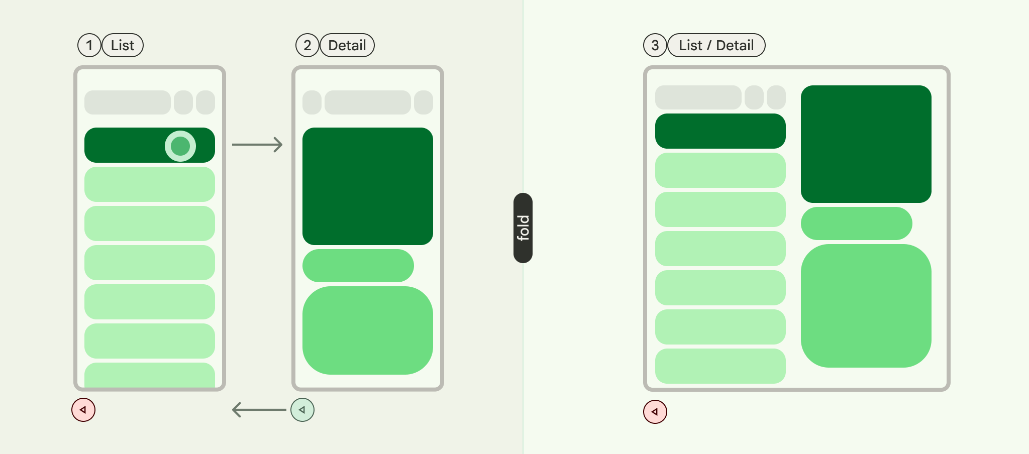
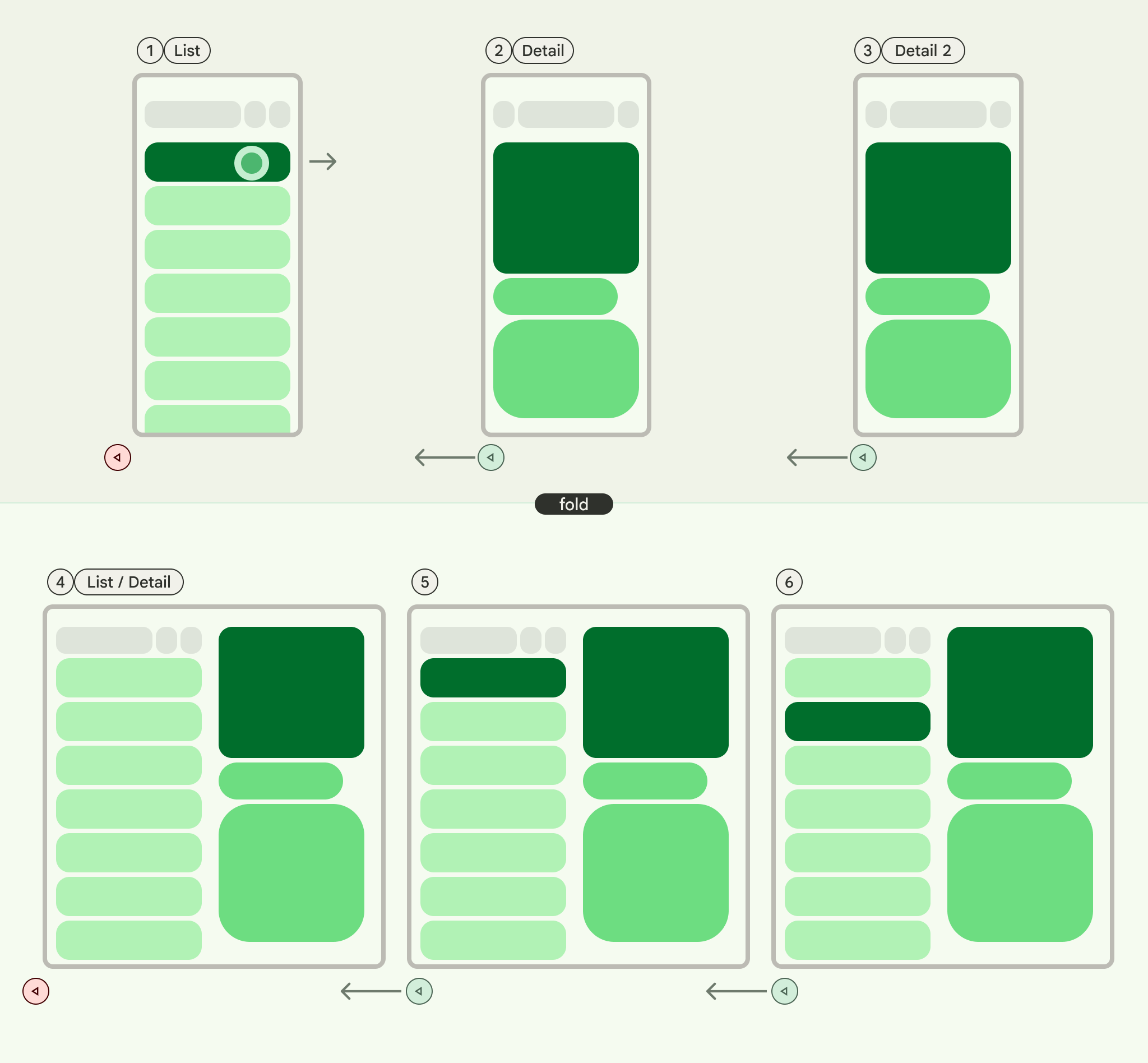
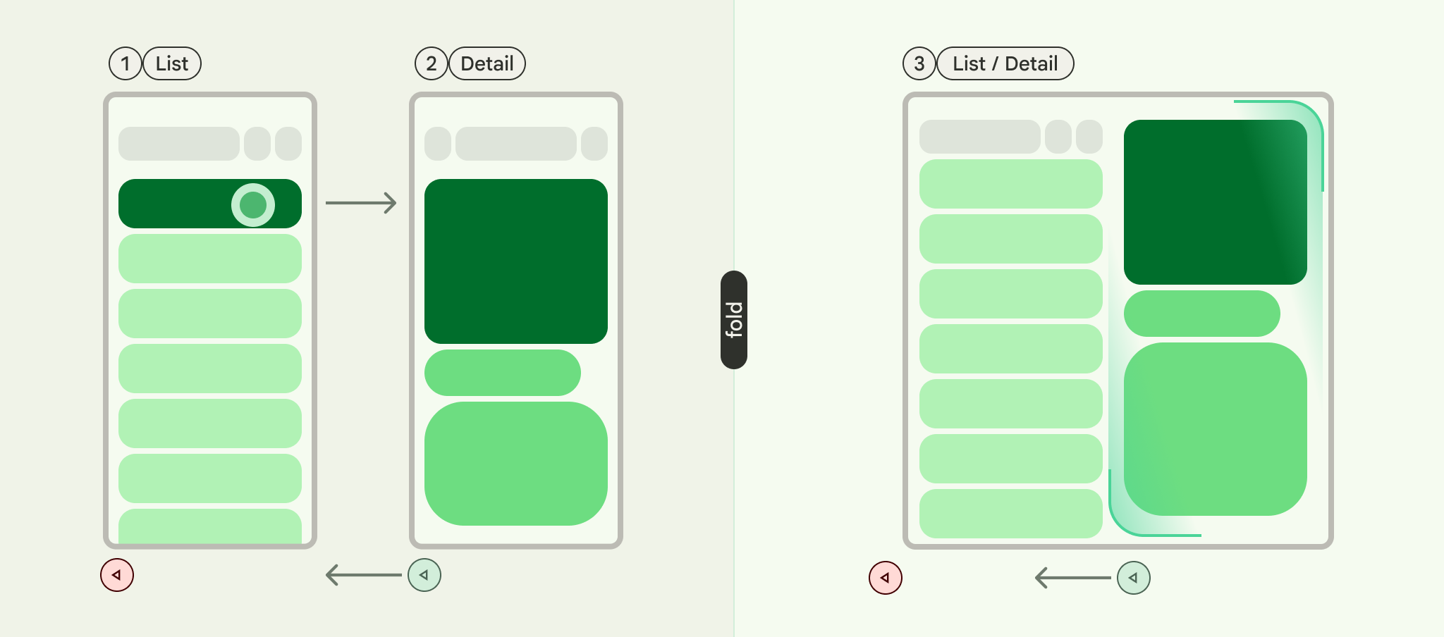
列表-详情是一种界面模式,包含双窗格布局,其中一个窗格显示项目列表,另一个窗格显示从列表中选择的项目的详情。
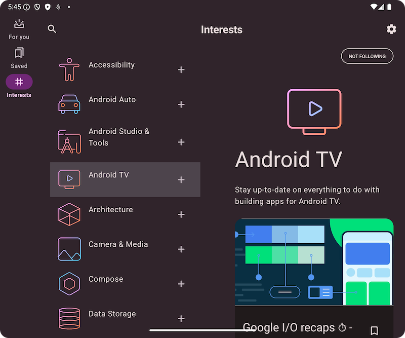
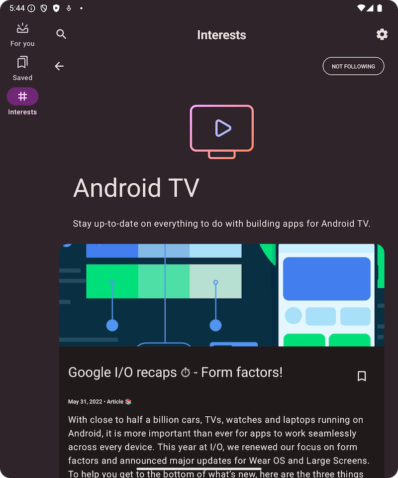
此模式特别适用于提供有关大型集合元素的深入信息的应用,例如包含电子邮件列表和每封电子邮件详细内容的电子邮件客户端。列表-详情模式也可用于不太重要的路径,例如将应用偏好设置划分为一个类别列表,并在详情窗格中显示每个类别的偏好设置。
使用 NavigableListDetailPaneScaffold 实现“列表-详情”模式
NavigableListDetailPaneScaffold 是一个可组合项,可简化在 Jetpack Compose 中实现列表-详情布局的过程。它封装了 ListDetailPaneScaffold 并添加了内置导航和预测性返回动画。
列表详情脚手架最多支持三个窗格:
- 列表窗格:显示内容集合。
- 详情窗格:显示所选项目的详细信息。
- 额外窗格(可选):在需要时提供更多背景信息。
支架会根据窗口大小进行调整:
- 在大窗口中,列表窗格和详情窗格会并排显示。
- 在小窗口中,一次只能显示一个窗格,并随着用户浏览而切换。
声明依赖项
NavigableListDetailPaneScaffold 是 Material 3 自适应导航库的一部分。
将以下三个相关依赖项添加到应用或模块的 build.gradle 文件中:
Kotlin
implementation("androidx.compose.material3.adaptive:adaptive")
implementation("androidx.compose.material3.adaptive:adaptive-layout")
implementation("androidx.compose.material3.adaptive:adaptive-navigation")
Groovy
implementation 'androidx.compose.material3.adaptive:adaptive'
implementation 'androidx.compose.material3.adaptive:adaptive-layout'
implementation 'androidx.compose.material3.adaptive:adaptive-navigation'
- 自适应:低级层构建块,例如
HingeInfo和Posture - 自适应布局:自适应布局,例如
ListDetailPaneScaffold和SupportingPaneScaffold - adaptive-navigation:用于在窗格内和窗格之间导航的可组合项,以及默认支持导航的自适应布局,例如
NavigableListDetailPaneScaffold和NavigableSupportingPaneScaffold
确保您的项目包含 compose-material3-adaptive 版本 1.1.0-beta1 或更高版本。
选择启用预测性返回手势
如需在 Android 15 或更低版本中启用预测性返回动画,您必须选择启用对预测性返回手势的支持。如需选择启用,请将 android:enableOnBackInvokedCallback="true" 添加到 AndroidManifest.xml 文件中的 <application> 标记或各个 <activity> 标记。如需了解详情,请参阅选择启用预测性返回手势。
一旦您的应用以 Android 16(API 级别 36)或更高版本为目标平台,系统就会默认启用预测性返回。
基本用法
按如下方式实现 NavigableListDetailPaneScaffold:
- 使用表示所选内容的类。使用
Parcelable类来支持保存和恢复所选列表项。使用 kotlin-parcelize 插件为您生成代码。 - 使用
rememberListDetailPaneScaffoldNavigator创建ThreePaneScaffoldNavigator。
此导航器用于在列表窗格、详情窗格和额外窗格之间移动。通过声明泛型,导航器还可以跟踪 Scaffold 的状态(即正在显示哪个 MyItem)。由于此类型是可序列化的,因此导航器可以保存和恢复状态,以自动处理配置更改。
将导航器传递给
NavigableListDetailPaneScaffold可组合项。向
NavigableListDetailPaneScaffold提供列表窗格实现。使用AnimatedPane在导航期间应用默认窗格动画。然后使用ThreePaneScaffoldNavigator导航到详情窗格ListDetailPaneScaffoldRole.Detail并显示传递的商品。在
NavigableListDetailPaneScaffold中添加详情窗格实现。
当导航完成时,currentDestination 包含应用已导航到的窗格,包括该窗格中显示的内容。contentKey 属性与原始调用中指定的类型相同,因此您可以访问需要显示的任何数据。
- (可选)更改
NavigableListDetailPaneScaffold中的defaultBackBehavior。默认情况下,NavigableListDetailPaneScaffold使用PopUntilScaffoldValueChange作为defaultBackBehavior。
如果您的应用需要不同的返回导航模式,您可以通过指定其他 BackNavigationBehavior 选项来替换此行为。
BackNavigationBehavior 个选项
以下部分以电子邮件应用为例,该应用在一个窗格中显示电子邮件列表,在另一个窗格中显示详细视图。
PopUntilScaffoldValueChange(默认值,在大多数情况下建议使用)
此行为侧重于对整体布局结构的更改。在多窗格设置中,更改详细信息窗格中的电子邮件内容不会改变底层布局结构。因此,返回按钮可能会退出应用或当前导航图,因为当前上下文中没有可恢复的布局更改。在单窗格布局中,按返回键会跳过详情视图中的内容更改,返回到列表视图,因为这表示布局发生了明显变化。
请参考以下示例:
- 多窗格:您正在详情窗格中查看电子邮件(项目 1)。点击另一封电子邮件(项目 2)会更新详情窗格,但列表窗格和详情窗格仍保持可见。按返回键可能会退出应用或当前导航流程。
- 单窗格:您查看完项目 1 后,再查看项目 2,然后按返回按钮,系统会直接将您返回到电子邮件列表窗格。
如果您希望用户在每次返回操作时都能感知到明显的布局过渡,请使用此常量。
PopUntilContentChange
此行为会优先显示内容。如果您先查看商品 1,然后查看商品 2,那么无论布局如何,按返回按钮都会返回到商品 1。
请参考以下示例:
- 多窗格:您在详情窗格中查看商品 1,然后点击列表中的商品 2。详细信息窗格会更新。按返回按钮会将详情窗格恢复为“项目 1”。
- 单窗格:发生相同的内容恢复。
当用户希望通过返回操作返回到之前查看的内容时,请使用此方法。
PopUntilCurrentDestinationChange
此行为会弹出返回堆栈,直到当前导航目的地发生更改。这同样适用于单窗格和多窗格布局。
请参考以下示例:
无论您处于单窗格布局还是多窗格布局中,按返回键始终会将焦点从突出显示的导航元素移至上一个目的地。在我们的电子邮件应用中,这意味着所选窗格的视觉指示会发生变化。
如果保持清晰的当前导航视觉指示对用户体验至关重要,请使用此属性。
PopLatest
此选项仅从返回堆栈中移除最近的目的地。使用此选项可进行后向导航,而不会跳过中间状态。
实现这些步骤后,您的代码应如下所示:
val scaffoldNavigator = rememberListDetailPaneScaffoldNavigator<MyItem>() val scope = rememberCoroutineScope() val backNavigationBehavior = BackNavigationBehavior.PopUntilScaffoldValueChange NavigableListDetailPaneScaffold( navigator = scaffoldNavigator, listPane = { AnimatedPane { MyList( onItemClick = { item -> // Navigate to the detail pane with the passed item scope.launch { scaffoldNavigator.navigateTo( ListDetailPaneScaffoldRole.Detail, item ) } }, ) } }, detailPane = { AnimatedPane { // Show the detail pane content if selected item is available scaffoldNavigator.currentDestination?.contentKey?.let { Column { // Allow users to dismiss the detail pane. Use back navigation to // hide an expanded detail pane. if (scaffoldNavigator.scaffoldValue[ListDetailPaneScaffoldRole.Detail] == PaneAdaptedValue.Expanded) { // Material design principles promote the usage of a right-aligned // close (X) button. IconButton( modifier = Modifier.align(Alignment.End).padding(16.dp), onClick = { scope.launch { scaffoldNavigator.navigateBack(backNavigationBehavior) } } ) { Icon(Icons.Default.Close, contentDescription = "Close") } } MyDetails(it) } } } }, )