keywords: AiAssisted, product:JetpackCompose
按钮是基本组件,可让用户触发已定义的操作。按钮有五种类型。下表介绍了五种按钮类型的外观以及应在何处使用它们:
| 类型 | 外观 | 用途 |
|---|---|---|
| Filled | 纯色背景,文字对比鲜明。 | 高强调度按钮。这些操作适用于应用中的主要操作,例如“提交”和“保存”。阴影效果突出了按钮的重要性。 |
| 填充色调 | 背景颜色会根据表面而变化。 | 也适用于主要操作或重要操作。填充色调按钮具有更强的视觉效果,适合“添加到购物车”和“登录”等功能。 |
| 过高 | 通过添加阴影来突出显示。 | 用途与色调按钮类似。增加高程,使按钮看起来更加突出。 |
| Outlined | 具有无填充的边框。 | 中强调度按钮,包含重要但并非主要的操作。这类按钮可与其他按钮搭配使用,用于指示替代性次要操作,例如“取消”或“返回”。 |
| 文本 | 显示没有背景或边框的文字。 | 低强调按钮,非常适合不太重要的操作,例如导航链接或“了解详情”或“查看详情”等辅助功能。 |
此图片展示了 Material Design 中的五种按钮:

API Surface
onClick- 用户按下按钮时系统调用的函数。
enabled- 当值为
false时,此参数会使按钮显示为不可用和不活动状态。 colors- 一个
ButtonColors实例,用于确定按钮中使用的颜色。 contentPadding- 按钮内的边衬区。
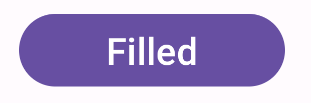
填充按钮
填充按钮组件使用基本的 Button 可组合函数。默认情况下,它会以纯色填充。以下代码段展示了如何实现该组件:
@Composable fun FilledButtonExample(onClick: () -> Unit) { Button(onClick = { onClick() }) { Text("Filled") } }
此实现如下所示:
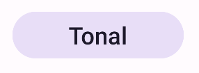
填充色调按钮
填充色调按钮组件使用 FilledTonalButton 可组合函数。默认情况下,它会填充色调颜色。
以下代码段展示了如何实现该组件:
@Composable fun FilledTonalButtonExample(onClick: () -> Unit) { FilledTonalButton(onClick = { onClick() }) { Text("Tonal") } }
此实现如下所示:
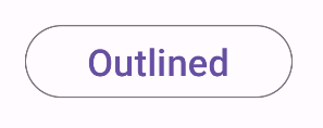
轮廓按钮
带轮廓的按钮组件使用 OutlinedButton 可组合函数。默认情况下,它会显示轮廓。
以下代码段展示了如何实现该组件:
@Composable fun OutlinedButtonExample(onClick: () -> Unit) { OutlinedButton(onClick = { onClick() }) { Text("Outlined") } }
此实现如下所示:
凸起按钮
高凸按钮组件使用 ElevatedButton 可组合函数。默认情况下,它具有表示高度效果的阴影。它是一个包含阴影的填充按钮。
以下代码段展示了如何实现该组件:
@Composable fun ElevatedButtonExample(onClick: () -> Unit) { ElevatedButton(onClick = { onClick() }) { Text("Elevated") } }
此实现如下所示:

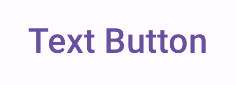
文本按钮
文本按钮组件使用 TextButton 可组合函数。在按之前,它仅显示为文字。默认情况下,它没有实心填充或轮廓。
以下代码段展示了如何实现该组件:
@Composable fun TextButtonExample(onClick: () -> Unit) { TextButton( onClick = { onClick() } ) { Text("Text Button") } }
此实现如下所示: