
雖然 Material Design 是我們推薦的設計系統,而且 Jetpack Compose 也導入了 Material Design,但您不一定要使用該系統。Material Design 是完全以公用 API 建構而成,因此您也可以透過相同的方式打造自己的設計系統。
您可以採取以下幾種做法:
- 使用其他主題設定值擴充
MaterialTheme。 - 更換一或多個 Material Design 系統 (
Colors、Typography或Shapes),改成自訂的實作系統,同時保留其他系統。 - 導入完全自訂的設計系統,以取代
MaterialTheme。
您也可以繼續使用 Material Design 元件搭配自訂的設計系統。雖然這種做法可行,但您採取的方式有相應注意事項。
想進一步瞭解 MaterialTheme 和自訂設計系統所使用的較低層級結構和 API,請參閱 Compose 主題剖析指南。
擴充 Material Design 主題設定
Compose Material Design 會仔細建構 Material Design 主題設定的模型,依據 Material Design 規範達到精簡與類型安全的目標。不過,您可以使用其他值來擴充顏色、字體排版和形狀集。最簡單的方法就是加入擴充屬性:
// Use with MaterialTheme.colorScheme.snackbarAction val ColorScheme.snackbarAction: Color @Composable get() = if (isSystemInDarkTheme()) Red300 else Red700 // Use with MaterialTheme.typography.textFieldInput val Typography.textFieldInput: TextStyle get() = TextStyle(/* ... */) // Use with MaterialTheme.shapes.card val Shapes.card: Shape get() = RoundedCornerShape(size = 20.dp)
這能夠提供與 MaterialTheme 應用 API 一致的體驗。由 Compose 本身定義的一個範例就是 surfaceColorAtElevation,其作用為根據高度決定應使用的表面顏色。
另一個做法是定義擴充主題並「包裝」MaterialTheme 和其值。
假設您要新增兩種額外的顏色 (caution 和 onCaution,用於半危險動作的黃色),同時保留現有的 Material Design 顏色:
@Immutable data class ExtendedColors( val caution: Color, val onCaution: Color ) val LocalExtendedColors = staticCompositionLocalOf { ExtendedColors( caution = Color.Unspecified, onCaution = Color.Unspecified ) } @Composable fun ExtendedTheme( /* ... */ content: @Composable () -> Unit ) { val extendedColors = ExtendedColors( caution = Color(0xFFFFCC02), onCaution = Color(0xFF2C2D30) ) CompositionLocalProvider(LocalExtendedColors provides extendedColors) { MaterialTheme( /* colors = ..., typography = ..., shapes = ... */ content = content ) } } // Use with eg. ExtendedTheme.colors.caution object ExtendedTheme { val colors: ExtendedColors @Composable get() = LocalExtendedColors.current }
這與 MaterialTheme 應用 API 類似,同樣支援多個主題,可讓您將 ExtendedTheme 加入巢狀結構,就跟使用 MaterialTheme 時一樣。
使用 Material 元件
擴充 Material Design 主題設定時,系統會保留現有的 MaterialTheme 值,而 Material Design 元件仍具備合理的預設值。
如果想在元件中使用擴充值,請將這些值包裝在您自己的可組合函式中,直接設定要更改的值,並將其他值以參數形式提供給所屬可組合項:
@Composable fun ExtendedButton( onClick: () -> Unit, modifier: Modifier = Modifier, content: @Composable RowScope.() -> Unit ) { Button( colors = ButtonDefaults.buttonColors( containerColor = ExtendedTheme.colors.caution, contentColor = ExtendedTheme.colors.onCaution /* Other colors use values from MaterialTheme */ ), onClick = onClick, modifier = modifier, content = content ) }
接著,視情況將 Button 的應用更換為 ExtendedButton。
@Composable fun ExtendedApp() { ExtendedTheme { /*...*/ ExtendedButton(onClick = { /* ... */ }) { /* ... */ } } }
更換 Material 子系統
在某些情況下,與其擴充 Material Design 主題設定,不如將一或多個系統 (Colors、Typography 或 Shapes) 更換成自訂的實作系統,同時保留其他系統。
假設您想取代類型和形狀系統,同時保留顏色系統:
@Immutable data class ReplacementTypography( val body: TextStyle, val title: TextStyle ) @Immutable data class ReplacementShapes( val component: Shape, val surface: Shape ) val LocalReplacementTypography = staticCompositionLocalOf { ReplacementTypography( body = TextStyle.Default, title = TextStyle.Default ) } val LocalReplacementShapes = staticCompositionLocalOf { ReplacementShapes( component = RoundedCornerShape(ZeroCornerSize), surface = RoundedCornerShape(ZeroCornerSize) ) } @Composable fun ReplacementTheme( /* ... */ content: @Composable () -> Unit ) { val replacementTypography = ReplacementTypography( body = TextStyle(fontSize = 16.sp), title = TextStyle(fontSize = 32.sp) ) val replacementShapes = ReplacementShapes( component = RoundedCornerShape(percent = 50), surface = RoundedCornerShape(size = 40.dp) ) CompositionLocalProvider( LocalReplacementTypography provides replacementTypography, LocalReplacementShapes provides replacementShapes ) { MaterialTheme( /* colors = ... */ content = content ) } } // Use with eg. ReplacementTheme.typography.body object ReplacementTheme { val typography: ReplacementTypography @Composable get() = LocalReplacementTypography.current val shapes: ReplacementShapes @Composable get() = LocalReplacementShapes.current }
使用 Material 元件
更換了 MaterialTheme 的一或多個系統後,如果依原樣使用 Material Design 元件,可能會產生不必要的 Material Design 顏色、類型或形狀值。
如果想在元件中使用替換值,請將這些值包裝在可組合函式中,直接設定相關系統的值,並將其他值以參數形式提供給所屬可組合項。
@Composable fun ReplacementButton( onClick: () -> Unit, modifier: Modifier = Modifier, content: @Composable RowScope.() -> Unit ) { Button( shape = ReplacementTheme.shapes.component, onClick = onClick, modifier = modifier, content = { ProvideTextStyle( value = ReplacementTheme.typography.body ) { content() } } ) }
接著,視情況將 Button 的應用更換為 ReplacementButton。
@Composable fun ReplacementApp() { ReplacementTheme { /*...*/ ReplacementButton(onClick = { /* ... */ }) { /* ... */ } } }
導入完全自訂的設計系統
您可能想將 Material Design 主題設定更換成完全自訂的設計系統。假設 MaterialTheme 提供下列系統:
Colors、Typography和Shapes:Material Design 主題設定系統TextSelectionColors:Text和TextField用於呈現已選取文字的顏色Ripple和RippleTheme:Indication的 Material Design 實作
如要繼續使用 Material Design 元件,您必須在自訂主題中更換部分系統,或是處理元件中的系統,以避免不必要的行為。
不過,設計系統並不受限於 Material Design 採用的概念。您可以修改現有系統,並導入採用新類別和類型的全新系統,讓其他概念也能與主題相容。
在下方程式碼中,我們建構了包含漸層 (List<Color>) 的自訂顏色系統模型、納入了類型系統、導入了新的高度系統,並排除了 MaterialTheme 提供的其他系統:
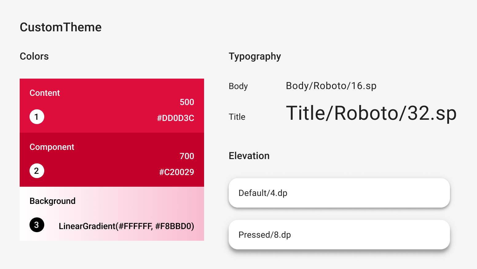
@Immutable data class CustomColors( val content: Color, val component: Color, val background: List<Color> ) @Immutable data class CustomTypography( val body: TextStyle, val title: TextStyle ) @Immutable data class CustomElevation( val default: Dp, val pressed: Dp ) val LocalCustomColors = staticCompositionLocalOf { CustomColors( content = Color.Unspecified, component = Color.Unspecified, background = emptyList() ) } val LocalCustomTypography = staticCompositionLocalOf { CustomTypography( body = TextStyle.Default, title = TextStyle.Default ) } val LocalCustomElevation = staticCompositionLocalOf { CustomElevation( default = Dp.Unspecified, pressed = Dp.Unspecified ) } @Composable fun CustomTheme( /* ... */ content: @Composable () -> Unit ) { val customColors = CustomColors( content = Color(0xFFDD0D3C), component = Color(0xFFC20029), background = listOf(Color.White, Color(0xFFF8BBD0)) ) val customTypography = CustomTypography( body = TextStyle(fontSize = 16.sp), title = TextStyle(fontSize = 32.sp) ) val customElevation = CustomElevation( default = 4.dp, pressed = 8.dp ) CompositionLocalProvider( LocalCustomColors provides customColors, LocalCustomTypography provides customTypography, LocalCustomElevation provides customElevation, content = content ) } // Use with eg. CustomTheme.elevation.small object CustomTheme { val colors: CustomColors @Composable get() = LocalCustomColors.current val typography: CustomTypography @Composable get() = LocalCustomTypography.current val elevation: CustomElevation @Composable get() = LocalCustomElevation.current }
使用 Material 元件
沒有 MaterialTheme 時,如果依原樣使用 Material Design 元件,將產生不必要的 Material Design 顏色、類型和形狀值,以及指標行為。
如要在元件中使用自訂值,請將這些值包裝在可組合函式中,直接設定相關系統的值,並將其他值以參數形式提供給所屬可組合項。
建議您從自訂主題存取您設定的值。如果您的主題未提供 Color、TextStyle、Shape 或其他系統,則可採取硬式編碼方式。
@Composable fun CustomButton( onClick: () -> Unit, modifier: Modifier = Modifier, content: @Composable RowScope.() -> Unit ) { Button( colors = ButtonDefaults.buttonColors( containerColor = CustomTheme.colors.component, contentColor = CustomTheme.colors.content, disabledContainerColor = CustomTheme.colors.content .copy(alpha = 0.12f) .compositeOver(CustomTheme.colors.component), disabledContentColor = CustomTheme.colors.content .copy(alpha = 0.38f) ), shape = ButtonShape, elevation = ButtonDefaults.elevatedButtonElevation( defaultElevation = CustomTheme.elevation.default, pressedElevation = CustomTheme.elevation.pressed /* disabledElevation = 0.dp */ ), onClick = onClick, modifier = modifier, content = { ProvideTextStyle( value = CustomTheme.typography.body ) { content() } } ) } val ButtonShape = RoundedCornerShape(percent = 50)
如果您導入了新的類別類型 (例如,導入 List<Color> 來代表漸層),最好從頭開始實作元件,而不要包裝元件。如需範例,請參閱 Jetsnack 範例中的 JetsnackButton。
為您推薦
- 注意:系統會在 JavaScript 關閉時顯示連結文字
- Compose 中的 Material Design 3
- 在 Compose 中從 Material 2 遷移至 Material 3
- Compose 主題剖析