
清单、元数据
以下部分介绍了如何使用 Glance 创建基本应用微件。
在清单中声明 AppWidget
完成设置步骤后,在应用中声明 AppWidget 及其元数据。
从
GlanceAppWidgetReceiver扩展AppWidget接收器:class MyAppWidgetReceiver : GlanceAppWidgetReceiver() { override val glanceAppWidget: GlanceAppWidget = TODO("Create GlanceAppWidget") }
在
AndroidManifest.xml文件和关联的元数据文件中注册应用 widget 的提供方:<receiver android:name=".glance.MyReceiver" android:exported="true"> <intent-filter> <action android:name="android.appwidget.action.APPWIDGET_UPDATE" /> </intent-filter> <meta-data android:name="android.appwidget.provider" android:resource="@xml/my_app_widget_info" /> </receiver>
添加 AppWidgetProviderInfo 元数据
接下来,按照创建 widget 指南中的说明在 @xml/my_app_widget_info 文件中创建并定义应用 widget 信息。
对于 Glance,唯一的区别是没有 initialLayout XML,但您必须定义一个。您可以使用库中提供的预定义加载布局:
<appwidget-provider xmlns:android="http://schemas.android.com/apk/res/android"
android:initialLayout="@layout/glance_default_loading_layout">
</appwidget-provider>
声明 AppWidgetProviderInfo XML
AppWidgetProviderInfo 对象用于定义 widget 的基本特性。在 XML 元数据资源文件 (res/xml/my_app_widget_info.xml) 的 <appwidget-provider> 元素内定义 AppWidgetProviderInfo:
<appwidget-provider xmlns:android="http://schemas.android.com/apk/res/android"
    android:minWidth="40dp"
    android:minHeight="40dp"
    android:targetCellWidth="1"
    android:targetCellHeight="1"
    android:maxResizeWidth="250dp"
    android:maxResizeHeight="120dp"
    android:updatePeriodMillis="86400000"
    android:description="@string/example_appwidget_description"
    android:previewLayout="@layout/example_appwidget_preview"
    android:initialLayout="@layout/glance_default_loading_layout"
    android:configure="com.example.android.ExampleAppWidgetConfigurationActivity"
    android:resizeMode="horizontal|vertical"
    android:widgetCategory="home_screen"
    android:widgetFeatures="reconfigurable|configuration_optional">
</appwidget-provider>
微件尺寸设置属性
默认的主屏幕根据定义了高度和宽度的单元格的网格在其窗口中放置 widget。大多数主屏幕只允许微件采用网格单元的整数倍大小,例如水平方向上为 2 个单元格,垂直方向上为 3 个单元格。
借助 widget 大小调整属性,您可以为 widget 指定默认大小,并提供 widget 大小的下限和上限。在此背景下,widget 的默认大小是指 widget 首次添加到主屏幕时所占的大小。
下表介绍了与 widget 大小调整相关的 <appwidget-provider> 属性:
| 属性和说明 | |
|---|---|
targetCellWidth 和 targetCellHeight(Android 12)、minWidth 和 minHeight |
targetCellWidth 和 targetCellHeight,以及 minWidth 和 minHeight),以便在用户设备不支持 targetCellWidth 和 targetCellHeight 时,您的应用可以回退到使用 minWidth 和 minHeight。如果支持,targetCellWidth 和 targetCellHeight 属性优先于 minWidth 和 minHeight 属性。
|
minResizeWidth 和
minResizeHeight |
指定 widget 的绝对最小大小。这些值用于指定微件小于什么尺寸会难以辨认或无法使用。使用这些属性,用户可以将微件的大小调整为小于默认微件大小。如果 minResizeWidth 属性的值大于 minWidth 或未启用水平大小调整,系统将忽略该属性。请参阅 resizeMode。同样,如果 minResizeHeight 属性的值大于 minHeight 或未启用垂直大小调整,系统也会忽略该属性。 |
maxResizeWidth 和
maxResizeHeight |
指定 widget 的建议最大尺寸。如果这些值不是网格单元格尺寸的倍数,则会向上舍入为最接近的单元格大小。如果 maxResizeWidth 属性小于 minWidth 或未启用水平大小调整,系统将忽略该属性。请参阅 resizeMode。同样,如果 maxResizeHeight 属性小于 minHeight 或未启用垂直大小调整,系统将忽略该属性。在 Android 12 中引入。 |
resizeMode |
指定可以按什么规则来调整 widget 的大小。您可以使用此属性来让主屏幕 widget 在横轴上可调整大小、在纵轴上可调整大小,或者在这两个轴上均可调整大小。用户可轻触并按住微件以显示其大小调整手柄,然后拖动水平或垂直手柄以更改其在布局网格上的大小。resizeMode 属性的值包括 horizontal、vertical 和 none。如需将 widget 声明为在水平和垂直方向上均可调整大小,请使用 horizontal|vertical。 |
示例
为说明上表中的属性如何影响 widget 大小调整,假设有以下规范:
- 网格单元格的宽度为 30 dp,高度为 50 dp。
- 以下是属性规范:
<appwidget-provider xmlns:android="http://schemas.android.com/apk/res/android"
    android:minWidth="80dp"
    android:minHeight="80dp"
    android:targetCellWidth="2"
    android:targetCellHeight="2"
    android:minResizeWidth="40dp"
    android:minResizeHeight="40dp"
    android:maxResizeWidth="120dp"
    android:maxResizeHeight="120dp"
    android:resizeMode="horizontal|vertical" />
从 Android 12 开始:
使用 targetCellWidth 和 targetCellHeight 属性作为微件的默认大小。
默认情况下,微件的大小为 2x2。该 widget 的大小可调整为最小 2x1 或最大 4x3。
Android 11 及更低版本:
使用 minWidth 和 minHeight 属性计算 widget 的默认大小。
默认宽度 = Math.ceil(80 / 30) = 3
默认高度 = Math.ceil(80 / 50) = 2
默认情况下,微件的大小为 3x2。您可以将该 widget 调整为最小 2x1 或最大全屏。
其他 widget 属性
下表介绍了与 widget 大小调整以外的质量相关的 <appwidget-provider> 属性。
| 属性和说明 | |
|---|---|
updatePeriodMillis |
定义 widget 框架通过调用 onUpdate() 回调方法从 GlanceAppWidgetReceiver 请求更新的频率。我们建议尽可能降低更新频率(不超过每小时一次),以节省电池电量。
如需了解详情,请参阅概览状态管理中的何时更新 widget 部分。 |
initialLayout |
指向用于定义 widget 在 Glance 界面组合渲染之前的加载布局的布局资源。您可以使用库中提供的预定义加载布局:@layout/glance_default_loading_layout。 |
configure |
定义在用户添加 widget 时启动的配置 activity。请参阅本页面上的实现微件配置 Activity 部分。 |
description |
指定微件选择器要为微件显示的说明。在 Android 12 中引入。 |
previewLayout(Android 12)和 previewImage(Android 11 及更低版本) |
|
autoAdvanceViewId |
指定由 widget 的宿主自动跳转的 widget 子视图的视图 ID。 |
widgetCategory |
声明 widget 是否可以显示在主屏幕 (home_screen)、锁屏 (keyguard) 或两者上。对于 Android 5.0 及更高版本,只有 home_screen 有效。 |
widgetFeatures |
声明 widget 支持的功能。例如,如果 widget 的配置是可选的,请同时指定 configuration_optional 和 reconfigurable。 |
定义 GlanceAppWidget
创建一个新类,用于扩展
GlanceAppWidget并替换provideGlance方法。您可以在此方法中加载渲染 widget 所需的数据:class MyAppWidget : GlanceAppWidget() { override suspend fun provideGlance(context: Context, id: GlanceId) { // In this method, load data needed to render the AppWidget. // Use `withContext` to switch to another thread for long running // operations. provideContent { // create your AppWidget here Text("Hello World") } } }
在
GlanceAppWidgetReceiver的glanceAppWidget中实例化该对象:class MyAppWidgetReceiver : GlanceAppWidgetReceiver() { // Let MyAppWidgetReceiver know which GlanceAppWidget to use override val glanceAppWidget: GlanceAppWidget = MyAppWidget() }
您现在已使用 Glance 配置 AppWidget。
使用 AppWidgetProvider 类处理 widget 广播
GlanceAppWidgetReceiver 坐标 widget 通过扩展底层 AppWidgetProvider 来广播和更新平台状态。当您的 widget 更新、删除、启用或停用时,它会接收平台事件,并将这些事件转换为 Compose 生命周期请求。
在清单中声明 widget
在 AndroidManifest.xml 文件中将 GlanceAppWidgetReceiver 类子类声明为广播接收器:
<receiver android:name="ExampleAppWidgetReceiver"
          android:exported="false">
    <intent-filter>
        <action android:name="android.appwidget.action.APPWIDGET_UPDATE" />
    </intent-filter>
    <meta-data android:name="android.appwidget.provider"
               android:resource="@xml/my_app_widget_info" />
</receiver>
<receiver> 元素需要 android:name 属性,该属性用于指定接收器类。接收方必须在 <intent-filter> 内接受 ACTION_APPWIDGET_UPDATE 广播操作。
<meta-data> 元素必须将其名称标识为 android.appwidget.provider,并且 android:resource 属性必须指向您的 AppWidgetProviderInfo XML 元数据资源 (@xml/my_app_widget_info)。
实现 AppWidgetProvider 类
在 Glance 中,您需要扩展 GlanceAppWidgetReceiver,而不是直接扩展 AppWidgetProvider。通过将接收器与 GlanceAppWidget 实例相关联来实现。GlanceAppWidgetReceiver 中提供的主要回调按如下方式运行:
onUpdate():由 Glance 自动替换,以执行组合更新。如果您手动替换onUpdate,则必须调用super.onUpdate,以便 Glance 成功启动组合线程。onAppWidgetOptionsChanged():在首次放置或调整 widget 大小时调用。Glance 读取选项会在后台捆绑项,以便您的布局根据运行时维度进行无缝调整。onDeleted(Context, IntArray):每当用户删除特定 widget 实例时调用。onEnabled(Context):当成功创建 widget 的第一个实例时触发。非常适合运行全局迁移。onDisabled(Context):当提供程序的最后一个有效实例被移除时调用。onReceive(Context, Intent):在特定回调方法之前拦截每个平台广播。您必须确保自己编写的任何自定义接收器逻辑都会调用super.onReceive(context, intent),并且绝不能自行调用goAsync,因为 Glance 会自动异步路由工作。
接收 widget 广播 intent
从本质上讲,GlanceAppWidgetReceiver 会过滤并处理以下基础平台 widget 广播 intent:
ACTION_APPWIDGET_UPDATEACTION_APPWIDGET_DELETEDACTION_APPWIDGET_ENABLEDACTION_APPWIDGET_DISABLEDACTION_APPWIDGET_OPTIONS_CHANGED
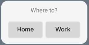
创建界面
以下代码段演示了如何创建界面:
/* Import Glance Composables In the event there is a name clash with the Compose classes of the same name, you may rename the imports per https://kotlinlang.org/docs/packages.html#imports using the `as` keyword. import androidx.glance.Button import androidx.glance.layout.Column import androidx.glance.layout.Row import androidx.glance.text.Text */ class MyAppWidget : GlanceAppWidget() { override suspend fun provideGlance(context: Context, id: GlanceId) { // Load data needed to render the AppWidget. // Use `withContext` to switch to another thread for long running // operations. provideContent { // create your AppWidget here MyContent() } } @Composable private fun MyContent() { Column( modifier = GlanceModifier.fillMaxSize(), verticalAlignment = Alignment.Top, horizontalAlignment = Alignment.CenterHorizontally ) { Text(text = "Where to?", modifier = GlanceModifier.padding(12.dp)) Row(horizontalAlignment = Alignment.CenterHorizontally) { Button( text = "Home", onClick = actionStartActivity<MyActivity>() ) Button( text = "Work", onClick = actionStartActivity<MyActivity>() ) } } } }
上述代码示例会执行以下操作:
- 在顶层
Column中,各项会垂直放置,彼此紧挨。 Column会将其大小扩展为与可用空间相匹配(通过GlanceModifier),并将其内容与顶部对齐 (verticalAlignment) 并水平居中 (horizontalAlignment)。Column的内容使用 lambda 定义。顺序很重要。
您可以更改对齐值或应用不同的修饰符值(例如边衬区),以更改组件的放置位置和大小。如需查看每个类的组件、参数和可用修饰符的完整列表,请参阅参考文档。
实现圆角
Android 12 引入了系统参数,用于动态自定义应用微件的圆角半径:
system_app_widget_background_radius:指定 widget 背景容器的角半径(绝不会大于 28 dp)。- 内半径:为防止内容被剪裁,请根据系统背景轮廓计算内内容的比例半径:
systemRadiusValue - widgetPadding
在 Glance 中,您可以使用 GlanceModifier.cornerRadius(android.R.dimen.system_app_widget_background_radius) 在组合中动态应用圆角半径大小调整属性。
为了在搭载 Android 11(API 级别 30)或更低版本的设备上实现向后兼容性,请实现自定义属性和自定义主题资源回退:
/values/attrs.xml<resources> <attr name="backgroundRadius" format="dimension" /> </resources>/values/styles.xml<resources> <style name="MyWidgetTheme"> <item name="backgroundRadius">@dimen/my_background_radius_dimen</item> </style> </resources>/values-31/styles.xml<resources> <style name="MyWidgetTheme" parent="@android:style/Theme.DeviceDefault.DayNight"> <item name="backgroundRadius">@android:dimen/system_app_widget_background_radius</item> </style> </resources>/drawable/my_widget_background.xml<shape xmlns:android="http://schemas.android.com/apk/res/android" android:shape="rectangle"> <corners android:radius="?attr/backgroundRadius" /> </shape>