
窗口大小类别是一组主观的视口划分点,有助于您 设计、开发和测试自适应布局。这些断点平衡了布局简单性与灵活性,以便针对独特情形优化您的应用。
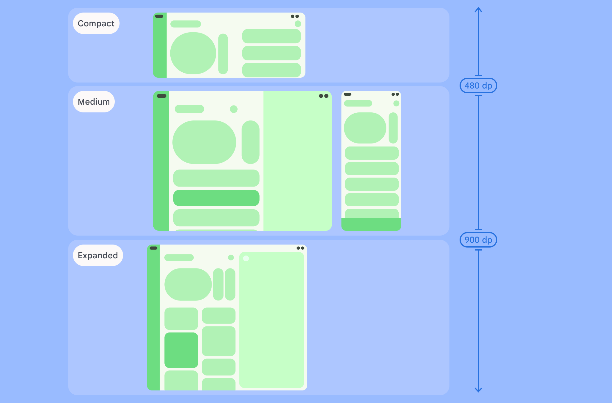
窗口大小类别将应用中可用的显示区域分类为: 紧凑、中等、展开、较大或超大。可用宽度和高度是单独分类的,因此在任何时间点,应用都有两个窗口大小类别:宽度窗口大小类别和高度窗口大小类别。但由于垂直滚动的普遍存在,可用宽度通常比可用高度更重要;因此,宽度窗口大小类别很可能与应用的界面更相关。
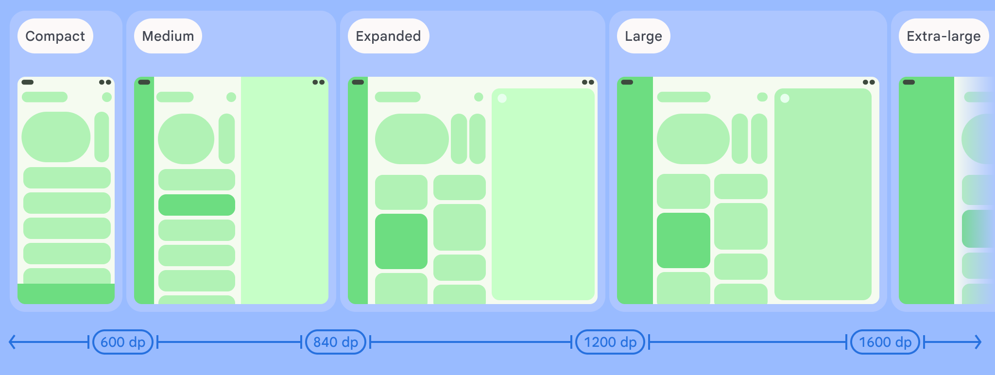
如图所示,划分点可让您继续从设备和配置的角度考虑布局。每个大小类别断点代表了典型设备场景的大多数情况,当您考虑基于断点的布局设计时,这可能是一个有用的参考框架。
| 大小类别 | 划分点 | 设备表示 |
|---|---|---|
| 较小的宽度 | 宽度 < 600dp | 99.96% 的手机处于竖屏模式 |
| 中等宽度 | 600dp ≤ 宽度 < 840dp | 93.73% 的平板电脑处于竖屏模式,
大多数展开的大型内部显示屏处于竖屏模式 |
| 展开宽度 | 840dp ≤ 宽度 < 1200dp | 97.22% 的平板电脑处于横屏模式,
大多数展开的大型内屏在横向模式下至少处于展开宽度 |
| 较大宽度 | 1200dp ≤ 宽度 < 1600dp | 大型平板电脑显示屏 |
| 超大宽度 | 宽度 ≥ 1600dp | 桌面显示屏 |
| 较小的高度 | 高度 < 480dp | 99.78% 的手机处于横屏模式 |
| 中等高度 | 480dp ≤ 高度 < 900dp | 96.56% 的平板电脑处于横屏模式,
97.59% 的手机处于竖屏模式 |
| 展开高度 | 高度 ≥ 900dp | 94.25% 的平板电脑处于竖屏模式 |
虽然使用实体设备直观地查看大小类别很有用,但窗口大小类别不是由设备屏幕的尺寸明确决定的。窗口大小类别不适用于 isTablet类型的逻辑。相反,窗口大小类别由应用可用的窗口大小决定,而与应用运行的设备类型无关,这具有两个重要含义:
实体设备不能保证特定的窗口大小类别。由于多种原因,应用可用的屏幕空间可能与设备的屏幕尺寸不同。在移动设备上,分屏模式可以在两个应用之间分割屏幕。在 ChromeOS 中,Android 应用可以呈现在可任意调整大小的桌面式窗口中。 可折叠设备可以有两个大小不同的屏幕,分别可通过折叠或展开设备使用。
窗口大小类别可能会在应用的整个生命周期内发生变化。 在应用运行时,设备屏幕方向变化、多任务处理和折叠/展开可能会改变可用的屏幕空间量。因此,窗口大小类别是动态的,应用的界面应相应地调整。
窗口大小类别与 Material Design 布局指南中的紧凑、中等和展开划分点一一对应。此外,还添加了较大和超大划分点,以便更好地定位桌面和连接的显示屏。
使用窗口大小类别来做出高级应用布局决策,如决定是否使用特定的规范布局以利用额外的屏幕空间。
使用 androidx.compose.material3.adaptive 库的 currentWindowAdaptiveInfo() 顶级函数计算当前 WindowSizeClass。该函数会返回一个 WindowAdaptiveInfo 实例,其中包含 windowSizeClass。如需支持大型和超大型断点,请向函数调用添加设置为 true 的 supportLargeAndXLargeWidth 参数。以下示例展示了如何计算窗口大小类别,并在窗口大小类别发生变化时随时接收更新:
val windowSizeClass = currentWindowAdaptiveInfo().windowSizeClass
使用窗口大小类别管理布局
通过窗口大小类别,您可以将应用布局更改为显示空间 更改,例如当设备折叠或展开时, 设备屏幕方向发生变化,或者应用窗口在多窗口模式下被调整大小 模式。
通过传递窗口大小,将用于处理显示屏大小变化的逻辑本地化 像任何其他应用状态一样,将类作为状态向下传递到嵌套可组合项:
@Composable fun MyApp( windowSizeClass: WindowSizeClass = currentWindowAdaptiveInfo(supportLargeAndXLargeWidth = true).windowSizeClass ) { // Decide whether to show the top app bar based on window size class. val showTopAppBar = windowSizeClass.isHeightAtLeastBreakpoint(WindowSizeClass.HEIGHT_DP_MEDIUM_LOWER_BOUND) // MyScreen logic is based on the showTopAppBar boolean flag. MyScreen( showTopAppBar = showTopAppBar, /* ... */ ) }
测试窗口大小类别
在进行布局更改时,请测试所有窗口大小的布局行为,尤其是在紧凑、中等和展开断点宽度下。
如果您的某个现有布局适合较小的屏幕,请首先针对展开宽度大小类别优化布局,因为此大小类别可以为额外的内容或界面变化提供最大的空间。然后,决定什么布局对中等宽度大小类别有意义,并考虑添加专用布局。
后续步骤
如需详细了解如何使用窗口大小类别创建自适应布局,请参阅以下内容:
对于基于 Compose 的布局:支持不同的屏幕尺寸
对于基于 View 的布局:使用 View 实现响应式/自适应设计
如需详细了解如何让应用在所有设备和屏幕尺寸上都表现出色,请参阅: