


如要在應用程式中顯示靜態圖片,可以使用 Drawable 類別及其子類別繪製形狀和圖片。Drawable 是「可繪製的項目」的一般抽象概念。各個子類別可協助處理特定圖片情境,您也可以擴充這些子類別,定義以獨特方式運作的可繪項目物件。
除了使用類別建構函式,您還可以透過下列兩種方式定義及例項化 Drawable:
- 將專案中儲存的圖片資源 (點陣圖檔案) 擴充。
- 擴充定義可繪項目屬性的 XML 資源。
注意: 您可能比較偏好使用向量可繪項目,這類項目會以一組點、線和曲線定義圖片,並提供相關色彩資訊。這樣一來,向量可繪項目就能縮放成不同大小,而不會降低畫質。詳情請參閱「向量可繪項目總覽」。
從資源圖片建立可繪項目
您可以從專案資源參照圖片檔案,將圖片新增至應用程式。支援的檔案類型包括 PNG (建議)、JPG (可接受) 和 GIF (不建議)。應用程式圖示、標誌和其他圖像 (例如遊戲中使用的圖像) 都很適合採用這項技巧。
如要使用圖片資源,請將檔案新增至專案的 res/drawable/ 目錄。圖片資源加入專案後,您就可以從程式碼或 XML 版面配置參照該資源。無論是哪種方式,系統都會使用資源 ID 參照檔案,也就是不含副檔名的檔案名稱。舉例來說,請將 my_image.png 稱為 my_image。
注意:建構程序期間,aapt 工具可能會自動對 res/drawable/ 目錄中的圖片資源進行無失真壓縮,以達到最佳化效果。舉例來說,真實色彩 PNG 如果需要的顏色不超過 256 種顏色,也許可以利用調色盤轉換成 8 位元 PNG。這種方式產生的圖片品質相同,但所需的記憶體較少。因此,此目錄中的圖片二進位檔可能會在建構期間發生變化。如果是為了要將圖片轉換成點陣圖,而想要以位元串流讀取圖片,請改為將圖片存放在 res/raw/ 資料夾中,這樣 aapt 工具才不會修改圖片。
下列程式碼片段示範如何建構 ImageView,使用從可繪製資源建立的圖片,並將圖片新增至版面配置:
Kotlin
private lateinit var constraintLayout: ConstraintLayout

override fun onCreate(savedInstanceState: Bundle?) {
    super.onCreate(savedInstanceState)

    // Instantiate an ImageView and define its properties
    val i = ImageView(this).apply {
        setImageResource(R.drawable.my_image)
        contentDescription = resources.getString(R.string.my_image_desc)

        // set the ImageView bounds to match the Drawable's dimensions
        adjustViewBounds = true
        layoutParams = ViewGroup.LayoutParams(
                ViewGroup.LayoutParams.WRAP_CONTENT,
                ViewGroup.LayoutParams.WRAP_CONTENT)
    }

    // Create a ConstraintLayout in which to add the ImageView
    constraintLayout = ConstraintLayout(this).apply {

        // Add the ImageView to the layout.
        addView(i)
    }

    // Set the layout as the content view.
    setContentView(constraintLayout)
}
Java
ConstraintLayout constraintLayout;

protected void onCreate(Bundle savedInstanceState) {
  super.onCreate(savedInstanceState);

  // Create a ConstraintLayout in which to add the ImageView
  constraintLayout = new ConstraintLayout(this);

  // Instantiate an ImageView and define its properties
  ImageView i = new ImageView(this);
  i.setImageResource(R.drawable.my_image);
  i.setContentDescription(getResources().getString(R.string.my_image_desc));

  // set the ImageView bounds to match the Drawable's dimensions
  i.setAdjustViewBounds(true);
  i.setLayoutParams(new ViewGroup.LayoutParams(
          ViewGroup.LayoutParams.WRAP_CONTENT,
          ViewGroup.LayoutParams.WRAP_CONTENT));

  // Add the ImageView to the layout and set the layout as the content view.
  constraintLayout.addView(i);
  setContentView(constraintLayout);
}
在其他情況下,您可能需要將圖片資源做為 Drawable 物件處理,如下列範例所示:
Kotlin
val myImage: Drawable = ResourcesCompat.getDrawable(context.resources, R.drawable.my_image, null)
Java
Resources res = context.getResources();
Drawable myImage = ResourcesCompat.getDrawable(res, R.drawable.my_image, null);
警告:專案中的每個專屬資源只能維持一種狀態,無論您為該資源例項化多少不同的物件,舉例來說,如果您從同一個圖片資源例項化兩個 Drawable 物件,並變更其中一個物件的屬性 (例如 Alpha),另一個物件也會受到影響。處理圖片資源的多個執行個體時,您應執行補間動畫,而非直接轉換 Drawable 物件。
以下 XML 程式碼片段說明如何在 XML 版面配置中,將可繪製資源新增至 ImageView:
<ImageView
        android:layout_width="wrap_content"
        android:layout_height="wrap_content"
        android:src="@drawable/my_image"
        android:contentDescription="@string/my_image_desc" />
如要進一步瞭解如何使用專案資源,請參閱「資源和素材資源」。
注意:使用圖片資源做為可繪項目的來源時,請務必確保圖片大小適合各種像素密度。如果圖片不正確,系統會放大圖片以符合大小,這可能會導致可繪項目出現影像失真。 詳情請參閱「支援不同的像素密度」。
從 XML 資源建立可繪項目
如果想建立的 Drawable 物件一開始並非取決於程式碼或使用者互動定義的變數,那麼在 XML 中定義 Drawable 是不錯的選擇。即使您預期 Drawable 會在使用者與應用程式互動時變更屬性,也應考慮在 XML 中定義物件,因為您可以在物件例項化後修改屬性。
使用 XML 定義 Drawable 後,請將檔案儲存到專案的 res/drawable/ 目錄中。以下範例顯示定義 TransitionDrawable 資源的 XML,該資源會從 Drawable 繼承:
<!-- res/drawable/expand_collapse.xml -->
<transition xmlns:android="http://schemas.android.com/apk/res/android">
    <item android:drawable="@drawable/image_expand"/>
    <item android:drawable="@drawable/image_collapse"/>
</transition>
然後,呼叫 Resources#getDrawable() 並傳遞 XML 檔案的資源 ID,即可擷取及例項化物件。任何支援 inflate() 方法的 Drawable 子類別都可以在 XML 中定義,並由應用程式例項化。
支援 XML 膨脹的每個可繪項目類別,都會使用特定 XML 屬性來定義物件屬性。下列程式碼會將 TransitionDrawable 例項化,並設為 ImageView 物件的內容:
Kotlin
val transition= ResourcesCompat.getDrawable(
        context.resources,
        R.drawable.expand_collapse,
        null
) as TransitionDrawable

val image: ImageView = findViewById(R.id.toggle_image)
image.setImageDrawable(transition)

// Description of the initial state that the drawable represents.
image.contentDescription = resources.getString(R.string.collapsed)

// Then you can call the TransitionDrawable object's methods.
transition.startTransition(1000)

// After the transition is complete, change the image's content description
// to reflect the new state.
Java
Resources res = context.getResources();
TransitionDrawable transition =
    (TransitionDrawable) ResourcesCompat.getDrawable(res, R.drawable.expand_collapse, null);

ImageView image = (ImageView) findViewById(R.id.toggle_image);
image.setImageDrawable(transition);

// Description of the initial state that the drawable represents.
image.setContentDescription(getResources().getString(R.string.collapsed));

// Then you can call the TransitionDrawable object's methods.
transition.startTransition(1000);

// After the transition is complete, change the image's content description
// to reflect the new state.
如要進一步瞭解支援的 XML 屬性,請參閱上方列出的類別。
形狀可繪項目
如要動態繪製二維圖像,ShapeDrawable 物件是不錯的選擇。您可以在 ShapeDrawable 物件上以程式輔助方式繪製基本圖形,並套用應用程式所需的樣式。
ShapeDrawable 是 Drawable 的子類別。因此,您可以在預期使用 Drawable 的位置使用 ShapeDrawable。舉例來說,您可以將 ShapeDrawable 物件傳遞至檢視區塊的 setBackgroundDrawable() 方法,藉此設定檢視區塊的背景。您也可以將形狀繪製為自己的自訂檢視區塊,並新增至應用程式的版面配置。
由於 ShapeDrawable 有自己的 draw() 方法,因此您可以建立 View 的子類別,在 onDraw() 事件期間繪製 ShapeDrawable 物件,如下列程式碼範例所示:
Kotlin
class CustomDrawableView(context: Context) : View(context) {
    private val drawable: ShapeDrawable = run {
        val x = 10
        val y = 10
        val width = 300
        val height = 50
        contentDescription = context.resources.getString(R.string.my_view_desc)

        ShapeDrawable(OvalShape()).apply {
            // If the color isn't set, the shape uses black as the default.
            paint.color = 0xff74AC23.toInt()
            // If the bounds aren't set, the shape can't be drawn.
            setBounds(x, y, x + width, y + height)
        }
    }

    override fun onDraw(canvas: Canvas) {
        drawable.draw(canvas)
    }
}
Java
public class CustomDrawableView extends View {
  private ShapeDrawable drawable;

  public CustomDrawableView(Context context) {
    super(context);

    int x = 10;
    int y = 10;
    int width = 300;
    int height = 50;
    setContentDescription(context.getResources().getString(
            R.string.my_view_desc));

    drawable = new ShapeDrawable(new OvalShape());
    // If the color isn't set, the shape uses black as the default.
    drawable.getPaint().setColor(0xff74AC23);
    // If the bounds aren't set, the shape can't be drawn.
    drawable.setBounds(x, y, x + width, y + height);
  }

  protected void onDraw(Canvas canvas) {
    drawable.draw(canvas);
  }
}
您可以像使用任何其他自訂檢視區塊一樣,在上述程式碼範例中使用 CustomDrawableView 類別。舉例來說,您可以透過程式輔助方式將其新增至應用程式的活動,如下列範例所示:
Kotlin
private lateinit var customDrawableView: CustomDrawableView

override fun onCreate(savedInstanceState: Bundle?) {
    super.onCreate(savedInstanceState)
    customDrawableView = CustomDrawableView(this)

    setContentView(customDrawableView)
}
Java
CustomDrawableView customDrawableView;

protected void onCreate(Bundle savedInstanceState) {
  super.onCreate(savedInstanceState);
  customDrawableView = new CustomDrawableView(this);

  setContentView(customDrawableView);
}
如要在 XML 版面配置中使用自訂檢視區塊,CustomDrawableView 類別必須覆寫 View(Context, AttributeSet) 建構函式,這個函式會在類別從 XML 加載時呼叫。以下範例說明如何在 XML 版面配置中宣告 CustomDrawableView:
<com.example.shapedrawable.CustomDrawableView
        android:layout_width="fill_parent"
        android:layout_height="wrap_content"
        />
與 android.graphics.drawable 套件中的許多其他可繪項目類型一樣,ShapeDrawable 類別可讓您使用公開方法定義物件的各種屬性。您可能想調整的屬性包括 Alpha 透明度、色彩濾鏡、抖動、不透明度和顏色。
您也可以使用 XML 資源定義基本可繪項目形狀。詳情請參閱「 形狀可繪項目」一文中的「 可繪製資源類型」。
NinePatch 可繪項目
NinePatchDrawable 圖形是可延展的點陣圖圖片,可用做檢視區塊的背景。Android 會自動調整圖像大小,以配合檢視畫面內容。舉例來說,標準 Android 按鈕使用的背景就是 NinePatch 圖片,因為按鈕必須延展,才能容納各種長度的字串。NinePatch 圖像是一種標準 PNG 圖片,包含額外的 1 像素邊界。必須以 9.png 副檔名儲存在專案的 res/drawable/ 目錄中。
使用邊框定義圖片的可延展和靜態區域。 如要指出可延展的部分,請在邊框的左側和頂端繪製一或多條 1 像素寬的黑線 (其他邊框像素應完全透明或白色)。你可以視需要加入任意數量的可延展區段。可延展區段的相對大小維持不變,因此最大區段永遠是最大區段。
您也可以在右側和底部繪製線條,定義圖片的可繪項目區域 (實際上是邊框間距線條)。如果 View 物件將 NinePatch 圖像設為背景,然後指定檢視區塊的文字,系統會延伸該物件,讓所有文字只佔用右側和底部線條 (如有) 指定的區域。如果未納入邊框間距線,Android 會使用左側和頂端線定義這個可繪項目區域。
為釐清兩條線之間的差異,左側和頂端線條會定義允許複製的圖片像素,以便延展圖片。底線和右線定義圖片內的相對區域,視圖內容可佔用該區域。
圖 1 顯示用於定義按鈕的 NinePatch 圖像範例:
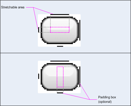
圖 1:定義按鈕的 NinePatch 圖像範例
這個 NinePatch 圖像會使用左側和頂端線條定義一個可延展區域,並使用底部和右側線條定義可繪製區域。在上圖中,灰色虛線代表圖片中複製的區域,目的是為了延展圖片。下圖中的粉紅色矩形代表可顯示檢視畫面內容的區域。如果內容不符合這個區域,系統會將圖片延展至符合區域大小。
9-patch 繪製工具提供非常實用的方式,可使用所見即所得的圖像編輯器建立 NinePatch 圖像。如果因像素複製而可能導致繪圖失真,系統甚至會發出警告。
以下範例版面配置 XML 說明如何將 NinePatch 圖像新增至幾個按鈕。NinePatch 圖像會儲存至 res/drawable/my_button_background.9.png。
<Button android:id="@+id/tiny"
        android:layout_width="wrap_content"
        android:layout_height="wrap_content"
        android:layout_alignParentTop="true"
        android:layout_centerInParent="true"
        android:text="Tiny"
        android:textSize="8sp"
        android:background="@drawable/my_button_background"/>

<Button android:id="@+id/big"
        android:layout_width="wrap_content"
        android:layout_height="wrap_content"
        android:layout_alignParentBottom="true"
        android:layout_centerInParent="true"
        android:text="Biiiiiiig text!"
        android:textSize="30sp"
        android:background="@drawable/my_button_background"/>
請注意,layout_width 和 layout_height 屬性已設為 wrap_content,讓按鈕能整齊地圍繞文字。
圖 2 顯示從 XML 和 NinePatch 圖片 (如上所示) 算繪的兩個按鈕。請注意,按鈕的寬度和高度會隨著文字而變化,背景圖片也會隨之延展。
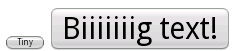
圖 2:使用 XML 資源和 NinePatch 圖形算繪的按鈕
自訂可繪項目
如要建立一些自訂繪圖,可以擴充 Drawable 類別 (或其任何子類別)。
最重要的實作方法是 draw(Canvas),因為這個方法會提供您必須用來提供繪圖指令的 Canvas 物件。
下列程式碼顯示 Drawable 的簡單子類別,可繪製圓形:
Kotlin
class MyDrawable : Drawable() {
    private val redPaint: Paint = Paint().apply { setARGB(255, 255, 0, 0) }

    override fun draw(canvas: Canvas) {
        // Get the drawable's bounds
        val width: Int = bounds.width()
        val height: Int = bounds.height()
        val radius: Float = Math.min(width, height).toFloat() / 2f

        // Draw a red circle in the center
        canvas.drawCircle((width / 2).toFloat(), (height / 2).toFloat(), radius, redPaint)
    }

    override fun setAlpha(alpha: Int) {
        // This method is required
    }

    override fun setColorFilter(colorFilter: ColorFilter?) {
        // This method is required
    }

    override fun getOpacity(): Int =
        // Must be PixelFormat.UNKNOWN, TRANSLUCENT, TRANSPARENT, or OPAQUE
        PixelFormat.OPAQUE
}
Java
public class MyDrawable extends Drawable {
    private final Paint redPaint;

    public MyDrawable() {
        // Set up color and text size
        redPaint = new Paint();
        redPaint.setARGB(255, 255, 0, 0);
    }

    @Override
    public void draw(Canvas canvas) {
        // Get the drawable's bounds
        int width = getBounds().width();
        int height = getBounds().height();
        float radius = Math.min(width, height) / 2;

        // Draw a red circle in the center
        canvas.drawCircle(width/2, height/2, radius, redPaint);
    }

    @Override
    public void setAlpha(int alpha) {
        // This method is required
    }

    @Override
    public void setColorFilter(ColorFilter colorFilter) {
        // This method is required
    }

    @Override
    public int getOpacity() {
        // Must be PixelFormat.UNKNOWN, TRANSLUCENT, TRANSPARENT, or OPAQUE
        return PixelFormat.OPAQUE;
    }
}
接著,您可以在所需位置新增可繪項目,例如新增至 ImageView,如下所示:
Kotlin
val myDrawing = MyDrawable()
val image: ImageView = findViewById(R.id.imageView)
image.setImageDrawable(myDrawing)
image.contentDescription = resources.getString(R.string.my_image_desc)
Java
MyDrawable mydrawing = new MyDrawable();
ImageView image = findViewById(R.id.imageView);
image.setImageDrawable(mydrawing);
image.setContentDescription(getResources().getString(R.string.my_image_desc));
在 Android 7.0 (API 級別 24) 以上版本中,您也可以透過下列方式,在 XML 中定義自訂可繪項目的例項:
- 使用完整類別名稱做為 XML 元素名稱。採用這種做法時,自訂可繪項目類別必須是公開的頂層類別:
<com.myapp.MyDrawable xmlns:android="http://schemas.android.com/apk/res/android"
    android:color="#ffff0000" />
- 使用
drawable做為 XML 標記名稱,並從類別屬性指定完整類別名稱。這種方法可用於公開頂層類別和公開靜態內部類別:<drawable xmlns:android="http://schemas.android.com/apk/res/android" class="com.myapp.MyTopLevelClass$MyDrawable" android:color="#ffff0000" />
為可繪項目著色
在 Android 5.0 (API 級別 21) 以上版本中,您可以為定義為 Alpha 遮罩的點陣圖和九宮格圖片著色。您可以使用顏色資源或主題屬性,將這些資產染成顏色資源 (例如 ?android:attr/colorPrimary)。通常您只需要建立一次這些資產,系統就會自動將其染成符合主題的顏色。
您可以使用 setTint() 方法,為 BitmapDrawable、NinePatchDrawable 或 VectorDrawable 物件套用色調。您也可以使用 android:tint 和 android:tintMode 屬性,在版面配置中設定色調顏色和模式。
從圖片擷取顯著色彩
Android 支援資料庫包含 Palette 類別,可讓您從圖片擷取醒目顯示色彩。您可以將可繪項目載入為 Bitmap,並傳遞至 Palette,存取其顏色。
詳情請參閱「使用 Palette API 選取顏色」。