复选框可让用户从列表中选择一个或多个项目。您可以使用复选框让用户执行以下操作:
- 开启或关闭相应项目。
- 从列表中的多个选项中进行选择。
- 表示同意或接受。
解剖学
复选框包含以下元素:
- Box:这是复选框的容器。
- 勾选标记:此视觉指示器用于显示复选框是否处于选中状态。
- 标签:用于描述复选框的文本。
状态
复选框可处于以下三种状态之一:
- 未选中:复选框未选中。箱子是空的。
- 不确定:复选框处于不确定状态。该框包含短划线。
- 已选中:复选框处于选中状态。相应框中包含对勾标记。
下图展示了复选框的三种状态。

实现
您可以使用 Checkbox 可组合项在应用中创建复选框。只需记住几个关键参数:
checked:用于捕获复选框是否处于选中状态的布尔值。onCheckedChange():当用户点按复选框时,应用调用的函数。
以下代码段演示了如何使用 Checkbox 可组合项:
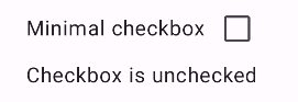
@Composable fun CheckboxMinimalExample() { var checked by remember { mutableStateOf(true) } Row( verticalAlignment = Alignment.CenterVertically, ) { Text( "Minimal checkbox" ) Checkbox( checked = checked, onCheckedChange = { checked = it } ) } Text( if (checked) "Checkbox is checked" else "Checkbox is unchecked" ) }
说明
此代码会创建一个最初处于未选中状态的复选框。当用户点击复选框时,onCheckedChange lambda 会更新 checked 状态。
结果
此示例在未选中时会生成以下组件:
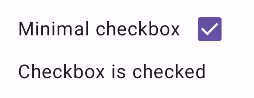
同一复选框在选中状态下如下所示:
高级示例
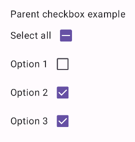
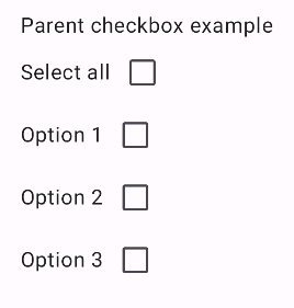
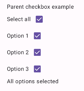
以下是一个更复杂的示例,展示了如何在应用中实现复选框。在此代码段中,有一个父复选框和一系列子复选框。当用户点按父复选框时,应用会选中所有子复选框。
@Composable fun CheckboxParentExample() { // Initialize states for the child checkboxes val childCheckedStates = remember { mutableStateListOf(false, false, false) } // Compute the parent state based on children's states val parentState = when { childCheckedStates.all { it } -> ToggleableState.On childCheckedStates.none { it } -> ToggleableState.Off else -> ToggleableState.Indeterminate } Column { // Parent TriStateCheckbox Row( verticalAlignment = Alignment.CenterVertically, ) { Text("Select all") TriStateCheckbox( state = parentState, onClick = { // Determine new state based on current state val newState = parentState != ToggleableState.On childCheckedStates.forEachIndexed { index, _ -> childCheckedStates[index] = newState } } ) } // Child Checkboxes childCheckedStates.forEachIndexed { index, checked -> Row( verticalAlignment = Alignment.CenterVertically, ) { Text("Option ${index + 1}") Checkbox( checked = checked, onCheckedChange = { isChecked -> // Update the individual child state childCheckedStates[index] = isChecked } ) } } } if (childCheckedStates.all { it }) { Text("All options selected") } }
说明
以下是您应注意的几个方面:
- 状态管理:
childCheckedStates:一个布尔值列表,使用mutableStateOf()跟踪每个子复选框的选中状态。parentState:一个ToggleableState,其值派生自子复选框的状态。
- 界面组件:
TriStateCheckbox:对于父复选框是必需的,因为它具有state参数,可让您将其设置为不确定状态。Checkbox:用于每个子复选框,其状态与childCheckedStates中的相应元素相关联。Text:显示标签和消息(“全选”“选项 X”“已选择所有选项”)。
- 逻辑:
- 父复选框的
onClick会将所有子复选框更新为与当前父状态相反的状态。 - 每个子复选框的
onCheckedChange都会更新childCheckedStates列表中对应的状态。 - 当所有子复选框都处于选中状态时,代码会显示“
All options selected”。
- 父复选框的
结果
当所有复选框均未选中时,此示例会生成以下组件。
同样,当所有选项都被选中时(例如用户点按“全选”时),该组件会显示如下:
如果只选中一个选项,父复选框会显示不确定状态: