Dialog 组件会在主应用内容上方的
图层中显示对话框消息或请求用户输入,它会创建中断式界面体验来吸引用户注意。
对话框的用例包括:
- 确认用户操作,例如删除文件时。
- 请求用户输入,例如在待办事项应用中。
- 显示供用户选择的选项列表,例如在个人资料设置中选择国家/地区。

提醒对话框
AlertDialog 可组合项提供了一个便捷的 API,用于创建
Material Design 主题对话框。AlertDialog 具有用于处理对话框特定元素的特定参数。其中包括:
title:显示在对话框顶部的文本。text:显示在对话框中央的文本。icon:显示在对话框顶部的图形。onDismissRequest:用户关闭对话框(例如点按对话框外部)时调用的函数。dismissButton:充当关闭按钮的可组合项。confirmButton:充当确认按钮的可组合项。
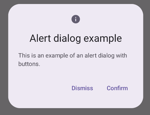
以下示例在提醒对话框中实现了两个按钮,一个用于关闭对话框,另一个用于确认其请求。
@Composable fun AlertDialogExample( onDismissRequest: () -> Unit, onConfirmation: () -> Unit, dialogTitle: String, dialogText: String, icon: ImageVector, ) { AlertDialog( icon = { Icon(icon, contentDescription = "Example Icon") }, title = { Text(text = dialogTitle) }, text = { Text(text = dialogText) }, onDismissRequest = { onDismissRequest() }, confirmButton = { TextButton( onClick = { onConfirmation() } ) { Text("Confirm") } }, dismissButton = { TextButton( onClick = { onDismissRequest() } ) { Text("Dismiss") } } ) }
此实现意味着父可组合项会以这种方式将实参传递给子可组合项:
@Composable fun DialogExamples() { // ... val openAlertDialog = remember { mutableStateOf(false) } // ... when { // ... openAlertDialog.value -> { AlertDialogExample( onDismissRequest = { openAlertDialog.value = false }, onConfirmation = { openAlertDialog.value = false println("Confirmation registered") // Add logic here to handle confirmation. }, dialogTitle = "Alert dialog example", dialogText = "This is an example of an alert dialog with buttons.", icon = Icons.Default.Info ) } } } }
此实现如下所示:
对话框可组合项
Dialog 是一个基本的可组合项,不提供任何样式或用于内容的预定义槽。它是一个相对简单的容器,您应使用 Card
等容器填充它。以下是对话框的一些关键参数:
onDismissRequest:用户关闭对话框时调用的 lambda。properties:DialogProperties的实例,可提供一些 额外的自定义范围。
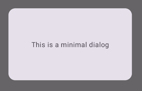
基本示例
以下示例是 Dialog 可组合项的基本实现。请注意,它使用 Card 作为辅助容器。如果没有
Card,Text 组件将单独显示在主应用内容上方。
@Composable fun MinimalDialog(onDismissRequest: () -> Unit) { Dialog(onDismissRequest = { onDismissRequest() }) { Card( modifier = Modifier .fillMaxWidth() .height(200.dp) .padding(16.dp), shape = RoundedCornerShape(16.dp), ) { Text( text = "This is a minimal dialog", modifier = Modifier .fillMaxSize() .wrapContentSize(Alignment.Center), textAlign = TextAlign.Center, ) } } }
此实现如下所示。请注意,当对话框打开时,其下方的主应用内容会变暗并灰显:
高级示例
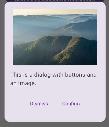
以下是 Dialog 可组合项的更高级实现。在这种情况下,该组件会手动实现与前面的 AlertDialog 示例类似的接口。
@Composable fun DialogWithImage( onDismissRequest: () -> Unit, onConfirmation: () -> Unit, painter: Painter, imageDescription: String, ) { Dialog(onDismissRequest = { onDismissRequest() }) { // Draw a rectangle shape with rounded corners inside the dialog Card( modifier = Modifier .fillMaxWidth() .height(375.dp) .padding(16.dp), shape = RoundedCornerShape(16.dp), ) { Column( modifier = Modifier .fillMaxSize(), verticalArrangement = Arrangement.Center, horizontalAlignment = Alignment.CenterHorizontally, ) { Image( painter = painter, contentDescription = imageDescription, contentScale = ContentScale.Fit, modifier = Modifier .height(160.dp) ) Text( text = "This is a dialog with buttons and an image.", modifier = Modifier.padding(16.dp), ) Row( modifier = Modifier .fillMaxWidth(), horizontalArrangement = Arrangement.Center, ) { TextButton( onClick = { onDismissRequest() }, modifier = Modifier.padding(8.dp), ) { Text("Dismiss") } TextButton( onClick = { onConfirmation() }, modifier = Modifier.padding(8.dp), ) { Text("Confirm") } } } } } }
此实现如下所示: