Оптимизируйте свои подборки
Сохраняйте и классифицируйте контент в соответствии со своими настройками.
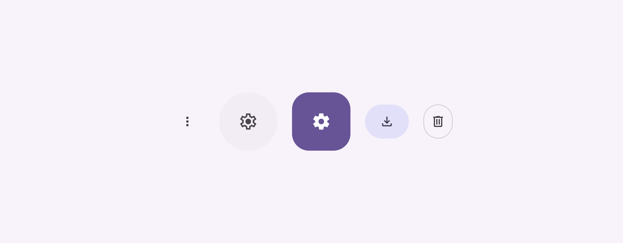
Кнопки-значки отображают действия, которые могут выполнять пользователи. Кнопки-значки должны использовать значок с понятным значением и, как правило, представлять общие или часто используемые действия.
Существует два типа кнопок-значков:
По умолчанию : эти кнопки могут открывать другие элементы, такие как меню или поиск.
Переключение : эти кнопки могут представлять двоичные действия, которые можно включать и выключать, например, «избранное» или «закладка».
Рисунок 1. Кнопки-иконки, некоторые из которых закрашены (что указывает на выбор) и обведены.
API поверхность
Используйте IconButton composable для реализации стандартных кнопок со значками. Для создания различных визуальных стилей, таких как заполненные, заполненные тонально или обведенные, используйте FilledIconButton , FilledTonalIconButton и OutlinedIconButton соответственно.
Ключевые параметры IconButton включают в себя:
onClick : лямбда-функция, которая выполняется, когда пользователь нажимает кнопку со значком.
enabled : Логическое значение, которое управляет включенным состоянием кнопки. Если false , кнопка не реагирует на пользовательский ввод.
content : Компонуемое содержимое внутри кнопки, обычно Icon .
Простой пример: кнопка со значком переключения
В этом примере показано, как реализовать кнопку-переключатель. Кнопка-переключатель меняет свой внешний вид в зависимости от того, выбрана она или нет.
@Preview@ComposablefunToggleIconButtonExample(){// isToggled initial value should be read from a view model or persistent storage.varisToggledbyrememberSaveable{mutableStateOf(false)}IconButton(onClick={isToggled=!isToggled}){Icon(painter=if(isToggled)painterResource(R.drawable.favorite_filled)elsepainterResource(R.drawable.favorite),contentDescription=if(isToggled)"Selected icon button"else"Unselected icon button.")}}
Компонуемый объект ToggleIconButtonExample определяет переключаемую IconButton .
mutableStateOf(false) создает объект MutableState , который содержит логическое значение, изначально false . Это делает isToggled держателем состояния, то есть Compose перестраивает пользовательский интерфейс всякий раз, когда его значение изменяется.
rememberSaveable обеспечивает сохранение состояния isToggled при изменении конфигурации, например при повороте экрана.
Лямбда-функция onClick элемента IconButton определяет поведение кнопки при нажатии, переключая состояние между true и false .
Параметр painter компонуемого Icon условно загружает другой painterResource на основе состояния isToggled . Это изменяет внешний вид значка.
Если isToggled имеет true , загружается закрашенное сердце.
Если isToggled имеет значение false , загружается выделенное сердце.
contentDescriptionIcon также обновляется в зависимости от состояния isToggled , чтобы предоставить соответствующую информацию о доступности.
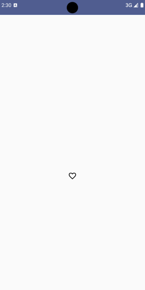
Результат
На следующем изображении показана кнопка-значок переключения из предыдущего фрагмента в невыбранном состоянии:
Рисунок 2. Кнопка-переключатель «Избранное» в невыбранном состоянии.
Расширенный пример: Повторные действия при нажатии
В этом разделе показано, как создавать кнопки со значками, которые непрерывно запускают действие, пока пользователь нажимает и удерживает их, а не просто запускают его один раз при каждом щелчке.
@ComposablefunMomentaryIconButton(unselectedImage:Int,selectedImage:Int,contentDescription:String,modifier:Modifier=Modifier,stepDelay:Long=100L,// Minimum value is 1L milliseconds.onClick:()->Unit){valinteractionSource=remember{MutableInteractionSource()}valisPressedbyinteractionSource.collectIsPressedAsState()valpressedListenerbyrememberUpdatedState(onClick)LaunchedEffect(isPressed){while(isPressed){delay(stepDelay.coerceIn(1L,Long.MAX_VALUE))pressedListener()}}IconButton(modifier=modifier,onClick=onClick,interactionSource=interactionSource){Icon(painter=if(isPressed)painterResource(id=selectedImage)elsepainterResource(id=unselectedImage),contentDescription=contentDescription,)}}
MomentaryIconButton принимает unselectedImage: Int , идентификатор отрисовываемого ресурса для значка, когда кнопка не нажата, и selectedImage: Int , идентификатор отрисовываемого ресурса для значка, когда кнопка нажата.
Он использует interactionSource для отслеживания взаимодействий пользователя с помощью «нажатий».
isPressed имеет значение true, когда кнопка активно нажимается, и false в противном случае. Когда isPressed имеет значение true , LaunchedEffect входит в цикл.
Внутри этого цикла используется delay ( stepDelay ) для создания пауз между запускаемыми действиями. coerceIn гарантирует, что задержка составит не менее 1 мс, чтобы предотвратить бесконечные циклы.
pressedListener вызывается после каждой задержки в цикле. Это заставляет действие повторяться.
pressedListener использует rememberUpdatedState , чтобы гарантировать, что лямбда-функция onClick (действие, которое нужно выполнить) всегда является самой актуальной из последней композиции.
Icon меняет отображаемое изображение в зависимости от того, нажата ли в данный момент кнопка или нет.
Если isPressed имеет значение true, отображается selectedImage .
В противном случае отображается unselectedImage изображение.
Далее, используйте этот MomentaryIconButton в примере. Следующий фрагмент демонстрирует две кнопки-иконки, управляющие счетчиком:
@Preview()@ComposablefunMomentaryIconButtonExample(){varpressedCountbyremember{mutableIntStateOf(0)}Row(modifier=Modifier.fillMaxWidth(),verticalAlignment=Alignment.CenterVertically){MomentaryIconButton(unselectedImage=R.drawable.fast_rewind,selectedImage=R.drawable.fast_rewind_filled,stepDelay=100L,onClick={pressedCount-=1},contentDescription="Decrease count button")Spacer(modifier=Modifier)Text("advanced by $pressedCount frames")Spacer(modifier=Modifier)MomentaryIconButton(unselectedImage=R.drawable.fast_forward,selectedImage=R.drawable.fast_forward_filled,contentDescription="Increase count button",stepDelay=100L,onClick={pressedCount+=1})}}
Компонуемый элемент MomentaryIconButtonExample отображает Row , содержащую два экземпляра MomentaryIconButton , и компонуемый Text для создания пользовательского интерфейса для увеличения и уменьшения счетчика.
Он поддерживает переменную изменяемого состояния pressedCount с помощью remember и mutableIntStateOf , инициализированную значением 0. Когда pressedCount изменяется, любые компонуемые объекты, наблюдающие за ним (например, компонуемый Text ), перестраиваются, чтобы отразить новое значение.
Первая MomentaryIconButton уменьшает pressedCount при нажатии или удержании.
Вторая MomentaryIconButton увеличивает pressedCount при нажатии или удержании.
Обе кнопки используют stepDelay в 100 миллисекунд, что означает, что действие onClick повторяется каждые 100 мс, пока удерживается кнопка.
Результат
В следующем видео показан пользовательский интерфейс с иконками кнопок и счетчиком:
Рисунок 3. Пользовательский интерфейс счетчика с двумя кнопками-значками (плюс и минус), которые увеличивают и уменьшают счетчик.
Контент и образцы кода на этой странице предоставлены по лицензиям. Java и OpenJDK – это зарегистрированные товарные знаки корпорации Oracle и ее аффилированных лиц.
Последнее обновление: 2025-08-27 UTC.
[null,null,["Последнее обновление: 2025-08-27 UTC."],[],[],null,["Icon buttons display actions that users can take. Icon buttons must use an icon\nwith a clear meaning, and typically represent common or frequently used actions.\n\nThere are two types of icon buttons:\n\n- **Default**: These buttons can open other elements, such as a menu or search.\n- **Toggle**: These buttons can represent binary actions that can be toggled on or off, such as \"favorite\" or \"bookmark\".\n\n**Figure 1.** Icon buttons, some of which are filled (indicating selection) and outlined.\n\nAPI surface\n\nUse the [`IconButton`](/reference/kotlin/androidx/compose/material3/package-summary#IconButton(kotlin.Function0,androidx.compose.ui.Modifier,kotlin.Boolean,androidx.compose.material3.IconButtonColors,androidx.compose.foundation.interaction.MutableInteractionSource,kotlin.Function1)) composable to implement standard icon buttons. To\ncreate different visual styles like filled, filled tonal, or outlined, use\n[`FilledIconButton`](/reference/kotlin/androidx/compose/material3/package-summary#FilledIconButton(kotlin.Function0,androidx.compose.material3.IconButtonShapes,androidx.compose.ui.Modifier,kotlin.Boolean,androidx.compose.material3.IconButtonColors,androidx.compose.foundation.interaction.MutableInteractionSource,kotlin.Function0)), [`FilledTonalIconButton`](/reference/kotlin/androidx/compose/material3/package-summary#FilledTonalIconButton(kotlin.Function0,androidx.compose.ui.Modifier,kotlin.Boolean,androidx.compose.ui.graphics.Shape,androidx.compose.material3.IconButtonColors,androidx.compose.foundation.interaction.MutableInteractionSource,kotlin.Function0)), and\n[`OutlinedIconButton`](/reference/kotlin/androidx/compose/material3/package-summary#OutlinedIconButton(kotlin.Function0,androidx.compose.material3.IconButtonShapes,androidx.compose.ui.Modifier,kotlin.Boolean,androidx.compose.material3.IconButtonColors,androidx.compose.foundation.BorderStroke,androidx.compose.foundation.interaction.MutableInteractionSource,kotlin.Function0)), respectively.\n\nThe key parameters for `IconButton` include:\n\n- `onClick`: A lambda function that executes when the user taps the icon button.\n- `enabled`: A boolean that controls the enabled state of the button. When `false`, the button does not respond to user input.\n- `content`: The composable content inside the button, typically an `Icon`.\n\nBasic example: Toggle icon button\n\nThis example shows you how to implement a toggle icon button. A toggle icon\nbutton changes its appearance based on whether it's selected or unselected.\n\n\n```kotlin\n@Preview\n@Composable\nfun ToggleIconButtonExample() {\n // isToggled initial value should be read from a view model or persistent storage.\n var isToggled by rememberSaveable { mutableStateOf(false) }\n\n IconButton(\n onClick = { isToggled = !isToggled }\n ) {\n Icon(\n painter = if (isToggled) painterResource(R.drawable.favorite_filled) else painterResource(R.drawable.favorite),\n contentDescription = if (isToggled) \"Selected icon button\" else \"Unselected icon button.\"\n )\n }\n}https://github.com/android/snippets/blob/5673ffc60b614daf028ee936227128eb8c4f9781/compose/snippets/src/main/java/com/example/compose/snippets/components/IconButton.kt#L44-L58\n```\n\n\u003cbr /\u003e\n\nKey points about the code\n\n- The `ToggleIconButtonExample` composable defines a toggleable `IconButton`.\n - `mutableStateOf(false)` creates a `MutableState` object that holds a boolean value, initially `false`. This makes `isToggled` a state holder, meaning Compose recomposes the UI whenever its value changes.\n - `rememberSaveable` ensures the `isToggled` state persists across configuration changes, like screen rotation.\n- The `onClick` lambda of the `IconButton` defines the button's behavior when clicked, toggling the state between `true` and `false`.\n- The [`Icon`](/reference/kotlin/androidx/compose/material3/package-summary#Icon(androidx.compose.ui.graphics.painter.Painter,kotlin.String,androidx.compose.ui.Modifier,androidx.compose.ui.graphics.Color)) composable's `painter` parameter conditionally loads a different `painterResource` based on the `isToggled` state. This changes the visual appearance of the icon.\n - If `isToggled` is `true`, it loads the filled heart drawable.\n - If `isToggled` is `false`, it loads the outlined heart drawable.\n- The `contentDescription` of the `Icon` also updates based on the `isToggled` state to provide appropriate accessibility information.\n\nResult\n\nThe following image shows the toggle icon button from the preceding snippet in\nits unselected state:\n**Figure 2.** A \"favorite\" toggle icon button in its unselected state.\n\nAdvanced example: Repeated actions on press\n\nThis section demonstrates how to create icon buttons that continuously trigger\nan action while the user presses and holds them, rather than just triggering\nonce per click.\n\n\n```kotlin\n@Composable\nfun MomentaryIconButton(\n unselectedImage: Int,\n selectedImage: Int,\n contentDescription: String,\n modifier: Modifier = Modifier,\n stepDelay: Long = 100L, // Minimum value is 1L milliseconds.\n onClick: () -\u003e Unit\n) {\n val interactionSource = remember { MutableInteractionSource() }\n val isPressed by interactionSource.collectIsPressedAsState()\n val pressedListener by rememberUpdatedState(onClick)\n\n LaunchedEffect(isPressed) {\n while (isPressed) {\n delay(stepDelay.coerceIn(1L, Long.MAX_VALUE))\n pressedListener()\n }\n }\n\n IconButton(\n modifier = modifier,\n onClick = onClick,\n interactionSource = interactionSource\n ) {\n Icon(\n painter = if (isPressed) painterResource(id = selectedImage) else painterResource(id = unselectedImage),\n contentDescription = contentDescription,\n )\n }\n}https://github.com/android/snippets/blob/5673ffc60b614daf028ee936227128eb8c4f9781/compose/snippets/src/main/java/com/example/compose/snippets/components/IconButton.kt#L62-L92\n```\n\n\u003cbr /\u003e\n\nKey points about the code\n\n- `MomentaryIconButton` takes an `unselectedImage: Int`, the drawable resource ID for the icon when the button is not pressed, and `selectedImage: Int`, the drawable resource ID for the icon when the button is pressed.\n- It uses an `interactionSource` to specifically track \"press\" interactions from the user.\n- `isPressed` is true when the button is actively being pressed and false otherwise. When `isPressed` is `true`, the `LaunchedEffect` enters a loop.\n - Inside this loop, it uses a `delay` (with `stepDelay`) to create pauses between triggering actions. `coerceIn` ensures the delay is at least 1ms to prevent infinite loops.\n - The `pressedListener` is invoked after each delay within the loop. This makes the action repeat.\n- The `pressedListener` uses `rememberUpdatedState` to ensure that the `onClick` lambda (the action to perform) is always the most up-to-date from the latest composition.\n- The `Icon` changes its displayed image based on whether the button is currently pressed or not.\n - If `isPressed` is true, the `selectedImage` is shown.\n - Otherwise, the `unselectedImage` is shown.\n\nNext, use this `MomentaryIconButton` in an example. The following snippet\ndemonstrates two icon buttons controlling a counter:\n\n\n```kotlin\n@Preview()\n@Composable\nfun MomentaryIconButtonExample() {\n var pressedCount by remember { mutableIntStateOf(0) }\n\n Row(\n modifier = Modifier.fillMaxWidth(),\n verticalAlignment = Alignment.CenterVertically\n ) {\n MomentaryIconButton(\n unselectedImage = R.drawable.fast_rewind,\n selectedImage = R.drawable.fast_rewind_filled,\n stepDelay = 100L,\n onClick = { pressedCount -= 1 },\n contentDescription = \"Decrease count button\"\n )\n Spacer(modifier = Modifier)\n Text(\"advanced by $pressedCount frames\")\n Spacer(modifier = Modifier)\n MomentaryIconButton(\n unselectedImage = R.drawable.fast_forward,\n selectedImage = R.drawable.fast_forward_filled,\n contentDescription = \"Increase count button\",\n stepDelay = 100L,\n onClick = { pressedCount += 1 }\n )\n }\n}https://github.com/android/snippets/blob/5673ffc60b614daf028ee936227128eb8c4f9781/compose/snippets/src/main/java/com/example/compose/snippets/components/IconButton.kt#L96-L123\n```\n\n\u003cbr /\u003e\n\nKey points about the code\n\n- The `MomentaryIconButtonExample` composable displays a `Row` containing two `MomentaryIconButton` instances and a `Text` composable to build a UI for incrementing and decrementing a counter.\n- It maintains a `pressedCount` mutable state variable using `remember` and `mutableIntStateOf`, initialized to 0. When `pressedCount` changes, any composables observing it (like the `Text` composable) recompose to reflect the new value.\n- The first `MomentaryIconButton` decreases `pressedCount` when clicked or held.\n- The second `MomentaryIconButton` increases `pressedCount` when clicked or held.\n- Both buttons use a `stepDelay` of 100 milliseconds, meaning the `onClick` action repeats every 100ms while a button is held.\n\nResult\n\nThe following video shows the UI with the icon buttons and the counter:\n**Figure 3**. A counter UI with two icon buttons (plus and minus) that increment and decrement the counter.\n\nAdditional resources\n\n- [Material 3 - Icon buttons](https://m3.material.io/components/icon-buttons/overview)"]]