
借助下拉菜单,用户可以点击图标、文本字段或其他组件,然后在临时界面上从选项列表中进行选择。本指南介绍了如何创建基本菜单以及包含分隔线和图标的更复杂的菜单。
API Surface
使用 DropdownMenu、DropdownMenuItem 和 IconButton 组件来实现自定义下拉菜单。DropdownMenu 和 DropdownMenuItem 组件用于显示菜单项,而 IconButton 是显示或隐藏下拉菜单的触发器。
DropdownMenu 组件的关键参数包括:
expanded:指示菜单是否可见。onDismissRequest:用于处理菜单关闭。content:菜单的可组合项内容,通常包含DropdownMenuItem可组合项。
DropdownMenuItem 的关键参数包括:
text:定义菜单项中显示的内容。onClick:用于处理与菜单中项的互动的回调。
创建基本下拉菜单
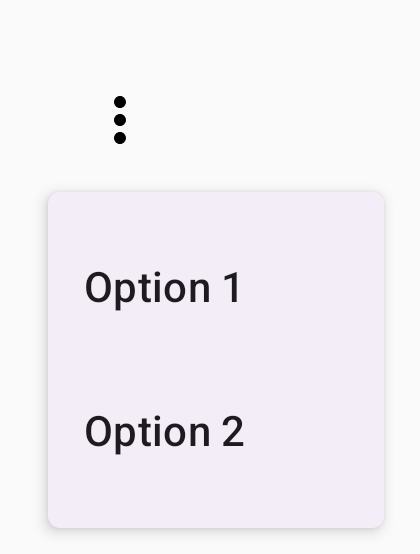
以下代码段展示了一个最简单的 DropdownMenu 实现:
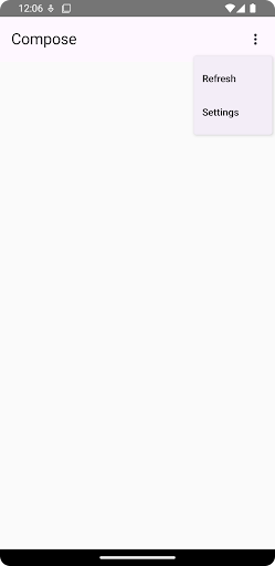
@Composable fun MinimalDropdownMenu() { var expanded by remember { mutableStateOf(false) } Box( modifier = Modifier .padding(16.dp) ) { IconButton(onClick = { expanded = !expanded }) { Icon(Icons.Default.MoreVert, contentDescription = "More options") } DropdownMenu( expanded = expanded, onDismissRequest = { expanded = false } ) { DropdownMenuItem( text = { Text("Option 1") }, onClick = { /* Do something... */ } ) DropdownMenuItem( text = { Text("Option 2") }, onClick = { /* Do something... */ } ) } } }
代码要点
- 定义包含两个菜单项的基本
DropdownMenu。 expanded参数用于控制菜单的展开或收起状态。onDismissRequest参数定义了在用户关闭菜单时执行的回调。DropdownMenuItem可组合项表示下拉菜单中的可选项目。IconButton会触发菜单的展开和收起。
结果
创建更长的下拉菜单
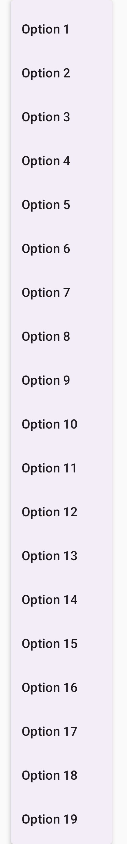
如果所有菜单项无法同时显示,DropdownMenu 默认可滚动。以下代码段创建了一个更长、可滚动的下拉菜单:
@Composable fun LongBasicDropdownMenu() { var expanded by remember { mutableStateOf(false) } // Placeholder list of 100 strings for demonstration val menuItemData = List(100) { "Option ${it + 1}" } Box( modifier = Modifier .padding(16.dp) ) { IconButton(onClick = { expanded = !expanded }) { Icon(Icons.Default.MoreVert, contentDescription = "More options") } DropdownMenu( expanded = expanded, onDismissRequest = { expanded = false } ) { menuItemData.forEach { option -> DropdownMenuItem( text = { Text(option) }, onClick = { /* Do something... */ } ) } } } }
代码要点
- 当
DropdownMenu的内容总高度超过可用空间时,该DropdownMenu可滚动。此代码会创建一个可滚动的DropdownMenu,其中显示 100 个占位项。 forEach循环动态生成DropdownMenuItem可组合项。这些项不是延迟创建的,这意味着所有 100 个下拉菜单项都会创建并存在于合成中。- 点击
IconButton时,会触发DropdownMenu的展开和收起。 - 每个
DropdownMenuItem中的onClicklambda 可让您定义用户选择菜单项时执行的操作。
结果
上述代码段会生成以下可滚动菜单:
创建带有分隔线的较长下拉菜单
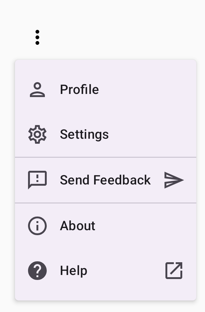
以下代码段展示了下拉菜单的更高级实现。 在此代码段中,菜单项添加了前导和尾随图标,并且分隔线分隔了菜单项组。
@Composable fun DropdownMenuWithDetails() { var expanded by remember { mutableStateOf(false) } Box( modifier = Modifier .fillMaxWidth() .padding(16.dp) ) { IconButton(onClick = { expanded = !expanded }) { Icon(Icons.Default.MoreVert, contentDescription = "More options") } DropdownMenu( expanded = expanded, onDismissRequest = { expanded = false } ) { // First section DropdownMenuItem( text = { Text("Profile") }, leadingIcon = { Icon(Icons.Outlined.Person, contentDescription = null) }, onClick = { /* Do something... */ } ) DropdownMenuItem( text = { Text("Settings") }, leadingIcon = { Icon(Icons.Outlined.Settings, contentDescription = null) }, onClick = { /* Do something... */ } ) HorizontalDivider() // Second section DropdownMenuItem( text = { Text("Send Feedback") }, leadingIcon = { Icon(Icons.Outlined.Feedback, contentDescription = null) }, trailingIcon = { Icon(Icons.AutoMirrored.Outlined.Send, contentDescription = null) }, onClick = { /* Do something... */ } ) HorizontalDivider() // Third section DropdownMenuItem( text = { Text("About") }, leadingIcon = { Icon(Icons.Outlined.Info, contentDescription = null) }, onClick = { /* Do something... */ } ) DropdownMenuItem( text = { Text("Help") }, leadingIcon = { Icon(Icons.AutoMirrored.Outlined.Help, contentDescription = null) }, trailingIcon = { Icon(Icons.AutoMirrored.Outlined.OpenInNew, contentDescription = null) }, onClick = { /* Do something... */ } ) } } }
此代码在 Box 中定义了 DropdownMenu。
代码要点
leadingIcon和trailingIcon参数用于向DropdownMenuItem的开头和结尾添加图标。IconButton会触发菜单的展开。DropdownMenu包含多个DropdownMenuItem可组合项,每个可组合项都表示一个可选择的操作。HorizontalDivider可组合函数会插入一条水平线来分隔菜单项组。
结果
上述代码段会生成一个带有图标和分隔线的下拉菜单:
其他资源
- Material Design:菜单