Organiza tus páginas con colecciones
Guarda y categoriza el contenido según tus preferencias.
Un botón de selección permite que el usuario seleccione una opción de un conjunto de opciones. Usa un botón de selección cuando solo se pueda seleccionar un elemento de una lista. Si los usuarios deben seleccionar más de un elemento, usa un interruptor en su lugar.
Figura 1: Un par de botones de selección con una opción seleccionada.
Superficie de la API
Usa el elemento RadioButton componible para enumerar las opciones disponibles. Encapsula cada opción RadioButton y su etiqueta dentro de un componente Row para agruparlas.
RadioButton incluye los siguientes parámetros clave:
selected: Indica si el botón de selección está seleccionado.
onClick: Es una función lambda que ejecuta tu app cuando el usuario hace clic en el botón de opción. Si es null, el usuario no puede interactuar directamente con el botón de selección.
enabled: Controla si el botón de selección está habilitado o inhabilitado. Los usuarios no pueden interactuar con los botones de radio inhabilitados.
interactionSource: Te permite observar el estado de interacción del botón, por ejemplo, si está presionado, si el mouse se encuentra sobre él o si está enfocado.
Cómo crear un botón de opción básico
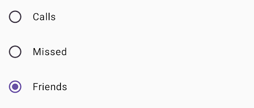
El siguiente fragmento de código renderiza una lista de botones de selección dentro de un Column:
@ComposablefunRadioButtonSingleSelection(modifier:Modifier=Modifier){valradioOptions=listOf("Calls","Missed","Friends")val(selectedOption,onOptionSelected)=remember{mutableStateOf(radioOptions[0])}// Note that Modifier.selectableGroup() is essential to ensure correct accessibility behaviorColumn(modifier.selectableGroup()){radioOptions.forEach{text->
Row(Modifier.fillMaxWidth().height(56.dp).selectable(selected=(text==selectedOption),onClick={onOptionSelected(text)},role=Role.RadioButton).padding(horizontal=16.dp),verticalAlignment=Alignment.CenterVertically){RadioButton(selected=(text==selectedOption),onClick=null// null recommended for accessibility with screen readers)Text(text=text,style=MaterialTheme.typography.bodyLarge,modifier=Modifier.padding(start=16.dp))}}}}
radioOptions representa las etiquetas de los botones de selección.
La función de componibilidad remember crea una variable de estado selectedOption y una función para actualizar ese estado llamada onOptionSelected. Este estado contiene la opción del botón de selección seleccionada.
mutableStateOf(radioOptions[0]) inicializa el estado en el primer elemento de la lista. “Llamadas” es el primer elemento, por lo que es el botón de selección que se selecciona de forma predeterminada.
Modifier.selectableGroup() garantiza el comportamiento de accesibilidad adecuado para los lectores de pantalla. Informa al sistema que los elementos dentro de este Column forman parte de un grupo seleccionable, lo que permite una compatibilidad adecuada con el lector de pantalla.
Modifier.selectable() hace que todo el Row actúe como un solo elemento seleccionable.
selected indica si el Row actual está seleccionado según el estado de selectedOption.
La función lambda onClick actualiza el estado selectedOption a la opción en la que se hizo clic cuando se hace clic en Row.
role = Role.RadioButton informa a los servicios de accesibilidad que Row funciona como un botón de selección.
RadioButton(...) crea el elemento RadioButton componible.
El onClick = null en el RadioButton mejora la accesibilidad. Esto evita que el botón de selección controle el evento de clic directamente y permite que el modificador selectable de Row administre el estado de selección y el comportamiento de accesibilidad.
Resultado
Figura 2: Tres botones de selección con la opción "Amigos" seleccionada.
El contenido y las muestras de código que aparecen en esta página están sujetas a las licencias que se describen en la Licencia de Contenido. Java y OpenJDK son marcas registradas de Oracle o sus afiliados.
Última actualización: 2025-08-23 (UTC)
[null,null,["Última actualización: 2025-08-23 (UTC)"],[],[],null,["# Radio button\n\nA [radio button](https://m3.material.io/components/radio-button/overview) lets a user select an option from a set of\noptions. You use a radio button when only one item can be selected from a\nlist. If users need to select more than one item, use a [switch](https://m3.material.io/components/switch/overview)\ninstead.\n**Figure 1.** A pair of radio buttons with one option selected.\n\nAPI surface\n-----------\n\nUse the [`RadioButton`](/reference/kotlin/androidx/compose/material3/package-summary#RadioButton(kotlin.Boolean,kotlin.Function0,androidx.compose.ui.Modifier,kotlin.Boolean,androidx.compose.material3.RadioButtonColors,androidx.compose.foundation.interaction.MutableInteractionSource)) composable to list the available options. Wrap each\n`RadioButton` option and its label inside a `Row` component to group them\ntogether.\n\n`RadioButton` includes the following key parameters:\n\n- `selected`: Indicates whether the radio button is selected.\n- `onClick`: A lambda function that your app executes when the user clicks the radio button. If this is `null`, the user can't interact directly with the radio button.\n- `enabled`: Controls whether the radio button is enabled or disabled. Users can't interact with disabled radio buttons.\n- `interactionSource`: Lets you observe the interaction state of the button, for example, whether it's pressed, hovered, or focused.\n\nCreate a basic radio button\n---------------------------\n\nThe following code snippet renders a list of radio buttons within a `Column`:\n\n\n```kotlin\n@Composable\nfun RadioButtonSingleSelection(modifier: Modifier = Modifier) {\n val radioOptions = listOf(\"Calls\", \"Missed\", \"Friends\")\n val (selectedOption, onOptionSelected) = remember { mutableStateOf(radioOptions[0]) }\n // Note that Modifier.selectableGroup() is essential to ensure correct accessibility behavior\n Column(modifier.selectableGroup()) {\n radioOptions.forEach { text -\u003e\n Row(\n Modifier\n .fillMaxWidth()\n .height(56.dp)\n .selectable(\n selected = (text == selectedOption),\n onClick = { onOptionSelected(text) },\n role = Role.RadioButton\n )\n .padding(horizontal = 16.dp),\n verticalAlignment = Alignment.CenterVertically\n ) {\n RadioButton(\n selected = (text == selectedOption),\n onClick = null // null recommended for accessibility with screen readers\n )\n Text(\n text = text,\n style = MaterialTheme.typography.bodyLarge,\n modifier = Modifier.padding(start = 16.dp)\n )\n }\n }\n }\n}https://github.com/android/snippets/blob/dd30aee903e8c247786c064faab1a9ca8d10b46e/compose/snippets/src/main/java/com/example/compose/snippets/components/RadioButton.kt#L39-L70\n```\n\n\u003cbr /\u003e\n\n### Key points about the code\n\n- `radioOptions` represents the labels for the radio buttons.\n- The `remember` composable function creates a state variable `selectedOption` and a function to update that state called `onOptionSelected`. This state holds the selected radio button option.\n - `mutableStateOf(radioOptions[0])` initializes the state to the first item in the list. \"Calls\" is the first item, so it's the radio button selected by default.\n- [`Modifier.selectableGroup()`](/reference/kotlin/androidx/compose/ui/Modifier#(androidx.compose.ui.Modifier).selectableGroup()) ensures proper accessibility behavior for screen readers. It informs the system that the elements within this `Column` are part of a selectable group, which enables proper screen reader support.\n- [`Modifier.selectable()`](/reference/kotlin/androidx/compose/ui/Modifier#(androidx.compose.ui.Modifier).selectable(kotlin.Boolean,kotlin.Boolean,androidx.compose.ui.semantics.Role,kotlin.Function0)) makes the entire `Row` act as a single selectable item.\n - `selected` indicates whether the current `Row` is selected based on the `selectedOption` state.\n - The `onClick` lambda function updates the `selectedOption` state to the clicked option when the `Row` is clicked.\n - `role = Role.RadioButton` informs accessibility services that the `Row` functions as a radio button.\n- `RadioButton(...)` creates the `RadioButton` composable.\n - `onClick = null` on the `RadioButton` improves accessibility. This prevents the radio button from handling the click event directly, and allows the `Row`'s `selectable` modifier to manage the selection state and accessibility behavior.\n\n### Result\n\n**Figure 2.** Three radio buttons with the \"Friends\" option selected.\n\nAdditional resources\n--------------------\n\n- Material Design: [Buttons](https://m3.material.io/components/buttons/overview)"]]