Restez organisé à l'aide des collections
Enregistrez et classez les contenus selon vos préférences.
Une case d'option permet à un utilisateur de sélectionner une option parmi un ensemble d'options. Vous utilisez une case d'option lorsqu'un seul élément peut être sélectionné dans une liste. Si les utilisateurs doivent sélectionner plusieurs éléments, utilisez plutôt un commutateur.
Figure 1. Paire de cases d'option avec une option sélectionnée.
Surface d'API
Utilisez le composable RadioButton pour lister les options disponibles. Encapsulez chaque option RadioButton et son libellé dans un composant Row pour les regrouper.
RadioButton inclut les paramètres clés suivants :
selected : indique si la case d'option est sélectionnée.
onClick : fonction lambda que votre application exécute lorsque l'utilisateur clique sur le bouton radio. Si la valeur est null, l'utilisateur ne peut pas interagir directement avec le bouton radio.
enabled : contrôle si la case d'option est activée ou désactivée. Les utilisateurs ne peuvent pas interagir avec les cases d'option désactivées.
interactionSource : vous permet d'observer l'état d'interaction du bouton, par exemple s'il est enfoncé, survolé ou sélectionné.
Créer un bouton radio de base
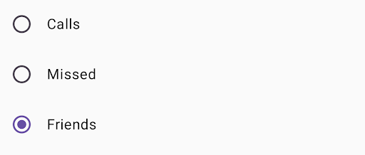
L'extrait de code suivant affiche une liste de boutons radio dans un Column :
@ComposablefunRadioButtonSingleSelection(modifier:Modifier=Modifier){valradioOptions=listOf("Calls","Missed","Friends")val(selectedOption,onOptionSelected)=remember{mutableStateOf(radioOptions[0])}// Note that Modifier.selectableGroup() is essential to ensure correct accessibility behaviorColumn(modifier.selectableGroup()){radioOptions.forEach{text->
Row(Modifier.fillMaxWidth().height(56.dp).selectable(selected=(text==selectedOption),onClick={onOptionSelected(text)},role=Role.RadioButton).padding(horizontal=16.dp),verticalAlignment=Alignment.CenterVertically){RadioButton(selected=(text==selectedOption),onClick=null// null recommended for accessibility with screen readers)Text(text=text,style=MaterialTheme.typography.bodyLarge,modifier=Modifier.padding(start=16.dp))}}}}
radioOptions représente les libellés des boutons radio.
La fonction composable remember crée une variable d'état selectedOption et une fonction permettant de mettre à jour cet état, appelée onOptionSelected. Cet état contient l'option de bouton radio sélectionnée.
mutableStateOf(radioOptions[0]) initialise l'état sur le premier élément de la liste. "Appels" est le premier élément. La case d'option correspondante est donc sélectionnée par défaut.
Modifier.selectableGroup() garantit un comportement d'accessibilité approprié pour les lecteurs d'écran. Il indique au système que les éléments de ce Column font partie d'un groupe sélectionnable, ce qui permet une prise en charge correcte du lecteur d'écran.
Modifier.selectable() permet à l'ensemble de Row d'agir comme un seul élément sélectionnable.
selected indique si le Row actuel est sélectionné en fonction de l'état selectedOption.
La fonction lambda onClick met à jour l'état selectedOption sur l'option sélectionnée lorsque l'utilisateur clique sur Row.
role = Role.RadioButton informe les services d'accessibilité que Row fonctionne comme une case d'option.
RadioButton(...) crée le composable RadioButton.
onClick = null sur RadioButton améliore l'accessibilité. Cela empêche la case d'option de gérer directement l'événement de clic et permet au modificateur selectable de selectable de gérer l'état de sélection et le comportement d'accessibilité.Row
Résultat
Figure 2. Trois cases d'option avec l'option "Amis" sélectionnée.
Le contenu et les exemples de code de cette page sont soumis aux licences décrites dans la Licence de contenu. Java et OpenJDK sont des marques ou des marques déposées d'Oracle et/ou de ses sociétés affiliées.
Dernière mise à jour le 2025/08/23 (UTC).
[null,null,["Dernière mise à jour le 2025/08/23 (UTC)."],[],[],null,["# Radio button\n\nA [radio button](https://m3.material.io/components/radio-button/overview) lets a user select an option from a set of\noptions. You use a radio button when only one item can be selected from a\nlist. If users need to select more than one item, use a [switch](https://m3.material.io/components/switch/overview)\ninstead.\n**Figure 1.** A pair of radio buttons with one option selected.\n\nAPI surface\n-----------\n\nUse the [`RadioButton`](/reference/kotlin/androidx/compose/material3/package-summary#RadioButton(kotlin.Boolean,kotlin.Function0,androidx.compose.ui.Modifier,kotlin.Boolean,androidx.compose.material3.RadioButtonColors,androidx.compose.foundation.interaction.MutableInteractionSource)) composable to list the available options. Wrap each\n`RadioButton` option and its label inside a `Row` component to group them\ntogether.\n\n`RadioButton` includes the following key parameters:\n\n- `selected`: Indicates whether the radio button is selected.\n- `onClick`: A lambda function that your app executes when the user clicks the radio button. If this is `null`, the user can't interact directly with the radio button.\n- `enabled`: Controls whether the radio button is enabled or disabled. Users can't interact with disabled radio buttons.\n- `interactionSource`: Lets you observe the interaction state of the button, for example, whether it's pressed, hovered, or focused.\n\nCreate a basic radio button\n---------------------------\n\nThe following code snippet renders a list of radio buttons within a `Column`:\n\n\n```kotlin\n@Composable\nfun RadioButtonSingleSelection(modifier: Modifier = Modifier) {\n val radioOptions = listOf(\"Calls\", \"Missed\", \"Friends\")\n val (selectedOption, onOptionSelected) = remember { mutableStateOf(radioOptions[0]) }\n // Note that Modifier.selectableGroup() is essential to ensure correct accessibility behavior\n Column(modifier.selectableGroup()) {\n radioOptions.forEach { text -\u003e\n Row(\n Modifier\n .fillMaxWidth()\n .height(56.dp)\n .selectable(\n selected = (text == selectedOption),\n onClick = { onOptionSelected(text) },\n role = Role.RadioButton\n )\n .padding(horizontal = 16.dp),\n verticalAlignment = Alignment.CenterVertically\n ) {\n RadioButton(\n selected = (text == selectedOption),\n onClick = null // null recommended for accessibility with screen readers\n )\n Text(\n text = text,\n style = MaterialTheme.typography.bodyLarge,\n modifier = Modifier.padding(start = 16.dp)\n )\n }\n }\n }\n}https://github.com/android/snippets/blob/dd30aee903e8c247786c064faab1a9ca8d10b46e/compose/snippets/src/main/java/com/example/compose/snippets/components/RadioButton.kt#L39-L70\n```\n\n\u003cbr /\u003e\n\n### Key points about the code\n\n- `radioOptions` represents the labels for the radio buttons.\n- The `remember` composable function creates a state variable `selectedOption` and a function to update that state called `onOptionSelected`. This state holds the selected radio button option.\n - `mutableStateOf(radioOptions[0])` initializes the state to the first item in the list. \"Calls\" is the first item, so it's the radio button selected by default.\n- [`Modifier.selectableGroup()`](/reference/kotlin/androidx/compose/ui/Modifier#(androidx.compose.ui.Modifier).selectableGroup()) ensures proper accessibility behavior for screen readers. It informs the system that the elements within this `Column` are part of a selectable group, which enables proper screen reader support.\n- [`Modifier.selectable()`](/reference/kotlin/androidx/compose/ui/Modifier#(androidx.compose.ui.Modifier).selectable(kotlin.Boolean,kotlin.Boolean,androidx.compose.ui.semantics.Role,kotlin.Function0)) makes the entire `Row` act as a single selectable item.\n - `selected` indicates whether the current `Row` is selected based on the `selectedOption` state.\n - The `onClick` lambda function updates the `selectedOption` state to the clicked option when the `Row` is clicked.\n - `role = Role.RadioButton` informs accessibility services that the `Row` functions as a radio button.\n- `RadioButton(...)` creates the `RadioButton` composable.\n - `onClick = null` on the `RadioButton` improves accessibility. This prevents the radio button from handling the click event directly, and allows the `Row`'s `selectable` modifier to manage the selection state and accessibility behavior.\n\n### Result\n\n**Figure 2.** Three radio buttons with the \"Friends\" option selected.\n\nAdditional resources\n--------------------\n\n- Material Design: [Buttons](https://m3.material.io/components/buttons/overview)"]]