
Nút chọn cho phép người dùng chọn một lựa chọn trong một tập hợp các lựa chọn. Bạn sử dụng nút chọn khi chỉ có thể chọn một mục trong danh sách. Nếu người dùng cần chọn nhiều mục, hãy sử dụng công tắc thay thế.

Nền tảng API
Sử dụng thành phần kết hợp RadioButton để liệt kê các lựa chọn có sẵn. Bọc từng lựa chọn RadioButton và nhãn của lựa chọn đó bên trong một thành phần Row để nhóm chúng lại với nhau.
RadioButton bao gồm các thông số chính sau:
selected: Cho biết liệu nút chọn có được chọn hay không.onClick: Một hàm lambda mà ứng dụng của bạn thực thi khi người dùng nhấp vào nút chọn. Nếu đây lànull, người dùng sẽ không thể tương tác trực tiếp với nút chọn.enabled: Kiểm soát xem nút chọn có được bật hay tắt. Người dùng không thể tương tác với các nút chọn bị vô hiệu hoá.interactionSource: Cho phép bạn quan sát trạng thái tương tác của nút, ví dụ: liệu nút có được nhấn, di chuột hoặc lấy làm tâm điểm hay không.
Tạo một nút chọn cơ bản
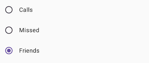
Đoạn mã sau đây hiển thị một danh sách các nút chọn trong Column:
@Composable fun RadioButtonSingleSelection(modifier: Modifier = Modifier) { val radioOptions = listOf("Calls", "Missed", "Friends") val (selectedOption, onOptionSelected) = remember { mutableStateOf(radioOptions[0]) } // Note that Modifier.selectableGroup() is essential to ensure correct accessibility behavior Column(modifier.selectableGroup()) { radioOptions.forEach { text -> Row( Modifier .fillMaxWidth() .height(56.dp) .selectable( selected = (text == selectedOption), onClick = { onOptionSelected(text) }, role = Role.RadioButton ) .padding(horizontal = 16.dp), verticalAlignment = Alignment.CenterVertically ) { RadioButton( selected = (text == selectedOption), onClick = null // null recommended for accessibility with screen readers ) Text( text = text, style = MaterialTheme.typography.bodyLarge, modifier = Modifier.padding(start = 16.dp) ) } } } }
Các điểm chính về mã
radioOptionsbiểu thị nhãn cho các nút chọn.- Hàm có khả năng kết hợp
remembertạo ra một biến trạng tháiselectedOptionvà một hàm để cập nhật trạng thái đó có tên làonOptionSelected. Trạng thái này giữ lựa chọn nút chọn đã chọn.mutableStateOf(radioOptions[0])khởi chạy trạng thái thành mục đầu tiên trong danh sách. "Cuộc gọi" là mục đầu tiên, nên đây là nút chọn được chọn theo mặc định.
Modifier.selectableGroup()đảm bảo hành vi hỗ trợ tiếp cận phù hợp cho trình đọc màn hình. Thuộc tính này thông báo cho hệ thống rằng các phần tử trongColumnnày là một phần của nhóm có thể chọn, giúp hỗ trợ trình đọc màn hình đúng cách.Modifier.selectable()làm cho toàn bộRowhoạt động như một mục duy nhất có thể chọn.selectedcho biết liệuRowhiện tại có được chọn hay không dựa trên trạng tháiselectedOption.- Hàm lambda
onClickcập nhật trạng tháiselectedOptionthành lựa chọn đã nhấp khi người dùng nhấp vàoRow. role = Role.RadioButtonthông báo cho các dịch vụ hỗ trợ tiếp cận rằngRowhoạt động như một nút chọn.
RadioButton(...)tạo thành phần kết hợpRadioButton.onClick = nulltrênRadioButtongiúp cải thiện khả năng hỗ trợ tiếp cận. Việc này ngăn nút chọn xử lý trực tiếp sự kiện nhấp và cho phép đối tượng sửa đổiselectablecủaRowquản lý trạng thái lựa chọn và hành vi hỗ trợ tiếp cận.
Kết quả
Tài nguyên khác
- Material Design: Nút