Tetap teratur dengan koleksi
Simpan dan kategorikan konten berdasarkan preferensi Anda.
Tombol pilihan memungkinkan pengguna memilih opsi dari serangkaian opsi. Anda menggunakan tombol pilihan saat hanya satu item yang dapat dipilih dari
daftar. Jika pengguna perlu memilih lebih dari satu item, gunakan tombol geser sebagai gantinya.
Gambar 1. Sepasang tombol pilihan dengan satu opsi dipilih.
Platform API
Gunakan composable RadioButton untuk mencantumkan opsi yang tersedia. Gabungkan setiap opsi
RadioButton dan labelnya di dalam komponen Row untuk mengelompokkannya
bersama.
RadioButton mencakup parameter utama berikut:
selected: Menunjukkan apakah tombol pilihan dipilih.
onClick: Fungsi lambda yang dieksekusi aplikasi Anda saat pengguna mengklik tombol
radio. Jika ini adalah null, pengguna tidak dapat berinteraksi langsung dengan tombol pilihan.
enabled: Mengontrol apakah tombol pilihan diaktifkan atau dinonaktifkan. Pengguna tidak dapat berinteraksi dengan tombol pilihan yang dinonaktifkan.
interactionSource: Memungkinkan Anda mengamati status interaksi
tombol, misalnya, apakah tombol ditekan, diarahkan kursor, atau difokuskan.
Membuat tombol pilihan dasar
Cuplikan kode berikut merender daftar tombol pilihan dalam Column:
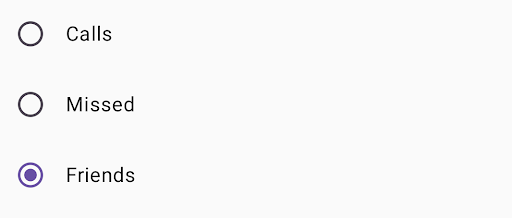
@ComposablefunRadioButtonSingleSelection(modifier:Modifier=Modifier){valradioOptions=listOf("Calls","Missed","Friends")val(selectedOption,onOptionSelected)=remember{mutableStateOf(radioOptions[0])}// Note that Modifier.selectableGroup() is essential to ensure correct accessibility behaviorColumn(modifier.selectableGroup()){radioOptions.forEach{text->
Row(Modifier.fillMaxWidth().height(56.dp).selectable(selected=(text==selectedOption),onClick={onOptionSelected(text)},role=Role.RadioButton).padding(horizontal=16.dp),verticalAlignment=Alignment.CenterVertically){RadioButton(selected=(text==selectedOption),onClick=null// null recommended for accessibility with screen readers)Text(text=text,style=MaterialTheme.typography.bodyLarge,modifier=Modifier.padding(start=16.dp))}}}}
Fungsi composable remember membuat variabel status selectedOption
dan fungsi untuk mengupdate status tersebut yang disebut onOptionSelected. Status ini menyimpan opsi tombol pilihan yang dipilih.
mutableStateOf(radioOptions[0]) menginisialisasi status ke item pertama
dalam daftar. "Panggilan" adalah item pertama, jadi tombol pilihan tersebut dipilih secara default.
Modifier.selectableGroup() memastikan perilaku aksesibilitas yang tepat untuk
pembaca layar. Atribut ini memberi tahu sistem bahwa elemen dalam Column ini adalah bagian dari grup yang dapat dipilih, yang memungkinkan dukungan pembaca layar yang tepat.
Modifier.selectable() membuat seluruh Row bertindak sebagai satu item yang dapat dipilih.
selected menunjukkan apakah Row saat ini dipilih berdasarkan status
selectedOption.
Fungsi lambda onClick mengupdate status selectedOption ke opsi yang diklik saat Row diklik.
role = Role.RadioButton memberi tahu layanan aksesibilitas bahwa Row
berfungsi sebagai tombol pilihan.
RadioButton(...) membuat composable RadioButton.
onClick = null pada RadioButton meningkatkan aksesibilitas. Hal ini mencegah
tombol pilihan menangani peristiwa klik secara langsung, dan memungkinkan pengubah
Row's selectable mengelola status pilihan dan perilaku
aksesibilitas.
Hasil
Gambar 2. Tiga tombol pilihan dengan opsi "Teman" dipilih.
Konten dan contoh kode di halaman ini tunduk kepada lisensi yang dijelaskan dalam Lisensi Konten. Java dan OpenJDK adalah merek dagang atau merek dagang terdaftar dari Oracle dan/atau afiliasinya.
Terakhir diperbarui pada 2025-08-23 UTC.
[null,null,["Terakhir diperbarui pada 2025-08-23 UTC."],[],[],null,["# Radio button\n\nA [radio button](https://m3.material.io/components/radio-button/overview) lets a user select an option from a set of\noptions. You use a radio button when only one item can be selected from a\nlist. If users need to select more than one item, use a [switch](https://m3.material.io/components/switch/overview)\ninstead.\n**Figure 1.** A pair of radio buttons with one option selected.\n\nAPI surface\n-----------\n\nUse the [`RadioButton`](/reference/kotlin/androidx/compose/material3/package-summary#RadioButton(kotlin.Boolean,kotlin.Function0,androidx.compose.ui.Modifier,kotlin.Boolean,androidx.compose.material3.RadioButtonColors,androidx.compose.foundation.interaction.MutableInteractionSource)) composable to list the available options. Wrap each\n`RadioButton` option and its label inside a `Row` component to group them\ntogether.\n\n`RadioButton` includes the following key parameters:\n\n- `selected`: Indicates whether the radio button is selected.\n- `onClick`: A lambda function that your app executes when the user clicks the radio button. If this is `null`, the user can't interact directly with the radio button.\n- `enabled`: Controls whether the radio button is enabled or disabled. Users can't interact with disabled radio buttons.\n- `interactionSource`: Lets you observe the interaction state of the button, for example, whether it's pressed, hovered, or focused.\n\nCreate a basic radio button\n---------------------------\n\nThe following code snippet renders a list of radio buttons within a `Column`:\n\n\n```kotlin\n@Composable\nfun RadioButtonSingleSelection(modifier: Modifier = Modifier) {\n val radioOptions = listOf(\"Calls\", \"Missed\", \"Friends\")\n val (selectedOption, onOptionSelected) = remember { mutableStateOf(radioOptions[0]) }\n // Note that Modifier.selectableGroup() is essential to ensure correct accessibility behavior\n Column(modifier.selectableGroup()) {\n radioOptions.forEach { text -\u003e\n Row(\n Modifier\n .fillMaxWidth()\n .height(56.dp)\n .selectable(\n selected = (text == selectedOption),\n onClick = { onOptionSelected(text) },\n role = Role.RadioButton\n )\n .padding(horizontal = 16.dp),\n verticalAlignment = Alignment.CenterVertically\n ) {\n RadioButton(\n selected = (text == selectedOption),\n onClick = null // null recommended for accessibility with screen readers\n )\n Text(\n text = text,\n style = MaterialTheme.typography.bodyLarge,\n modifier = Modifier.padding(start = 16.dp)\n )\n }\n }\n }\n}https://github.com/android/snippets/blob/dd30aee903e8c247786c064faab1a9ca8d10b46e/compose/snippets/src/main/java/com/example/compose/snippets/components/RadioButton.kt#L39-L70\n```\n\n\u003cbr /\u003e\n\n### Key points about the code\n\n- `radioOptions` represents the labels for the radio buttons.\n- The `remember` composable function creates a state variable `selectedOption` and a function to update that state called `onOptionSelected`. This state holds the selected radio button option.\n - `mutableStateOf(radioOptions[0])` initializes the state to the first item in the list. \"Calls\" is the first item, so it's the radio button selected by default.\n- [`Modifier.selectableGroup()`](/reference/kotlin/androidx/compose/ui/Modifier#(androidx.compose.ui.Modifier).selectableGroup()) ensures proper accessibility behavior for screen readers. It informs the system that the elements within this `Column` are part of a selectable group, which enables proper screen reader support.\n- [`Modifier.selectable()`](/reference/kotlin/androidx/compose/ui/Modifier#(androidx.compose.ui.Modifier).selectable(kotlin.Boolean,kotlin.Boolean,androidx.compose.ui.semantics.Role,kotlin.Function0)) makes the entire `Row` act as a single selectable item.\n - `selected` indicates whether the current `Row` is selected based on the `selectedOption` state.\n - The `onClick` lambda function updates the `selectedOption` state to the clicked option when the `Row` is clicked.\n - `role = Role.RadioButton` informs accessibility services that the `Row` functions as a radio button.\n- `RadioButton(...)` creates the `RadioButton` composable.\n - `onClick = null` on the `RadioButton` improves accessibility. This prevents the radio button from handling the click event directly, and allows the `Row`'s `selectable` modifier to manage the selection state and accessibility behavior.\n\n### Result\n\n**Figure 2.** Three radio buttons with the \"Friends\" option selected.\n\nAdditional resources\n--------------------\n\n- Material Design: [Buttons](https://m3.material.io/components/buttons/overview)"]]