Scaffold
W Material Design szkielet to podstawowa struktura, która zapewnia standardową platformę dla złożonych interfejsów. Łączy różne części interfejsu, takie jak paski aplikacji i pływające przyciski poleceń, dzięki czemu aplikacje mają spójny wygląd.
Przykład
Kompozycja Scaffold udostępnia prosty interfejs API, którego możesz użyć do
szybkiego złożenia struktury aplikacji zgodnie z wytycznymi Material Design.
Scaffold akceptuje kilka kompozycji jako parametry. Oto niektóre z nich:
topBar: pasek aplikacji u góry ekranu.bottomBar: pasek aplikacji u dołu ekranu.floatingActionButton: przycisk, który unosi się w prawym dolnym rogu ekranu i umożliwia wyświetlanie najważniejszych działań.
Możesz też przekazać treści Scaffold tak jak w przypadku innych kontenerów. Przekazuje PaddingValues do lambdy content, którą należy zastosować do kompozycji głównej treści, aby ograniczyć jej rozmiar.
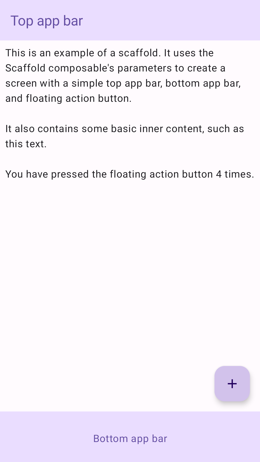
Poniższy przykład pokazuje pełną implementację Scaffold. Zawiera górny pasek aplikacji, dolny pasek aplikacji i pływający przycisk polecenia.
@Composable fun ScaffoldExample() { var presses by remember { mutableIntStateOf(0) } Scaffold( topBar = { TopAppBar( colors = topAppBarColors( containerColor = MaterialTheme.colorScheme.primaryContainer, titleContentColor = MaterialTheme.colorScheme.primary, ), title = { Text("Top app bar") } ) }, bottomBar = { BottomAppBar( containerColor = MaterialTheme.colorScheme.primaryContainer, contentColor = MaterialTheme.colorScheme.primary, ) { Text( modifier = Modifier .fillMaxWidth(), textAlign = TextAlign.Center, text = "Bottom app bar", ) } }, floatingActionButton = { FloatingActionButton(onClick = { presses++ }) { Icon(Icons.Default.Add, contentDescription = "Add") } } ) { innerPadding -> Column( modifier = Modifier .padding(innerPadding), verticalArrangement = Arrangement.spacedBy(16.dp), ) { Text( modifier = Modifier.padding(8.dp), text = """ This is an example of a scaffold. It uses the Scaffold composable's parameters to create a screen with a simple top app bar, bottom app bar, and floating action button. It also contains some basic inner content, such as this text. You have pressed the floating action button $presses times. """.trimIndent(), ) } } }
Ta implementacja wygląda tak: