
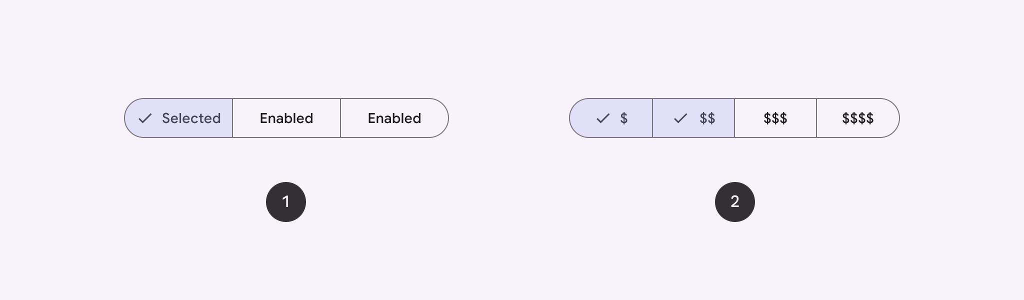
使用分段按钮可让用户从一组并排显示的选项中进行选择。 分段按钮有两种类型:
- 单选按钮:可让用户选择一个选项。
- 多选按钮:可让用户选择 2 到 5 个项目。对于更复杂的选择或超过 5 个选项,请使用微片。
API Surface
使用 SingleChoiceSegmentedButtonRow 和 MultiChoiceSegmentedButtonRow 布局创建分段按钮。这些布局可正确定位和调整 SegmentedButton 的大小,并共享以下关键参数:
space:调整按钮之间的重叠。content:包含分段按钮行的内容,通常是SegmentedButton的序列。
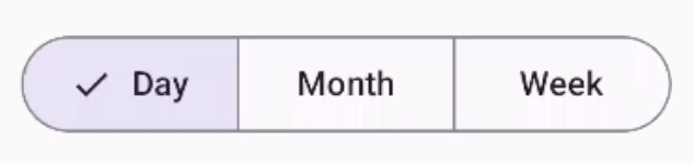
创建单选分段按钮
此示例展示了如何创建单选分段按钮:
@Composable fun SingleChoiceSegmentedButton(modifier: Modifier = Modifier) { var selectedIndex by remember { mutableIntStateOf(0) } val options = listOf("Day", "Month", "Week") SingleChoiceSegmentedButtonRow { options.forEachIndexed { index, label -> SegmentedButton( shape = SegmentedButtonDefaults.itemShape( index = index, count = options.size ), onClick = { selectedIndex = index }, selected = index == selectedIndex, label = { Text(label) } ) } } }
代码要点
- 使用
remember和mutableIntStateOf初始化selectedIndex变量,以跟踪所选按钮的索引。 - 定义表示按钮标签的
options列表。 SingleChoiceSegmentedButtonRow仅允许选择一个按钮。- 在
forEachIndexed循环内,为每个选项创建一个SegmentedButton:shape使用SegmentedButtonDefaults.itemShape根据按钮的索引和选项总数定义按钮的形状。onClick会使用所点击按钮的索引来更新selectedIndex。selected根据selectedIndex设置按钮的选择状态。label使用Text可组合项显示按钮标签。
结果
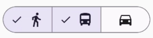
创建多选分段按钮
此示例展示了如何创建带有图标的多选分段按钮,让用户可以选择多个选项:
@Composable fun MultiChoiceSegmentedButton(modifier: Modifier = Modifier) { val selectedOptions = remember { mutableStateListOf(false, false, false) } val options = listOf("Walk", "Ride", "Drive") MultiChoiceSegmentedButtonRow { options.forEachIndexed { index, label -> SegmentedButton( shape = SegmentedButtonDefaults.itemShape( index = index, count = options.size ), checked = selectedOptions[index], onCheckedChange = { selectedOptions[index] = !selectedOptions[index] }, icon = { SegmentedButtonDefaults.Icon(selectedOptions[index]) }, label = { when (label) { "Walk" -> Icon( imageVector = Icons.AutoMirrored.Filled.DirectionsWalk, contentDescription = "Directions Walk" ) "Ride" -> Icon( imageVector = Icons.Default.DirectionsBus, contentDescription = "Directions Bus" ) "Drive" -> Icon( imageVector = Icons.Default.DirectionsCar, contentDescription = "Directions Car" ) } } ) } } }
代码要点
- 该代码使用
remember和mutableStateListOf初始化selectedOptions变量。用于跟踪每个按钮的选中状态。 - 该代码使用
MultiChoiceSegmentedButtonRow来包含按钮。 - 在
forEachIndexed循环内,代码会为每个选项创建一个SegmentedButton:shape根据按钮的索引和选项总数定义按钮的形状。checked根据selectedOptions中的相应值设置按钮的选中状态。- 点击按钮时,
onCheckedChange会切换selectedOptions中相应项的选中状态。 icon根据SegmentedButtonDefaults.Icon和按钮的选中状态显示图标。label使用具有相应图片向量和内容说明的Icon可组合项显示与标签对应的图标。
结果
其他资源
- Material 3:分段按钮