时间选择器通常显示在对话框中。您可以使用相对通用且最简单的对话框实现,也可以实现更灵活的自定义对话框。
如需详细了解对话框(包括如何使用时间选择器状态),请参阅时间选择器指南。
基本示例
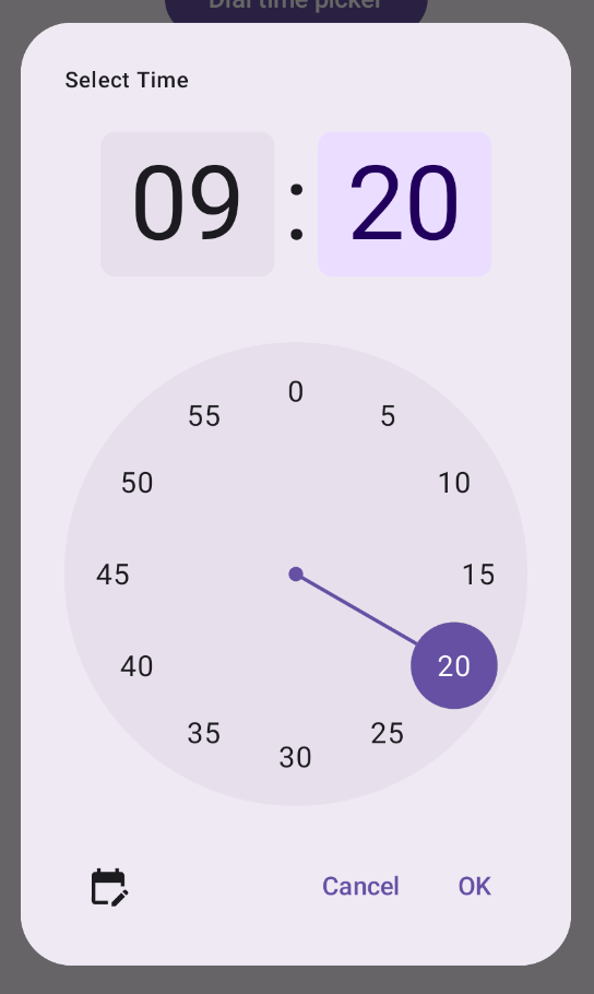
为时间选择器创建对话框的最直接方法是创建一个实现 AlertDialog 的可组合项。以下代码段提供了一个使用此方法创建的相对最简对话框的示例:
@Composable fun DialWithDialogExample( onConfirm: (TimePickerState) -> Unit, onDismiss: () -> Unit, ) { val currentTime = Calendar.getInstance() val timePickerState = rememberTimePickerState( initialHour = currentTime.get(Calendar.HOUR_OF_DAY), initialMinute = currentTime.get(Calendar.MINUTE), is24Hour = true, ) TimePickerDialog( onDismiss = { onDismiss() }, onConfirm = { onConfirm(timePickerState) } ) { TimePicker( state = timePickerState, ) } } @Composable fun TimePickerDialog( onDismiss: () -> Unit, onConfirm: () -> Unit, content: @Composable () -> Unit ) { AlertDialog( onDismissRequest = onDismiss, dismissButton = { TextButton(onClick = { onDismiss() }) { Text("Dismiss") } }, confirmButton = { TextButton(onClick = { onConfirm() }) { Text("OK") } }, text = { content() } ) }
请注意此代码段中的要点:
DialWithDialogExample可组合项将TimePicker封装在对话框中。TimePickerDialog是一个自定义的可组合函数,用于创建具有以下参数的AlertDialog:onDismiss:当用户关闭对话框(通过关闭按钮或返回导航)时调用的函数。onConfirm:用户点击“确定”按钮时调用的函数。content:在对话框中显示时间选择器的可组合项。
AlertDialog包含:- 一个标有“关闭”的关闭按钮。
- 一个标有“确定”的确认按钮。
- 作为
text参数传递的时间选择器内容。
DialWithDialogExample使用当前时间初始化TimePickerState,并将其传递给TimePicker和onConfirm函数。
高级示例
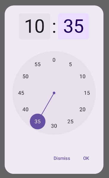
此代码段演示了如何在 Jetpack Compose 中实现可自定义的高级时间选择器对话框。
@Composable fun AdvancedTimePickerExample( onConfirm: (TimePickerState) -> Unit, onDismiss: () -> Unit, ) { val currentTime = Calendar.getInstance() val timePickerState = rememberTimePickerState( initialHour = currentTime.get(Calendar.HOUR_OF_DAY), initialMinute = currentTime.get(Calendar.MINUTE), is24Hour = true, ) /** Determines whether the time picker is dial or input */ var showDial by remember { mutableStateOf(true) } /** The icon used for the icon button that switches from dial to input */ val toggleIcon = if (showDial) { Icons.Filled.EditCalendar } else { Icons.Filled.AccessTime } AdvancedTimePickerDialog( onDismiss = { onDismiss() }, onConfirm = { onConfirm(timePickerState) }, toggle = { IconButton(onClick = { showDial = !showDial }) { Icon( imageVector = toggleIcon, contentDescription = "Time picker type toggle", ) } }, ) { if (showDial) { TimePicker( state = timePickerState, ) } else { TimeInput( state = timePickerState, ) } } } @Composable fun AdvancedTimePickerDialog( title: String = "Select Time", onDismiss: () -> Unit, onConfirm: () -> Unit, toggle: @Composable () -> Unit = {}, content: @Composable () -> Unit, ) { Dialog( onDismissRequest = onDismiss, properties = DialogProperties(usePlatformDefaultWidth = false), ) { Surface( shape = MaterialTheme.shapes.extraLarge, tonalElevation = 6.dp, modifier = Modifier .width(IntrinsicSize.Min) .height(IntrinsicSize.Min) .background( shape = MaterialTheme.shapes.extraLarge, color = MaterialTheme.colorScheme.surface ), ) { Column( modifier = Modifier.padding(24.dp), horizontalAlignment = Alignment.CenterHorizontally ) { Text( modifier = Modifier .fillMaxWidth() .padding(bottom = 20.dp), text = title, style = MaterialTheme.typography.labelMedium ) content() Row( modifier = Modifier .height(40.dp) .fillMaxWidth() ) { toggle() Spacer(modifier = Modifier.weight(1f)) TextButton(onClick = onDismiss) { Text("Cancel") } TextButton(onClick = onConfirm) { Text("OK") } } } } } }
请注意此代码段中的要点:
AdvancedTimePickerExample可组合项会创建一个可自定义的时间选择器对话框。- 它使用
Dialog可组合项,比AlertDialog更灵活。 - 该对话框包含可自定义的标题和一个用于在拨号模式和输入模式之间切换的切换按钮。
Surface会将形状和升降效果应用于对话框,并为宽度和高度设置IntrinsicSize.Min。Column和Row布局提供对话框的结构组件。- 该示例使用
showDial跟踪选择器模式。IconButton可在模式之间切换,并相应地更新图标。- 对话框内容会根据
showDial状态在TimePicker和TimeInput之间切换。
这种高级实现方式提供了一个高度可自定义且可重复使用的时间选择器对话框,可适应应用中的不同使用情形。
此实现如下所示: