
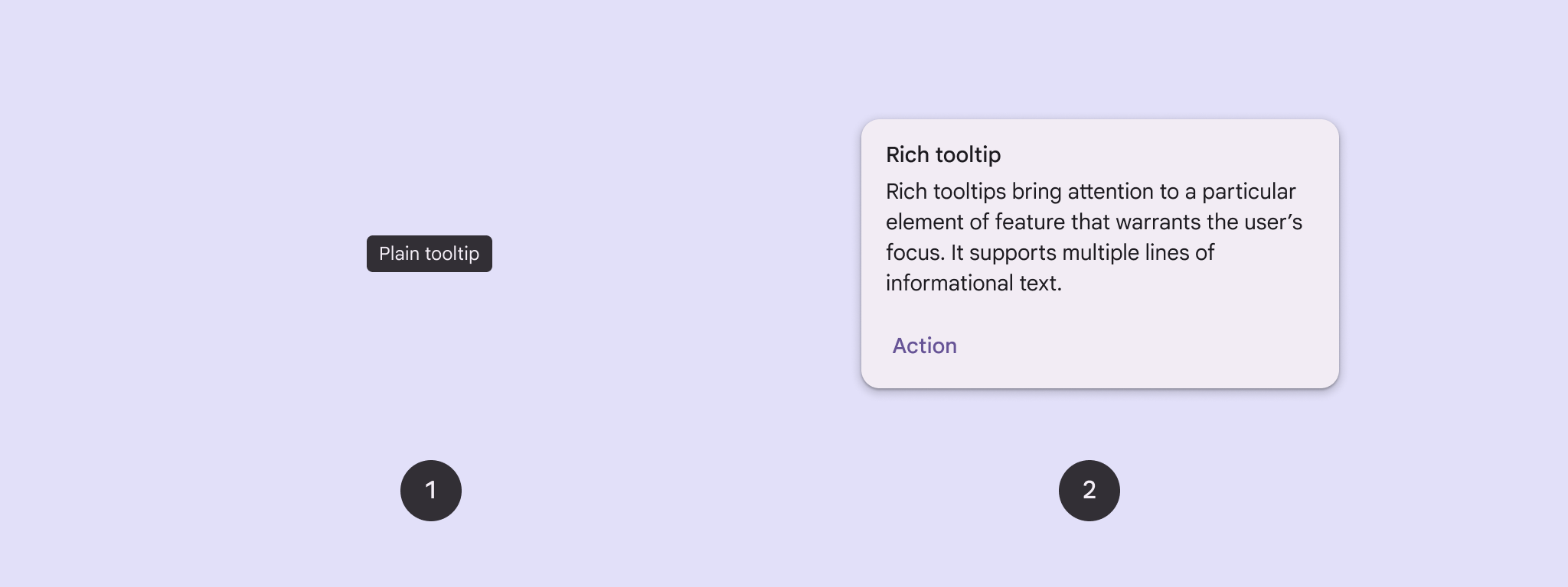
Используйте подсказки для добавления контекста к кнопке или другому элементу пользовательского интерфейса. Существует два типа подсказок:
- Простые подсказки : описывают элементы или действия кнопок-значков.
- Расширенные подсказки : предоставляют более подробную информацию, например, описывают ценность функции. Могут также включать заголовок, ссылку и кнопки (по желанию).
API поверхность
Вы можете использовать компонуемый элемент TooltipBox для реализации всплывающих подсказок в своём приложении. Внешний вид TooltipBox управляется следующими основными параметрами:
-
positionProvider: размещает подсказку относительно содержимого якоря. Обычно используется поставщик позиции по умолчанию изTooltipDefaults, или можно указать свой собственный, если требуется особая логика позиционирования. -
tooltip: компонуемый элемент, содержащий содержимое подсказки. Обычно используются компонуемые элементыPlainTooltipилиRichTooltip.- Используйте
PlainTooltipдля описания элементов или действий кнопок-значков. - Используйте
RichTooltipдля предоставления более подробной информации, например, описания ценности функции. Расширенные подсказки могут включать в себя заголовок, ссылку и кнопки (по желанию).
- Используйте
-
state: держатель состояния, содержащий логику пользовательского интерфейса и состояние элемента для этой подсказки. -
content: Компонуемое содержимое, к которому привязана подсказка.
Отобразить простую подсказку
Используйте простую подсказку для краткого описания элемента пользовательского интерфейса. Этот фрагмент кода отображает простую подсказку поверх кнопки со значком «Добавить в избранное»:
@Composable fun PlainTooltipExample( modifier: Modifier = Modifier, plainTooltipText: String = "Add to favorites" ) { TooltipBox( modifier = modifier, positionProvider = TooltipDefaults.rememberPlainTooltipPositionProvider(), tooltip = { PlainTooltip { Text(plainTooltipText) } }, state = rememberTooltipState() ) { IconButton(onClick = { /* Do something... */ }) { Icon( imageVector = Icons.Filled.Favorite, contentDescription = "Add to favorites" ) } } }
Ключевые моменты кода
-
TooltipBoxсоздает подсказку с текстом «Добавить в избранное».-
TooltipDefaults.rememberPlainTooltipPositionProvider()обеспечивает позиционирование по умолчанию для простых подсказок. -
tooltip— это лямбда-функция, которая определяет содержимое подсказки с помощью составного объектаPlainTooltip. -
Text(plainTooltipText)отображает текст внутри подсказки. -
tooltipStateуправляет состоянием подсказки.
-
-
IconButtonсоздает нажимаемую кнопку со значком.-
Icon(...)отображает значок сердца внутри кнопки. - При взаимодействии пользователя с
IconButton,TooltipBoxотображает подсказку с текстом «Добавить в избранное». В зависимости от устройства, подсказку можно вызвать следующими способами: - Наведение курсора на значок
- Длительное нажатие на значок на мобильном устройстве
-
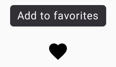
Результат
В этом примере создается простая подсказка поверх значка:
Отобразить расширенную подсказку
Используйте расширенную подсказку для предоставления дополнительного контекста об элементе пользовательского интерфейса. В этом примере создается многострочная расширенная подсказка с заголовком, привязанным к Icon :
@Composable fun RichTooltipExample( modifier: Modifier = Modifier, richTooltipSubheadText: String = "Rich Tooltip", richTooltipText: String = "Rich tooltips support multiple lines of informational text." ) { TooltipBox( modifier = modifier, positionProvider = TooltipDefaults.rememberRichTooltipPositionProvider(), tooltip = { RichTooltip( title = { Text(richTooltipSubheadText) } ) { Text(richTooltipText) } }, state = rememberTooltipState() ) { IconButton(onClick = { /* Icon button's click event */ }) { Icon( imageVector = Icons.Filled.Info, contentDescription = "Show more information" ) } } }
Ключевые моменты кода
-
TooltipBoxобрабатывает прослушиватели событий взаимодействия с пользователем и соответствующим образом обновляетTooltipState. КогдаTooltipStateуказывает на необходимость отображения подсказки, выполняется лямбда-функция tooltip, иTooltipBoxотображаетRichTooltip.TooltipBoxвыступает в качестве якоря и контейнера как для содержимого, так и для подсказки.- В данном случае контент представляет собой компонент
IconButton, который обеспечивает действие при нажатии. При длительном нажатии (на сенсорных устройствах) или наведении курсора (например, указателя мыши) на любую часть контентаTooltipBoxотображается подсказка с дополнительной информацией.
- В данном случае контент представляет собой компонент
- Компонуемый объект
RichTooltipопределяет содержимое подсказки, включая заголовок и основной текст.TooltipDefaults.rememberRichTooltipPositionProvider()предоставляет информацию о позиционировании расширенных подсказок.
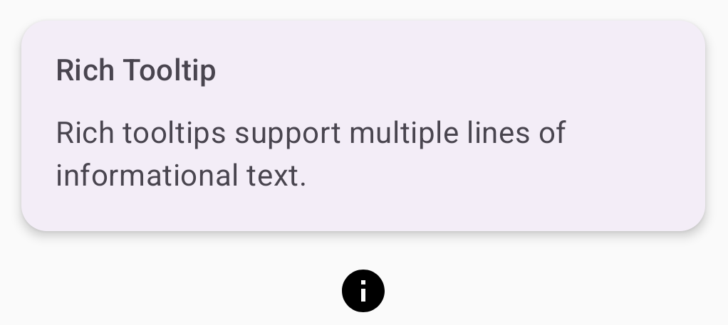
Результат
В этом примере создается расширенная подсказка с заголовком, прикрепленным к значку информации:
Настройте расширенную подсказку
Этот фрагмент кода отображает расширенную подсказку с заголовком, настраиваемыми действиями и настраиваемым курсором (стрелкой), отображаемым поверх кнопки со значком камеры:
@Composable fun AdvancedRichTooltipExample( modifier: Modifier = Modifier, richTooltipSubheadText: String = "Custom Rich Tooltip", richTooltipText: String = "Rich tooltips support multiple lines of informational text.", richTooltipActionText: String = "Dismiss" ) { val tooltipState = rememberTooltipState() val coroutineScope = rememberCoroutineScope() TooltipBox( modifier = modifier, positionProvider = TooltipDefaults.rememberRichTooltipPositionProvider(), tooltip = { RichTooltip( title = { Text(richTooltipSubheadText) }, action = { Row { TextButton(onClick = { coroutineScope.launch { tooltipState.dismiss() } }) { Text(richTooltipActionText) } } }, ) { Text(richTooltipText) } }, state = tooltipState ) { IconButton(onClick = { coroutineScope.launch { tooltipState.show() } }) { Icon( imageVector = Icons.Filled.Camera, contentDescription = "Open camera" ) } } }
Ключевые моменты кода
-
RichToolTipотображает подсказку с заголовком и действием по ее закрытию. - При активации (долгом нажатии или наведении указателя мыши на содержимое
ToolTipBox) подсказка отображается примерно одну секунду. Вы можете скрыть подсказку, коснувшись любого места на экране или нажав кнопку «Скрыть». - При выполнении действия «Отклонить» система запускает сопрограмму для вызова
tooltipState.dismiss. Это проверяет, не заблокировано ли выполнение действия во время отображения подсказки. -
onClick = coroutineScope.launch { tooltipState.show() } }запускает сопрограмму для ручного отображения подсказки с помощьюtooltipState.show. - Параметр
actionпозволяет добавлять в подсказку интерактивные элементы, например кнопку. - Параметр
caretSizeизменяет размер стрелки подсказки.
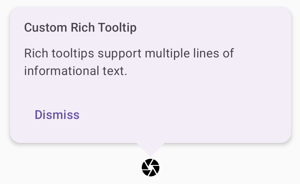
Результат
В этом примере получается следующее:
Дополнительные ресурсы
- Material Design: Подсказки