
本页介绍了如何使用现有的 Glance 组件处理尺寸,并通过 Glance 提供灵活且响应的布局。
使用 Box、Column 和 Row
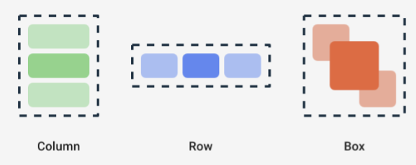
Glance 有三个主要的可组合项布局:
Box:将元素放置在另一个元素之上。它会转换为RelativeLayout。Column:在垂直轴上将元素一个接一个地放置。它会转换为纵向的LinearLayout。Row:在水平轴中将元素一个接一个地放置。它会转换为横向的LinearLayout。
资讯一览支持 Scaffold 对象。将 Column、Row 和 Box 可组合项放置在给定 Scaffold 对象中。
您可以使用修饰符为每种可组合项定义其内容的垂直和水平对齐方式,以及宽度、高度、粗细或内边距约束条件。此外,每个子项都可以定义其修饰符,以更改父项中的间距和放置方式。
以下示例展示了如何创建一个水平均匀分布其子项的 Row,如图 1 所示:
Row(modifier = GlanceModifier.fillMaxWidth().padding(16.dp)) { val modifier = GlanceModifier.defaultWeight() Text("first", modifier) Text("second", modifier) Text("third", modifier) }
Row 会填充最大可用宽度,并且由于每个子项的权重相同,因此它们会平均分配可用空间。您可以定义不同的粗细、大小、内边距或对齐方式,以根据需要调整布局。
使用可滚动布局
提供响应式内容的另一种方法是使其可滚动。LazyColumn 可组合项可以实现这一点。借助此可组合项,您可以定义要在应用微件中可滚动容器内显示的一组项。
以下代码段展示了在 LazyColumn 中定义项的不同方式。
您可以提供项的数量:
// Remember to import Glance Composables // import androidx.glance.appwidget.layout.LazyColumn LazyColumn { items(10) { index: Int -> Text( text = "Item $index", modifier = GlanceModifier.fillMaxWidth() ) } }
提供单个项:
LazyColumn { item { Text("First Item") } item { Text("Second Item") } }
提供项的列表或数组:
LazyColumn { items(peopleNameList) { name -> Text(name) } }
您还可以组合使用上述示例:
LazyColumn { item { Text("Names:") } items(peopleNameList) { name -> Text(name) } // or in case you need the index: itemsIndexed(peopleNameList) { index, person -> Text("$person at index $index") } }
请注意,上一个代码段未指定 itemId。指定 itemId 有助于从 Android 12 开始通过列表和 appWidget 更新来提升性能并保持滚动位置(例如,从列表中添加或移除项时)。以下示例展示了如何指定 itemId:
items(items = peopleList, key = { person -> person.id }) { person -> Text(person.name) }
定义 SizeMode
AppWidget 大小可能会因设备、用户选择或启动器而异,因此请务必提供灵活的布局,如提供灵活的微件布局页面中所述。Glance 通过 SizeMode 定义和 LocalSize 值简化了此过程。以下部分介绍了这三种模式。
SizeMode.Single
SizeMode.Single 是默认模式。它表示仅提供一种类型的内容;也就是说,即使 AppWidget 可用大小发生变化,内容大小也不会发生变化。
class MyAppWidget : GlanceAppWidget() { override val sizeMode = SizeMode.Single override suspend fun provideGlance(context: Context, id: GlanceId) { // ... provideContent { MyContent() } } @Composable private fun MyContent() { // Size will be the minimum size or resizable // size defined in the App Widget metadata val size = LocalSize.current // ... } }
使用此模式时,请确保:
- 基于内容大小,正确定义大小最小值和大小最大值元数据值。
- 内容在预期大小范围内足够灵活。
一般来说,当满足以下任一条件时,您应使用此模式:
a) AppWidget 具有固定大小,或 b) 在调整大小时不会更改其内容。
SizeMode.Responsive
此模式相当于提供响应式布局,可让 GlanceAppWidget 定义一组受特定尺寸限制的响应式布局。对于每个定义的尺寸,系统都会在创建或更新 AppWidget 时创建内容并将其映射到特定尺寸。然后,系统会根据可用尺寸选择最合适的字体。
例如,在目标 AppWidget 中,您可以定义三种尺寸及其内容:
class MyAppWidget : GlanceAppWidget() { companion object { private val SMALL_SQUARE = DpSize(100.dp, 100.dp) private val HORIZONTAL_RECTANGLE = DpSize(250.dp, 100.dp) private val BIG_SQUARE = DpSize(250.dp, 250.dp) } override val sizeMode = SizeMode.Responsive( setOf( SMALL_SQUARE, HORIZONTAL_RECTANGLE, BIG_SQUARE ) ) override suspend fun provideGlance(context: Context, id: GlanceId) { // ... provideContent { MyContent() } } @Composable private fun MyContent() { // Size will be one of the sizes defined above. val size = LocalSize.current Column { if (size.height >= BIG_SQUARE.height) { Text(text = "Where to?", modifier = GlanceModifier.padding(12.dp)) } Row(horizontalAlignment = Alignment.CenterHorizontally) { Button() Button() if (size.width >= HORIZONTAL_RECTANGLE.width) { Button("School") } } if (size.height >= BIG_SQUARE.height) { Text(text = "provided by X") } } } }
在前面的示例中,系统会调用 provideContent 方法三次,并将其映射到定义的大小。
- 在第一次调用中,大小的计算结果为
100x100。内容不包含额外的按钮,也不包含顶部和底部的文字。 - 在第二次调用中,大小的计算结果为
250x100。内容包括额外的按钮,但不包括顶部和底部的文字。 - 在第三次调用中,大小的计算结果为
250x250。内容包括额外的按钮和两条文本。
SizeMode.Responsive 是其他两种模式的组合,可让您在预定义边界内定义响应式内容。通常,此模式的性能更好,并且在调整 AppWidget 大小时可实现更流畅的转换。
下表显示了大小的值,具体取决于 SizeMode 和 AppWidget 的可用大小:
| 可选尺寸 | 105 x 110 | 203 x 112 | 72 x 72 | 203 x 150 |
|---|---|---|---|---|
SizeMode.Single |
110 x 110 | 110 x 110 | 110 x 110 | 110 x 110 |
SizeMode.Exact |
105 x 110 | 203 x 112 | 72 x 72 | 203 x 150 |
SizeMode.Responsive |
80 x 100 | 80 x 100 | 80 x 100 | 150 x 120 |
| * 确切值仅用于演示目的。 |
SizeMode.Exact
SizeMode.Exact 相当于提供确切的布局,每当可用的 AppWidget 大小发生变化时(例如,当用户调整主屏幕中的 AppWidget 大小时),都会请求 GlanceAppWidget 内容。
例如,在目的地微件中,如果可用宽度大于某个值,则可以添加一个额外的按钮。
class MyAppWidget : GlanceAppWidget() { override val sizeMode = SizeMode.Exact override suspend fun provideGlance(context: Context, id: GlanceId) { // ... provideContent { MyContent() } } @Composable private fun MyContent() { // Size will be the size of the AppWidget val size = LocalSize.current Column { Text(text = "Where to?", modifier = GlanceModifier.padding(12.dp)) Row(horizontalAlignment = Alignment.CenterHorizontally) { Button() Button() if (size.width > 250.dp) { Button("School") } } } } }
与其他模式相比,此模式更灵活,但也存在一些限制:
- 每次大小发生变化时,都必须完全重新创建
AppWidget。这可能会导致内容复杂时出现性能问题和界面跳转。 - 可用大小可能会因启动器的实现而异。 例如,如果启动器未提供尺寸列表,则系统会使用尽可能小的尺寸。
- 在 Android 12 之前的设备上,大小计算逻辑可能并非在所有情况下都适用。
一般来说,如果无法使用 SizeMode.Responsive(即无法使用一小组自适应布局),则应使用此模式。
访问资源
使用 LocalContext.current 访问任何 Android 资源,如以下示例所示:
LocalContext.current.getString(R.string.glance_title)
我们建议直接提供资源 ID,以缩减最终 RemoteViews 对象的大小并启用动态资源,例如动态颜色。
可组合项和方法使用“提供程序”(例如 ImageProvider)或使用 GlanceModifier.background(R.color.blue) 等过载方法接受资源。例如:
Column( modifier = GlanceModifier.background(R.color.default_widget_background) ) { /**...*/ } Image( provider = ImageProvider(R.drawable.ic_logo), contentDescription = "My image", )
处理文本
Glance 1.1.0 包含用于设置文本样式的 API。使用 TextStyle 类的 fontSize、fontWeight 或 fontFamily 属性设置文本样式。
fontFamily 支持所有系统字体,如以下示例所示,但不支持应用中的自定义字体:
Text(
    style = TextStyle(
        fontWeight = FontWeight.Bold,
        fontSize = 18.sp,
        fontFamily = FontFamily.Monospace
    ),
    text = "Example Text"
)
添加复合按钮
复合按钮在 Android 12 中引入。Glance 支持以下类型的复合按钮向后兼容:
这些复合按钮各自显示一个可点击的视图,表示“已选中”状态。
var isApplesChecked by remember { mutableStateOf(false) } var isEnabledSwitched by remember { mutableStateOf(false) } var isRadioChecked by remember { mutableIntStateOf(0) } CheckBox( checked = isApplesChecked, onCheckedChange = { isApplesChecked = !isApplesChecked }, text = "Apples" ) Switch( checked = isEnabledSwitched, onCheckedChange = { isEnabledSwitched = !isEnabledSwitched }, text = "Enabled" ) RadioButton( checked = isRadioChecked == 1, onClick = { isRadioChecked = 1 }, text = "Checked" )
当状态发生变化时,系统会触发所提供的 lambda。您可以存储检查状态,如以下示例所示:
class MyAppWidget : GlanceAppWidget() { override suspend fun provideGlance(context: Context, id: GlanceId) { val myRepository = MyRepository.getInstance() provideContent { val scope = rememberCoroutineScope() val saveApple: (Boolean) -> Unit = { scope.launch { myRepository.saveApple(it) } } MyContent(saveApple) } } @Composable private fun MyContent(saveApple: (Boolean) -> Unit) { var isAppleChecked by remember { mutableStateOf(false) } Button( text = "Save", onClick = { saveApple(isAppleChecked) } ) } }
您还可以为 CheckBox、Switch 和 RadioButton 提供 colors 属性,以自定义其颜色:
CheckBox( // ... colors = CheckboxDefaults.colors( checkedColor = ColorProvider(day = colorAccentDay, night = colorAccentNight), uncheckedColor = ColorProvider(day = Color.DarkGray, night = Color.LightGray) ), checked = isChecked, onCheckedChange = { isChecked = !isChecked } ) Switch( // ... colors = SwitchDefaults.colors( checkedThumbColor = ColorProvider(day = Color.Red, night = Color.Cyan), uncheckedThumbColor = ColorProvider(day = Color.Green, night = Color.Magenta), checkedTrackColor = ColorProvider(day = Color.Blue, night = Color.Yellow), uncheckedTrackColor = ColorProvider(day = Color.Magenta, night = Color.Green) ), checked = isChecked, onCheckedChange = { isChecked = !isChecked }, text = "Enabled" ) RadioButton( // ... colors = RadioButtonDefaults.colors( checkedColor = ColorProvider(day = Color.Cyan, night = Color.Yellow), uncheckedColor = ColorProvider(day = Color.Red, night = Color.Blue) ), )
其他组件
Glance 1.1.0 包含其他组件的发布,如下表所示:
| 名称 | 图片 | 参考链接 | 其他说明 |
|---|---|---|---|
| 填充按钮 |

|
组件 | |
| 轮廓按钮 |

|
组件 | |
| 图标按钮 |
|
组件 | 主要 / 次要 / 仅图标 |
| 标题栏 |

|
组件 | |
| Scaffold | 该演示中包含 Scaffold 和标题栏。 |
如需详细了解设计细节,请参阅 Figma 上此设计套件中的组件设计。
如需详细了解规范布局,请参阅规范 widget 布局。