
在 Compose 中,UI 元素會可組合函式表示;這些函式會在叫用時發出 UI,然後新增至畫面中算繪的 UI 樹狀結構中。每個 UI 元素都有一個父項,而且可能有多個子項。每個元素也位於其父項中,並指定為 (x, y) 位置,且大小指定為 width 和 height。
父項會定義其子項元素的限制。元素會在這些限制內定義其大小。限制會用於界定元素的最小及最大 width 和 height。如果元素具有子項元素,就可測量每個子項以協助決定其大小。元素決定並回報自身大小後,就有機會定義子項元素相對的位置。如「建立自訂版面配置」所述。
在 UI 樹狀結構中完成每個節點的版面配置需要三個步驟。每個節點必須:
- 測量任何子項
- 決定其大小
- 放置其子項

使用範圍可定義「何時」可以測量及放置子項。只有在測量和版面配置傳遞期間才能測量版面配置,而且只能在版面配置期間 (且已經測量之後) 才能放置子項。由於有 MeasureScope 和 PlacementScope 等 Compose 的範圍,此操作會在編譯時間強制執行。
使用版面配置修飾符
您可以使用 layout 修飾符修改元素的測量及配置方式。Layout 為一種 lambda,其參數包括可以測量,並以 measurable 傳遞的元素,而可組合項的傳入限制則會以 constraints 傳遞。自訂版面配置修飾符的外觀如下:
fun Modifier.customLayoutModifier() = layout { measurable, constraints -> // ... }
在畫面中顯示 Text,並控制從頂端到第一行文字基準線的距離。這正是 paddingFromBaseline 修飾符的功能,這裡我們提供實作範例。
如要執行此操作,請使用 layout 修飾符以手動方式將可組合項放置在畫面中。以下是當 Text 頂端邊框間距設為 24.dp 時的結果:
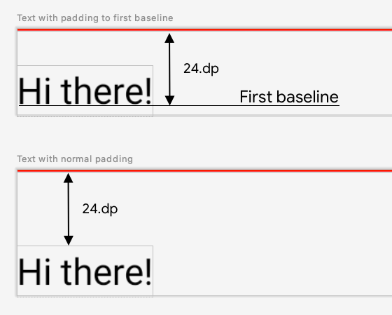
paddingFromBaseline 的文字。以下是產生此間距的程式碼:
fun Modifier.firstBaselineToTop( firstBaselineToTop: Dp ) = layout { measurable, constraints -> // Measure the composable val placeable = measurable.measure(constraints) // Check the composable has a first baseline check(placeable[FirstBaseline] != AlignmentLine.Unspecified) val firstBaseline = placeable[FirstBaseline] // Height of the composable with padding - first baseline val placeableY = firstBaselineToTop.roundToPx() - firstBaseline val height = placeable.height + placeableY layout(placeable.width, height) { // Where the composable gets placed placeable.placeRelative(0, placeableY) } }
以下程式碼的運作方式:
- 在
measurablelambda 參數中,透過呼叫measurable.measure(constraints)的方式,測量以可測量參數代表的Text。 - 透過呼叫
layout(width, height)的方式,您可以指定可組合函式的大小,而此方法也會提供可於放置已包裝元素的 lambda 使用。在此範例中,這是上一個基準及新增頂端邊框間距的高度。 - 呼叫
placeable.place(x, y),就可以將包裝的元素放到畫面中。如果沒有放置包裝的元素,這些就不會顯示。y位置對應至頂端邊框間距:第一個文字基準線的位置。
如要驗證此設定是否正常運作,請在 Text 上使用修飾符:
@Preview @Composable fun TextWithPaddingToBaselinePreview() { MyApplicationTheme { Text("Hi there!", Modifier.firstBaselineToTop(32.dp)) } } @Preview @Composable fun TextWithNormalPaddingPreview() { MyApplicationTheme { Text("Hi there!", Modifier.padding(top = 32.dp)) } }

Text 可組合函式的修飾符,並進行預覽。
建立自訂版面配置
layout 修飾符只能變更呼叫的可組合函式。如要測量多個可組合函式並為其進行版面配置,請改用 Layout 可組合函式。此可組合函式可手動測量及調整子項的版面配置。所有較高層級的版面配置 (如 Column 及 Row),均以 Layout 可組合函式建構。
這個範例會建構非常基本的 Column。大部分自訂版面配置都會沿用以下模式:
@Composable fun MyBasicColumn( modifier: Modifier = Modifier, content: @Composable () -> Unit ) { Layout( modifier = modifier, content = content ) { measurables, constraints -> // measure and position children given constraints logic here // ... } }
measurables 與 layout 修飾符類似,都是需要測量的子項清單,而 constraints 則是來自父項的限制條件。
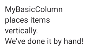
和先前的邏輯相同,MyBasicColumn 可依此方式實作:
@Composable fun MyBasicColumn( modifier: Modifier = Modifier, content: @Composable () -> Unit ) { Layout( modifier = modifier, content = content ) { measurables, constraints -> // Don't constrain child views further, measure them with given constraints // List of measured children val placeables = measurables.map { measurable -> // Measure each children measurable.measure(constraints) } // Set the size of the layout as big as it can layout(constraints.maxWidth, constraints.maxHeight) { // Track the y co-ord we have placed children up to var yPosition = 0 // Place children in the parent layout placeables.forEach { placeable -> // Position item on the screen placeable.placeRelative(x = 0, y = yPosition) // Record the y co-ord placed up to yPosition += placeable.height } } } }
子項可組合項受 Layout 限制條件的限制 (但沒有 minHeight 限制),而且會根據前一個可組合項的 yPosition 放置。
自訂可組合函式的運用方式如下:
@Composable fun CallingComposable(modifier: Modifier = Modifier) { MyBasicColumn(modifier.padding(8.dp)) { Text("MyBasicColumn") Text("places items") Text("vertically.") Text("We've done it by hand!") } }
Column 實作。
版面配置方向
變更 LocalLayoutDirection 組合區域,即可變更可組合項的版面配置方向。
如果要在畫面中以手動方式放置可組合項,LayoutDirection 是 layout 修飾符的 LayoutScope 或 Layout 可組合項的一部分。
使用 layoutDirection 時,請使用 place 放置可組合函式。與 placeRelative 方法不同,place 不會根據版面配置方向 (從左至右或從右至左) 變更。
實際操作自訂版面配置
如要進一步瞭解版面配置和修飾符,請參閱「Compose 的基本版面配置」一文;如要瞭解自訂版面配置的操作方式,請參閱「建立自訂版面配置的 Compose 範例」。
瞭解詳情
如要進一步瞭解 Compose 中的自訂版面配置,請參閱以下其他資源。
影片
為您推薦
- 注意:系統會在 JavaScript 關閉時顯示連結文字
- Compose 版面配置中的內建函式測量資料
- Compose 中的圖形
- Compose 修飾符