


本页详细介绍了从 Android 12(API 级别 31)开始提供的可选 widget 增强功能。这些功能是可选的,但实现起来非常简单,可改善用户的 widget 体验。
如需了解其他增强 widget 的方法,请参阅 Compose 指南增强 widget。
使用动态配色
从 Android 12 开始,微件可以为按钮、背景及其他组件使用设备主题颜色。这样可使过渡更流畅,而且还能在不同的 widget 之间保持一致。
您可以通过以下两种方式实现动态颜色:
在根布局中使用系统的默认主题 (
@android:style/Theme.DeviceDefault.DayNight)。使用 Material Components for Android 库中的 Material 3 主题 (
Theme.Material3.DynamicColors.DayNight),该主题从 Material Components for Android v1.6.0 开始提供。
在根布局中设置主题后,您可以在根布局或其任何子布局中使用通用颜色属性来获取动态颜色。
您可以使用的颜色属性的一些示例如下:
?attr/primary?attr/primaryContainer?attr/onPrimary?attr/onPrimaryContainer
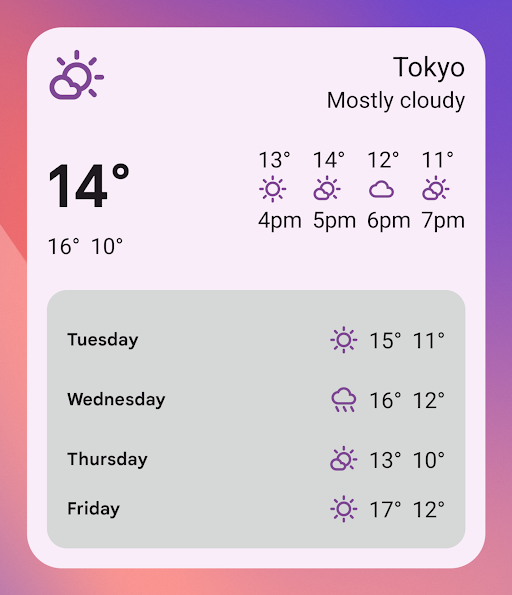
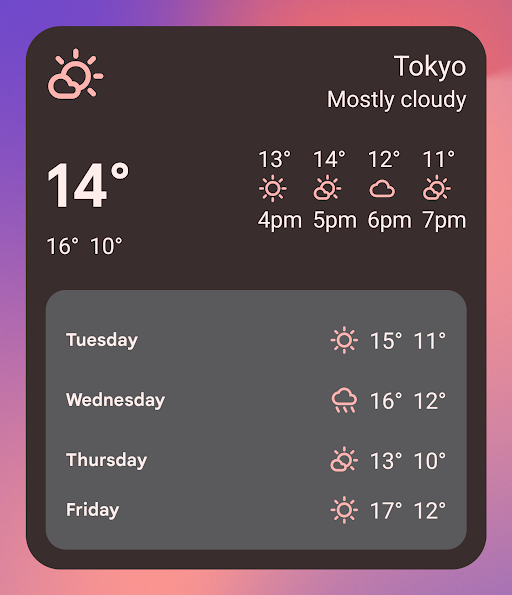
在以下使用 Material 3 主题的示例中,设备的颜色主题为“偏紫色”。强调色和 widget 背景会根据浅色模式和深色模式进行调整,如图 1 和图 2 所示。
<LinearLayout xmlns:android="http://schemas.android.com/apk/res/android" xmlns:app="http://schemas.android.com/apk/res-auto" android:layout_width="match_parent" android:layout_height="match_parent" android:background="?attr/colorPrimaryContainer" android:theme="@style/Theme.Material3.DynamicColors.DayNight"> <ImageView android:layout_width="wrap_content" android:layout_height="wrap_content" app:tint="?attr/colorPrimaryContainer" android:src="@drawable/ic_cloud" /> <!-- Other widget content. --> </LinearLayout>
动态颜色的向后兼容性
动态颜色仅适用于搭载 Android 12 或更高版本的设备。如需为较低版本提供自定义主题,请使用默认主题属性创建包含自定义颜色的默认主题和新的限定符 (values-v31)。
下面是一个使用 Material 3 主题的示例:
/values/styles.xml
<resources> <style name="MyWidgetTheme" parent="Theme.Material3.DynamicColors.DayNight"> <!-- Override default colorBackground attribute with custom color. --> <item name="android:colorBackground">@color/my_background_color</item> <!-- Add other colors/attributes. --> </style> </resources>
/values-v31/styles.xml
<resources> <!-- Do not override any color attribute. --> <style name="MyWidgetTheme" parent="Theme.Material3.DynamicColors.DayNight" /> </resources>
/layout/my_widget_layout.xml
<LinearLayout xmlns:android="http://schemas.android.com/apk/res/android" android:layout_width="match_parent" android:layout_height="match_parent" android:orientation="vertical" android:background="?android:attr/colorBackground" android:theme="@style/MyWidgetTheme" />
启用语音支持
借助与应用有关的 Action,Google 助理可以显示 widget 来响应相关的用户语音指令。通过将 widget 配置为响应内置 intent (BII),您的应用可以在 Google 助理平台(例如 Android 和 Android Auto)上主动显示 widget。用户可以选择将 Google 助理显示的 widget 固定到其启动器,从而鼓励用户日后继续互动。
例如,您可以为锻炼应用配置锻炼总结 widget,以满足触发 GET_EXERCISE_OBSERVATION BII 的用户语音指令。当用户通过发出“Hey Google,我本周在 ExampleApp 上跑了多少英里?”之类的请求来触发此 BII 时,Google 助理会主动显示您的 widget。
有数十个 BII 涵盖了多个类别的用户互动,几乎所有 Android 应用都可以通过这些 BII 增强其 widget 的语音功能。如需开始集成,请参阅将与应用有关的 Action 与 Android widget 集成。
实现更流畅的过渡
从 Android 12 开始,当用户从 widget 启动您的应用时,启动器会提供更流畅的过渡。
为了实现这种改进的过渡,请使用 @android:id/background 或 android.R.id.background 标识背景元素:
<!-- Top-level layout of the widget. --> <LinearLayout xmlns:android="http://schemas.android.com/apk/res/android" android:id="@android:id/background" android:layout_width="match_parent" android:layout_height="match_parent" android:orientation="vertical"> </LinearLayout>
您的应用可以在以前的 Android 版本中使用 @android:id/background,而不会出现中断,但系统会忽略该属性。
使用 RemoteViews 的运行时修改
从 Android 12 开始,您可以利用几个 RemoteViews 方法在运行时修改 RemoteViews 属性。如需查看所添加方法的完整列表,请参阅 RemoteViews API 参考文档。
以下代码示例展示了如何使用其中的一些方法。
// Set the colors of a progress bar at runtime. remoteView.setColorStateList( R.id.progress, "setProgressTintList", createProgressColorStateList() ) // Specify exact sizes for margins. remoteView.setViewLayoutMargin( R.id.text, RemoteViews.MARGIN_END, 8f, TypedValue.COMPLEX_UNIT_DIP )