


แอปมักจะต้องแสดงข้อมูลในคอนเทนเนอร์ที่มีสไตล์คล้ายกัน เช่น คอนเทนเนอร์ที่เก็บข้อมูลเกี่ยวกับรายการในรายการ ระบบมี
API CardView ให้คุณ
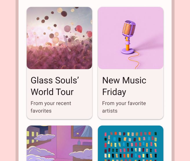
แสดงข้อมูลในการ์ดที่มีลักษณะที่สอดคล้องกันในแพลตฟอร์ม ตัวอย่างเช่น การ์ดมีความสูงเริ่มต้นเหนือกลุ่มมุมมองที่บรรจุอยู่ ดังนั้นระบบจึงวาดเงาไว้ใต้การ์ด การ์ดเป็นวิธีหนึ่งในการบรรจุกลุ่มมุมมองต่างๆ ไว้ด้วยกันพร้อมกับให้สไตล์ที่สอดคล้องกันสำหรับคอนเทนเนอร์
เพิ่มทรัพยากร Dependency
วิดเจ็ต CardView เป็นส่วนหนึ่งของ AndroidX หากต้องการใช้วิดเจ็ตนี้ในโปรเจ็กต์ ให้เพิ่มทรัพยากร Dependency ต่อไปนี้ลงในไฟล์ build.gradle ของโมดูลแอป
ดึงดูด
dependencies {
    implementation "androidx.cardview:cardview:1.0.0"
}
Kotlin
dependencies {
    implementation("androidx.cardview:cardview:1.0.0")
}
สร้างการ์ด
หากต้องการใช้ CardView ให้เพิ่มลงในไฟล์เลย์เอาต์ ใช้เป็นกลุ่มการแสดงผลเพื่อบรรจุมุมมองอื่นๆ ในตัวอย่างต่อไปนี้ CardView มี ImageView และ TextViews 2-3 รายการเพื่อแสดงข้อมูลบางอย่างแก่ผู้ใช้
<?xml version="1.0" encoding="utf-8"?>
<androidx.constraintlayout.widget.ConstraintLayout
    xmlns:android="http://schemas.android.com/apk/res/android"
    xmlns:app="http://schemas.android.com/apk/res-auto"
    android:padding="16dp"
    android:background="#E0F7FA"
    android:layout_width="match_parent"
    android:layout_height="match_parent">

    <androidx.cardview.widget.CardView
        android:layout_width="match_parent"
        android:layout_height="wrap_content"
        app:layout_constraintBottom_toBottomOf="parent"
        app:layout_constraintEnd_toEndOf="parent"
        app:layout_constraintStart_toStartOf="parent"
        app:layout_constraintTop_toTopOf="parent">

        <androidx.constraintlayout.widget.ConstraintLayout
            android:padding="4dp"
            android:layout_width="match_parent"
            android:layout_height="match_parent">

            <ImageView
                android:id="@+id/header_image"
                android:layout_width="match_parent"
                android:layout_height="200dp"
                android:src="@drawable/logo"
                app:layout_constraintEnd_toEndOf="parent"
                app:layout_constraintStart_toStartOf="parent"
                app:layout_constraintTop_toTopOf="parent" />

            <TextView
                android:id="@+id/title"
                style="@style/TextAppearance.MaterialComponents.Headline3"
                android:layout_width="match_parent"
                android:layout_height="wrap_content"
                android:layout_marginTop="4dp"
                android:text="I'm a title"
                app:layout_constraintEnd_toEndOf="parent"
                app:layout_constraintStart_toStartOf="parent"
                app:layout_constraintTop_toBottomOf="@id/header_image" />

            <TextView
                android:id="@+id/subhead"
                style="@style/TextAppearance.MaterialComponents.Subtitle2"
                android:layout_width="match_parent"
                android:layout_height="wrap_content"
                android:layout_marginTop="4dp"
                android:text="I'm a subhead"
                app:layout_constraintEnd_toEndOf="parent"
                app:layout_constraintStart_toStartOf="parent"
                app:layout_constraintTop_toBottomOf="@id/title" />

            <TextView
                android:id="@+id/body"
                style="@style/TextAppearance.MaterialComponents.Body1"
                android:layout_width="match_parent"
                android:layout_height="wrap_content"
                android:layout_marginTop="4dp"
                android:text="I'm a supporting text. Very Lorem ipsum dolor sit amet, consectetur adipiscing elit, sed do eiusmod tempor incididunt ut labore et dolore magna aliqua. Ut enim ad minim veniam, quis nostrud exercitation ullamco laboris nisi ut aliquip ex ea commodo consequat. Duis aute irure dolor in reprehenderit in voluptate velit esse cillum dolore eu fugiat nulla pariatur. Excepteur sint occaecat cupidatat non proident, sunt in culpa qui officia deserunt mollit anim id est laborum."
                app:layout_constraintEnd_toEndOf="parent"
                app:layout_constraintStart_toStartOf="parent"
                app:layout_constraintTop_toBottomOf="@id/subhead" />
        </androidx.constraintlayout.widget.ConstraintLayout>
    </androidx.cardview.widget.CardView>
</androidx.constraintlayout.widget.ConstraintLayout>
ข้อมูลโค้ดก่อนหน้าจะสร้างผลลัพธ์ที่คล้ายกับผลลัพธ์ต่อไปนี้ โดยสมมติว่าคุณใช้รูปภาพโลโก้ Android เดียวกัน
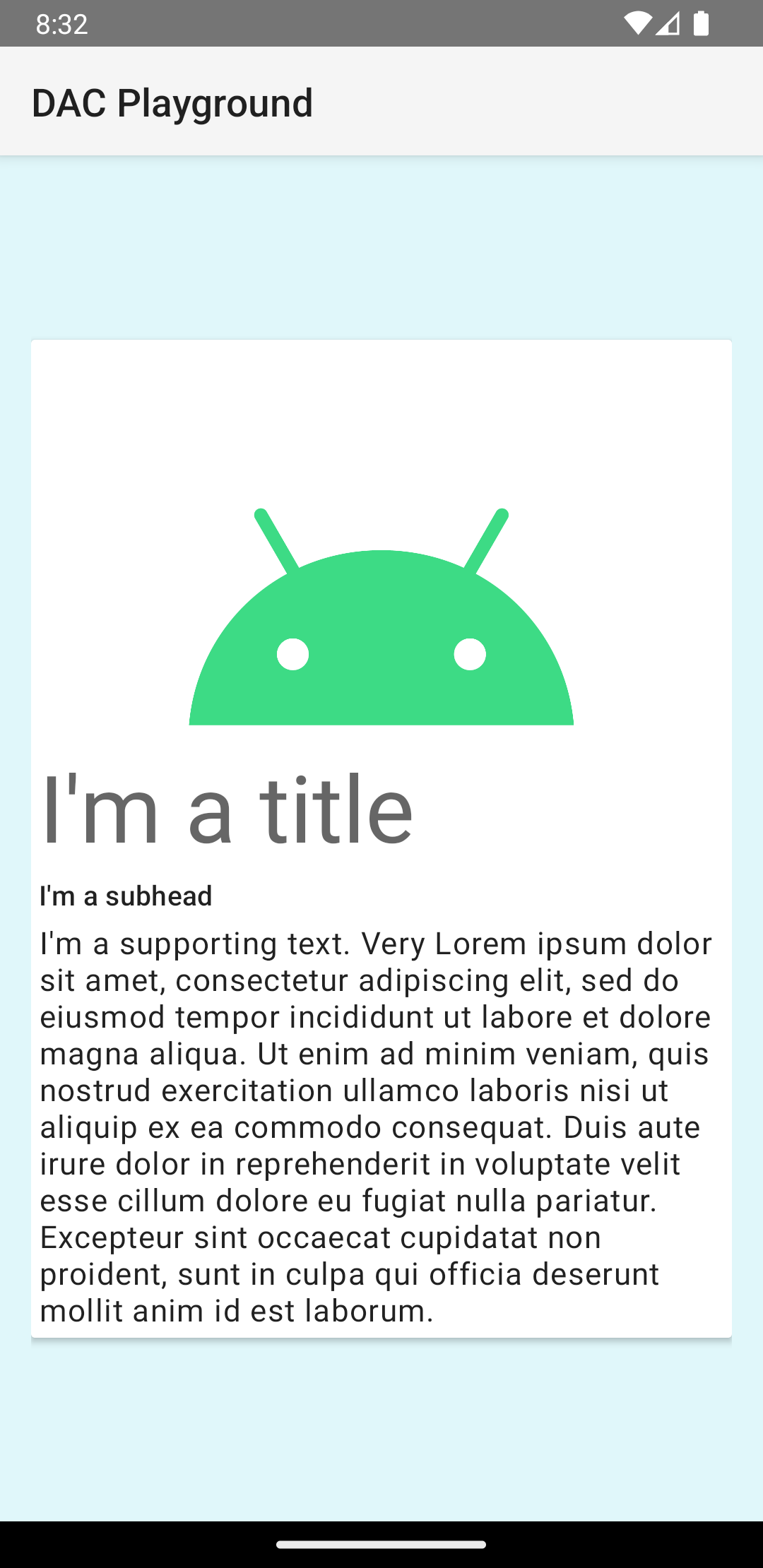
การ์ดในตัวอย่างนี้จะแสดงบนหน้าจอด้วยระดับความสูงเริ่มต้น ซึ่งทำให้ระบบวาดเงาไว้ใต้การ์ด คุณสามารถกำหนดระดับความสูงที่กำหนดเองสำหรับการ์ดได้ด้วยแอตทริบิวต์ card_view:cardElevation การ์ดที่มีความสูงมากกว่าจะมีเงาที่ชัดเจนกว่า และการ์ดที่มีความสูงน้อยกว่าจะมีเงาที่จางกว่า CardView ใช้ระดับความสูงจริงและเงาแบบไดนามิกใน Android 5.0 (ระดับ API 21) ขึ้นไป
ใช้พร็อพเพอร์ตี้ต่อไปนี้เพื่อปรับแต่งลักษณะที่ปรากฏของวิดเจ็ต CardView
- หากต้องการตั้งค่ารัศมีมุมในเลย์เอาต์ ให้ใช้แอตทริบิวต์
card_view:cardCornerRadius - หากต้องการตั้งค่ารัศมีมุมในโค้ด ให้ใช้วิธี
CardView.setRadius - หากต้องการตั้งค่าสีพื้นหลังของการ์ด ให้ใช้แอตทริบิวต์
card_view:cardBackgroundColor