编辑器操作
使用集合让一切井井有条
根据您的偏好保存内容并对其进行分类。
Android Studio 在编辑器区域提供了一些功能,可提高使用 Jetpack Compose 时的工作效率。
实时模板
Android Studio 提供了下面这些与 Compose 相关的实时模板,您可以通过输入相应的模板缩写来输入代码段,以实现快速插入:
comp
,用于设置 @Composable
函数
prev
,用于创建 @Preview
可组合函数
paddp
,用于以 dp 为单位添加 padding
修饰符
weight
,用于添加 weight
修饰符
W
、WR
、WC
,用于通过 Box
、Row
或 Column
容器设置当前可组合项的呈现效果
边线图标
边线图标是边栏中可见的上下文操作,位于行号旁边。Android Studio 引入了多个 Jetpack Compose 专用边线图标,以便开发者更轻松地使用。
部署预览对象
您可以直接通过边线图标将 @Preview
部署到模拟器或实体设备上:
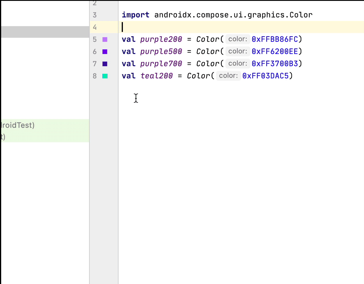
颜色选择器
无论是在可组合项内部还是外部定义颜色,边线上都会显示其预览。您可以点击颜色,通过颜色选择器进行更改,如下所示:
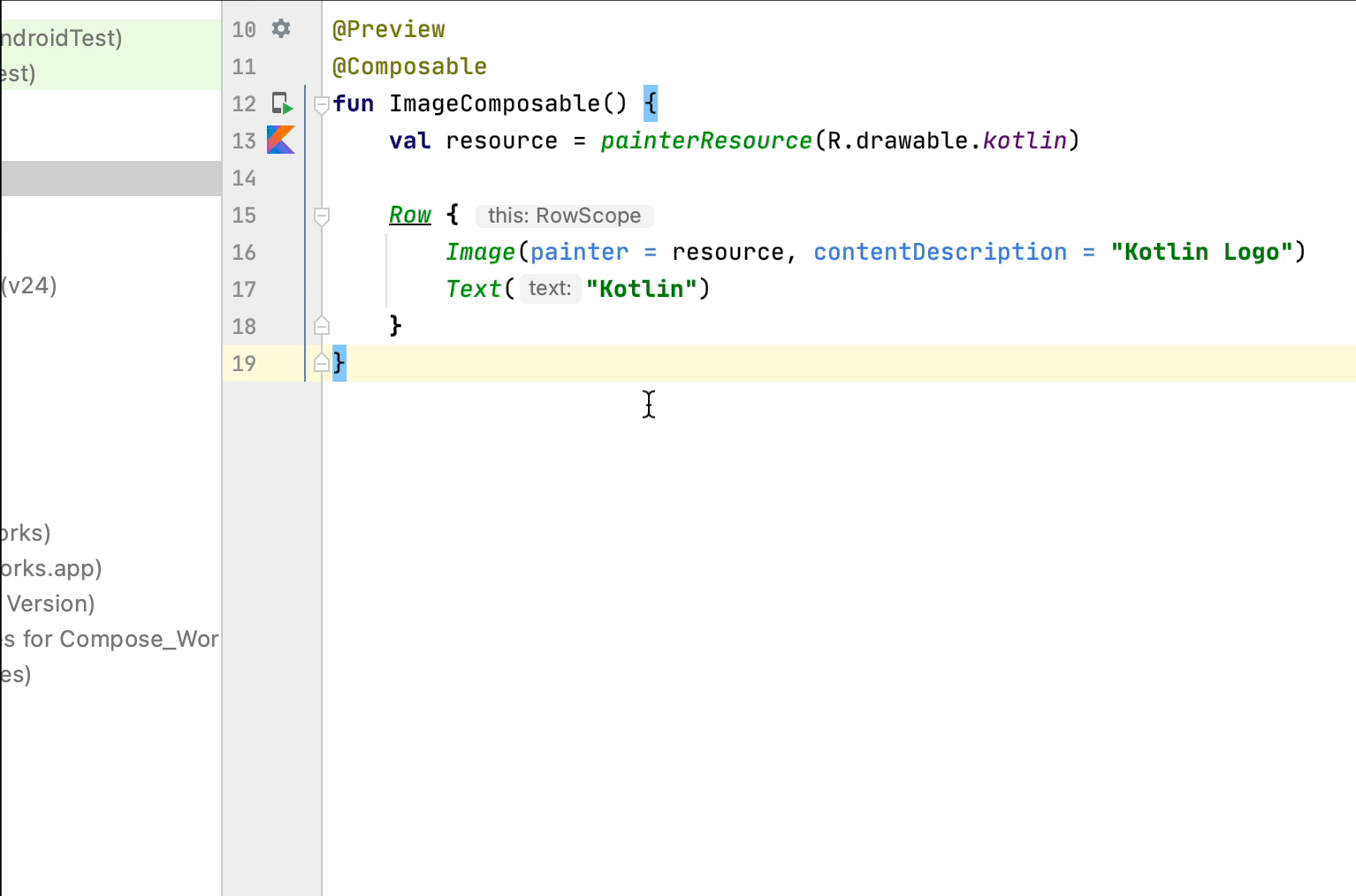
图像资源选择器
无论是在可组合项内部还是外部定义可绘制对象、矢量或图像,边线上都会显示其预览。您可以点击图像资源,通过图像资源选择器进行更改,如下所示:
为您推荐
本页面上的内容和代码示例受内容许可部分所述许可的限制。Java 和 OpenJDK 是 Oracle 和/或其关联公司的注册商标。
最后更新时间 (UTC):2025-08-21。
[null,null,["最后更新时间 (UTC):2025-08-21。"],[],[],null,["# Editor actions\n\nAndroid Studio has features inside the editor area to improve your productivity\nwith Jetpack Compose.\n\nLive templates\n--------------\n\nAndroid Studio comes with these Compose-related live templates, which allow you\nto enter code snippets for fast insertion by typing the corresponding template\nabbreviation:\n\n- `comp` to set up a `@Composable` function\n- `prev` to create a `@Preview` composable function\n- `paddp` to add a `padding` Modifier in dp\n- `weight` to add a `weight` Modifier\n- `W`, `WR`, `WC` to surround the current composable with a `Box`, `Row`, or `Column`container\n\nGutter icons\n------------\n\nGutter icons are contextual actions visible on the sidebar, next to the line\nnumbers. Android Studio introduces several gutter icons specific to Jetpack\nCompose to ease your developer experience.\n\n### Deploy preview\n\nYou can deploy a `@Preview` to the emulator or physical device directly from the\ngutter icon:\n\n### Color picker\n\nWhenever a color is defined inside or outside a composable, its preview is shown\non the gutter. You can change the color via the color picker by clicking on it\nlike this:\n\n### Image resource picker\n\nWhenever a drawable, vector, or image is defined inside or outside a composable,\nits preview is shown on the gutter. You can change it via the image resource\npicker by clicking on it like this:\n\nRecommended for you\n-------------------\n\n- Note: link text is displayed when JavaScript is off\n- [Compose layout basics](/develop/ui/compose/layouts/basics)\n- [Compose modifiers](/develop/ui/compose/modifiers)\n- [Lists and grids](/develop/ui/compose/lists)"]]