
Compose 具有许多内置动画机制,因此您可能很难知道该选择哪一种。以下列出了一些常见的动画使用情形。如需详细了解可供您使用的全套不同 API 选项,请参阅完整的 Compose 动画文档。
为常见的可组合属性添加动画效果
Compose 提供了便捷的 API,可用于解决许多常见的动画使用场景。本部分演示了如何为可组合函数的常见属性添加动画效果。
为显示 / 消失添加动画效果
使用 AnimatedVisibility 隐藏或显示可组合项。AnimatedVisibility 中的子项可以使用 Modifier.animateEnterExit() 来实现自己的进入或退出过渡。
var visible by remember { mutableStateOf(true) } // Animated visibility will eventually remove the item from the composition once the animation has finished. AnimatedVisibility(visible) { // your composable here // ... }
AnimatedVisibility 的进入和退出参数可让您配置可组合项在显示和消失时的行为。如需了解详情,请参阅完整文档。
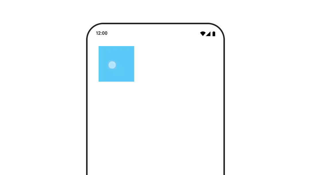
另一种为可组合项的可见性添加动画效果的方法是使用 animateFloatAsState 随时间推移为 Alpha 添加动画效果:
var visible by remember { mutableStateOf(true) } val animatedAlpha by animateFloatAsState( targetValue = if (visible) 1.0f else 0f, label = "alpha" ) Box( modifier = Modifier .size(200.dp) .graphicsLayer { alpha = animatedAlpha } .clip(RoundedCornerShape(8.dp)) .background(colorGreen) .align(Alignment.TopCenter) ) { }
不过,更改透明度时需要注意,可组合项仍会保留在组合中,并继续占用其布局空间。这可能会导致屏幕阅读器和其他无障碍机制仍将屏幕上的相应项视为可见。另一方面,AnimatedVisibility 最终会从组合中移除相应项。
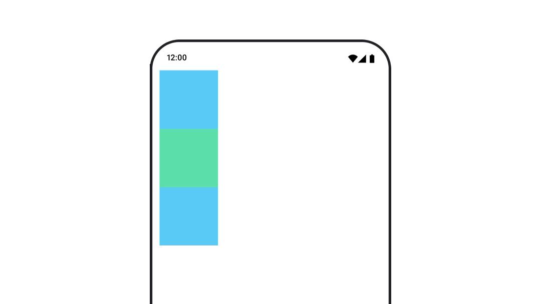
动画背景颜色
val animatedColor by animateColorAsState( if (animateBackgroundColor) colorGreen else colorBlue, label = "color" ) Column( modifier = Modifier.drawBehind { drawRect(animatedColor) } ) { // your composable here }
此选项的性能高于使用 Modifier.background()。
Modifier.background() 适用于一次性颜色设置,但如果颜色随时间变化而动画化,则可能会导致不必要的重组。
如需无限期地为背景颜色添加动画效果,请参阅重复动画部分。
为可组合项的大小设置动画效果
在 Compose 中,您可以通过几种不同的方式为可组合项的大小添加动画效果。使用 animateContentSize() 在可组合项大小发生变化时添加动画效果。
例如,如果您有一个包含文本的框,该文本可以从一行扩展到多行,则可以使用 Modifier.animateContentSize() 来实现更平滑的过渡:
var expanded by remember { mutableStateOf(false) } Box( modifier = Modifier .background(colorBlue) .animateContentSize() .height(if (expanded) 400.dp else 200.dp) .fillMaxWidth() .clickable( interactionSource = remember { MutableInteractionSource() }, indication = null ) { expanded = !expanded } ) { }
您还可以使用 AnimatedContent 和 SizeTransform 来描述尺寸变化应如何发生。
为可组合项的位置添加动画效果
如需为可组合项的位置添加动画效果,请将 Modifier.offset{ } 与 animateIntOffsetAsState() 结合使用。
var moved by remember { mutableStateOf(false) } val pxToMove = with(LocalDensity.current) { 100.dp.toPx().roundToInt() } val offset by animateIntOffsetAsState( targetValue = if (moved) { IntOffset(pxToMove, pxToMove) } else { IntOffset.Zero }, label = "offset" ) Box( modifier = Modifier .offset { offset } .background(colorBlue) .size(100.dp) .clickable( interactionSource = remember { MutableInteractionSource() }, indication = null ) { moved = !moved } )
如果您想确保在动画显示位置或大小时,可组合项不会绘制在其他可组合项之上或之下,请使用 Modifier.layout{ }。此修饰符会将尺寸和位置更改传播给父级,进而影响其他子级。
例如,如果您要在 Column 中移动 Box,并且其他子节点需要在 Box 移动时也移动,请使用 Modifier.layout{ } 添加偏移信息,如下所示:
var toggled by remember { mutableStateOf(false) } val interactionSource = remember { MutableInteractionSource() } Column( modifier = Modifier .padding(16.dp) .fillMaxSize() .clickable(indication = null, interactionSource = interactionSource) { toggled = !toggled } ) { val offsetTarget = if (toggled) { IntOffset(150, 150) } else { IntOffset.Zero } val offset = animateIntOffsetAsState( targetValue = offsetTarget, label = "offset" ) Box( modifier = Modifier .size(100.dp) .background(colorBlue) ) Box( modifier = Modifier .layout { measurable, constraints -> val offsetValue = if (isLookingAhead) offsetTarget else offset.value val placeable = measurable.measure(constraints) layout(placeable.width + offsetValue.x, placeable.height + offsetValue.y) { placeable.placeRelative(offsetValue) } } .size(100.dp) .background(colorGreen) ) Box( modifier = Modifier .size(100.dp) .background(colorBlue) ) }
Modifier.layout{ }为可组合项的内边距添加动画效果
如需为可组合项的内边距添加动画效果,请将 animateDpAsState 与 Modifier.padding() 结合使用:
var toggled by remember { mutableStateOf(false) } val animatedPadding by animateDpAsState( if (toggled) { 0.dp } else { 20.dp }, label = "padding" ) Box( modifier = Modifier .aspectRatio(1f) .fillMaxSize() .padding(animatedPadding) .background(Color(0xff53D9A1)) .clickable( interactionSource = remember { MutableInteractionSource() }, indication = null ) { toggled = !toggled } )
为可组合项的高度添加动画效果
如需为可组合项的高度添加动画效果,请将 animateDpAsState 与 Modifier.graphicsLayer{ } 结合使用。对于一次性海拔变化,请使用 Modifier.shadow()。如果您要为阴影添加动画效果,使用 Modifier.graphicsLayer{ } 修饰符是性能更高的选择。
val mutableInteractionSource = remember { MutableInteractionSource() } val pressed = mutableInteractionSource.collectIsPressedAsState() val elevation = animateDpAsState( targetValue = if (pressed.value) { 32.dp } else { 8.dp }, label = "elevation" ) Box( modifier = Modifier .size(100.dp) .align(Alignment.Center) .graphicsLayer { this.shadowElevation = elevation.value.toPx() } .clickable(interactionSource = mutableInteractionSource, indication = null) { } .background(colorGreen) ) { }
或者,使用 Card 可组合项,并根据状态将升降高度属性设置为不同的值。
为文字缩放、平移或旋转添加动画效果
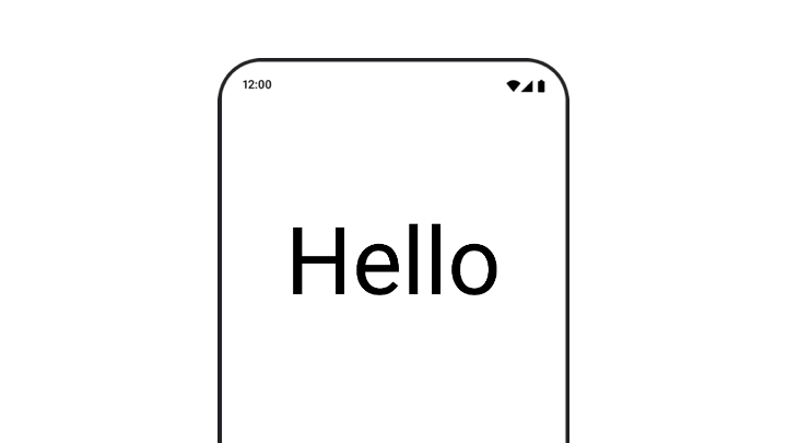
在为文字的缩放、平移或旋转设置动画效果时,请将 TextStyle 上 textMotion 参数设置为 TextMotion.Animated。这可确保文本动画之间的过渡更加顺畅。使用 Modifier.graphicsLayer{ } 可平移、旋转或缩放文本。
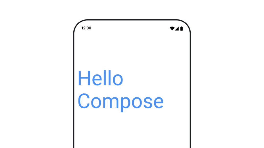
val infiniteTransition = rememberInfiniteTransition(label = "infinite transition") val scale by infiniteTransition.animateFloat( initialValue = 1f, targetValue = 8f, animationSpec = infiniteRepeatable(tween(1000), RepeatMode.Reverse), label = "scale" ) Box(modifier = Modifier.fillMaxSize()) { Text( text = "Hello", modifier = Modifier .graphicsLayer { scaleX = scale scaleY = scale transformOrigin = TransformOrigin.Center } .align(Alignment.Center), // Text composable does not take TextMotion as a parameter. // Provide it via style argument but make sure that we are copying from current theme style = LocalTextStyle.current.copy(textMotion = TextMotion.Animated) ) }
为文字颜色添加动画效果
如需为文字颜色添加动画效果,请在 BasicText 可组合函数中使用 color lambda:
val infiniteTransition = rememberInfiniteTransition(label = "infinite transition") val animatedColor by infiniteTransition.animateColor( initialValue = Color(0xFF60DDAD), targetValue = Color(0xFF4285F4), animationSpec = infiniteRepeatable(tween(1000), RepeatMode.Reverse), label = "color" ) BasicText( text = "Hello Compose", color = { animatedColor }, // ... )
在不同类型的内容之间切换
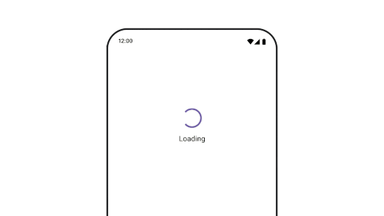
使用 AnimatedContent 可在不同的可组合项之间添加动画效果;如果您只是想在可组合项之间添加标准的淡入淡出效果,请使用 Crossfade。
var state by remember { mutableStateOf(UiState.Loading) } AnimatedContent( state, transitionSpec = { fadeIn( animationSpec = tween(3000) ) togetherWith fadeOut(animationSpec = tween(3000)) }, modifier = Modifier.clickable( interactionSource = remember { MutableInteractionSource() }, indication = null ) { state = when (state) { UiState.Loading -> UiState.Loaded UiState.Loaded -> UiState.Error UiState.Error -> UiState.Loading } }, label = "Animated Content" ) { targetState -> when (targetState) { UiState.Loading -> { LoadingScreen() } UiState.Loaded -> { LoadedScreen() } UiState.Error -> { ErrorScreen() } } }
AnimatedContent 可进行自定义,以显示多种不同的进入和退出过渡效果。如需了解详情,请参阅有关 AnimatedContent 的文档,或阅读这篇有关 AnimatedContent 的博文。
在前往不同目的地的导航过程中添加动画
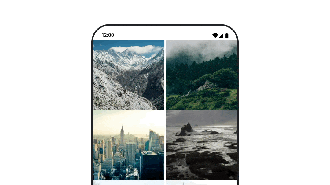
使用 navigation-compose 制品集时,如需在可组合项之间添加动画过渡效果,请在可组合项上指定 enterTransition 和 exitTransition。您还可以将默认动画设置为用于顶级 NavHost 的所有目的地:
val navController = rememberNavController() NavHost( navController = navController, startDestination = "landing", enterTransition = { EnterTransition.None }, exitTransition = { ExitTransition.None } ) { composable("landing") { ScreenLanding( // ... ) } composable( "detail/{photoUrl}", arguments = listOf(navArgument("photoUrl") { type = NavType.StringType }), enterTransition = { fadeIn( animationSpec = tween( 300, easing = LinearEasing ) ) + slideIntoContainer( animationSpec = tween(300, easing = EaseIn), towards = AnimatedContentTransitionScope.SlideDirection.Start ) }, exitTransition = { fadeOut( animationSpec = tween( 300, easing = LinearEasing ) ) + slideOutOfContainer( animationSpec = tween(300, easing = EaseOut), towards = AnimatedContentTransitionScope.SlideDirection.End ) } ) { backStackEntry -> ScreenDetails( // ... ) } }
有许多不同的进入和退出过渡效果,可为传入和传出的内容应用不同的效果,如需了解详情,请参阅文档。
重复播放动画
将 rememberInfiniteTransition 与 infiniteRepeatable
animationSpec 搭配使用,可让动画不断重复播放。更改 RepeatModes 以指定其应如何来回移动。
使用 repeatable 可重复执行指定次数。
val infiniteTransition = rememberInfiniteTransition(label = "infinite") val color by infiniteTransition.animateColor( initialValue = Color.Green, targetValue = Color.Blue, animationSpec = infiniteRepeatable( animation = tween(1000, easing = LinearEasing), repeatMode = RepeatMode.Reverse ), label = "color" ) Column( modifier = Modifier.drawBehind { drawRect(color) } ) { // your composable here }
在启动可组合项时启动动画
当可组合项进入组合时,LaunchedEffect 会运行。它会在启动可组合项时启动动画,您可以使用它来驱动动画状态变化。使用 Animatable 和 animateTo 方法在启动时开始动画:
val alphaAnimation = remember { Animatable(0f) } LaunchedEffect(Unit) { alphaAnimation.animateTo(1f) } Box( modifier = Modifier.graphicsLayer { alpha = alphaAnimation.value } )
创建连续动画
使用 Animatable 协程 API 可执行顺序或并发动画。在 Animatable 上依次调用 animateTo 会导致每个动画在继续之前等待之前的动画完成。这是因为该函数是一个挂起函数。
val alphaAnimation = remember { Animatable(0f) } val yAnimation = remember { Animatable(0f) } LaunchedEffect("animationKey") { alphaAnimation.animateTo(1f) yAnimation.animateTo(100f) yAnimation.animateTo(500f, animationSpec = tween(100)) }
创建并发动画
使用协程 API(Animatable#animateTo() 或 animate)或 Transition API 来实现并发动画。如果您在协程上下文中使用多个启动函数,则会同时启动动画:
val alphaAnimation = remember { Animatable(0f) } val yAnimation = remember { Animatable(0f) } LaunchedEffect("animationKey") { launch { alphaAnimation.animateTo(1f) } launch { yAnimation.animateTo(100f) } }
您可以使用 updateTransition API 同时使用同一状态来驱动许多不同的属性动画。以下示例为由状态变化控制的两个属性(rect 和 borderWidth)添加动画:
var currentState by remember { mutableStateOf(BoxState.Collapsed) } val transition = updateTransition(currentState, label = "transition") val rect by transition.animateRect(label = "rect") { state -> when (state) { BoxState.Collapsed -> Rect(0f, 0f, 100f, 100f) BoxState.Expanded -> Rect(100f, 100f, 300f, 300f) } } val borderWidth by transition.animateDp(label = "borderWidth") { state -> when (state) { BoxState.Collapsed -> 1.dp BoxState.Expanded -> 0.dp } }
优化动画效果
Compose 中的动画可能会导致性能问题。这是因为动画的本质是:屏幕上的像素逐帧快速移动或变化,从而营造出运动的错觉。
考虑 Compose 的不同阶段:组合、布局和绘制。如果动画更改了布局阶段,则需要所有受影响的可组合项重新布局和重绘。如果动画发生在绘制阶段,那么默认情况下,它的性能会比在布局阶段运行动画更好,因为总体上需要完成的工作更少。
为确保应用在动画播放期间尽可能少地执行操作,请尽可能选择 Modifier 的 lambda 版本。这会跳过重组并在组合阶段之外执行动画,否则请使用 Modifier.graphicsLayer{ },因为此修饰符始终在绘制阶段运行。如需详细了解此方面的信息,请参阅性能文档中的延迟读取部分。
更改动画时间设置
默认情况下,Compose 会为大多数动画使用弹簧动画。弹簧动画(即基于物理特性的动画)效果更自然。它们也是可中断的,因为它们会考虑对象的当前速度,而不是固定的时间。如果您想替换默认设置,上述所有动画 API 都可以设置 animationSpec 来定制动画的运行方式,无论您希望动画在特定时长内执行还是更具弹性。
以下是不同 animationSpec 选项的摘要:
spring:基于物理特性的动画,所有动画的默认值。您可以更改刚度或 dampingRatio,以实现不同的动画外观和效果。tween(介于的缩写):基于时长的动画,使用Easing函数在两个值之间添加动画效果。keyframes:用于指定动画中某些关键点的值的规范。repeatable:基于时长的规范,运行次数由RepeatMode指定。infiniteRepeatable:基于时长的规范,可无限期运行。snap:立即跳到最终值,没有任何动画效果。
如需详细了解 animationSpec,请参阅完整文档。
其他资源
如需查看更多有趣的 Compose 动画示例,请参阅以下内容: