
Las clases de tamaño de ventana son un conjunto de puntos de interrupción de viewports bien definidos que te ayudan a diseñar, desarrollar y probar diseños responsivos y adaptables. Los puntos de interrupción equilibran la simplicidad del diseño con la flexibilidad de optimizar tu app para casos únicos.
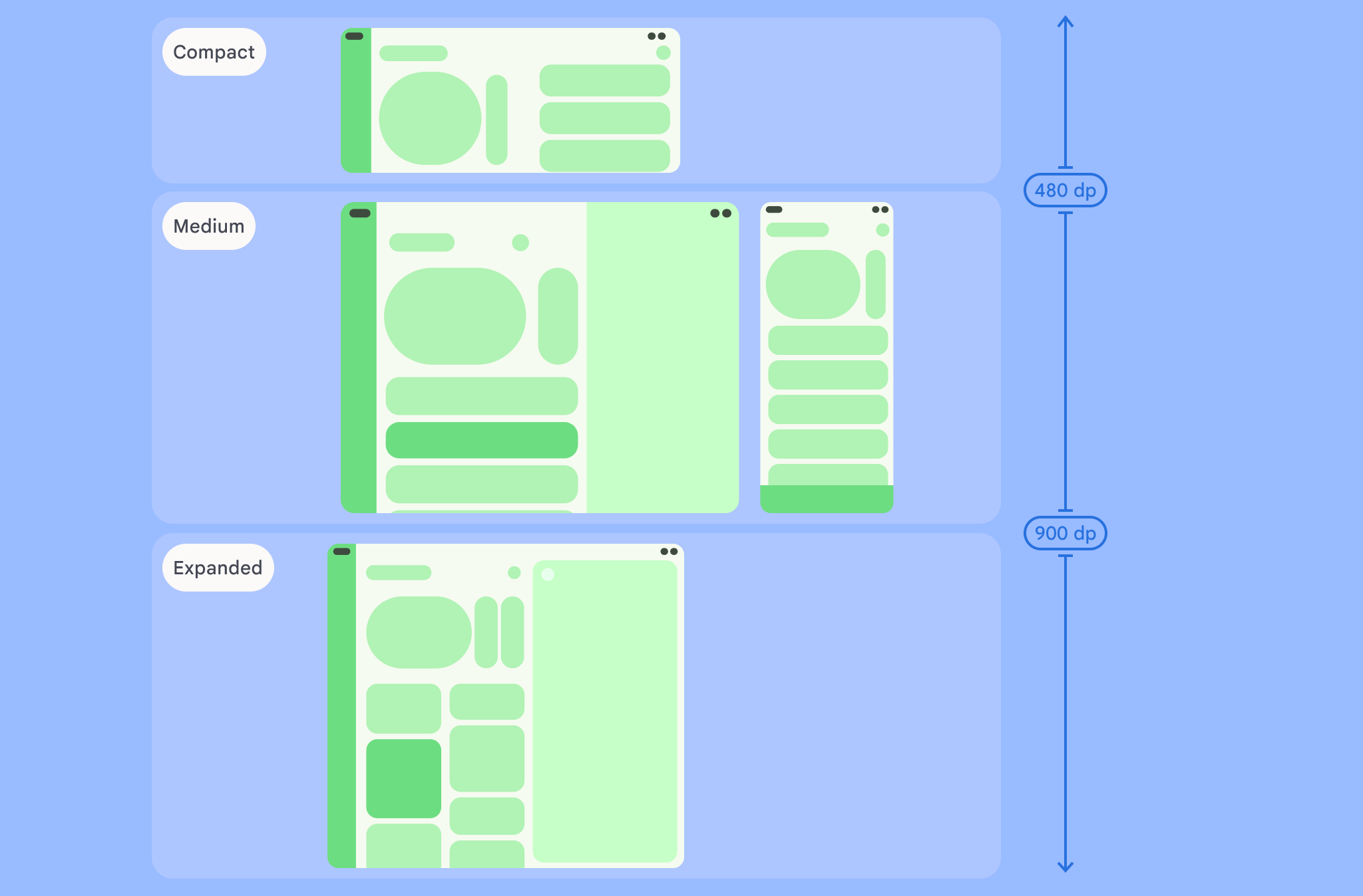
Las clases de tamaño de ventana categorizan el área de visualización disponible para tu app como compacta, mediana, expandida, grande o extragrande. El ancho y la altura disponibles se clasifican por separado, por lo que en cualquier momento, tu app tiene dos clases de tamaño de ventana: una para el ancho y otra para la altura. Por lo general, el ancho disponible es más importante que la altura disponible debido a la ubicuidad del desplazamiento vertical. Por lo tanto, es probable que la clase de tamaño de ancho de ventana sea más relevante para la IU de tu app.
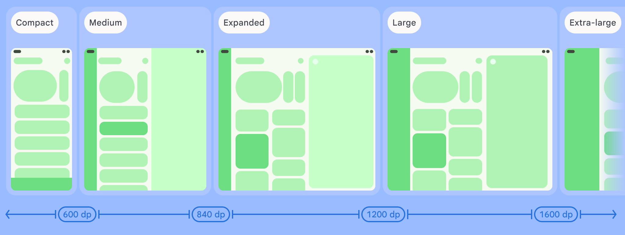
Como se indica en las figuras, los puntos de interrupción te permiten seguir pensando en los diseños en términos de dispositivos y configuraciones. Cada punto de interrupción de clase de tamaño representa la mayoría de los casos en cada dispositivo típico, que puede ser un marco de referencia útil cuando piensas en la forma de tus diseños basados en puntos de interrupción.
| Clase de tamaño | Punto de interrupción | Representación del dispositivo |
|---|---|---|
| Ancho compacto | ancho <600 dp | 99.96% de los teléfonos en orientación vertical |
| Ancho medio | 600 dp ≤ ancho < 840 dp | 93.73% de las tablets en orientación vertical La mayoría de las pantallas internas grandes y desplegadas en orientación vertical |
| Ancho expandido | 840 dp ≤ ancho < 1,200 dp | 97.22% de las tablets en orientación horizontal La mayoría de las pantallas internas grandes y desplegadas en horizontal tienen al menos un ancho expandido. |
| Ancho grande | 1200 dp ≤ ancho < 1600 dp | Pantallas de tablets grandes |
| Ancho extragrande | ancho ≥ 1,600 dp | Pantallas de escritorio |
| Altura compacta | altura <480 dp | 99.78% de los teléfonos en orientación horizontal |
| Altura media | 480 dp ≤ altura <900 dp | 96.56% de las tablets en orientación horizontal 97.59% de los teléfonos en orientación vertical |
| Altura expandida | altura ≥900 dp | 94.25% de las tablets en orientación vertical |
Si bien puede ser útil visualizar las clases de tamaño como dispositivos físicos, las clases de tamaño de ventana no están determinadas explícitamente por el tamaño de la pantalla del dispositivo. Las clases de tamaño de ventana no están diseñadas para la lógica de tipo isTablet. En cambio, están determinadas por el tamaño de ventana disponible para tu aplicación, independientemente del tipo de dispositivo en el que se ejecute, lo que tiene dos implicaciones importantes:
Los dispositivos físicos no garantizan una clase específica de tamaño de ventana. El espacio de pantalla disponible para tu app puede diferir del tamaño de la pantalla del dispositivo por varios motivos. En los dispositivos móviles, el modo de pantalla dividida puede particionar la pantalla entre dos aplicaciones. En ChromeOS, las apps para Android se pueden presentar en ventanas de tipo computadora cuyo tamaño puede cambiar de forma arbitraria. Los dispositivos plegables pueden tener dos pantallas de diferentes tamaños a las que se puede acceder de forma individual al plegar o desplegar el dispositivo.
La clase de tamaño de ventana puede cambiar durante el ciclo de vida de tu app. Mientras se ejecuta la app, los cambios de orientación, la realización de varias tareas y el plegado y desplegado del dispositivo pueden impactar en el espacio de pantalla disponible. Como resultado, la clase de tamaño de ventana es dinámica, y la IU de tu app debería adaptarse según corresponda.
Las clases de tamaño de ventana se asignan a los puntos de interrupción compactos, medianos y expandidos en la guía de diseño de Material Design. Además, se agregaron puntos de interrupción grandes y extragrandes para segmentar mejor las pantallas de escritorio y las pantallas conectadas.
Usa clases de tamaño de ventana para tomar decisiones generales en torno al diseño de la aplicación, por ejemplo, si usarás un diseño canónico específico para aprovechar el espacio de pantalla adicional.
Calcula el WindowSizeClass actual con la función de nivel superior currentWindowAdaptiveInfo() de la biblioteca androidx.compose.material3.adaptive. La función devuelve una instancia de WindowAdaptiveInfo, que contiene windowSizeClass. Para admitir puntos de interrupción grandes y extragrandes, agrega el parámetro supportLargeAndXLargeWidth establecido en true a la llamada a función. En el siguiente ejemplo, se muestra cómo calcular la clase de tamaño de ventana y recibir actualizaciones cada vez que cambia:
val windowSizeClass = currentWindowAdaptiveInfo().windowSizeClass
Cómo administrar diseños con clases de tamaño de ventana
Las clases de tamaño de ventana te permiten cambiar el diseño de tu app como el espacio de visualización. disponibles para tu app cambia, por ejemplo, cuando un dispositivo se pliega o se despliega, la Cambia la orientación del dispositivo o se cambia el tamaño de la ventana de la app en el modo multiventana. .
Localiza la lógica para controlar los cambios de tamaño de visualización pasando el tamaño de la ventana como estado a elementos componibles anidados, al igual que cualquier otro estado de la app:
@Composable fun MyApp( windowSizeClass: WindowSizeClass = currentWindowAdaptiveInfo(supportLargeAndXLargeWidth = true).windowSizeClass ) { // Decide whether to show the top app bar based on window size class. val showTopAppBar = windowSizeClass.isHeightAtLeastBreakpoint(WindowSizeClass.HEIGHT_DP_MEDIUM_LOWER_BOUND) // MyScreen logic is based on the showTopAppBar boolean flag. MyScreen( showTopAppBar = showTopAppBar, /* ... */ ) }
Prueba las clases de tamaño de ventana
A medida que realices cambios en el diseño, prueba su comportamiento en todos los tamaños de ventana, especialmente en los anchos de puntos de interrupción compacto, mediano y expandido.
Si ya tienes un diseño para pantallas compactas, primero debes optimizarlo para la clase de tamaño de ancho expandido, ya que esta clase de tamaño brinda más espacio para cambios adicionales de contenido o diseño. Luego, decide qué diseño es conveniente para la clase de tamaño mediano y considera agregar un diseño especializado.
Próximos pasos
Si quieres obtener más información para usar las clases de tamaño de ventana y crear diseños responsivos o adaptables, consulta lo siguiente:
Para diseños basados en Compose: Brinda compatibilidad con diferentes tamaños de visualización
Para diseños basados en vistas: Diseño responsivo/adaptable con vistas
Para obtener más información sobre los aspectos que hacen que una app resulte excelente en todos los dispositivos y tamaños de pantalla, consulta los siguientes recursos: