
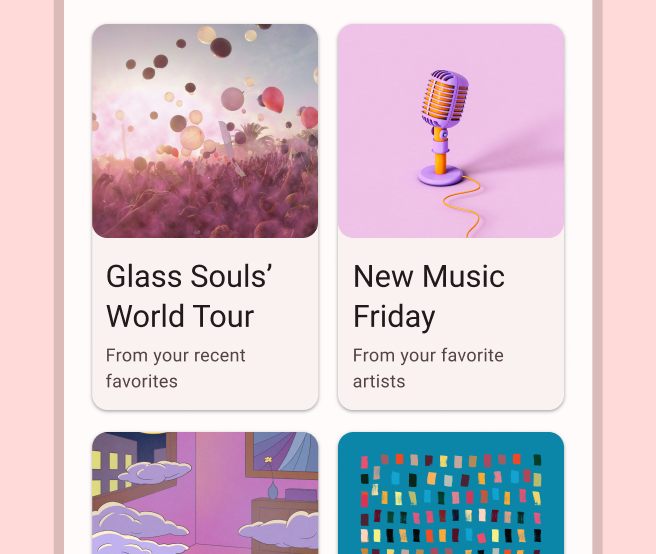
ऐप्लिकेशन को अक्सर एक जैसे स्टाइल वाले कंटेनर में डेटा दिखाना होता है. जैसे, ऐसे कंटेनर जिनमें सूची में मौजूद आइटम के बारे में जानकारी होती है. सिस्टम, आपको CardView API उपलब्ध कराता है. इसकी मदद से, कार्ड में जानकारी दिखाई जा सकती है. इन कार्ड का लुक, सभी प्लैटफ़ॉर्म पर एक जैसा होता है. उदाहरण के लिए, कार्ड में व्यू ग्रुप के ऊपर डिफ़ॉल्ट एलिवेशन होता है. इसलिए, सिस्टम उनके नीचे शैडो बनाता है. कार्ड की मदद से, व्यू के ग्रुप को एक साथ रखा जा सकता है. साथ ही, कंटेनर के लिए एक जैसा स्टाइल उपलब्ध कराया जा सकता है.
डिपेंडेंसी जोड़ना
CardView विजेट, AndroidX का हिस्सा है. इसे अपने प्रोजेक्ट में इस्तेमाल करने के लिए, अपने ऐप्लिकेशन मॉड्यूल की build.gradle फ़ाइल में यह डिपेंडेंसी जोड़ें:
ग्रूवी
dependencies {
    implementation "androidx.cardview:cardview:1.0.0"
}
Kotlin
dependencies {
    implementation("androidx.cardview:cardview:1.0.0")
}
कार्ड बनाना
किसी CardView का इस्तेमाल करने के लिए, उसे अपनी लेआउट फ़ाइल में जोड़ें. इसका इस्तेमाल व्यू ग्रुप के तौर पर करें, ताकि इसमें अन्य व्यू शामिल किए जा सकें. यहां दिए गए उदाहरण में, CardView में एक ImageView और कुछ TextViews शामिल हैं, ताकि उपयोगकर्ता को कुछ जानकारी दिखाई जा सके:
<?xml version="1.0" encoding="utf-8"?>
<androidx.constraintlayout.widget.ConstraintLayout
    xmlns:android="http://schemas.android.com/apk/res/android"
    xmlns:app="http://schemas.android.com/apk/res-auto"
    android:padding="16dp"
    android:background="#E0F7FA"
    android:layout_width="match_parent"
    android:layout_height="match_parent">

    <androidx.cardview.widget.CardView
        android:layout_width="match_parent"
        android:layout_height="wrap_content"
        app:layout_constraintBottom_toBottomOf="parent"
        app:layout_constraintEnd_toEndOf="parent"
        app:layout_constraintStart_toStartOf="parent"
        app:layout_constraintTop_toTopOf="parent">

        <androidx.constraintlayout.widget.ConstraintLayout
            android:padding="4dp"
            android:layout_width="match_parent"
            android:layout_height="match_parent">

            <ImageView
                android:id="@+id/header_image"
                android:layout_width="match_parent"
                android:layout_height="200dp"
                android:src="@drawable/logo"
                app:layout_constraintEnd_toEndOf="parent"
                app:layout_constraintStart_toStartOf="parent"
                app:layout_constraintTop_toTopOf="parent" />

            <TextView
                android:id="@+id/title"
                style="@style/TextAppearance.MaterialComponents.Headline3"
                android:layout_width="match_parent"
                android:layout_height="wrap_content"
                android:layout_marginTop="4dp"
                android:text="I'm a title"
                app:layout_constraintEnd_toEndOf="parent"
                app:layout_constraintStart_toStartOf="parent"
                app:layout_constraintTop_toBottomOf="@id/header_image" />

            <TextView
                android:id="@+id/subhead"
                style="@style/TextAppearance.MaterialComponents.Subtitle2"
                android:layout_width="match_parent"
                android:layout_height="wrap_content"
                android:layout_marginTop="4dp"
                android:text="I'm a subhead"
                app:layout_constraintEnd_toEndOf="parent"
                app:layout_constraintStart_toStartOf="parent"
                app:layout_constraintTop_toBottomOf="@id/title" />

            <TextView
                android:id="@+id/body"
                style="@style/TextAppearance.MaterialComponents.Body1"
                android:layout_width="match_parent"
                android:layout_height="wrap_content"
                android:layout_marginTop="4dp"
                android:text="I'm a supporting text. Very Lorem ipsum dolor sit amet, consectetur adipiscing elit, sed do eiusmod tempor incididunt ut labore et dolore magna aliqua. Ut enim ad minim veniam, quis nostrud exercitation ullamco laboris nisi ut aliquip ex ea commodo consequat. Duis aute irure dolor in reprehenderit in voluptate velit esse cillum dolore eu fugiat nulla pariatur. Excepteur sint occaecat cupidatat non proident, sunt in culpa qui officia deserunt mollit anim id est laborum."
                app:layout_constraintEnd_toEndOf="parent"
                app:layout_constraintStart_toStartOf="parent"
                app:layout_constraintTop_toBottomOf="@id/subhead" />
        </androidx.constraintlayout.widget.ConstraintLayout>
    </androidx.cardview.widget.CardView>
</androidx.constraintlayout.widget.ConstraintLayout>
पिछले कोड स्निपेट से, यहां दी गई इमेज जैसा कुछ दिखेगा. हालांकि, ऐसा तब होगा, जब आपने Android के लोगो वाली इमेज का इस्तेमाल किया हो:
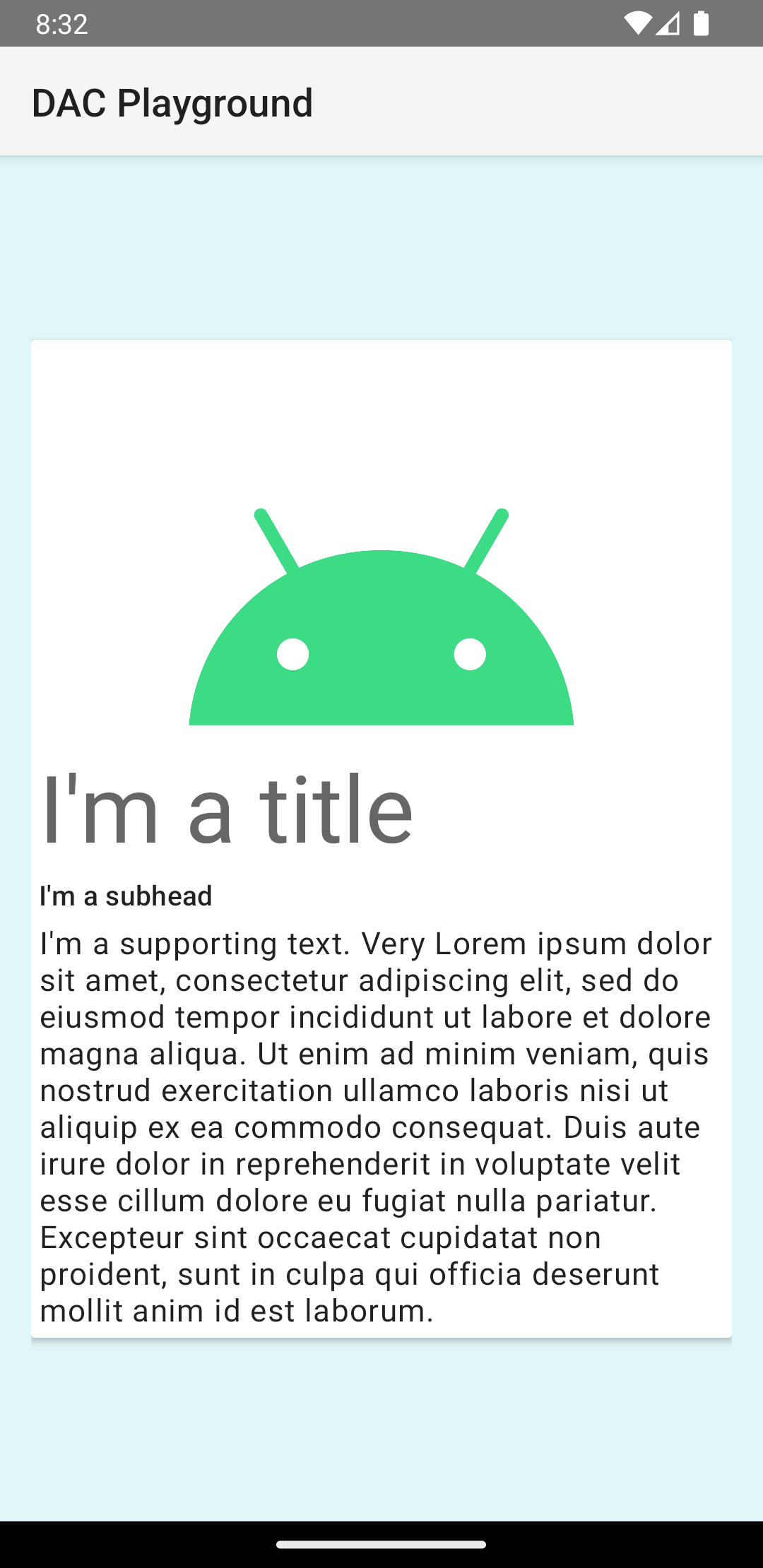
इस उदाहरण में, कार्ड को डिफ़ॉल्ट एलिवेशन के साथ स्क्रीन पर दिखाया गया है. इसकी वजह से, सिस्टम इसके नीचे एक शैडो बनाता है. card_view:cardElevation एट्रिब्यूट वाले कार्ड के लिए, कस्टम एलिवेशन दिया जा सकता है. ज़्यादा एलिवेशन वाले कार्ड की शैडो ज़्यादा गहरी होती है. वहीं, कम एलिवेशन वाले कार्ड की शैडो हल्की होती है. CardView Android 5.0 (एपीआई लेवल 21) और इसके बाद के वर्शन पर, असली एलिवेशन और डाइनैमिक शैडो का इस्तेमाल करता है.
CardView विजेट की स्टाइल को पसंद के मुताबिक बनाने के लिए, इन प्रॉपर्टी का इस्तेमाल करें:
- अपने लेआउट में कॉर्नर रेडियस सेट करने के लिए,
card_view:cardCornerRadiusएट्रिब्यूट का इस्तेमाल करें. - अपने कोड में कॉर्नर रेडियस सेट करने के लिए,
CardView.setRadiusतरीके का इस्तेमाल करें. - कार्ड के बैकग्राउंड का रंग सेट करने के लिए,
card_view:cardBackgroundColorएट्रिब्यूट का इस्तेमाल करें.