
虽然 Material 是我们推荐的设计系统并且 Jetpack Compose 附带了 Material 的实现,但并非只能使用该系统。Material 完全基于公共 API 构建而成,因此您可以按照同样的方式自行创建设计系统。
您可以采用以下几种方法:
- 使用其他主题
值扩展
MaterialTheme。 - 将一个或多个 Material 系统(
Colors、Typography或Shapes)替换为自定义实现,同时保留 其他实现。 - 实现完全自定义的设计系统以替换
MaterialTheme。
您可能还需要继续将 Material 组件与自定义设计系统结合使用。您可以这样做,但需要注意一些事项,以适应您所采用的方法。
如需详细了解 MaterialTheme
以及自定义设计系统使用的较低级别的结构体和 API,请参阅 Compose 中的主题详解指南。
扩展 Material 主题设置
Compose Material 会对 Material 主题设置 进行相近建模,使得遵循 Material 准则既简单又能确保类型安全。 不过,您也可以使用其他值扩展颜色、字体排版和形状集。最简单的方法是添加扩展属性:
// Use with MaterialTheme.colorScheme.snackbarAction val ColorScheme.snackbarAction: Color @Composable get() = if (isSystemInDarkTheme()) Red300 else Red700 // Use with MaterialTheme.typography.textFieldInput val Typography.textFieldInput: TextStyle get() = TextStyle(/* ... */) // Use with MaterialTheme.shapes.card val Shapes.card: Shape get() = RoundedCornerShape(size = 20.dp)
这与使用 MaterialTheme 的 API 一致。例如,
`surfaceColorAtElevation` 由 Compose 自行定义,且根据
高度确定应使用的表面颜色。surfaceColorAtElevation
另一种方法是定义可“封装”MaterialTheme 及其值的扩展主题。
假设您要添加另外两种颜色(caution 和 onCaution,一种用于表示半危险操作的黄色),且保留现有 Material 颜色:
@Immutable data class ExtendedColors( val caution: Color, val onCaution: Color ) val LocalExtendedColors = staticCompositionLocalOf { ExtendedColors( caution = Color.Unspecified, onCaution = Color.Unspecified ) } @Composable fun ExtendedTheme( /* ... */ content: @Composable () -> Unit ) { val extendedColors = ExtendedColors( caution = Color(0xFFFFCC02), onCaution = Color(0xFF2C2D30) ) CompositionLocalProvider(LocalExtendedColors provides extendedColors) { MaterialTheme( /* colors = ..., typography = ..., shapes = ... */ content = content ) } } // Use with eg. ExtendedTheme.colors.caution object ExtendedTheme { val colors: ExtendedColors @Composable get() = LocalExtendedColors.current }
这与使用 MaterialTheme 的 API 类似。此外,它还支持多个主题,因为您可以使用与 MaterialTheme
相同的方式嵌套 ExtendedTheme。
使用 Material 组件
扩展 Material 主题设置时,现有 MaterialTheme 值将持不变,且 Material 组件仍采用合理的默认值。
如果您希望在组件中使用扩展值,请将这些值封装到您自己的可组合函数中,直接设置您要更改的值,并将其他值作为参数提供给包含扩展值的可组合项:
@Composable fun ExtendedButton( onClick: () -> Unit, modifier: Modifier = Modifier, content: @Composable RowScope.() -> Unit ) { Button( colors = ButtonDefaults.buttonColors( containerColor = ExtendedTheme.colors.caution, contentColor = ExtendedTheme.colors.onCaution /* Other colors use values from MaterialTheme */ ), onClick = onClick, modifier = modifier, content = content ) }
然后,您可以根据需要将 Button 替换为 ExtendedButton。
@Composable fun ExtendedApp() { ExtendedTheme { /*...*/ ExtendedButton(onClick = { /* ... */ }) { /* ... */ } } }
替换 Material 子系统
您可能希望通过自定义实现替换一个或多个系统(Colors、Typography 或 Shapes),同时保留其他系统,而非扩展
Material 主题设置。
假设您希望替换类型系统和形状系统,同时保留颜色系统:
@Immutable data class ReplacementTypography( val body: TextStyle, val title: TextStyle ) @Immutable data class ReplacementShapes( val component: Shape, val surface: Shape ) val LocalReplacementTypography = staticCompositionLocalOf { ReplacementTypography( body = TextStyle.Default, title = TextStyle.Default ) } val LocalReplacementShapes = staticCompositionLocalOf { ReplacementShapes( component = RoundedCornerShape(ZeroCornerSize), surface = RoundedCornerShape(ZeroCornerSize) ) } @Composable fun ReplacementTheme( /* ... */ content: @Composable () -> Unit ) { val replacementTypography = ReplacementTypography( body = TextStyle(fontSize = 16.sp), title = TextStyle(fontSize = 32.sp) ) val replacementShapes = ReplacementShapes( component = RoundedCornerShape(percent = 50), surface = RoundedCornerShape(size = 40.dp) ) CompositionLocalProvider( LocalReplacementTypography provides replacementTypography, LocalReplacementShapes provides replacementShapes ) { MaterialTheme( /* colors = ... */ content = content ) } } // Use with eg. ReplacementTheme.typography.body object ReplacementTheme { val typography: ReplacementTypography @Composable get() = LocalReplacementTypography.current val shapes: ReplacementShapes @Composable get() = LocalReplacementShapes.current }
使用 Material 组件
替换一个或多个 MaterialTheme 系统后,按原样使用 Material 组件可能会产生不必要的 Material
颜色、类型或形状值。
如果您希望在组件中使用替换值,请将这些值封装到您自己的可组合函数中,直接设置相关系统的值,并将其他值作为参数提供给包含替换值的可组合项。
@Composable fun ReplacementButton( onClick: () -> Unit, modifier: Modifier = Modifier, content: @Composable RowScope.() -> Unit ) { Button( shape = ReplacementTheme.shapes.component, onClick = onClick, modifier = modifier, content = { ProvideTextStyle( value = ReplacementTheme.typography.body ) { content() } } ) }
然后,您可以根据需要将 Button 替换为 ReplacementButton。
@Composable fun ReplacementApp() { ReplacementTheme { /*...*/ ReplacementButton(onClick = { /* ... */ }) { /* ... */ } } }
实现完全自定义的设计系统
您可能会希望将 Material 主题设置系统替换为完全自定义的设计系统。
请注意,MaterialTheme
可提供以下系统:
Colors、Typography和Shapes:Material 主题设置系统TextSelectionColors:用于表示Text和TextField的文本选择颜色Ripple和RippleTheme:用于表示Indication的 Material 实现
如果您想继续使用 Material 组件,则必须在自定义主题中替换某些系统,或处理组件中的系统,以免出现异常。
但是,设计系统并不仅限于 Material 所依赖的概念。您可以修改现有系统并引入全新的系统(采用新的类和类型),以使其他概念与主题兼容。
在下面的代码中,我们对包含渐变效果
(List<Color>) 的自定义颜色系统进行了建模,添加了类型系统,引入了新的高度系统,
且排除了 MaterialTheme 提供的其他系统:
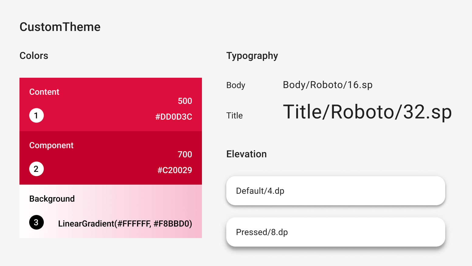
@Immutable data class CustomColors( val content: Color, val component: Color, val background: List<Color> ) @Immutable data class CustomTypography( val body: TextStyle, val title: TextStyle ) @Immutable data class CustomElevation( val default: Dp, val pressed: Dp ) val LocalCustomColors = staticCompositionLocalOf { CustomColors( content = Color.Unspecified, component = Color.Unspecified, background = emptyList() ) } val LocalCustomTypography = staticCompositionLocalOf { CustomTypography( body = TextStyle.Default, title = TextStyle.Default ) } val LocalCustomElevation = staticCompositionLocalOf { CustomElevation( default = Dp.Unspecified, pressed = Dp.Unspecified ) } @Composable fun CustomTheme( /* ... */ content: @Composable () -> Unit ) { val customColors = CustomColors( content = Color(0xFFDD0D3C), component = Color(0xFFC20029), background = listOf(Color.White, Color(0xFFF8BBD0)) ) val customTypography = CustomTypography( body = TextStyle(fontSize = 16.sp), title = TextStyle(fontSize = 32.sp) ) val customElevation = CustomElevation( default = 4.dp, pressed = 8.dp ) CompositionLocalProvider( LocalCustomColors provides customColors, LocalCustomTypography provides customTypography, LocalCustomElevation provides customElevation, content = content ) } // Use with eg. CustomTheme.elevation.small object CustomTheme { val colors: CustomColors @Composable get() = LocalCustomColors.current val typography: CustomTypography @Composable get() = LocalCustomTypography.current val elevation: CustomElevation @Composable get() = LocalCustomElevation.current }
使用 Material 组件
如果不存在 MaterialTheme,按原样使用 Material 组件将产生不必要的 Material
颜色、类型和形状值及指示行为。
如果您希望在组件中使用自定义值,请将这些值封装到您自己的可组合函数中,直接设置相关系统的值,并将其他值作为参数提供给包含自定义值的可组合项。
我们建议您从自定义主题访问您设置的值。
或者,如果您的主题未提供 Color、TextStyle、Shape
或其他系统,您可以对其进行硬编码。
@Composable fun CustomButton( onClick: () -> Unit, modifier: Modifier = Modifier, content: @Composable RowScope.() -> Unit ) { Button( colors = ButtonDefaults.buttonColors( containerColor = CustomTheme.colors.component, contentColor = CustomTheme.colors.content, disabledContainerColor = CustomTheme.colors.content .copy(alpha = 0.12f) .compositeOver(CustomTheme.colors.component), disabledContentColor = CustomTheme.colors.content .copy(alpha = 0.38f) ), shape = ButtonShape, elevation = ButtonDefaults.elevatedButtonElevation( defaultElevation = CustomTheme.elevation.default, pressedElevation = CustomTheme.elevation.pressed /* disabledElevation = 0.dp */ ), onClick = onClick, modifier = modifier, content = { ProvideTextStyle( value = CustomTheme.typography.body ) { content() } } ) } val ButtonShape = RoundedCornerShape(percent = 50)
如果您引入了新的类类型(例如引入 List<Color> 来表示
渐变),最好重新实现组件,而非采用封装的方式。您可以查看
JetsnackButton
Jetsnack 示例中的。
为您推荐
- 注意:当 JavaScript 处于关闭状态时,系统会显示链接文字
- Compose 中的 Material Design 3
- 在 Compose 中从 Material 2 迁移至 Material 3
- Compose 中的主题详解