Tetap teratur dengan koleksi
Simpan dan kategorikan konten berdasarkan preferensi Anda.
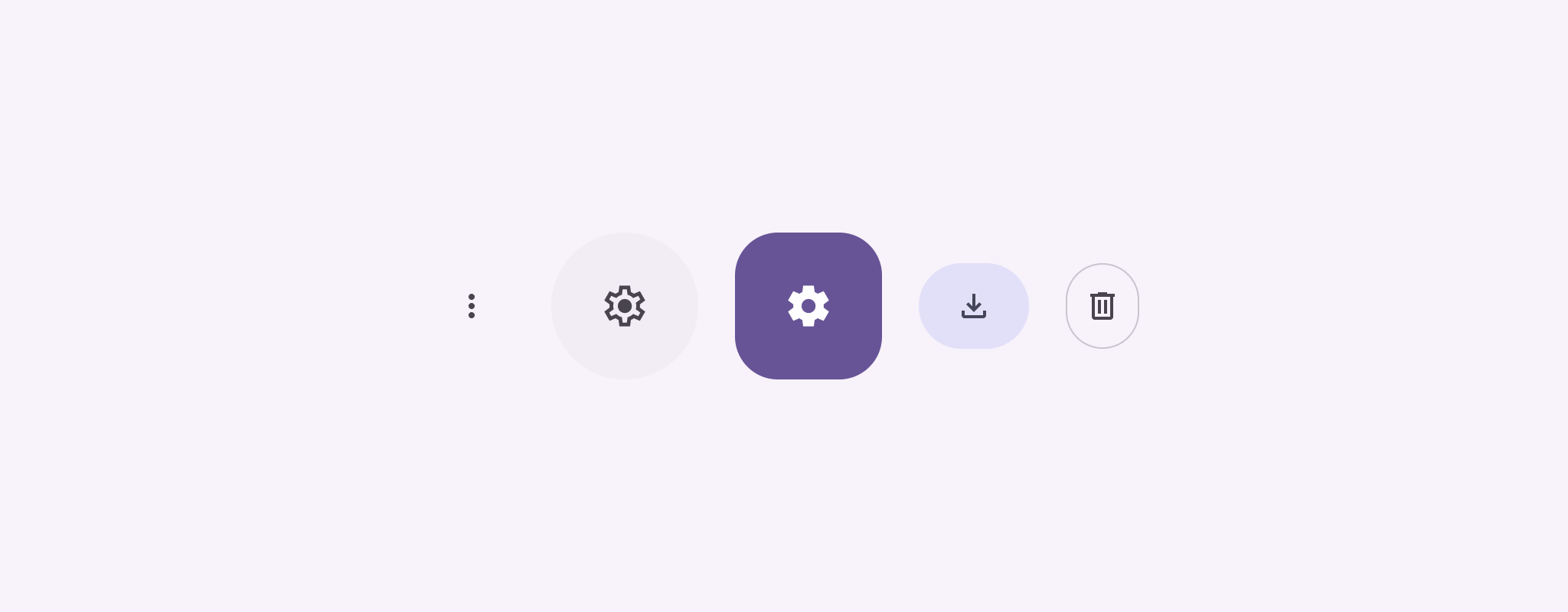
Tombol ikon menampilkan tindakan yang dapat dilakukan pengguna. Tombol ikon harus menggunakan ikon
dengan makna yang jelas, dan biasanya mewakili tindakan umum atau yang sering digunakan.
Ada dua jenis tombol ikon:
Default: Tombol ini dapat membuka elemen lain, seperti menu atau penelusuran.
Tombol alih: Tombol ini dapat mewakili tindakan biner yang dapat diaktifkan
atau dinonaktifkan, seperti "favorit" atau "bookmark".
Gambar 1. Tombol ikon, beberapa di antaranya diisi (menunjukkan pilihan) dan
digarisbatasi.
onClick: Fungsi lambda yang dijalankan saat pengguna mengetuk tombol ikon.
enabled: Boolean yang mengontrol status tombol yang diaktifkan. Jika
false, tombol tidak akan merespons input pengguna.
content: Konten composable di dalam tombol, biasanya Icon.
Contoh dasar: Tombol ikon tombol
Contoh ini menunjukkan cara menerapkan tombol ikon tombol. Tombol ikon
tombol akan mengubah tampilannya berdasarkan apakah tombol tersebut dipilih atau tidak dipilih.
@Preview@ComposablefunToggleIconButtonExample(){// isToggled initial value should be read from a view model or persistent storage.varisToggledbyrememberSaveable{mutableStateOf(false)}IconButton(onClick={isToggled=!isToggled}){Icon(painter=if(isToggled)painterResource(R.drawable.favorite_filled)elsepainterResource(R.drawable.favorite),contentDescription=if(isToggled)"Selected icon button"else"Unselected icon button.")}}
Composable ToggleIconButtonExample menentukan IconButton yang dapat diaktifkan.
mutableStateOf(false) membuat objek MutableState yang menyimpan
nilai boolean, awalnya false. Hal ini menjadikan isToggled sebagai holder status,
yang berarti Compose mengomposisi ulang UI setiap kali nilainya berubah.
rememberSaveable memastikan status isToggled tetap ada di seluruh
perubahan konfigurasi, seperti rotasi layar.
Lambda onClick dari IconButton menentukan perilaku tombol saat
diklik, yang mengalihkan status antara true dan false.
Parameter painter composable Icon memuat
painterResource yang berbeda secara kondisional berdasarkan status isToggled. Tindakan ini akan mengubah
tampilan visual ikon.
Jika isToggled adalah true, kode ini akan memuat drawable hati yang terisi.
Jika isToggled adalah false, isToggled akan memuat drawable hati yang digarisbatasi.
contentDescription dari Icon juga diperbarui berdasarkan status
isToggled untuk memberikan informasi aksesibilitas yang sesuai.
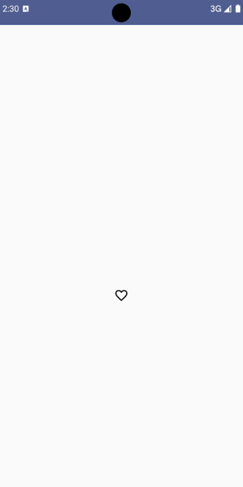
Hasil
Gambar berikut menampilkan tombol ikon tombol dari cuplikan sebelumnya dalam
status yang tidak dipilih:
Gambar 2. Tombol ikon tombol "favorit" dalam status tidak dipilih.
Contoh lanjutan: Tindakan berulang saat ditekan
Bagian ini menunjukkan cara membuat tombol ikon yang terus memicu
tindakan saat pengguna menekan dan menahannya, bukan hanya memicu
sekali per klik.
@ComposablefunMomentaryIconButton(unselectedImage:Int,selectedImage:Int,contentDescription:String,modifier:Modifier=Modifier,stepDelay:Long=100L,// Minimum value is 1L milliseconds.onClick:()->Unit){valinteractionSource=remember{MutableInteractionSource()}valisPressedbyinteractionSource.collectIsPressedAsState()valpressedListenerbyrememberUpdatedState(onClick)LaunchedEffect(isPressed){while(isPressed){delay(stepDelay.coerceIn(1L,Long.MAX_VALUE))pressedListener()}}IconButton(modifier=modifier,onClick=onClick,interactionSource=interactionSource){Icon(painter=if(isPressed)painterResource(id=selectedImage)elsepainterResource(id=unselectedImage),contentDescription=contentDescription,)}}
MomentaryIconButton menggunakan unselectedImage: Int, ID resource
drawable untuk ikon saat tombol tidak ditekan, dan selectedImage: Int, ID resource drawable untuk ikon saat tombol ditekan.
Fungsi ini menggunakan interactionSource untuk melacak interaksi "tekan" secara khusus dari
pengguna.
isPressed bernilai benar jika tombol ditekan secara aktif dan salah jika tidak. Jika isPressed adalah true, LaunchedEffect akan memasuki loop.
Di dalam loop ini, loop menggunakan delay (dengan stepDelay) untuk membuat jeda
di antara tindakan pemicu. coerceIn memastikan penundaan minimal 1 md untuk
mencegah loop tanpa henti.
pressedListener dipanggil setelah setiap penundaan dalam loop. Tindakan ini
akan membuat tindakan diulang.
pressedListener menggunakan rememberUpdatedState untuk memastikan bahwa lambda onClick (tindakan yang akan dilakukan) selalu yang terbaru dari komposisi
terbaru.
Icon mengubah gambar yang ditampilkan berdasarkan apakah tombol
saat ini ditekan atau tidak.
Jika isPressed bernilai benar, selectedImage akan ditampilkan.
Jika tidak, unselectedImage akan ditampilkan.
Selanjutnya, gunakan MomentaryIconButton ini dalam contoh. Cuplikan berikut
menunjukkan dua tombol ikon yang mengontrol penghitung:
@Preview()@ComposablefunMomentaryIconButtonExample(){varpressedCountbyremember{mutableIntStateOf(0)}Row(modifier=Modifier.fillMaxWidth(),verticalAlignment=Alignment.CenterVertically){MomentaryIconButton(unselectedImage=R.drawable.fast_rewind,selectedImage=R.drawable.fast_rewind_filled,stepDelay=100L,onClick={pressedCount-=1},contentDescription="Decrease count button")Spacer(modifier=Modifier)Text("advanced by $pressedCount frames")Spacer(modifier=Modifier)MomentaryIconButton(unselectedImage=R.drawable.fast_forward,selectedImage=R.drawable.fast_forward_filled,contentDescription="Increase count button",stepDelay=100L,onClick={pressedCount+=1})}}
Composable MomentaryIconButtonExample menampilkan Row yang berisi dua
instance MomentaryIconButton dan composable Text untuk mem-build UI guna
menambahkan dan mengurangi penghitung.
Fungsi ini mempertahankan variabel status pressedCount yang dapat diubah menggunakan remember dan
mutableIntStateOf, yang diinisialisasi ke 0. Saat pressedCount berubah, setiap
composable yang mengamatinya (seperti composable Text) akan merekomposisi untuk mencerminkan
nilai baru.
MomentaryIconButton pertama akan mengurangi pressedCount saat diklik atau ditahan.
MomentaryIconButton kedua akan meningkatkan pressedCount saat diklik atau
dipegang.
Kedua tombol menggunakan stepDelay 100 milidetik, yang berarti tindakan onClick
diulang setiap 100 md saat tombol ditekan.
Hasil
Video berikut menampilkan UI dengan tombol ikon dan penghitung:
Gambar 3. UI penghitung dengan dua tombol ikon (plus dan minus) yang menambah dan mengurangi penghitung.
Konten dan contoh kode di halaman ini tunduk kepada lisensi yang dijelaskan dalam Lisensi Konten. Java dan OpenJDK adalah merek dagang atau merek dagang terdaftar dari Oracle dan/atau afiliasinya.
Terakhir diperbarui pada 2025-08-28 UTC.
[null,null,["Terakhir diperbarui pada 2025-08-28 UTC."],[],[],null,["Icon buttons display actions that users can take. Icon buttons must use an icon\nwith a clear meaning, and typically represent common or frequently used actions.\n\nThere are two types of icon buttons:\n\n- **Default**: These buttons can open other elements, such as a menu or search.\n- **Toggle**: These buttons can represent binary actions that can be toggled on or off, such as \"favorite\" or \"bookmark\".\n\n**Figure 1.** Icon buttons, some of which are filled (indicating selection) and outlined.\n\nAPI surface\n\nUse the [`IconButton`](/reference/kotlin/androidx/compose/material3/package-summary#IconButton(kotlin.Function0,androidx.compose.ui.Modifier,kotlin.Boolean,androidx.compose.material3.IconButtonColors,androidx.compose.foundation.interaction.MutableInteractionSource,kotlin.Function1)) composable to implement standard icon buttons. To\ncreate different visual styles like filled, filled tonal, or outlined, use\n[`FilledIconButton`](/reference/kotlin/androidx/compose/material3/package-summary#FilledIconButton(kotlin.Function0,androidx.compose.material3.IconButtonShapes,androidx.compose.ui.Modifier,kotlin.Boolean,androidx.compose.material3.IconButtonColors,androidx.compose.foundation.interaction.MutableInteractionSource,kotlin.Function0)), [`FilledTonalIconButton`](/reference/kotlin/androidx/compose/material3/package-summary#FilledTonalIconButton(kotlin.Function0,androidx.compose.ui.Modifier,kotlin.Boolean,androidx.compose.ui.graphics.Shape,androidx.compose.material3.IconButtonColors,androidx.compose.foundation.interaction.MutableInteractionSource,kotlin.Function0)), and\n[`OutlinedIconButton`](/reference/kotlin/androidx/compose/material3/package-summary#OutlinedIconButton(kotlin.Function0,androidx.compose.material3.IconButtonShapes,androidx.compose.ui.Modifier,kotlin.Boolean,androidx.compose.material3.IconButtonColors,androidx.compose.foundation.BorderStroke,androidx.compose.foundation.interaction.MutableInteractionSource,kotlin.Function0)), respectively.\n\nThe key parameters for `IconButton` include:\n\n- `onClick`: A lambda function that executes when the user taps the icon button.\n- `enabled`: A boolean that controls the enabled state of the button. When `false`, the button does not respond to user input.\n- `content`: The composable content inside the button, typically an `Icon`.\n\nBasic example: Toggle icon button\n\nThis example shows you how to implement a toggle icon button. A toggle icon\nbutton changes its appearance based on whether it's selected or unselected.\n\n\n```kotlin\n@Preview\n@Composable\nfun ToggleIconButtonExample() {\n // isToggled initial value should be read from a view model or persistent storage.\n var isToggled by rememberSaveable { mutableStateOf(false) }\n\n IconButton(\n onClick = { isToggled = !isToggled }\n ) {\n Icon(\n painter = if (isToggled) painterResource(R.drawable.favorite_filled) else painterResource(R.drawable.favorite),\n contentDescription = if (isToggled) \"Selected icon button\" else \"Unselected icon button.\"\n )\n }\n}https://github.com/android/snippets/blob/5673ffc60b614daf028ee936227128eb8c4f9781/compose/snippets/src/main/java/com/example/compose/snippets/components/IconButton.kt#L44-L58\n```\n\n\u003cbr /\u003e\n\nKey points about the code\n\n- The `ToggleIconButtonExample` composable defines a toggleable `IconButton`.\n - `mutableStateOf(false)` creates a `MutableState` object that holds a boolean value, initially `false`. This makes `isToggled` a state holder, meaning Compose recomposes the UI whenever its value changes.\n - `rememberSaveable` ensures the `isToggled` state persists across configuration changes, like screen rotation.\n- The `onClick` lambda of the `IconButton` defines the button's behavior when clicked, toggling the state between `true` and `false`.\n- The [`Icon`](/reference/kotlin/androidx/compose/material3/package-summary#Icon(androidx.compose.ui.graphics.painter.Painter,kotlin.String,androidx.compose.ui.Modifier,androidx.compose.ui.graphics.Color)) composable's `painter` parameter conditionally loads a different `painterResource` based on the `isToggled` state. This changes the visual appearance of the icon.\n - If `isToggled` is `true`, it loads the filled heart drawable.\n - If `isToggled` is `false`, it loads the outlined heart drawable.\n- The `contentDescription` of the `Icon` also updates based on the `isToggled` state to provide appropriate accessibility information.\n\nResult\n\nThe following image shows the toggle icon button from the preceding snippet in\nits unselected state:\n**Figure 2.** A \"favorite\" toggle icon button in its unselected state.\n\nAdvanced example: Repeated actions on press\n\nThis section demonstrates how to create icon buttons that continuously trigger\nan action while the user presses and holds them, rather than just triggering\nonce per click.\n\n\n```kotlin\n@Composable\nfun MomentaryIconButton(\n unselectedImage: Int,\n selectedImage: Int,\n contentDescription: String,\n modifier: Modifier = Modifier,\n stepDelay: Long = 100L, // Minimum value is 1L milliseconds.\n onClick: () -\u003e Unit\n) {\n val interactionSource = remember { MutableInteractionSource() }\n val isPressed by interactionSource.collectIsPressedAsState()\n val pressedListener by rememberUpdatedState(onClick)\n\n LaunchedEffect(isPressed) {\n while (isPressed) {\n delay(stepDelay.coerceIn(1L, Long.MAX_VALUE))\n pressedListener()\n }\n }\n\n IconButton(\n modifier = modifier,\n onClick = onClick,\n interactionSource = interactionSource\n ) {\n Icon(\n painter = if (isPressed) painterResource(id = selectedImage) else painterResource(id = unselectedImage),\n contentDescription = contentDescription,\n )\n }\n}https://github.com/android/snippets/blob/5673ffc60b614daf028ee936227128eb8c4f9781/compose/snippets/src/main/java/com/example/compose/snippets/components/IconButton.kt#L62-L92\n```\n\n\u003cbr /\u003e\n\nKey points about the code\n\n- `MomentaryIconButton` takes an `unselectedImage: Int`, the drawable resource ID for the icon when the button is not pressed, and `selectedImage: Int`, the drawable resource ID for the icon when the button is pressed.\n- It uses an `interactionSource` to specifically track \"press\" interactions from the user.\n- `isPressed` is true when the button is actively being pressed and false otherwise. When `isPressed` is `true`, the `LaunchedEffect` enters a loop.\n - Inside this loop, it uses a `delay` (with `stepDelay`) to create pauses between triggering actions. `coerceIn` ensures the delay is at least 1ms to prevent infinite loops.\n - The `pressedListener` is invoked after each delay within the loop. This makes the action repeat.\n- The `pressedListener` uses `rememberUpdatedState` to ensure that the `onClick` lambda (the action to perform) is always the most up-to-date from the latest composition.\n- The `Icon` changes its displayed image based on whether the button is currently pressed or not.\n - If `isPressed` is true, the `selectedImage` is shown.\n - Otherwise, the `unselectedImage` is shown.\n\nNext, use this `MomentaryIconButton` in an example. The following snippet\ndemonstrates two icon buttons controlling a counter:\n\n\n```kotlin\n@Preview()\n@Composable\nfun MomentaryIconButtonExample() {\n var pressedCount by remember { mutableIntStateOf(0) }\n\n Row(\n modifier = Modifier.fillMaxWidth(),\n verticalAlignment = Alignment.CenterVertically\n ) {\n MomentaryIconButton(\n unselectedImage = R.drawable.fast_rewind,\n selectedImage = R.drawable.fast_rewind_filled,\n stepDelay = 100L,\n onClick = { pressedCount -= 1 },\n contentDescription = \"Decrease count button\"\n )\n Spacer(modifier = Modifier)\n Text(\"advanced by $pressedCount frames\")\n Spacer(modifier = Modifier)\n MomentaryIconButton(\n unselectedImage = R.drawable.fast_forward,\n selectedImage = R.drawable.fast_forward_filled,\n contentDescription = \"Increase count button\",\n stepDelay = 100L,\n onClick = { pressedCount += 1 }\n )\n }\n}https://github.com/android/snippets/blob/5673ffc60b614daf028ee936227128eb8c4f9781/compose/snippets/src/main/java/com/example/compose/snippets/components/IconButton.kt#L96-L123\n```\n\n\u003cbr /\u003e\n\nKey points about the code\n\n- The `MomentaryIconButtonExample` composable displays a `Row` containing two `MomentaryIconButton` instances and a `Text` composable to build a UI for incrementing and decrementing a counter.\n- It maintains a `pressedCount` mutable state variable using `remember` and `mutableIntStateOf`, initialized to 0. When `pressedCount` changes, any composables observing it (like the `Text` composable) recompose to reflect the new value.\n- The first `MomentaryIconButton` decreases `pressedCount` when clicked or held.\n- The second `MomentaryIconButton` increases `pressedCount` when clicked or held.\n- Both buttons use a `stepDelay` of 100 milliseconds, meaning the `onClick` action repeats every 100ms while a button is held.\n\nResult\n\nThe following video shows the UI with the icon buttons and the counter:\n**Figure 3**. A counter UI with two icon buttons (plus and minus) that increment and decrement the counter.\n\nAdditional resources\n\n- [Material 3 - Icon buttons](https://m3.material.io/components/icon-buttons/overview)"]]