Tetap teratur dengan koleksi
Simpan dan kategorikan konten berdasarkan preferensi Anda.
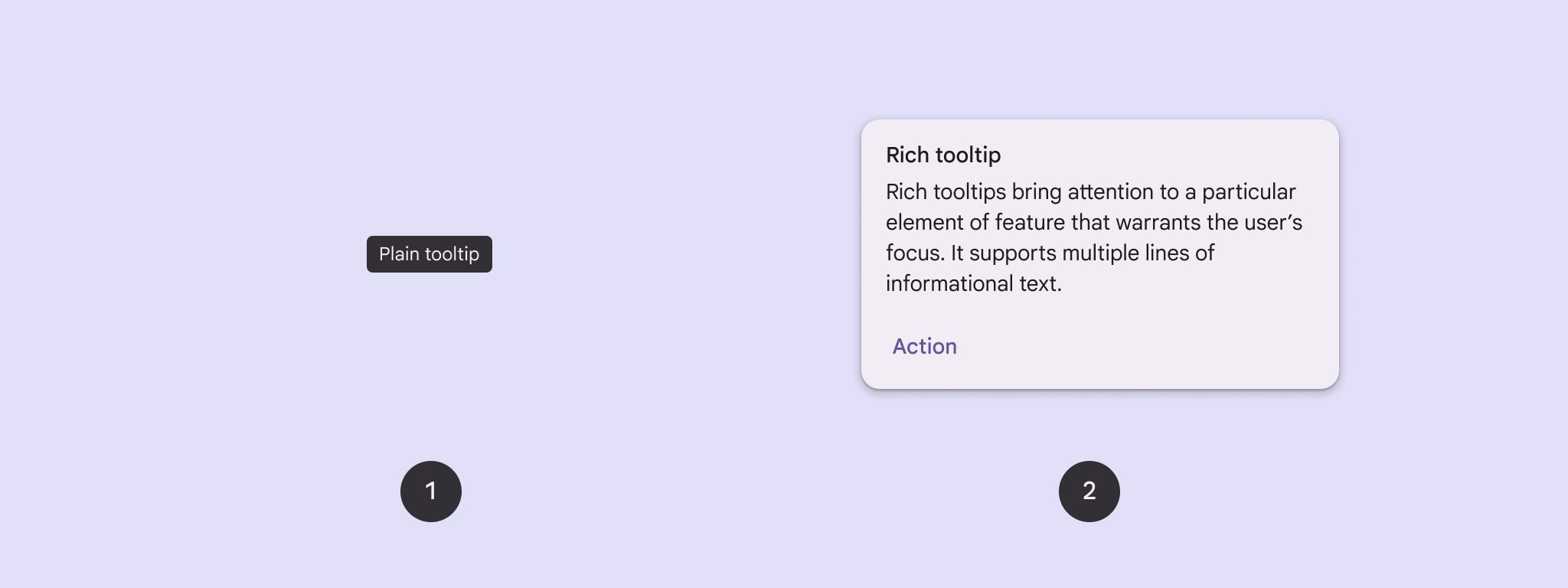
Gunakan tooltip untuk menambahkan konteks ke tombol atau elemen UI lainnya.
Ada dua jenis tooltip:
Tooltip biasa: Mendeskripsikan elemen atau tindakan tombol ikon.
Tooltip kaya: Memberikan detail lebih lanjut, seperti mendeskripsikan nilai fitur. Juga dapat menyertakan judul, link, dan tombol opsional.
Gambar 1. Tooltip biasa (1) dan tooltip lengkap (2).
Platform API
Anda dapat menggunakan composable TooltipBox untuk menerapkan tooltip di aplikasi Anda.
Anda mengontrol tampilan TooltipBox dengan parameter utama berikut:
positionProvider: Menempatkan tooltip relatif terhadap konten penampung. Anda biasanya menggunakan penyedia posisi default dari TooltipDefaults, atau Anda dapat menyediakan penyedia posisi Anda sendiri jika memerlukan logika penentuan posisi kustom.
tooltip: Composable yang berisi konten tooltip. Anda biasanya
menggunakan composable PlainTooltip atau RichTooltip.
Gunakan PlainTooltip untuk mendeskripsikan elemen atau tindakan tombol ikon.
Gunakan RichTooltip untuk memberikan detail selengkapnya, seperti mendeskripsikan nilai fitur. Tooltip kaya dapat menyertakan judul, link, dan tombol opsional.
state: Holder status yang berisi logika UI dan status elemen untuk
tooltip ini.
content: Konten composable yang menjadi titik penjangkaran tooltip.
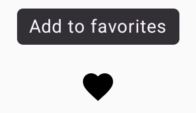
Menampilkan tooltip biasa
Gunakan tooltip biasa untuk menjelaskan elemen UI secara singkat. Cuplikan kode ini menampilkan
tooltip biasa di atas tombol ikon, yang diberi label "Tambahkan ke favorit":
@ComposablefunPlainTooltipExample(modifier:Modifier=Modifier,plainTooltipText:String="Add to favorites"){TooltipBox(modifier=modifier,positionProvider=TooltipDefaults.rememberPlainTooltipPositionProvider(),tooltip={PlainTooltip{Text(plainTooltipText)}},state=rememberTooltipState()){IconButton(onClick={/* Do something... */}){Icon(imageVector=Icons.Filled.Favorite,contentDescription="Add to favorites")}}}
IconButton membuat tombol yang dapat diklik dengan ikon.
Icon(...) menampilkan ikon hati di dalam tombol.
Saat pengguna berinteraksi dengan IconButton, TooltipBox menampilkan tooltip
dengan teks "Tambahkan ke favorit". Bergantung pada perangkat, pengguna dapat memicu
tooltip dengan cara berikut:
Mengarahkan kursor ke ikon
Menekan lama ikon di perangkat seluler
Hasil
Contoh ini menghasilkan tooltip biasa di atas ikon:
Gambar 2. Tooltip biasa yang muncul saat pengguna mengarahkan kursor ke atau menekan lama ikon hati.
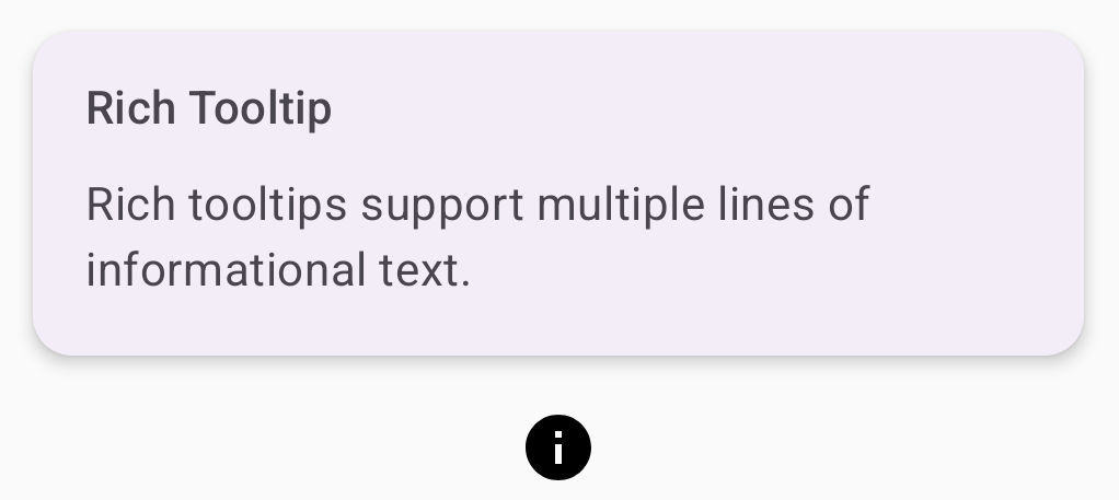
Menampilkan tooltip multimedia
Gunakan tooltip lengkap untuk memberikan konteks tambahan tentang elemen UI. Contoh
ini membuat tooltip kaya multi-baris dengan judul yang ditambatkan ke
Icon:
@ComposablefunRichTooltipExample(modifier:Modifier=Modifier,richTooltipSubheadText:String="Rich Tooltip",richTooltipText:String="Rich tooltips support multiple lines of informational text."){TooltipBox(modifier=modifier,positionProvider=TooltipDefaults.rememberRichTooltipPositionProvider(),tooltip={RichTooltip(title={Text(richTooltipSubheadText)}){Text(richTooltipText)}},state=rememberTooltipState()){IconButton(onClick={/* Icon button's click event */}){Icon(imageVector=Icons.Filled.Info,contentDescription="Show more information")}}}
TooltipBox menangani pemroses peristiwa untuk interaksi pengguna dan memperbarui
TooltipState dengan tepat. Saat TooltipState menunjukkan bahwa tooltip harus ditampilkan, lambda tooltip akan dieksekusi, dan TooltipBox akan menampilkan RichTooltip. TooltipBox berfungsi sebagai penampung dan anchor untuk konten dan tooltip.
Dalam hal ini, kontennya adalah komponen IconButton, yang menyediakan
perilaku tindakan yang dapat diketuk. Saat ditekan lama (pada perangkat sentuh) atau diarahkan kursornya
ke (seperti dengan pointer mouse) di mana saja dalam konten TooltipBox, tooltip akan ditampilkan untuk menunjukkan informasi selengkapnya.
Contoh ini menghasilkan tooltip lengkap dengan judul yang dilampirkan ke ikon
informasi:
Gambar 3. Tooltip lengkap dengan judul dan ikon informasi.
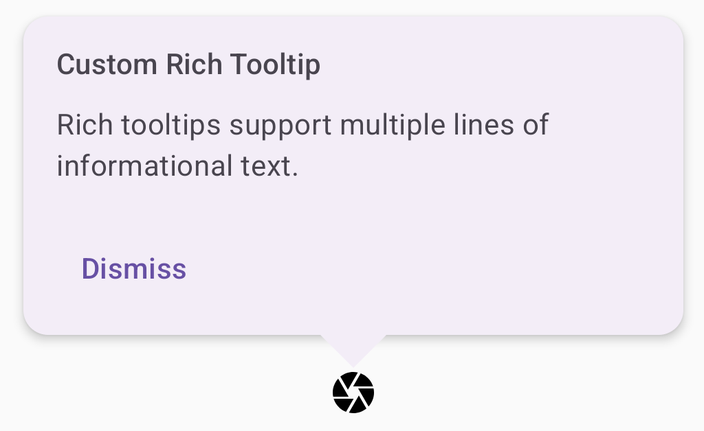
Menyesuaikan tooltip kaya
Cuplikan kode ini menampilkan tooltip kaya dengan judul, tindakan kustom, dan tanda sisipan (panah) kustom yang ditampilkan di atas tombol ikon kamera:
@ComposablefunAdvancedRichTooltipExample(modifier:Modifier=Modifier,richTooltipSubheadText:String="Custom Rich Tooltip",richTooltipText:String="Rich tooltips support multiple lines of informational text.",richTooltipActionText:String="Dismiss"){valtooltipState=rememberTooltipState()valcoroutineScope=rememberCoroutineScope()TooltipBox(modifier=modifier,positionProvider=TooltipDefaults.rememberRichTooltipPositionProvider(),tooltip={RichTooltip(title={Text(richTooltipSubheadText)},action={Row{TextButton(onClick={coroutineScope.launch{tooltipState.dismiss()}}){Text(richTooltipActionText)}}},caretSize=DpSize(32.dp,16.dp)){Text(richTooltipText)}},state=tooltipState){IconButton(onClick={coroutineScope.launch{tooltipState.show()}}){Icon(imageVector=Icons.Filled.Camera,contentDescription="Open camera")}}}
RichToolTip menampilkan tooltip dengan judul dan tindakan tutup.
Saat diaktifkan, baik dengan menekan lama atau mengarahkan kursor ke konten ToolTipBox
dengan pointer mouse, tooltip akan ditampilkan selama sekitar satu detik.
Anda dapat menutup tooltip ini dengan mengetuk di tempat lain pada layar atau menggunakan tombol tindakan tutup.
Saat tindakan menutup dijalankan, sistem akan meluncurkan coroutine untuk memanggil
tooltipState.dismiss. Hal ini memverifikasi bahwa eksekusi tindakan tidak diblokir saat tooltip ditampilkan.
onClick = coroutineScope.launch { tooltipState.show() } } meluncurkan
coroutine untuk menampilkan tooltip secara manual menggunakan tooltipState.show.
Parameter action memungkinkan penambahan elemen interaktif ke
tooltip, seperti tombol.
Parameter caretSize mengubah ukuran panah tooltip.
Hasil
Contoh ini menghasilkan output berikut:
Gambar 4. Tooltip lengkap kustom dengan tindakan tutup yang ditambatkan ke ikon kamera.
Konten dan contoh kode di halaman ini tunduk kepada lisensi yang dijelaskan dalam Lisensi Konten. Java dan OpenJDK adalah merek dagang atau merek dagang terdaftar dari Oracle dan/atau afiliasinya.
Terakhir diperbarui pada 2025-08-28 UTC.
[null,null,["Terakhir diperbarui pada 2025-08-28 UTC."],[],[],null,["Use [tooltips](https://m3.material.io/components/tooltips/overview) to add context to a button or other UI element.\nThere are two types of tooltips:\n\n- **Plain tooltips**: Describe elements or actions of icon buttons.\n- **Rich tooltips**: Provide more detail, such as describing the value of a feature. Can also include an optional title, link, and buttons.\n\n**Figure 1.** A plain tooltip (1) and a rich tooltip (2).\n\nAPI surface\n\nYou can use the [`TooltipBox`](/reference/kotlin/androidx/compose/material3/package-summary#TooltipBox(androidx.compose.ui.window.PopupPositionProvider,kotlin.Function1,androidx.compose.material3.TooltipState,androidx.compose.ui.Modifier,kotlin.Function0,kotlin.Boolean,kotlin.Boolean,kotlin.Function0)) composable to implement tooltips in your app.\nYou control [`TooltipBox`](/reference/kotlin/androidx/compose/material3/package-summary#TooltipBox(androidx.compose.ui.window.PopupPositionProvider,kotlin.Function1,androidx.compose.material3.TooltipState,androidx.compose.ui.Modifier,kotlin.Function0,kotlin.Boolean,kotlin.Boolean,kotlin.Function0)) appearance with these main parameters:\n\n- `positionProvider`: Places the tooltip relative to the anchor content. You typically use a default position provider from the `TooltipDefaults`, or you can provide your own if you need custom positioning logic.\n- `tooltip`: The composable that contains the tooltip's content. You typically use either the `PlainTooltip` or `RichTooltip` composables.\n - Use `PlainTooltip` to describe elements or actions of icon buttons.\n - Use `RichTooltip` to provide more details, like describing the value of a feature. Rich tooltips can include an optional title, link, and buttons.\n- `state`: The state holder that contains the UI logic and element state for this tooltip.\n- `content`: The composable content that the tooltip is anchored to.\n\nDisplay a plain tooltip\n\nUse a plain tooltip to briefly describe a UI element. This code snippet displays\na plain tooltip on top of an icon button, labeled \"Add to favorites\":\n\n\n```kotlin\n@Composable\nfun PlainTooltipExample(\n modifier: Modifier = Modifier,\n plainTooltipText: String = \"Add to favorites\"\n) {\n TooltipBox(\n modifier = modifier,\n positionProvider = TooltipDefaults.rememberPlainTooltipPositionProvider(),\n tooltip = {\n PlainTooltip { Text(plainTooltipText) }\n },\n state = rememberTooltipState()\n ) {\n IconButton(onClick = { /* Do something... */ }) {\n Icon(\n imageVector = Icons.Filled.Favorite,\n contentDescription = \"Add to favorites\"\n )\n }\n }\n}\nhttps://github.com/android/snippets/blob/dd30aee903e8c247786c064faab1a9ca8d10b46e/compose/snippets/src/main/java/com/example/compose/snippets/components/Tooltips.kt#L74-L95\n```\n\n\u003cbr /\u003e\n\nKey points about the code\n\n- `TooltipBox` generates a tooltip with the text \"Add to favorites\".\n - [`TooltipDefaults.rememberPlainTooltipPositionProvider()`](/reference/kotlin/androidx/compose/material3/TooltipDefaults?#rememberPlainTooltipPositionProvider(androidx.compose.ui.unit.Dp)) provides default positioning for plain tooltips.\n - `tooltip` is a lambda function that defines the tooltip's content using the [`PlainTooltip`](/reference/kotlin/androidx/compose/material3/TooltipScope#(androidx.compose.material3.TooltipScope).PlainTooltip(androidx.compose.ui.Modifier,androidx.compose.ui.unit.DpSize,androidx.compose.ui.unit.Dp,androidx.compose.ui.graphics.Shape,androidx.compose.ui.graphics.Color,androidx.compose.ui.graphics.Color,androidx.compose.ui.unit.Dp,androidx.compose.ui.unit.Dp,kotlin.Function0)) composable.\n - `Text(plainTooltipText)` displays the text within the tooltip.\n - [`tooltipState`](/reference/kotlin/androidx/compose/material3/TooltipState) controls the state of the tooltip.\n- `IconButton` creates a clickable button with an icon.\n - `Icon(...)` displays a heart icon within the button.\n - When a user interacts with the `IconButton`, `TooltipBox` shows the tooltip with the text \"Add to favorites\". Depending on the device, users can trigger the tooltip in the following ways:\n - Hovering over the icon with a cursor\n - Long-pressing the icon on a mobile device\n\nResult\n\nThis example produces a plain tooltip on top of an icon:\n**Figure 2.**A plain tooltip that appears when a user hovers over or long-presses the heart icon.\n\nDisplay a rich tooltip\n\nUse a rich tooltip to provide additional context about a UI element. This\nexample creates a multi-line rich tooltip with a title that is anchored to an\n`Icon`:\n\n\n```kotlin\n@Composable\nfun RichTooltipExample(\n modifier: Modifier = Modifier,\n richTooltipSubheadText: String = \"Rich Tooltip\",\n richTooltipText: String = \"Rich tooltips support multiple lines of informational text.\"\n) {\n TooltipBox(\n modifier = modifier,\n positionProvider = TooltipDefaults.rememberRichTooltipPositionProvider(),\n tooltip = {\n RichTooltip(\n title = { Text(richTooltipSubheadText) }\n ) {\n Text(richTooltipText)\n }\n },\n state = rememberTooltipState()\n ) {\n IconButton(onClick = { /* Icon button's click event */ }) {\n Icon(\n imageVector = Icons.Filled.Info,\n contentDescription = \"Show more information\"\n )\n }\n }\n}https://github.com/android/snippets/blob/dd30aee903e8c247786c064faab1a9ca8d10b46e/compose/snippets/src/main/java/com/example/compose/snippets/components/Tooltips.kt#L106-L131\n```\n\n\u003cbr /\u003e\n\nKey points about the code\n\n- `TooltipBox` handles the event listeners for user interactions and updates `TooltipState` accordingly. When `TooltipState` indicates that the tooltip should be shown, the tooltip lambda executes, and `TooltipBox` displays the `RichTooltip`. The `TooltipBox` acts as the anchor and container for both content and the tooltip.\n - In this case, the content is an `IconButton` component, which provides the tappable action behavior. When long-pressed (on touch devices) or hovered over (as with the mouse pointer) anywhere in `TooltipBox`'s content, the tooltip will display to show more information.\n- The `RichTooltip` composable defines the tooltip's content, including the title and body text. [`TooltipDefaults.rememberRichTooltipPositionProvider()`](/reference/kotlin/androidx/compose/material3/TooltipDefaults?#rememberRichTooltipPositionProvider(androidx.compose.ui.unit.Dp)) provides positioning information for rich tooltips.\n\nResult\n\nThis example produces a rich tooltip with a title attached to an information\nicon:\n**Figure 3.**A rich tooltip with a title and an information icon.\n\nCustomize a rich tooltip\n\nThis code snippet displays a rich tooltip with a title, custom actions, and a\ncustom caret (arrow) displayed on top of a camera icon button:\n\n\n```kotlin\n@Composable\nfun AdvancedRichTooltipExample(\n modifier: Modifier = Modifier,\n richTooltipSubheadText: String = \"Custom Rich Tooltip\",\n richTooltipText: String = \"Rich tooltips support multiple lines of informational text.\",\n richTooltipActionText: String = \"Dismiss\"\n) {\n val tooltipState = rememberTooltipState()\n val coroutineScope = rememberCoroutineScope()\n\n TooltipBox(\n modifier = modifier,\n positionProvider = TooltipDefaults.rememberRichTooltipPositionProvider(),\n tooltip = {\n RichTooltip(\n title = { Text(richTooltipSubheadText) },\n action = {\n Row {\n TextButton(onClick = {\n coroutineScope.launch {\n tooltipState.dismiss()\n }\n }) {\n Text(richTooltipActionText)\n }\n }\n },\n caretSize = DpSize(32.dp, 16.dp)\n ) {\n Text(richTooltipText)\n }\n },\n state = tooltipState\n ) {\n IconButton(onClick = {\n coroutineScope.launch {\n tooltipState.show()\n }\n }) {\n Icon(\n imageVector = Icons.Filled.Camera,\n contentDescription = \"Open camera\"\n )\n }\n }\n}https://github.com/android/snippets/blob/dd30aee903e8c247786c064faab1a9ca8d10b46e/compose/snippets/src/main/java/com/example/compose/snippets/components/Tooltips.kt#L142-L187\n```\n\n\u003cbr /\u003e\n\nKey points about the code\n\n- A `RichToolTip` displays a tooltip with a title and dismiss action.\n- When activated, either by a long-press or hovering over the `ToolTipBox` content with the mouse pointer, the tooltip is displayed for about one second. You can dismiss this tooltip by either tapping elsewhere on the screen or using the dismiss action button.\n- When the dismiss action executes, the system launches a coroutine to call `tooltipState.dismiss`. This verifies the action execution isn't blocked while the tooltip is displayed.\n- `onClick = coroutineScope.launch { tooltipState.show() } }` launches a coroutine to manually show the tooltip using `tooltipState.show`.\n- The `action` parameter allows for the adding of interactive elements to a tooltip, such as a button.\n- The `caretSize` parameter modifies the size of the tooltip's arrow.\n\nResult\n\nThis example produces the following:\n**Figure 4.** A custom rich tooltip with a dismiss action anchored to a camera icon.\n\nAdditional resources\n\n- Material Design: [Tooltips](https://m3.material.io/components/tooltips/overview)"]]