
Compose की मदद से, ऐसे शेप बनाए जा सकते हैं जो पॉलीगॉन से बने होते हैं. उदाहरण के लिए, इस तरह की शेप बनाई जा सकती हैं:

Compose में कस्टम राउंडेड पॉलीगॉन बनाने के लिए, अपनी app/build.gradle में graphics-shapes डिपेंडेंसी जोड़ें:
implementation "androidx.graphics:graphics-shapes:1.0.1"
इस लाइब्रेरी की मदद से, ऐसे शेप बनाए जा सकते हैं जो पॉलीगॉन से बने होते हैं. पॉलीगोनल शेप में सिर्फ़ सीधी लाइनें और नुकीले कोने होते हैं. हालांकि, इन शेप में गोल कोनों का विकल्प होता है. इससे दो अलग-अलग शेप के बीच आसानी से बदलाव किया जा सकता है. किसी भी शेप के बीच मॉर्फ़िंग करना मुश्किल होता है. साथ ही, यह डिज़ाइन के समय की समस्या होती है. हालांकि, यह लाइब्रेरी इन शेप के बीच आसानी से बदलाव कर सकती है. इसके लिए, यह एक जैसे पॉलीगोनल स्ट्रक्चर का इस्तेमाल करती है.
पॉलीगॉन बनाना
नीचे दिए गए स्निपेट में, ड्रॉइंग एरिया के बीच में छह पॉइंट वाला एक बेसिक पॉलीगॉन बनाया गया है:
Box( modifier = Modifier .drawWithCache { val roundedPolygon = RoundedPolygon( numVertices = 6, radius = size.minDimension / 2, centerX = size.width / 2, centerY = size.height / 2 ) val roundedPolygonPath = roundedPolygon.toPath().asComposePath() onDrawBehind { drawPath(roundedPolygonPath, color = Color.Blue) } } .fillMaxSize() )

इस उदाहरण में, लाइब्रेरी एक RoundedPolygon बनाती है. इसमें अनुरोध किए गए आकार को दिखाने वाली ज्यामिति होती है. Compose ऐप्लिकेशन में उस शेप को बनाने के लिए, आपको उससे एक Path ऑब्जेक्ट पाना होगा, ताकि शेप को ऐसे फ़ॉर्म में बदला जा सके जिसे Compose बना सके.
पॉलीगॉन के कोनों को गोल करना
किसी पॉलीगॉन के कोनों को गोल करने के लिए, CornerRounding पैरामीटर का इस्तेमाल करें. इसमें दो पैरामीटर होते हैं: radius और smoothing. हर गोल कोना, एक से तीन क्यूबिक कर्व से बना होता है. इसके बीच के हिस्से में गोलाकार चाप होता है, जबकि दोनों साइड ("फ़्लैंकिंग") कर्व, शेप के किनारे से सेंटर कर्व तक जाते हैं.
दायरा
radius, उस सर्कल की रेडियस होती है जिसका इस्तेमाल वर्टेक्स को गोल करने के लिए किया जाता है.
उदाहरण के लिए, गोल कोनों वाला यह त्रिकोण इस तरह बनाया गया है:

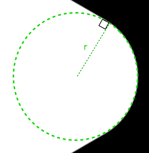
r से, गोल किए गए कोनों के गोलाकार होने का साइज़ तय होता है.स्मूदिंग
स्मूदिंग एक ऐसा फ़ैक्टर है जिससे यह तय होता है कि कोने के गोलाकार हिस्से से किनारे तक पहुंचने में कितना समय लगता है. स्मूदिंग फ़ैक्टर की वैल्यू 0 (स्मूद नहीं किया गया, CornerRounding की डिफ़ॉल्ट वैल्यू) होने पर, कॉर्नर पूरी तरह से गोल हो जाते हैं. स्मूदिंग फ़ैक्टर की वैल्यू शून्य से ज़्यादा होने पर (ज़्यादा से ज़्यादा 1.0 तक), कॉर्नर को तीन अलग-अलग कर्व से गोल किया जाता है.


उदाहरण के लिए, नीचे दिए गए स्निपेट में, स्मूदिंग को 0 और 1 पर सेट करने के बीच का मामूली अंतर दिखाया गया है:
Box( modifier = Modifier .drawWithCache { val roundedPolygon = RoundedPolygon( numVertices = 3, radius = size.minDimension / 2, centerX = size.width / 2, centerY = size.height / 2, rounding = CornerRounding( size.minDimension / 10f, smoothing = 0.1f ) ) val roundedPolygonPath = roundedPolygon.toPath().asComposePath() onDrawBehind { drawPath(roundedPolygonPath, color = Color.Black) } } .size(100.dp) )

साइज़ और पोज़िशन
डिफ़ॉल्ट रूप से, किसी शेप को सेंटर (0, 0) के चारों ओर 1 के रेडियस के साथ बनाया जाता है.
यह रेडियस, उस बहुभुज के सेंटर और बाहरी वर्टेक्स के बीच की दूरी को दिखाता है जिस पर शेप आधारित है. ध्यान दें कि कोनों को गोल करने से, आकार छोटा हो जाता है. ऐसा इसलिए होता है, क्योंकि गोल किए गए कोने, गोल किए जा रहे वर्टेक्स की तुलना में सेंटर के ज़्यादा करीब होते हैं. किसी पॉलीगॉन का साइज़ बदलने के लिए, radius वैल्यू को अडजस्ट करें. जगह में बदलाव करने के लिए, पॉलीगॉन के centerX या centerY में बदलाव करें.
इसके अलावा, ऑब्जेक्ट को ट्रांसफ़ॉर्म करके उसका साइज़, पोज़िशन, और रोटेशन बदला जा सकता है. इसके लिए, DrawScope ट्रांसफ़ॉर्मेशन फ़ंक्शन का इस्तेमाल करें. जैसे, DrawScope#translate().
शेप मॉर्फ़ करना
Morph ऑब्जेक्ट एक नई शेप है. यह दो पॉलीगोनल शेप के बीच ऐनिमेशन को दिखाता है. दो शेप के बीच मॉर्फ़ करने के लिए, दो RoundedPolygons और एक Morph ऑब्जेक्ट बनाएं, जो इन दोनों शेप को लेता हो. शुरुआत और आखिरी शेप के बीच का शेप कैलकुलेट करने के लिए, progress की वैल्यू शून्य और एक के बीच दें. इससे यह तय किया जा सकेगा कि शेप, शुरुआती (0) और आखिरी (1) शेप के बीच कैसा दिखेगा:
Box( modifier = Modifier .drawWithCache { val triangle = RoundedPolygon( numVertices = 3, radius = size.minDimension / 2f, centerX = size.width / 2f, centerY = size.height / 2f, rounding = CornerRounding( size.minDimension / 10f, smoothing = 0.1f ) ) val square = RoundedPolygon( numVertices = 4, radius = size.minDimension / 2f, centerX = size.width / 2f, centerY = size.height / 2f ) val morph = Morph(start = triangle, end = square) val morphPath = morph .toPath(progress = 0.5f).asComposePath() onDrawBehind { drawPath(morphPath, color = Color.Black) } } .fillMaxSize() )
ऊपर दिए गए उदाहरण में, प्रोग्रेस को दो शेप (गोल त्रिकोण और वर्ग) के बीच में रखा गया है. इससे यह नतीजा मिलता है:

ज़्यादातर मामलों में, मॉर्फ़िंग को ऐनिमेशन के तौर पर किया जाता है. इसे सिर्फ़ स्टैटिक रेंडरिंग के तौर पर नहीं किया जाता. इन दोनों के बीच ऐनिमेशन बनाने के लिए, Compose में मौजूद स्टैंडर्ड ऐनिमेशन एपीआई का इस्तेमाल किया जा सकता है. इससे समय के साथ प्रोग्रेस वैल्यू में बदलाव किया जा सकता है. उदाहरण के लिए, इन दो आकृतियों के बीच के मॉर्फ़ को इस तरह से हमेशा के लिए ऐनिमेट किया जा सकता है:
val infiniteAnimation = rememberInfiniteTransition(label = "infinite animation") val morphProgress = infiniteAnimation.animateFloat( initialValue = 0f, targetValue = 1f, animationSpec = infiniteRepeatable( tween(500), repeatMode = RepeatMode.Reverse ), label = "morph" ) Box( modifier = Modifier .drawWithCache { val triangle = RoundedPolygon( numVertices = 3, radius = size.minDimension / 2f, centerX = size.width / 2f, centerY = size.height / 2f, rounding = CornerRounding( size.minDimension / 10f, smoothing = 0.1f ) ) val square = RoundedPolygon( numVertices = 4, radius = size.minDimension / 2f, centerX = size.width / 2f, centerY = size.height / 2f ) val morph = Morph(start = triangle, end = square) val morphPath = morph .toPath(progress = morphProgress.value) .asComposePath() onDrawBehind { drawPath(morphPath, color = Color.Black) } } .fillMaxSize() )

पॉलीगॉन को क्लिप के तौर पर इस्तेमाल करना
Compose में, कंपोज़ेबल को रेंडर करने के तरीके में बदलाव करने के लिए, clip मॉडिफ़ायर का इस्तेमाल करना आम बात है. साथ ही, क्लिपिंग एरिया के चारों ओर शैडो का फ़ायदा पाने के लिए भी इसका इस्तेमाल किया जाता है:
fun RoundedPolygon.getBounds() = calculateBounds().let { Rect(it[0], it[1], it[2], it[3]) } class RoundedPolygonShape( private val polygon: RoundedPolygon, private var matrix: Matrix = Matrix() ) : Shape { private var path = Path() override fun createOutline( size: Size, layoutDirection: LayoutDirection, density: Density ): Outline { path.rewind() path = polygon.toPath().asComposePath() matrix.reset() val bounds = polygon.getBounds() val maxDimension = max(bounds.width, bounds.height) matrix.scale(size.width / maxDimension, size.height / maxDimension) matrix.translate(-bounds.left, -bounds.top) path.transform(matrix) return Outline.Generic(path) } }
इसके बाद, पॉलीगॉन को क्लिप के तौर पर इस्तेमाल किया जा सकता है. जैसा कि इस स्निपेट में दिखाया गया है:
val hexagon = remember { RoundedPolygon( 6, rounding = CornerRounding(0.2f) ) } val clip = remember(hexagon) { RoundedPolygonShape(polygon = hexagon) } Box( modifier = Modifier .clip(clip) .background(MaterialTheme.colorScheme.secondary) .size(200.dp) ) { Text( "Hello Compose", color = MaterialTheme.colorScheme.onSecondary, modifier = Modifier.align(Alignment.Center) ) }
इस वजह से, ये समस्याएं होती हैं:

यह पहले से रेंडर हो रहे टेक्स्ट से ज़्यादा अलग नहीं दिख सकता. हालांकि, इससे Compose में अन्य सुविधाओं का इस्तेमाल किया जा सकता है. उदाहरण के लिए, इस तकनीक का इस्तेमाल किसी इमेज को क्लिप करने और क्लिप किए गए हिस्से के चारों ओर शैडो लगाने के लिए किया जा सकता है:
val hexagon = remember { RoundedPolygon( 6, rounding = CornerRounding(0.2f) ) } val clip = remember(hexagon) { RoundedPolygonShape(polygon = hexagon) } Box( modifier = Modifier.fillMaxSize(), contentAlignment = Alignment.Center ) { Image( painter = painterResource(id = R.drawable.dog), contentDescription = "Dog", contentScale = ContentScale.Crop, modifier = Modifier .graphicsLayer { this.shadowElevation = 6.dp.toPx() this.shape = clip this.clip = true this.ambientShadowColor = Color.Black this.spotShadowColor = Color.Black } .size(200.dp) ) }

क्लिक करने पर बटन का आकार बदलना
graphics-shape लाइब्रेरी का इस्तेमाल करके, ऐसा बटन बनाया जा सकता है जिसे दबाने पर, वह दो शेप के बीच बदलता है. सबसे पहले, एक MorphPolygonShape बनाएं, जो Shape को बड़ा करता हो. साथ ही, उसे सही तरीके से फ़िट करने के लिए स्केल और ट्रांसलेट करता हो. शेप को ऐनिमेट करने के लिए, प्रोग्रेस को पास करने का तरीका देखें:
class MorphPolygonShape( private val morph: Morph, private val percentage: Float ) : Shape { private val matrix = Matrix() override fun createOutline( size: Size, layoutDirection: LayoutDirection, density: Density ): Outline { // Below assumes that you haven't changed the default radius of 1f, nor the centerX and centerY of 0f // By default this stretches the path to the size of the container, if you don't want stretching, use the same size.width for both x and y. matrix.scale(size.width / 2f, size.height / 2f) matrix.translate(1f, 1f) val path = morph.toPath(progress = percentage).asComposePath() path.transform(matrix) return Outline.Generic(path) } }
इस मॉर्फ़ शेप का इस्तेमाल करने के लिए, दो पॉलीगॉन बनाएं: shapeA और shapeB. Morph बनाएं और उसे याद रखें. इसके बाद, बटन पर क्लिप आउटलाइन के तौर पर मॉर्फ़ लागू करें. इसके लिए, interactionSource on press का इस्तेमाल करें, ताकि ऐनिमेशन को कंट्रोल किया जा सके:
val shapeA = remember { RoundedPolygon( 6, rounding = CornerRounding(0.2f) ) } val shapeB = remember { RoundedPolygon.star( 6, rounding = CornerRounding(0.1f) ) } val morph = remember { Morph(shapeA, shapeB) } val interactionSource = remember { MutableInteractionSource() } val isPressed by interactionSource.collectIsPressedAsState() val animatedProgress = animateFloatAsState( targetValue = if (isPressed) 1f else 0f, label = "progress", animationSpec = spring(dampingRatio = 0.4f, stiffness = Spring.StiffnessMedium) ) Box( modifier = Modifier .size(200.dp) .padding(8.dp) .clip(MorphPolygonShape(morph, animatedProgress.value)) .background(Color(0xFF80DEEA)) .size(200.dp) .clickable(interactionSource = interactionSource, indication = null) { } ) { Text("Hello", modifier = Modifier.align(Alignment.Center)) }
बॉक्स पर टैप करने पर, यह ऐनिमेशन दिखता है:

शेप मॉर्फ़िंग को हमेशा के लिए ऐनिमेट करना
किसी शेप को लगातार ऐनिमेट करने के लिए, rememberInfiniteTransition का इस्तेमाल करें.
यहां एक ऐसी प्रोफ़ाइल फ़ोटो का उदाहरण दिया गया है जिसका आकार समय के साथ बदलता रहता है और जो लगातार घूमती रहती है. इस तरीके में, ऊपर दिखाए गए MorphPolygonShape में मामूली बदलाव किया जाता है:
class CustomRotatingMorphShape( private val morph: Morph, private val percentage: Float, private val rotation: Float ) : Shape { private val matrix = Matrix() override fun createOutline( size: Size, layoutDirection: LayoutDirection, density: Density ): Outline { // Below assumes that you haven't changed the default radius of 1f, nor the centerX and centerY of 0f // By default this stretches the path to the size of the container, if you don't want stretching, use the same size.width for both x and y. matrix.scale(size.width / 2f, size.height / 2f) matrix.translate(1f, 1f) matrix.rotateZ(rotation) val path = morph.toPath(progress = percentage).asComposePath() path.transform(matrix) return Outline.Generic(path) } } @Preview @Composable private fun RotatingScallopedProfilePic() { val shapeA = remember { RoundedPolygon( 12, rounding = CornerRounding(0.2f) ) } val shapeB = remember { RoundedPolygon.star( 12, rounding = CornerRounding(0.2f) ) } val morph = remember { Morph(shapeA, shapeB) } val infiniteTransition = rememberInfiniteTransition("infinite outline movement") val animatedProgress = infiniteTransition.animateFloat( initialValue = 0f, targetValue = 1f, animationSpec = infiniteRepeatable( tween(2000, easing = LinearEasing), repeatMode = RepeatMode.Reverse ), label = "animatedMorphProgress" ) val animatedRotation = infiniteTransition.animateFloat( initialValue = 0f, targetValue = 360f, animationSpec = infiniteRepeatable( tween(6000, easing = LinearEasing), repeatMode = RepeatMode.Reverse ), label = "animatedMorphProgress" ) Box( modifier = Modifier.fillMaxSize(), contentAlignment = Alignment.Center ) { Image( painter = painterResource(id = R.drawable.dog), contentDescription = "Dog", contentScale = ContentScale.Crop, modifier = Modifier .clip( CustomRotatingMorphShape( morph, animatedProgress.value, animatedRotation.value ) ) .size(200.dp) ) } }
इस कोड से यह मज़ेदार नतीजा मिलता है:

कस्टम पॉलीगॉन
अगर सामान्य बहुभुजों से बनाए गए आकार, आपके इस्तेमाल के उदाहरण को कवर नहीं करते हैं, तो वर्टेक्स की सूची की मदद से, अपनी पसंद के मुताबिक कोई आकार बनाया जा सकता है. उदाहरण के लिए, आपको शायद इस तरह का दिल बनाना हो:

RoundedPolygon
ओवरलोड का इस्तेमाल करके, इस शेप के अलग-अलग वर्टेक्स तय किए जा सकते हैं. यह ओवरलोड, x और y कोऑर्डिनेट का फ़्लोट ऐरे लेता है.
दिल के पॉलीगॉन को छोटे-छोटे हिस्सों में बांटने के लिए, ध्यान दें कि पॉइंट तय करने के लिए पोलर कोऑर्डिनेट सिस्टम का इस्तेमाल करना, कार्टेशियन (x,y) कोऑर्डिनेट सिस्टम के मुकाबले ज़्यादा आसान होता है. इसमें 0° दाईं ओर से शुरू होता है और घड़ी की दिशा में आगे बढ़ता है. साथ ही, 270° 12 बजे की पोज़िशन पर होता है:

अब शेप को आसानी से तय किया जा सकता है. इसके लिए, हर पॉइंट पर कोण (𝜭) और केंद्र से रेडियस तय करें:

अब वर्टेक्स बनाए जा सकते हैं और उन्हें RoundedPolygon फ़ंक्शन में भेजा जा सकता है:
val vertices = remember { val radius = 1f val radiusSides = 0.8f val innerRadius = .1f floatArrayOf( radialToCartesian(radiusSides, 0f.toRadians()).x, radialToCartesian(radiusSides, 0f.toRadians()).y, radialToCartesian(radius, 90f.toRadians()).x, radialToCartesian(radius, 90f.toRadians()).y, radialToCartesian(radiusSides, 180f.toRadians()).x, radialToCartesian(radiusSides, 180f.toRadians()).y, radialToCartesian(radius, 250f.toRadians()).x, radialToCartesian(radius, 250f.toRadians()).y, radialToCartesian(innerRadius, 270f.toRadians()).x, radialToCartesian(innerRadius, 270f.toRadians()).y, radialToCartesian(radius, 290f.toRadians()).x, radialToCartesian(radius, 290f.toRadians()).y, ) }
इस radialToCartesian फ़ंक्शन का इस्तेमाल करके, वर्टेक्स को कार्टेशियन कोऑर्डिनेट में बदला जाना चाहिए:
internal fun Float.toRadians() = this * PI.toFloat() / 180f internal val PointZero = PointF(0f, 0f) internal fun radialToCartesian( radius: Float, angleRadians: Float, center: PointF = PointZero ) = directionVectorPointF(angleRadians) * radius + center internal fun directionVectorPointF(angleRadians: Float) = PointF(cos(angleRadians), sin(angleRadians))
ऊपर दिए गए कोड से, आपको दिल के रॉ वर्टेक्स मिलते हैं. हालांकि, आपको दिल का चुना गया आकार पाने के लिए, कुछ कोनों को गोल करना होगा. 90° और 270° पर मौजूद कोनों को गोल नहीं किया गया है, लेकिन अन्य कोनों को गोल किया गया है. अलग-अलग कोनों को अपनी पसंद के मुताबिक गोल करने के लिए, perVertexRounding पैरामीटर का इस्तेमाल करें:
val rounding = remember { val roundingNormal = 0.6f val roundingNone = 0f listOf( CornerRounding(roundingNormal), CornerRounding(roundingNone), CornerRounding(roundingNormal), CornerRounding(roundingNormal), CornerRounding(roundingNone), CornerRounding(roundingNormal), ) } val polygon = remember(vertices, rounding) { RoundedPolygon( vertices = vertices, perVertexRounding = rounding ) } Box( modifier = Modifier .drawWithCache { val roundedPolygonPath = polygon.toPath().asComposePath() onDrawBehind { scale(size.width * 0.5f, size.width * 0.5f) { translate(size.width * 0.5f, size.height * 0.5f) { drawPath(roundedPolygonPath, color = Color(0xFFF15087)) } } } } .size(400.dp) )
इससे गुलाबी रंग का दिल दिखता है:
अगर ऊपर दिए गए शेप आपकी ज़रूरत के हिसाब से नहीं हैं, तो Path क्लास का इस्तेमाल करके कस्टम शेप बनाएं. इसके अलावा, डिस्क से ImageVector फ़ाइल लोड की जा सकती है. graphics-shapes लाइब्रेरी का इस्तेमाल किसी भी तरह की शेप के लिए नहीं किया जा सकता. इसका इस्तेमाल खास तौर पर, गोल किनारों वाले पॉलीगॉन बनाने और उनके बीच मॉर्फ़ ऐनिमेशन बनाने के लिए किया जाता है.
अन्य संसाधन
ज़्यादा जानकारी और उदाहरणों के लिए, यहां दिए गए संसाधन देखें: