Grid is a Jetpack Compose API
that lets you flexibly implement a two-dimensional layout.
With this API, you can display items in multi-column
or multi-row layouts that adapt to the available container size.
Grid.
How is Grid different from similar composables?
Compose already offers similar components, such as LazyVerticalGrid.
These components are mainly for visualization of large, homogeneous data sets—
for example, displaying a content catalog in a video streaming app.
These components are NOT designed
for the structural layout of a screen or complex component.
You can also implement a two-dimensional layout
by combining multiple Row and Column composables.
However, this approach has some downsides,
such as deep hierarchies and difficulties in adaptability.
The following table provides an overview of which layouts are suitable for each API:
| Component | Purpose |
|---|---|
LazyVerticalGrid, LazyStaggeredGrid, LazyHorizontalGrid |
Visualization of large, homogeneous data sets that requires lazy loading. |
Row, Column, FlexBox |
One-dimensional layout |
Grid |
Two-dimensional layout |
Terminology
Familiarize yourself with the following terminology
to understand how Grid works.
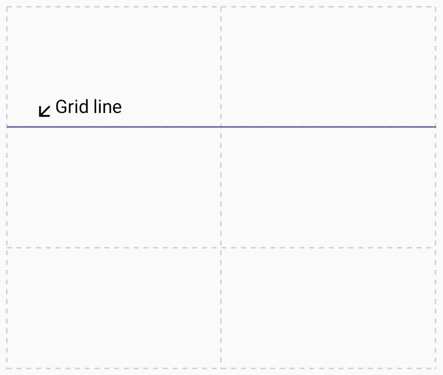
Grid line
A grid is made up of lines, which run horizontally and vertically. If your grid has three rows, it has four horizontal lines, including the one after the last row. In the following image, each dotted line represents a grid line:
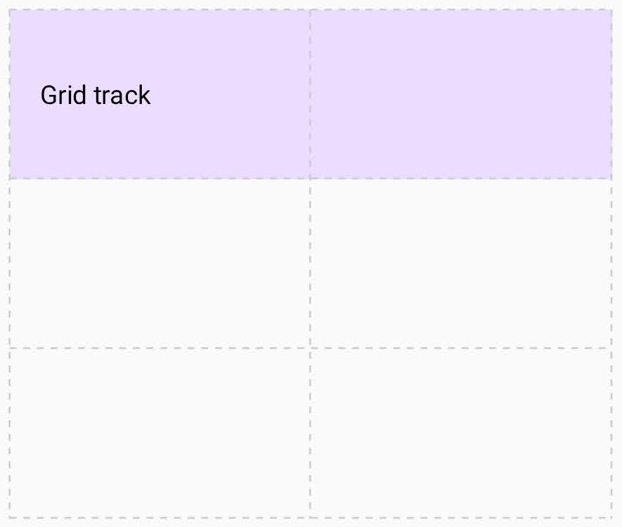
Grid track
A grid track is the space between two grid lines. A row track is between two horizontal lines, and a column track is between two vertical lines. To define the size of these tracks, assign a size to them when you create the grid.
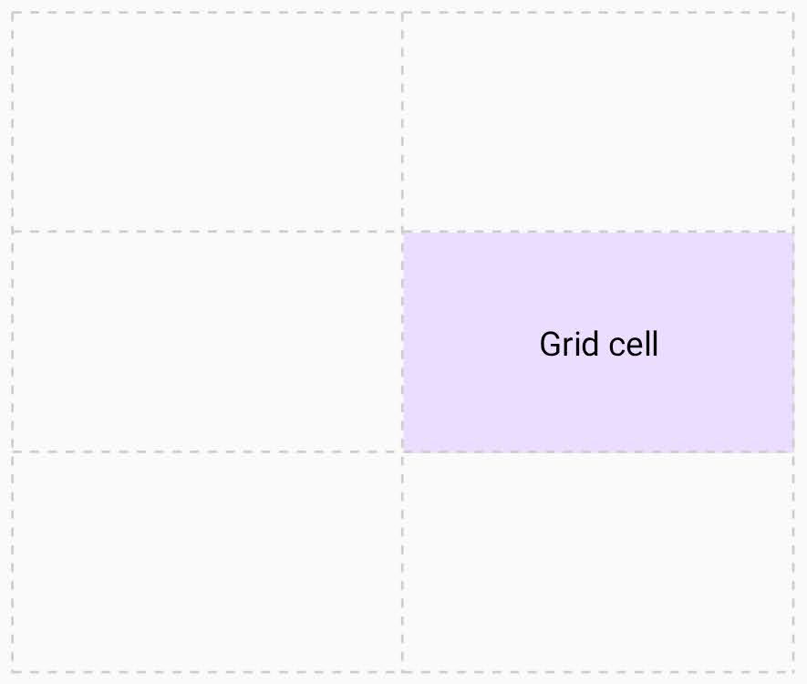
Grid cell
A grid cell is the intersection of a row and column track.
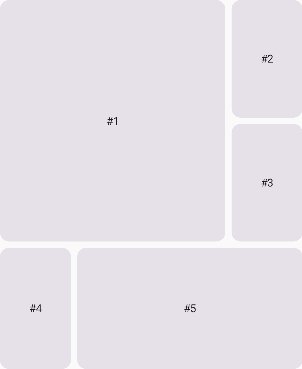
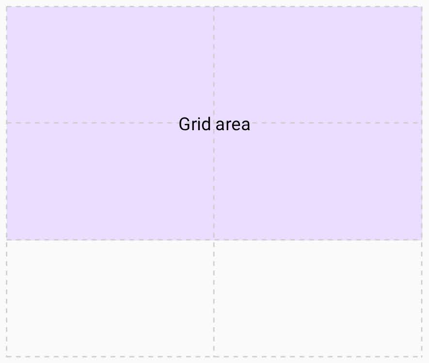
Grid area
A grid area consists of several grid cells. You can define a grid area by making an item span multiple tracks.
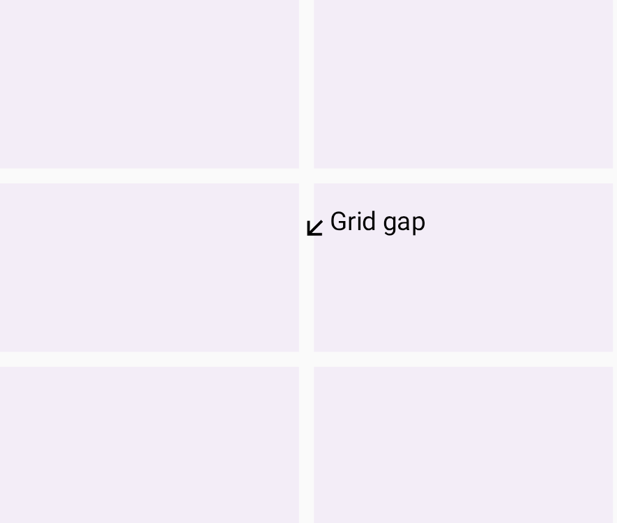
Grid gap
A grid gap is the gutter between grid tracks. You can't place a UI element into a gap, but you can span a UI element across it.