
버튼은 사용자가 탭할 때 어떤 작업이 발생하는지 알려주는 텍스트나 아이콘 또는 텍스트와 아이콘으로 구성됩니다.
텍스트나 아이콘 하나만 있는 버튼을 원하는지 또는 둘 다 있는 버튼을 원하는지에 따라 레이아웃에서 다음 세 가지 방법으로 버튼을 만들 수 있습니다.
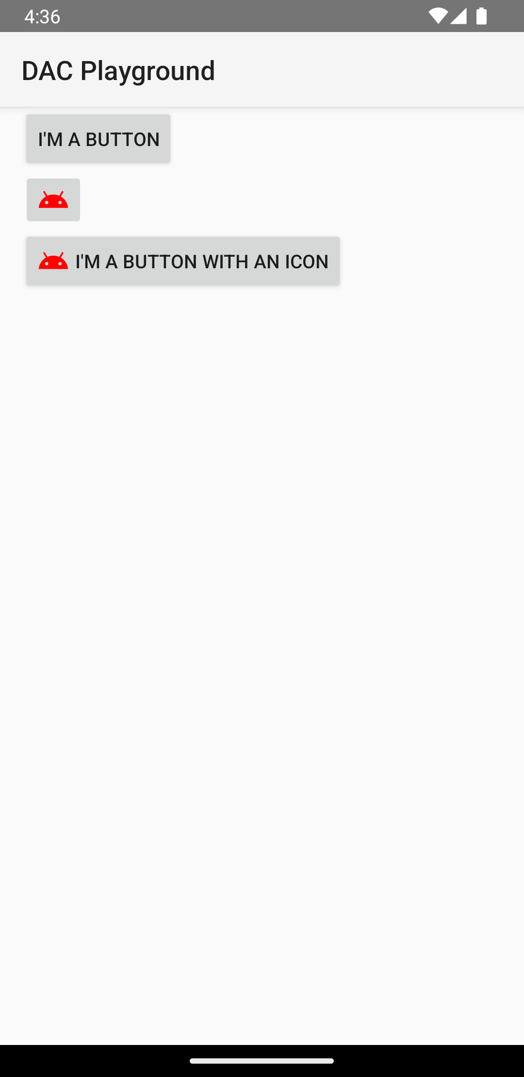
  <LinearLayout xmlns:android="http://schemas.android.com/apk/res/android"
      xmlns:app="http://schemas.android.com/apk/res-auto"
      android:layout_width="match_parent"
      android:layout_height="match_parent"
      android:paddingLeft="16dp"
      android:paddingRight="16dp"
      android:orientation="vertical" >

      <Button
          android:id="@+id/supabutton"
          android:layout_width="wrap_content"
          android:layout_height="wrap_content"
          android:text="I'm a button" />

      <ImageButton
          android:layout_width="wrap_content"
          android:layout_height="wrap_content"
          android:contentDescription="A tiny Android icon"
          android:src="@drawable/baseline_android_24"
          app:tint="#ff0000" />

      <Button
          android:layout_width="wrap_content"
          android:layout_height="wrap_content"
          android:drawableStart="@drawable/baseline_android_24"
          android:drawablePadding="4dp"
          android:drawableTint="#ff0000"
          android:text="I'm a button with an icon" />
  </LinearLayout>
이전 코드는 다음과 같은 결과를 생성합니다.
클릭 이벤트에 응답
사용자가 버튼을 탭하면 Button 객체가 클릭 시 이벤트를 수신합니다.
프로그래매틱 방식으로 이벤트 핸들러를 선언하려면 다음 예와 같이 View.OnClickListener 객체를 만들고 setOnClickListener(View.OnClickListener)를 호출하여 버튼에 할당합니다.
Kotlin
findViewById<Button>(R.id.supabutton)
  .setOnClickListener {
      Log.d("BUTTONS", "User tapped the Supabutton")
  }
자바
Button button = (Button) findViewById(R.id.supabutton);
button.setOnClickListener(new View.OnClickListener() {
    public void onClick(View v) {
      Log.d("BUTTONS", "User tapped the Supabutton");
    }
});
버튼 스타일 지정
버튼 모양(배경 이미지 및 글꼴)은 기기마다 다릅니다. 여러 제조업체의 기기에서 입력 컨트롤의 기본 스타일이 다른 경우가 많기 때문입니다.
다양한 배경의 개별 버튼을 맞춤설정하려면 드로어블 또는 색상 리소스와 함께 android:background 속성을 지정합니다. 또는 버튼에 스타일을 적용할 수 있습니다. 이 방법은 HTML 스타일과 유사한 방식으로 작동하여 배경, 글꼴, 크기 등 여러 스타일 속성을 정의합니다. 스타일 적용에 관한 자세한 내용은 스타일 및 테마를 참고하세요.
테두리 없는 버튼
유용한 디자인 중 하나는 '테두리 없는' 버튼입니다. 테두리 없는 버튼은 테두리나 배경이 없는 점을 제외하면 기본 버튼과 비슷하지만 다양한 상태(예: 탭한 경우)에 따라 모양이 변경된다는 점이 다릅니다.
테두리 없는 버튼을 만들려면 다음 예와 같이 버튼에 borderlessButtonStyle 스타일을 적용합니다.
<Button
  android:id="@+id/supabutton"
  style="?android:attr/borderlessButtonStyle"
  android:layout_width="wrap_content"
  android:layout_height="wrap_content"
  android:text="I'm a button" />
맞춤 배경
버튼 모양을 제대로 다시 정의하려면 맞춤 배경을 지정하면 됩니다. 그러나 간단한 비트맵이나 색상을 제공하는 대신 배경은 버튼의 현재 상태에 따라 모양을 변경하는 상태 목록 리소스여야 합니다.
다양한 버튼 상태에 사용할 세 가지 이미지나 색상을 정의하는 XML 파일에서 상태 목록을 정의할 수 있습니다.
버튼 배경에 상태 목록 드로어블을 만들려면 다음 단계를 따르세요.
- 기본 버튼 상태, 탭된 버튼 상태, 포커스가 있는 버튼 상태를 표시하는 버튼 배경에 세 가지 비트맵을 만듭니다. 이미지가 다양한 크기의 버튼에 맞도록 하려면 비트맵을 나인 패치 비트맵으로 만듭니다.
- 비트맵을 프로젝트의
res/drawable/디렉터리에 배치합니다. 각 비트맵이 나타내는 버튼 상태(예:button_default.9.png,button_pressed.9.png,button_focused.9.png)를 반영하도록 이름을 지정합니다. res/drawable/디렉터리에 새로운 XML 파일을 만듭니다.button_custom.xml와 같은 이름을 지정합니다. 다음과 같은 XML을 삽입합니다.<?xml version="1.0" encoding="utf-8"?> <selector xmlns:android="http://schemas.android.com/apk/res/android"> <item android:drawable="@drawable/button_pressed" android:state_pressed="true" /> <item android:drawable="@drawable/button_focused" android:state_focused="true" /> <item android:drawable="@drawable/button_default" /> </selector>
이렇게 해서 버튼의 현재 상태에 기반해 이미지를 변경하는 단일 드로어블 리소스를 정의합니다.
- 첫 번째
<item>은 버튼을 탭할 때(버튼이 활성화될 때) 사용할 비트맵을 정의합니다. - 두 번째
<item>은 버튼에 포커스를 맞출 때(예: 트랙볼이나 방향 패드를 사용하여 버튼을 강조표시할 때) 사용할 비트맵을 정의합니다. - 세 번째
<item>은 버튼이 기본 상태일 때(탭하지도 포커스가 있지도 않을 때) 사용할 비트맵을 정의합니다.
이 XML 파일은 단일 드로어블 리소스를 나타냅니다. 배경으로
Button에서 참조할 때 표시되는 이미지는 버튼의 상태에 따라 변경됩니다.- 첫 번째
- 드로어블 XML 파일을 버튼 배경으로 적용합니다.
<Button
    android:id="@+id/button_send"
    android:layout_width="wrap_content"
    android:layout_height="wrap_content"
    android:text="@string/button_send"
    android:onClick="sendMessage"
    android:background="@drawable/button_custom"  />
사용 중지, 마우스 오버 또는 기타 상태의 버튼을 정의하는 방법을 비롯하여 XML 구문에 관한 자세한 내용은 StateListDrawable를 참고하세요.