
Chip 组件是一种紧凑的交互式界面元素。它表示联系人或标记等复杂实体,通常带有图标和标签。可以是可勾选、可关闭或可点击的。
以下是四种类型的芯片以及可能的使用场景:
- 辅助:在任务期间引导用户。通常以临时界面元素的形式显示,以响应用户输入。
- 过滤:允许用户通过一组选项来优化内容。可以选择或取消选择,选中时可能包含对勾标记图标。
- 输入:表示用户提供的信息,例如菜单中的选择。它们可以包含图标和文字,并提供用于移除的 X。
- 建议:根据用户的近期活动或输入内容向用户提供建议。通常显示在输入字段下方,用于提示用户操作。

API Surface
有四个可组合项,分别对应于四种类型的 chip。以下部分将详细介绍这些可组合函数及其差异。 不过,它们共用以下参数:
label:显示在 chip 上的字符串。icon:显示在 chip 开头的图标。某些特定可组合项具有单独的leadingIcon和trailingIcon参数。onClick:用户按下芯片时,芯片调用的 lambda。
辅助条状标签
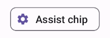
AssistChip 可组合项提供了一种简单明了的方式来创建辅助芯片,以引导用户朝特定方向前进。一个显著的特点是其 leadingIcon 参数,可让您在 chip 的左侧显示图标。以下示例演示了如何实现该方法:
@Composable fun AssistChipExample() { AssistChip( onClick = { Log.d("Assist chip", "hello world") }, label = { Text("Assist chip") }, leadingIcon = { Icon( Icons.Filled.Settings, contentDescription = "Localized description", Modifier.size(AssistChipDefaults.IconSize) ) } ) }
此实现如下所示。
过滤组件
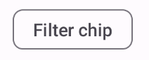
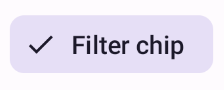
FilterChip 可组合项要求您跟踪芯片是否处于选中状态。以下示例演示了如何仅在用户选择了 chip 时显示前导选中标记:
@Composable fun FilterChipExample() { var selected by remember { mutableStateOf(false) } FilterChip( onClick = { selected = !selected }, label = { Text("Filter chip") }, selected = selected, leadingIcon = if (selected) { { Icon( imageVector = Icons.Filled.Done, contentDescription = "Done icon", modifier = Modifier.size(FilterChipDefaults.IconSize) ) } } else { null }, ) }
未选择时,此实现如下所示:
选择后,该按钮会显示如下:
输入信息块
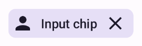
您可以使用 InputChip 可组合项来创建因用户互动而产生的 chip。例如,在电子邮件客户端中,当用户撰写电子邮件时,输入块可能表示用户已添加到“收件人:”字段中的联系人。
以下实现展示了已处于选中状态的输入微芯片。用户在按相应功能块时将其关闭。
@Composable fun InputChipExample( text: String, onDismiss: () -> Unit, ) { var enabled by remember { mutableStateOf(true) } if (!enabled) return InputChip( onClick = { onDismiss() enabled = !enabled }, label = { Text(text) }, selected = enabled, avatar = { Icon( Icons.Filled.Person, contentDescription = "Localized description", Modifier.size(InputChipDefaults.AvatarSize) ) }, trailingIcon = { Icon( Icons.Default.Close, contentDescription = "Localized description", Modifier.size(InputChipDefaults.AvatarSize) ) }, ) }
此实现如下所示。
建议内容信息条
SuggestionChip 可组合项是本页列出的可组合项中最基本的一个,无论是在 API 定义还是常见用例方面都是如此。建议芯片会显示动态生成的提示。例如,在 AI 聊天应用中,您可以使用建议芯片来呈现对最新消息的可能回复。
请考虑以下 SuggestionChip 实现:
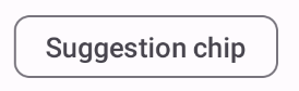
@Composable fun SuggestionChipExample() { SuggestionChip( onClick = { Log.d("Suggestion chip", "hello world") }, label = { Text("Suggestion chip") } ) }
此实现如下所示:
凸起条状标签
本文档中的所有示例都使用采用扁平外观的基础可组合项。如果您想要外观凸起的 chip,请使用以下三个可组合项之一: