悬浮操作按钮 (FAB) 是一种高强调度按钮,可让用户在应用中执行主要操作。它会突出显示用户可能采取的最常见途径,即一个重点明确的操作,并且通常固定在屏幕右下角。
请考虑以下三种可能使用 FAB 的情形:
- 创建新项:在记事应用中,FAB 可用于快速创建新记事。
- 添加新联系人:在聊天应用中,FAB 可以打开一个界面,让用户将某人添加到对话中。
- 居中显示位置:在地图界面中,FAB 可将地图居中显示在用户的当前位置。
在 Material Design 中,FAB 分为四种类型:
- FAB:普通大小的悬浮操作按钮。
- 小型 FAB:较小的悬浮操作按钮。
- 大型 FAB:较大的悬浮操作按钮。
- 展开式 FAB:包含图标以外的其他内容的悬浮操作按钮。

API Surface
虽然您可以使用多个可组合函数来创建符合 Material Design 的悬浮操作按钮,但它们的参数差异不大。您应注意的关键参数包括:
onClick:用户按下按钮时调用的函数。containerColor:按钮的颜色。contentColor:图标的颜色。
悬浮操作按钮
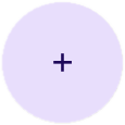
如需创建常规悬浮操作按钮,请使用基本的 FloatingActionButton 可组合项。以下示例演示了 FAB 的基本实现:
@Composable fun Example(onClick: () -> Unit) { FloatingActionButton( onClick = { onClick() }, ) { Icon(Icons.Filled.Add, "Floating action button.") } }
此实现如下所示:

小按钮
如需创建小型悬浮操作按钮,请使用 SmallFloatingActionButton 可组合函数。以下示例演示了如何添加自定义颜色。
@Composable fun SmallExample(onClick: () -> Unit) { SmallFloatingActionButton( onClick = { onClick() }, containerColor = MaterialTheme.colorScheme.secondaryContainer, contentColor = MaterialTheme.colorScheme.secondary ) { Icon(Icons.Filled.Add, "Small floating action button.") } }
此实现如下所示:

大按钮
如需创建大型悬浮操作按钮,请使用 LargeFloatingActionButton 可组合函数。除了会生成更大的按钮之外,此可组合项与其他示例没有显著区别。
以下是大型 FAB 的简单实现。
@Composable fun LargeExample(onClick: () -> Unit) { LargeFloatingActionButton( onClick = { onClick() }, shape = CircleShape, ) { Icon(Icons.Filled.Add, "Large floating action button") } }
此实现如下所示:
扩展按钮
您可以使用 ExtendedFloatingActionButton 可组合函数创建更复杂的悬浮操作按钮。它与 FloatingActionButton 的主要区别在于,它具有专用的 icon 和 text 参数。它们可让您创建包含更复杂内容的按钮,并可根据内容适当调整大小。
以下代码段演示了如何实现 ExtendedFloatingActionButton,并传递了 icon 和 text 的示例值。
@Composable fun ExtendedExample(onClick: () -> Unit) { ExtendedFloatingActionButton( onClick = { onClick() }, icon = { Icon(Icons.Filled.Edit, "Extended floating action button.") }, text = { Text(text = "Extended FAB") }, ) }
此实现如下所示: