
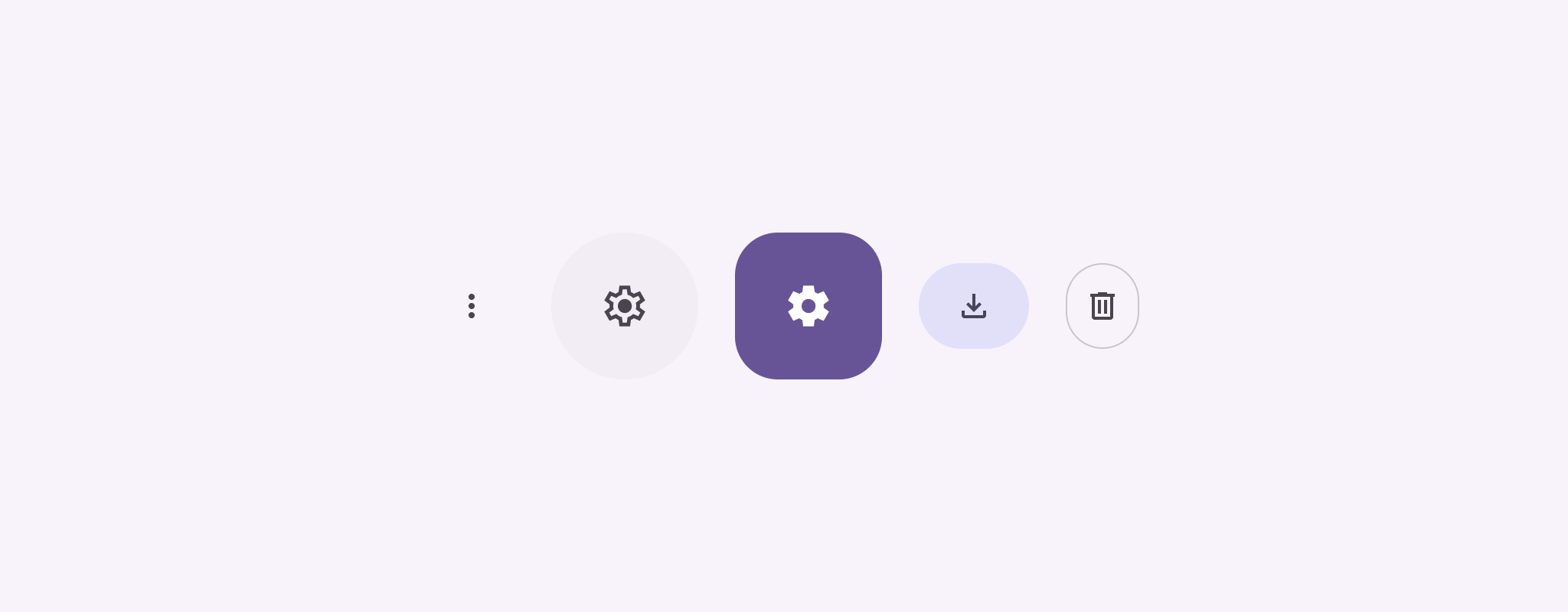
Simge düğmeleri, kullanıcıların yapabileceği işlemleri gösterir. Simge düğmelerinde açıkça anlaşılır bir simge kullanılmalıdır ve genellikle yaygın veya sık kullanılan işlemleri temsil etmelidir.
İki tür simge düğmesi vardır:
- Varsayılan: Bu düğmeler menü veya arama gibi diğer öğeleri açabilir.
- Açma/kapatma: Bu düğmeler, "favori" veya "yer işareti" gibi etkinleştirilip devre dışı bırakılabilen ikili işlemleri temsil edebilir.
API yüzeyi
Standart simge düğmelerini uygulamak için IconButton bileşenini kullanın. Doldurulmuş, tonlu veya kenarlıklandırılmış gibi farklı görsel stiller oluşturmak için sırasıyla FilledIconButton, FilledTonalIconButton ve OutlinedIconButton simgesini kullanın.
IconButton için temel parametreler şunlardır:
onClick: Kullanıcı simge düğmesine dokunduğunda yürütülen bir lambda işlevi.enabled: Düğmenin etkin durumunu kontrol eden bir boole değeridir.falseolduğunda düğme kullanıcı girişine yanıt vermez.content: Düğmenin içindeki, genellikleIconolan derlenebilir içerik.
Temel örnek: Açma/kapatma simgesi düğmesi
Bu örnekte, açma/kapatma düğmesi simgesinin nasıl uygulanacağı gösterilmektedir. Açma/kapatma düğmesi simgesinin görünümü, düğmenin seçili olup olmadığına göre değişir.
@Preview @Composable fun ToggleIconButtonExample() { // isToggled initial value should be read from a view model or persistent storage. var isToggled by rememberSaveable { mutableStateOf(false) } IconButton( onClick = { isToggled = !isToggled } ) { Icon( painter = if (isToggled) painterResource(R.drawable.favorite_filled) else painterResource(R.drawable.favorite), contentDescription = if (isToggled) "Selected icon button" else "Unselected icon button." ) } }
Kodla ilgili önemli noktalar
ToggleIconButtonExamplecomposable, açma/kapatma düğmeli birIconButtontanımlar.mutableStateOf(false), başlangıçtafalseolan bir boole değeri içeren birMutableStatenesnesi oluşturur. Bu,isToggleddeğerini bir durum tutucusu yapar. Diğer bir deyişle, Compose, değeri değiştiğinde kullanıcı arayüzünü yeniden oluşturur.rememberSaveable,isToggleddurumunun ekran döndürme gibi yapılandırma değişikliklerinde korunmasını sağlar.
IconButtonöğesininonClicklambdası, düğmenin tıklandığında davranışını tanımlar ve durumutrueilefalsearasında değiştirir.Iconbileşenininpainterparametresi,isToggleddurumuna göre koşullu olarak farklı birpainterResourceyükler. Bu işlem, simgesinin görsel görünümünü değiştirir.isToggledtrueise dolu kalp çizilebilir öğesi yüklenir.isToggledfalseise kenarları çizili kalp çizilebilir öğesi yüklenir.
Icon'uncontentDescriptionözelliği de uygun erişilebilirlik bilgilerini sağlamak içinisToggleddurumuna göre güncellenir.
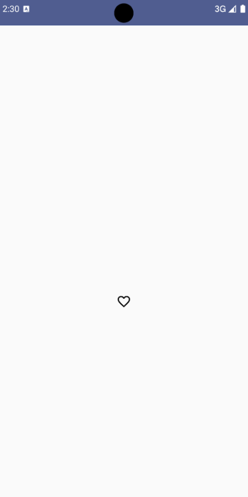
Sonuç
Aşağıdaki resimde, önceki snippet'teki açma/kapatma simgesi düğmesi seçili olmayan durumunda gösterilmektedir:
Gelişmiş örnek: Basın sırasında tekrarlanan işlemler
Bu bölümde, kullanıcı düğmeye basıp basılı tutarken bir işlemi yalnızca tıklama başına bir kez değil, sürekli olarak tetikleyen simge düğmelerinin nasıl oluşturulacağı gösterilmektedir.
@Composable fun MomentaryIconButton( unselectedImage: Int, selectedImage: Int, contentDescription: String, modifier: Modifier = Modifier, stepDelay: Long = 100L, // Minimum value is 1L milliseconds. onClick: () -> Unit ) { val interactionSource = remember { MutableInteractionSource() } val isPressed by interactionSource.collectIsPressedAsState() val pressedListener by rememberUpdatedState(onClick) LaunchedEffect(isPressed) { while (isPressed) { delay(stepDelay.coerceIn(1L, Long.MAX_VALUE)) pressedListener() } } IconButton( modifier = modifier, onClick = onClick, interactionSource = interactionSource ) { Icon( painter = if (isPressed) painterResource(id = selectedImage) else painterResource(id = unselectedImage), contentDescription = contentDescription, ) } }
Kodla ilgili önemli noktalar
MomentaryIconButton, düğmeye basılmadığında simgenin çizilebilir kaynak kimliği olanunselectedImage: Intve düğmeye basıldığında simgenin çizilebilir kaynak kimliği olanselectedImage: Intparametrelerini alır.- Özellikle kullanıcıdan gelen "basma" etkileşimlerini izlemek için bir
interactionSourcekullanır. isPressed, düğmeye etkin bir şekilde basıldığında doğru, aksi takdirde yanlış değerini alır.isPressed,trueolduğundaLaunchedEffectbir döngüye girer.- Bu döngü içinde, tetikleyici işlemler arasında duraklamalar oluşturmak için
delay(stepDelayile) kullanılır.coerceIn, sonsuz döngüleri önlemek için gecikmenin en az 1 ms olmasını sağlar. pressedListener, döngüdeki her gecikmeden sonra çağrılır. Bu işlem, işlemin tekrar etmesini sağlar.
- Bu döngü içinde, tetikleyici işlemler arasında duraklamalar oluşturmak için
pressedListener,onClicklambda'sının (uygulanacak işlem) her zaman en son derlemedeki en güncel sürüm olduğundan emin olmak içinrememberUpdatedState'ı kullanır.Icon, düğmeye basılı olup olmadığına bağlı olarak görüntülenen resmini değiştirir.isPresseddoğruysaselectedImagegösterilir.- Aksi takdirde
unselectedImagegösterilir.
Ardından, bu MomentaryIconButton değerini bir örnekte kullanın. Aşağıdaki snippet'te, bir sayıcıyı kontrol eden iki simge düğmesi gösterilmektedir:
@Preview() @Composable fun MomentaryIconButtonExample() { var pressedCount by remember { mutableIntStateOf(0) } Row( modifier = Modifier.fillMaxWidth(), verticalAlignment = Alignment.CenterVertically ) { MomentaryIconButton( unselectedImage = R.drawable.fast_rewind, selectedImage = R.drawable.fast_rewind_filled, stepDelay = 100L, onClick = { pressedCount -= 1 }, contentDescription = "Decrease count button" ) Spacer(modifier = Modifier) Text("advanced by $pressedCount frames") Spacer(modifier = Modifier) MomentaryIconButton( unselectedImage = R.drawable.fast_forward, selectedImage = R.drawable.fast_forward_filled, contentDescription = "Increase count button", stepDelay = 100L, onClick = { pressedCount += 1 } ) } }
Kodla ilgili önemli noktalar
MomentaryIconButtonExamplebileşeni, ikiMomentaryIconButtonörneği içeren birRowve bir sayıcıyı artırıp azaltmak için kullanıcı arayüzü oluşturmak üzere birTextbileşeni gösterir.remembervemutableIntStateOfkullanarak 0 olarak başlatılmış birpressedCountdeğişken durum değişkeni tutar.pressedCountdeğiştiğinde, bunu gözlemleyen tüm bileşenler (Textbileşeni gibi) yeni değeri yansıtacak şekilde yeniden oluşturulur.- İlk
MomentaryIconButtontıklandığında veya basılı tutulduğundapressedCountazalır. - İkinci
MomentaryIconButton, tıklandığında veya basılı tutulduğundapressedCountdeğerini artırır. - Her iki düğmede de 100 milisaniyelik bir
stepDelaykullanılır. Yani düğme basılı tutulurkenonClickişlemi 100 milisaniyede bir tekrarlanır.
Sonuç
Aşağıdaki videoda, simge düğmelerini ve sayacı içeren kullanıcı arayüzü gösterilmektedir: