

ड्रॉप-डाउन मेन्यू की मदद से, उपयोगकर्ता किसी आइकॉन, टेक्स्ट फ़ील्ड या अन्य कॉम्पोनेंट पर क्लिक कर सकते हैं. इसके बाद, वे कुछ समय के लिए दिखने वाली स्क्रीन पर मौजूद विकल्पों की सूची में से कोई विकल्प चुन सकते हैं. इस गाइड में, बेसिक मेन्यू बनाने का तरीका बताया गया है. साथ ही, डिवाइडर और आइकॉन वाले ज़्यादा जटिल मेन्यू बनाने का तरीका भी बताया गया है.

एपीआई सरफ़ेस
ड्रॉप-डाउन मेन्यू लागू करने के लिए, DropdownMenu, DropdownMenuItem, IconButton, और ExposedDropdownMenuBox कॉम्पोनेंट का इस्तेमाल करें. DropdownMenu और DropdownMenuItem कॉम्पोनेंट का इस्तेमाल, मेन्यू आइटम दिखाने के लिए किया जाता है. वहीं, IconButton या अन्य कॉम्पोनेंट, मेन्यू को ट्रिगर कर सकते हैं.
ExposedDropdownMenuBox का इस्तेमाल, टेक्स्ट फ़ील्ड से जुड़ा मेन्यू बनाने के लिए किया जाता है.
DropdownMenu कॉम्पोनेंट के मुख्य पैरामीटर में ये शामिल हैं:
expanded: इससे पता चलता है कि मेन्यू दिख रहा है या नहीं.onDismissRequest: इसका इस्तेमाल, मेन्यू को खारिज करने के लिए किया जाता है.content: मेन्यू का कंपोज़ेबल कॉन्टेंट. आम तौर पर, इसमेंDropdownMenuItemकंपोज़ेबल होते हैं.
DropdownMenuItem के लिए मुख्य पैरामीटर में ये शामिल हैं:
text: इससे मेन्यू आइटम में दिखने वाले कॉन्टेंट के बारे में पता चलता है.onClick: मेन्यू में मौजूद आइटम के साथ इंटरैक्शन को मैनेज करने के लिए कॉलबैक.
बेसिक ड्रॉप-डाउन मेन्यू बनाना
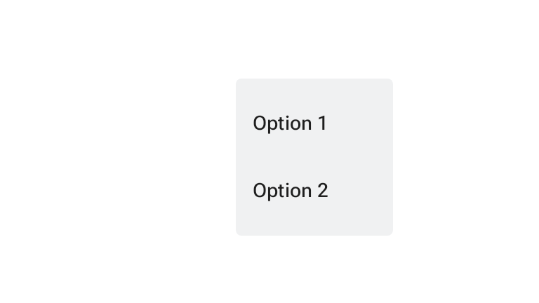
यहां दिए गए स्निपेट में, DropdownMenu को लागू करने का सबसे आसान तरीका बताया गया है:
@Composable fun MinimalDropdownMenu() { var expanded by remember { mutableStateOf(false) } Box( modifier = Modifier .padding(16.dp) ) { IconButton(onClick = { expanded = !expanded }) { Icon(painter = rememberVectorPainter(AppIcons.MoreVert), contentDescription = "More options") } DropdownMenu( expanded = expanded, onDismissRequest = { expanded = false } ) { DropdownMenuItem( text = { Text("Option 1") }, onClick = { /* Do something... */ } ) DropdownMenuItem( text = { Text("Option 2") }, onClick = { /* Do something... */ } ) } } }
कोड के बारे में अहम बातें
- इससे एक बुनियादी
DropdownMenuतय होता है, जिसमें दो मेन्यू आइटम शामिल होते हैं. expandedपैरामीटर से यह कंट्रोल किया जाता है कि मेन्यू बड़ा करके दिखाया जाए या छोटा करके.onDismissRequestपैरामीटर, एक कॉलबैक तय करता है. यह कॉलबैक तब लागू होता है, जब उपयोगकर्ता मेन्यू बंद करता है.DropdownMenuItemकंपोज़ेबल, ड्रॉप-डाउन मेन्यू में चुने जा सकने वाले आइटम दिखाता है.IconButtonसे मेन्यू को बड़ा और छोटा किया जा सकता है.
नतीजा
ज़्यादा विकल्पों वाला ड्रॉप-डाउन मेन्यू बनाना
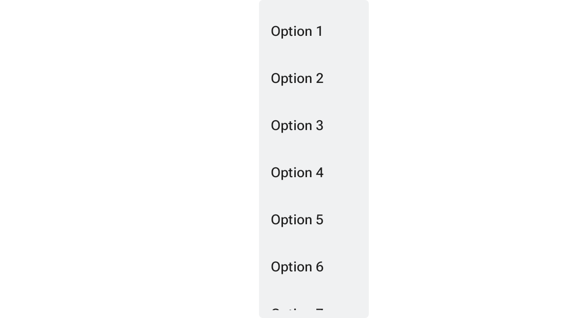
अगर मेन्यू के सभी आइटम एक साथ नहीं दिखाए जा सकते, तो DropdownMenu को डिफ़ॉल्ट रूप से स्क्रोल किया जा सकता है. यहां दिए गए स्निपेट से, स्क्रोल किया जा सकने वाला लंबा ड्रॉप-डाउन मेन्यू बनता है:
@Composable fun LongBasicDropdownMenu() { var expanded by remember { mutableStateOf(false) } // Placeholder list of 100 strings for demonstration val menuItemData = List(100) { "Option ${it + 1}" } Box( modifier = Modifier .padding(16.dp) ) { IconButton(onClick = { expanded = !expanded }) { Icon(painter = rememberVectorPainter(AppIcons.MoreVert), contentDescription = "More options") } DropdownMenu( expanded = expanded, onDismissRequest = { expanded = false } ) { menuItemData.forEach { option -> DropdownMenuItem( text = { Text(option) }, onClick = { /* Do something... */ } ) } } } }
कोड के बारे में अहम बातें
- जब
DropdownMenuके कॉन्टेंट की कुल ऊंचाई, उपलब्ध जगह से ज़्यादा हो जाती है, तो उसे स्क्रोल किया जा सकता है. यह कोड, स्क्रोल किया जा सकने वालाDropdownMenuबनाता है, जिसमें 100 प्लेसहोल्डर आइटम दिखते हैं. forEachलूप, डाइनैमिक तौर परDropdownMenuItemकंपोज़ेबल जनरेट करता है. आइटम लेज़ी तरीके से नहीं बनाए जाते. इसका मतलब है कि ड्रॉप-डाउन के सभी 100 आइटम बनाए जाते हैं और कंपोज़िशन में मौजूद होते हैं.IconButtonपर क्लिक करने से,DropdownMenuको बड़ा और छोटा किया जा सकता है.- हर
DropdownMenuItemमें मौजूदonClickलैम्ब्डा की मदद से, यह तय किया जा सकता है कि उपयोगकर्ता के कोई मेन्यू आइटम चुनने पर क्या कार्रवाई की जाए.
नतीजा
ऊपर दिए गए कोड स्निपेट से, स्क्रोल किया जा सकने वाला यह मेन्यू बनता है:
डिवाइडर की मदद से, ड्रॉप-डाउन मेन्यू को बड़ा बनाना
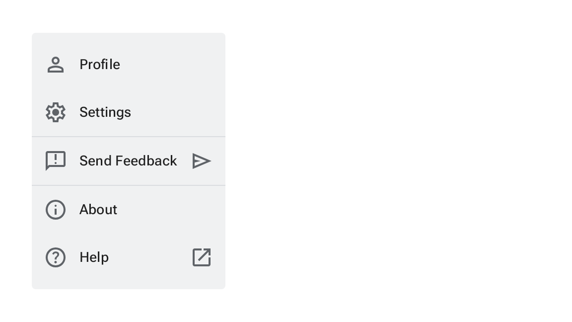
नीचे दिए गए स्निपेट में, ड्रॉप-डाउन मेन्यू को बेहतर तरीके से लागू करने का तरीका बताया गया है. इस स्निपेट में, मेन्यू आइटम में लीडिंग और ट्रेलिंग आइकॉन जोड़े गए हैं. साथ ही, डिवाइडर का इस्तेमाल करके मेन्यू आइटम के ग्रुप को अलग-अलग किया गया है.
@Composable fun DropdownMenuWithDetails() { var expanded by remember { mutableStateOf(false) } Box( modifier = Modifier .fillMaxWidth() .padding(16.dp) ) { IconButton(onClick = { expanded = !expanded }) { Icon(painter = rememberVectorPainter(AppIcons.MoreVert), contentDescription = "More options") } DropdownMenu( expanded = expanded, onDismissRequest = { expanded = false } ) { // First section DropdownMenuItem( text = { Text("Profile") }, leadingIcon = { Icon(painter = rememberVectorPainter(AppIcons.Person), contentDescription = null) }, onClick = { /* Do something... */ } ) DropdownMenuItem( text = { Text("Settings") }, leadingIcon = { Icon(painter = rememberVectorPainter(AppIcons.Settings), contentDescription = null) }, onClick = { /* Do something... */ } ) HorizontalDivider() // Second section DropdownMenuItem( text = { Text("Send Feedback") }, leadingIcon = { Icon(painter = rememberVectorPainter(AppIcons.Feedback), contentDescription = null) }, trailingIcon = { Icon(painter = rememberVectorPainter(AppIcons.Send), contentDescription = null) }, onClick = { /* Do something... */ } ) HorizontalDivider() // Third section DropdownMenuItem( text = { Text("About") }, leadingIcon = { Icon(painter = rememberVectorPainter(AppIcons.Info), contentDescription = null) }, onClick = { /* Do something... */ } ) DropdownMenuItem( text = { Text("Help") }, leadingIcon = { Icon(painter = rememberVectorPainter(AppIcons.Help), contentDescription = null) }, trailingIcon = { Icon(painter = rememberVectorPainter(AppIcons.OpenInNew), contentDescription = null) }, onClick = { /* Do something... */ } ) } } }
यह कोड, Box में DropdownMenu को तय करता है.
कोड के बारे में अहम बातें
leadingIconऔरtrailingIconपैरामीटर,DropdownMenuItemके शुरू और आखिर में आइकॉन जोड़ते हैं.IconButtonसे मेन्यू बड़ा होता है.DropdownMenuमें कईDropdownMenuItemकंपोज़ेबल होते हैं. हर कंपोज़ेबल, चुनी जा सकने वाली कार्रवाई को दिखाता है.HorizontalDividerकंपोज़ेबल, मेन्यू आइटम के ग्रुप को अलग करने के लिए हॉरिज़ॉन्टल लाइन डालते हैं.
नतीजा
ऊपर दिया गया स्निपेट, आइकॉन और डिवाइडर के साथ ड्रॉप-डाउन मेन्यू बनाता है:
M3 Expressive अपडेट
मटीरियल 3 एक्सप्रेसिव में DropdownMenu और DropdownMenuItem के साथ-साथ, DropdownMenuPopup, DropdownMenuGroup, और CheckableDropdownMenuItem को अतिरिक्त विकल्पों के तौर पर शामिल किया गया है. इनकी मदद से, ग्रुप किए गए आइटम, गैप, और चेक किए जा सकने वाले स्टेटस के साथ सेगमेंट वाले मेन्यू बनाए जा सकते हैं.
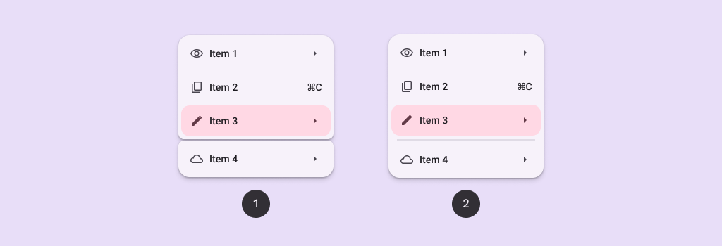
मेन्यू के लिए, M3 एक्सप्रेसिव के अपडेट के बारे में ज़्यादा जानने के लिए, मटीरियल डिज़ाइन 3 के मेन्यू से जुड़े दिशा-निर्देश देखें.
सेगमेंट किए गए मेन्यू
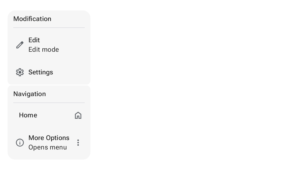
सेगमेंट किए गए मेन्यू, मिलती-जुलती कार्रवाइयों को अलग-अलग विज़ुअल सेक्शन में बांटते हैं. इन सेक्शन को गैप या डिवाइडर से अलग किया जाता है. यहां दिए गए स्निपेट से पता चलता है कि DropdownMenuPopup, DropdownMenuGroup, और CheckableDropdownMenuItem का इस्तेमाल करके, सेगमेंट में बंटा ड्रॉप-डाउन मेन्यू कैसे लागू किया जाता है:
@OptIn(ExperimentalMaterial3Api::class) @Composable fun GroupedMenuSample() { val groupInteractionSource = remember { MutableInteractionSource() } var expanded by remember { mutableStateOf(false) } val groupLabels = listOf("Modification", "Navigation") val groupItemLabels = listOf(listOf("Edit", "Settings"), listOf("Home", "More Options")) val groupItemLeadingIcons = listOf(listOf(AppIcons.Edit, AppIcons.Settings), listOf(null, AppIcons.Info)) val groupItemCheckedLeadingIcons = listOf( listOf(AppIcons.EditFilled, AppIcons.SettingsFilled), listOf(AppIcons.Check, AppIcons.InfoFilled), ) val groupItemTrailingIcons: List<List<ImageVector?>> = listOf(listOf(null, null), listOf(AppIcons.Home, AppIcons.MoreVert)) val groupItemCheckedTrailingIcons: List<List<ImageVector?>> = listOf(listOf(null, null), listOf(AppIcons.HomeFilled, AppIcons.MoreVert)) val groupItemSupportingText: List<List<String?>> = listOf(listOf("Edit mode", null), listOf(null, "Opens menu")) val checked = remember { listOf(mutableStateListOf(false, false), mutableStateListOf(false, false)) } Box(modifier = Modifier.fillMaxSize().wrapContentSize(Alignment.TopStart)) { // Icon button should have a tooltip associated with it for a11y. TooltipBox( positionProvider = TooltipDefaults.rememberTooltipPositionProvider(TooltipAnchorPosition.Above), tooltip = { PlainTooltip { Text("Localized description") } }, state = rememberTooltipState(), ) { IconButton(onClick = { expanded = true }) { Icon(painter = rememberVectorPainter(AppIcons.MoreVert), contentDescription = "Localized description") } } DropdownMenuPopup(expanded = expanded, onDismissRequest = { expanded = false }) { val groupCount = groupLabels.size groupLabels.fastForEachIndexed { groupIndex, label -> DropdownMenuGroup( shapes = MenuDefaults.groupShape(groupIndex, groupCount), interactionSource = groupInteractionSource, ) { MenuDefaults.DropdownMenuGroupLabel { Text(label) } HorizontalDivider(modifier = Modifier.padding(MenuDefaults.HorizontalDividerPadding)) val groupItemCount = groupItemLabels[groupIndex].size groupItemLabels[groupIndex].fastForEachIndexed { itemIndex, itemLabel -> CheckableDropdownMenuItem( text = { Text(itemLabel) }, supportingText = groupItemSupportingText[groupIndex][itemIndex]?.let { supportingText -> { Text(supportingText) } }, shapes = MenuDefaults.itemShape(itemIndex, groupItemCount), leadingIcon = groupItemLeadingIcons[groupIndex][itemIndex]?.let { iconData -> { Icon( painter = rememberVectorPainter(iconData), modifier = Modifier.size(MenuDefaults.LeadingIconSize), contentDescription = null, ) } }, checkedLeadingIcon = { Icon( painter = rememberVectorPainter(groupItemCheckedLeadingIcons[groupIndex][itemIndex]), modifier = Modifier.size(MenuDefaults.LeadingIconSize), contentDescription = null, ) }, trailingContent = if (checked[groupIndex][itemIndex]) { groupItemCheckedTrailingIcons[groupIndex][itemIndex]?.let { iconData -> { Icon( painter = rememberVectorPainter(iconData), modifier = Modifier.size(MenuDefaults.TrailingIconSize), contentDescription = null, ) } } } else { groupItemTrailingIcons[groupIndex][itemIndex]?.let { iconData -> { Icon( painter = rememberVectorPainter(iconData), modifier = Modifier.size(MenuDefaults.TrailingIconSize), contentDescription = null, ) } } }, checked = checked[groupIndex][itemIndex], onCheckedChange = { checked[groupIndex][itemIndex] = it }, ) } } if (groupIndex != groupCount - 1) { Spacer(Modifier.height(MenuDefaults.GroupSpacing)) } } if (checked.last().last()) { DropdownMenuButtonGroup() } } } } @Composable private fun DropdownMenuButtonGroup() { ButtonGroup( overflowIndicator = { menuState -> ButtonGroupDefaults.OverflowIndicator(menuState) }, modifier = Modifier.fillMaxWidth(), horizontalArrangement = Arrangement.spacedBy(2.dp, Alignment.CenterHorizontally), ) { customItem( buttonGroupContent = { FilledIconButton( onClick = {}, colors = IconButtonDefaults.filledIconButtonColors( containerColor = MenuDefaults.groupStandardContainerColor ), ) { Icon(painter = rememberVectorPainter(AppIcons.ThumbUp), contentDescription = "Localized description") } }, menuContent = { DropdownMenuItem( leadingIcon = { Icon(painter = rememberVectorPainter(AppIcons.ThumbUp), contentDescription = null) }, text = { Text("Thumbs up") }, onClick = {}, ) }, ) customItem( buttonGroupContent = { FilledIconButton( onClick = {}, colors = IconButtonDefaults.filledIconButtonColors( containerColor = MenuDefaults.groupStandardContainerColor ), ) { Icon(painter = rememberVectorPainter(AppIcons.ThumbDown), contentDescription = "Localized description") } }, menuContent = { DropdownMenuItem( leadingIcon = { Icon(painter = rememberVectorPainter(AppIcons.ThumbDown), contentDescription = null) }, text = { Text("Thumbs down") }, onClick = {}, ) }, ) customItem( buttonGroupContent = { FilledIconButton( onClick = {}, colors = IconButtonDefaults.filledIconButtonColors( containerColor = MenuDefaults.groupStandardContainerColor ), ) { Icon(painter = rememberVectorPainter(AppIcons.TagFaces), contentDescription = "Localized description") } }, menuContent = { DropdownMenuItem( leadingIcon = { Icon(painter = rememberVectorPainter(AppIcons.TagFaces), contentDescription = null) }, text = { Text("Emotes") }, onClick = {}, ) }, ) } }
अन्य संसाधन
- मटीरियल डिज़ाइन: मेन्यू