

您可以通过以下三种方式在整个应用中采用样式:
- 直接在公开
Style参数的现有组件上使用。 - 在不接受
Style参数的布局 可组合项上使用Modifier.styleable应用样式。 - 在您自己的自定义设计系统中,使用
Modifier.styleable{}并在您自己的组件上公开样式参数。
样式的可用属性
样式支持许多与修饰符相同的属性;不过,并非所有修饰符都可以通过样式复制。您仍然需要修饰符来实现某些行为,例如互动、自定义绘制或属性堆叠。
| 分组 | 属性 | 子项继承 |
|---|---|---|
| 布局和大小调整 | ||
| 内容内边距(内部) | - contentPadding(all: Dp)- contentPadding(horizontal: Dp, vertical: Dp)- contentPadding(start: Dp, top: Dp, end: Dp, bottom: Dp)- contentPaddingHorizontal(value: Dp) / contentPaddingVertical(value: Dp)- contentPaddingStart(value: Dp) / contentPaddingTop(value: Dp) / contentPaddingEnd(value: Dp) / contentPaddingBottom(value: Dp) |
否 |
| 外部内边距(外部) | - externalPadding(all: Dp)- externalPadding(horizontal: Dp, vertical: Dp)- externalPadding(start: Dp, top: Dp, end: Dp, bottom: Dp)- externalPaddingHorizontal(value: Dp) / externalPaddingVertical(value: Dp)- externalPaddingStart(value: Dp) / externalPaddingTop(value: Dp) / externalPaddingEnd(value: Dp) / externalPaddingBottom(value: Dp) |
否 |
| 维度 | fillWidth()/fillHeight()/fillSize() 以及 width、height 和 size(支持 Dp、DpSize 或 Float 分数)。 |
否 |
| 定位 | left/top/right/bottom 偏移量。 |
否 |
| 视觉外观 | ||
| 填充 | background 和 foreground(支持 Color 或 Brush)。 |
否 |
| 边框 | borderWidth、borderColor 和 borderBrush。 |
否 |
| 形状 | shape |
否 - 但与其他属性结合使用。clip 和 border 使用此定义的形状。 |
| 阴影 | dropShadow、innerShadow |
否 |
| 转换 | ||
| 图形层空间移动 | translationX、translationY、scaleX/scaleY、rotationX/rotationY/rotationZ |
否 |
| 控制 | alpha、zIndex(堆叠顺序)和 transformOrigin(轴点) |
否 |
| 排版 | ||
| 样式 | textStyle、fontSize、fontWeight、fontStyle 和 fontFamily |
是 |
| 着色 | contentColor 和 contentBrush。这也用于图标样式。 |
是 |
| 段落 | lineHeight、letterSpacing、textAlign、textDirection、lineBreak 和 hyphens。 |
是 |
| 装饰 | textDecoration、textIndent 和 baselineShift。 |
是 |
直接在具有样式参数的组件上使用样式
公开 Style 参数的组件允许您设置其样式:
BaseButton( onClick = { }, style = { } ) { BaseText("Click me") }
在样式 lambda 中,您可以设置各种属性,例如 externalPadding 或 background:
BaseButton( onClick = { }, style = { background(Color.Blue) } ) { BaseText("Click me") }
如需查看受支持属性的完整列表,请参阅样式的 可用属性。
使用修饰符为没有现有参数的组件应用样式
对于缺少内置样式参数的组件,您仍然可以使用 styleable 修饰符应用样式。在开发自己的自定义组件时,此方法也很有用。
Row( modifier = Modifier.styleable { } ) { BaseText("Content") }
与 style 参数类似,您可以在 lambda 中添加 background、contentPadding 或 externalPadding 等属性。
Row( modifier = Modifier.styleable { background(Color.Blue) } ) { BaseText("Content") }
多个链接的 Modifier.styleable 修饰符会与所应用可组合项上的非继承属性相加,其行为类似于定义相同属性的多个修饰符。对于继承的属性,这些属性会被替换,并且链中的最后一个 styleable 修饰符会设置这些值。
使用 Modifier.styleable 时,您可能还需要创建并提供 StyleState 以与修饰符一起使用,从而应用基于状态的样式。如需了解更多
详情,请参阅使用样式的状态和
动画。
定义独立样式
您可以定义独立样式以实现可重用性:
val style = Style { background(Color.Blue) }
然后,您可以将定义的样式传递到可组合项的样式参数中,或使用 Modifier.styleable 传递。使用 Modifier.styleable 时,您还需要创建 StyleState 对象。StyleState 在 使用样式的状态和
动画文档中详细介绍。
以下示例展示了如何通过组件的内置参数或通过 Modifier.styleable 直接应用样式:
val style = Style { background(Color.Blue) } // built in parameter BaseButton(onClick = { }, style = style) { BaseText("Button") } // modifier styleable val styleState = remember { MutableStyleState(null) } Column( Modifier.styleable(styleState, style) ) { BaseText("Column content") }
您还可以将该样式传递到多个组件中:
val style = Style { background(Color.Blue) } // built in parameter BaseButton(onClick = { }, style = style) { BaseText("Button") } BaseText("Different text that uses the same style parameter", style = style) // modifier styleable val columnStyleState = remember { MutableStyleState(null) } Column( Modifier.styleable(columnStyleState, style) ) { BaseText("Column") } val rowStyleState = remember { MutableStyleState(null) } Row( Modifier.styleable(rowStyleState, style) ) { BaseText("Row") }
添加多个样式属性
您可以通过在每一行中设置不同的属性来添加多个样式属性:
BaseButton( onClick = { }, style = { background(Color.Blue) contentPaddingStart(16.dp) } ) { BaseText("Button") }
与基于修饰符的样式不同,样式中的属性不会相加。样式会采用一个样式块中属性列表中的最后一个设置值。在以下示例中,由于背景设置了两次,因此 TealColor 是应用的背景。对于内边距,contentPaddingTop 会替换顶部
内边距,并且不会合并这些值。contentPadding
BaseButton( style = { background(Color.Red) // Background of Red is now overridden with TealColor instead background(TealColor) // All directions of padding are set to 64.dp (top, start, end, bottom) contentPadding(64.dp) // Top padding is now set to 16.dp, all other paddings remain at 64.dp contentPaddingTop(16.dp) }, onClick = { // } ) { BaseText("Click me!") }
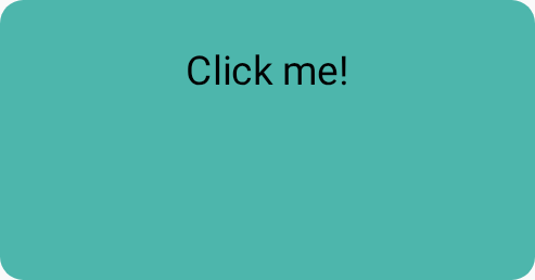
contentPadding 替换。合并多个样式对象
您可以创建多个样式对象,并将其传递到可组合项的样式参数中。
val style1 = Style { background(TealColor) } val style2 = Style { contentPaddingTop(16.dp) } BaseButton( style = style1 then style2, onClick = { }, ) { BaseText("Click me!") }
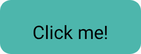
contentPaddingTop。当多个样式指定同一属性时,系统会选择最后设置的属性。由于样式中的属性不会相加,因此传入的最后一个
内边距会替换初始
contentPadding设置的 contentPaddingHorizontal。此外,最后一个背景颜色会替换传入的初始样式设置的背景颜色。
val style1 = Style { background(Color.Red) contentPadding(32.dp) } val style2 = Style { contentPaddingHorizontal(8.dp) background(Color.LightGray) } BaseButton( style = style1 then style2, onClick = { }, ) { BaseText("Click me!") }
在这种情况下,应用的样式具有浅灰色背景和 32.dp 内边距,但左内边距和右内边距除外,其值为 8.dp。

contentPadding。样式继承
某些样式属性(例如 contentColor 和与文本样式相关的属性)会传播到子可组合项。在子可组合项上设置的样式会替换该特定子项的继承父样式。

Style、styleable 和直接参数的样式传播。| 优先级 | 方法 | 效果 |
|---|---|---|
| 1(最高) | 可组合项上的直接实参 | 替换所有内容;例如,Text(color = Color.Red) |
| 2 | 样式参数 | 本地样式替换 Text(style = Style { contentColor(Color.Red)} |
| 3 | 修饰符链 | 组件本身的 Modifier.styleable{ contentColor(Color.Red)。 |
| 4(最低) | 父样式 | 对于可以从父项继承的属性(排版/颜色)。 |
父样式
您可以从父可组合项设置文本属性(例如 contentColor),这些属性会传播到所有子 Text 可组合项。
val styleState = remember { MutableStyleState(null) } Column( modifier = Modifier.styleable(styleState) { background(Color.LightGray) val blue = Color(0xFF4285F4) val purple = Color(0xFFA250EA) val colors = listOf(blue, purple) contentBrush(Brush.linearGradient(colors)) }, ) { BaseText("Children inherit", style = { width(60.dp) }) BaseText("certain properties") BaseText("from their parents") }

子项替换属性
您还可以在特定的 Text 可组合项上设置样式。如果父可组合项设置了样式,则在子可组合项上设置的样式会替换父可组合项的样式。
val styleState = remember { MutableStyleState(null) } Column( modifier = Modifier.styleable(styleState) { background(Color.LightGray) val blue = Color(0xFF4285F4) val purple = Color(0xFFA250EA) val colors = listOf(blue, purple) contentBrush(Brush.linearGradient(colors)) }, ) { BaseText("Children can ", style = { contentBrush(Brush.linearGradient(listOf(Color.Red, Color.Blue))) }) BaseText("override properties") BaseText("set by their parents") }

实现自定义样式属性
您可以使用 StyleScope 上的扩展函数创建映射到现有样式定义的自定义属性,如以下示例所示:
fun StyleScope.outlinedBackground(color: Color) { border(1.dp, color) background(color) }
在样式定义中应用此新属性:
val customExtensionStyle = Style { outlinedBackground(Color.Blue) }
不支持创建新的可设置样式的属性。如果您的使用场景 需要此类支持,请提交功能请求。
读取 CompositionLocal 值
一种常见模式是将设计系统令牌存储在 CompositionLocal 中,以便在无需将变量作为参数传递的情况下访问这些变量。样式可以访问 CompositionLocal 以检索样式中的系统级值:
val buttonStyle = Style { contentPadding(12.dp) shape(RoundedCornerShape(50)) background(Brush.verticalGradient(LocalCustomColors.currentValue.background)) }