
Os layouts canônicos são comprovados e versáteis, oferecendo uma experiência ideal ao usuário em vários formatos.

Os layouts canônicos têm suporte a smartphones de tela pequena, assim como tablets, dobráveis e dispositivos ChromeOS. Derivados das orientações do Material Design, os layouts são estéticos e funcionais.
O framework do Android inclui componentes especializados que tornam a implementação dos layouts direta e confiável.
Os layouts canônicos criam IUs envolventes e que melhoram a produtividade e formam a base de ótimos apps.
Se você já conhece os layouts canônicos de apps adaptáveis, mas não sabe quais APIs do Android usar, acesse a seção Aplicabilidade para saber qual é o layout ideal para os casos de uso do seu app.
Detalhes de lista

O layout de detalhes e listas permite que os usuários descubram listas de itens que têm informações descritivas, explicativas ou outras informações complementares: os detalhes do item.
O layout divide a janela do app em dois painéis lado a lado: um para a lista e outro para os detalhes. Os usuários selecionam itens da lista para mostrar detalhes deles. Os links diretos no detalhe revelam mais conteúdo no painel de detalhes.
Telas de largura expandida (consulte Usar classes de tamanho de janela) acomodam a lista e os detalhes ao mesmo tempo. A seleção de um item da lista atualiza o painel de detalhes para mostrar o conteúdo relacionado ao item selecionado.
Telas de largura média e compacta mostram a lista ou o detalhe, dependendo da interação do usuário com o app. Quando apenas a lista está visível, a seleção de um item mostra o detalhe em vez da lista. Quando apenas o detalhe está visível, o botão "Voltar" mostra a lista novamente.
Mudanças de configuração, por exemplo, na orientação do dispositivo ou no tamanho da janela do app, podem modificar a classe de tamanho da janela da tela. Um layout de detalhes e listas responde de acordo com a mudança, preservando o estado do app:
- Se uma tela de largura expandida mostrando os painéis de lista e de detalhes se restringir a média ou compacta, o painel de detalhes vai continuar visível, e o painel de lista vai ficar oculto.
- Se uma tela de largura média ou compacta tiver apenas o painel de detalhes visível e a classe de tamanho da janela expandir, a lista e os detalhes vão ser mostrados juntos, e a lista vai indicar que o item correspondente ao conteúdo do painel de detalhes está selecionado.
- Se uma tela de largura média ou compacta tiver apenas o painel da lista visível e for expandida, a lista e o painel de detalhes do marcador de posição vão aparecer juntos.
O layout de detalhes e listas é ideal para apps de mensagens, gerenciadores de contatos, navegadores de mídia interativos ou qualquer app em que o conteúdo possa ser organizado como uma lista de itens que revelam informações extras.
Implementação
Um layout de detalhes e listas pode ser criado com várias tecnologias, incluindo Compose, visualizações e incorporação de atividades (para apps legados). Consulte a seção Aplicabilidade para decidir qual tecnologia é mais adequada para seu app.
A biblioteca SlidingPaneLayout foi criada para a implementação de
layouts de detalhes e listas com base em visualizações ou fragmentos.
Primeiro, declare um SlidingPaneLayout como o elemento raiz do seu layout XML.
Em seguida, adicione os dois elementos filhos (visualizações ou fragmentos) que
representam a lista e o conteúdo detalhado.
Implemente uma metodologia de comunicação para transmitir dados entre as visualizações ou os fragmentos de detalhes e listas. O ViewModel é recomendado devido à capacidade de armazenar
a lógica de negócios e sobreviver a mudanças de configuração.
SlidingPaneLayout determina automaticamente se a lista e os detalhes vão aparecer juntos ou individualmente. Em uma janela com espaço horizontal suficiente para
acomodar ambos, a lista e os detalhes aparecem lado a lado. Em uma janela sem espaço suficiente, a lista ou os detalhes vão aparecer dependendo da interação do usuário com o app.
Para conferir um exemplo de implementação, consulte o exemplo Detalhes da lista com painel deslizante.
Incorporação de atividades
Use a incorporação de atividades para permitir que apps legados com várias atividades mostrem duas atividades lado a lado na mesma tela ou empilhadas (uma sobrepondo a outra). Se o app implementar a lista e os detalhes de um layout de detalhes e listas em atividades separadas, a incorporação de atividades vai permitir que você crie um layout de detalhes e listas com pouca ou nenhuma refatoração de código.
Implemente a incorporação de atividades especificando uma divisão da janela de tarefas usando um arquivo de configuração XML. A divisão define a atividade principal, que inicia a divisão, além de uma atividade secundária. Especifique uma largura mínima de exibição para a divisão usando os pontos de interrupção da classe de tamanho da janela. Quando a largura da tela fica abaixo do ponto de interrupção mínimo, as atividades aparecem uma sobre a outra. Por exemplo, se a largura mínima for 600 dp, as atividades vão aparecer uma sobrepondo a outra em telas compactas, mas lado a lado em telas médias e expandidas.
A incorporação de atividades pode ser realizada no Android 12L (nível 32 da API) e versões mais recentes. No entanto, ela também pode estar disponível em níveis mais baixos da API, se implementada pelos fabricantes de dispositivos. Quando a incorporação de atividades não está disponível em um dispositivo, o comportamento alternativo resulta nas atividades de lista ou de detalhes ocupando a janela inteira do app com base na interação do usuário.
Para mais informações, consulte Incorporação de atividades.
Para conferir um exemplo de implementação, consulte Detalhes e listas com incorporação de atividades.
Feed

Um layout de feed organiza elementos de conteúdo equivalentes em uma grade configurável para uma visualização rápida e conveniente de um grande volume de conteúdo.
O tamanho e a posição estabelecem relações entre os elementos de conteúdo.
Os agrupamentos de conteúdo são criados com o mesmo tamanho dos elementos e posicionados juntos. Para chamar a atenção a um elemento, torne-o maior que elementos próximos.
Cards e listas são componentes comuns de layouts de feed.
Um layout de feed oferece suporte a exibições de quase todos os tamanhos, porque a grade pode se adaptar de uma única coluna de rolagem a um feed de conteúdo com várias colunas.
Os feeds são especialmente adequados para apps de notícias e redes sociais.
Implementação
Uma RecyclerView renderiza um grande número de itens em uma única
coluna de maneira eficiente. Um GridLayoutManager mostra os itens em uma grade, permitindo
a configuração dos tamanhos e comprimentos deles.
Configure as colunas da grade com base no tamanho da área de exibição disponível para definir a largura mínima permitida para itens.
A estratégia de tamanho padrão de GridLayoutManager, que é um tamanho por item,
pode ser substituída criando um SpanSizeLookup personalizado. Ajuste o tamanho para
destacar alguns itens em vez de outros.
Em telas de largura compacta que têm espaço suficiente para apenas uma coluna, use
LinearLayoutManager em vez de GridLayoutManager.
Para conferir um exemplo de implementação, consulte o exemplo Feed com visualizações.
Painel de suporte

O layout do painel de suporte organiza o conteúdo do app nas áreas de exibição principal e secundária.
A área de exibição principal ocupa a maior parte da janela do app (geralmente cerca de dois terços) e mostra o conteúdo principal. A área de exibição secundária é um painel que ocupa o restante da janela do app e apresenta conteúdo de suporte ao principal.
Os layouts de painel de suporte funcionam bem em telas de largura expandida (consulte Usar classes de tamanho de janela) na orientação paisagem. Telas de largura média ou compacta podem mostrar as áreas de exibição principal e secundária se o conteúdo se adaptar a espaços de exibição mais estreitos. Elas também oferecem suporte se o conteúdo extra puder estar inicialmente oculto em uma página inferior ou lateral, acessível por um controle, como um menu ou botão.
Um layout de painel de suporte difere de um layout de detalhes e listas em relação ao conteúdo principal e secundário. O conteúdo do painel secundário só é significativo em relação ao conteúdo principal. Por exemplo, uma janela de ferramentas do painel de suporte é irrelevante por si só. No entanto, o conteúdo suplementar no painel de detalhes de um layout de detalhes e listas é significativo, mesmo sem o conteúdo principal. Por exemplo, a descrição de um produto.
Os casos de uso do painel de suporte incluem:
- Apps de produtividade:um documento ou planilha com comentários de revisores em um painel de suporte.
- Apps de mídia:um streaming de vídeo e uma lista de vídeos relacionados em um painel de suporte. Ou a representação de um álbum de músicas complementado por uma playlist.
- Ferramentas e configurações:uma ferramenta de edição de mídia com paletas, efeitos e outras configurações em um painel de suporte.
Implementação
Um layout de painel de suporte é implementado usando um layout auxiliar como
LinearLayout ou ConstraintLayout. Estabeleça as classes de tamanho de janela
que dividem a quantidade de espaço de exibição horizontal disponível para o app em
três categorias: compacta (< 600 dp), média (>= 600 dp) e expandida
(>= 840 dp).
Para cada classe de tamanho de janela, defina os layouts desta forma:
- Compactar:na pasta
layoutdos recursos do app, coloque o conteúdo que renderiza o painel de suporte abaixo do conteúdo principal ou dentro de uma página inferior; - Média: na pasta
layout-w600dp, forneça o conteúdo do painel de suporte que resulte na renderização do painel principal e no painel de suporte lado a lado, dividindo o espaço de exibição horizontal da mesma forma. - Expandida: na pasta
layout-w840dp, inclua o conteúdo do painel de suporte que resulte na renderização do conteúdo principal e do painel de suporte lado a lado. No entanto, o painel de suporte ocupa apenas 30% do espaço horizontal, deixando os 70% restantes para o conteúdo principal.
Use um ViewModel para a comunicação entre o conteúdo principal e o
painel de suporte, seja usando visualizações, fragmentos ou uma combinação.
Confira alguns exemplos de implementação (links em inglês):
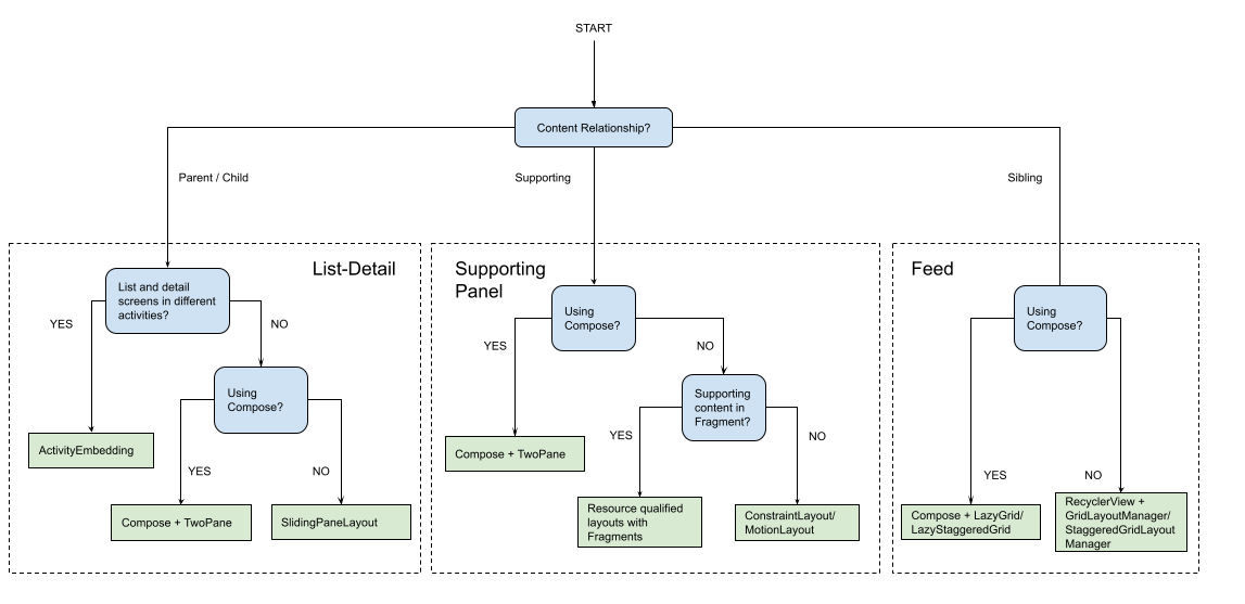
Aplicabilidade
Os layouts canônicos criam apresentações multifacetadas de conteúdo para facilitar o acesso e a análise detalhada. Use o fluxograma a seguir para determinar qual layout e estratégia de implementação são melhores para os casos de uso do seu app.
Para encontrar exemplos de layouts canônicos implementados em diferentes tipos de app, consulte a galeria de telas grandes.
Outros recursos
- Material Design: Layouts canônicos (link em inglês)